Empirical Project 8 Working in R
Download the code
To download the code chunks used in this project, right-click on the download link and select ‘Save Link As…’. You’ll need to save the code download to your working directory, and open it in RStudio.
Don’t forget to also download the data into your working directory by following the steps in this project.
Getting started in R
For this project you will need the following packages:
-
tidyverse, to help with data manipulation -
readxl, to import an Excel spreadsheet -
knitr, to format tables.
If you need to install any of these packages, run the following code:
install.packages(c("tidyverse", "readxl", "knitr"))
You can import the libraries now, or when they are used in the R walk-throughs below.
library(tidyverse)
library(readxl)
library(knitr)
Part 8.1 Cleaning and summarizing the data
Learning objectives for this part
- detect and correct entries in a dataset
- recode variables to make them easier to analyse
- calculate percentiles for subsets of the data.
So far we have been working with data that was formatted correctly. However, sometimes the datasets will be messier and we will need to clean the data before starting any analysis. Data cleaning involves checking that all variables are formatted correctly, all observations are entered correctly (e.g. no typos), and missing values are coded in a way that the software you are using can understand. Otherwise, the software will either not be able to analyse your data, or only analyse the observations it recognizes, which could lead to incorrect results and conclusions.
In the data we will use, the European Values Study (EVS) data has been converted to an Excel spreadsheet from another program, so there are some entries that were not converted correctly and some variables that need to be recoded (for example, replacing words with numbers, or replacing one number with another).
Download the EVS data and documentation:
- Download the EVS data.
- For the documentation, go to the data download site.
- Click on the ‘Data and Documents’ button in the middle of the page, then click the ‘Other Documents’ button and download the PDF file called ‘ZA4804_EVS_VariableCorrespondence.pdf’. This file contains information about each variable in the dataset (e.g. variable name and what it measures).
Although we will be performing our analysis in R, the data has been provided as an Excel spreadsheet, so look at the spreadsheet in Excel first to understand its structure.
- The Excel spreadsheet contains multiple worksheets, one for each wave, that need to be joined together to create a single ‘tibble’ (like a spreadsheet for R). The variable names currently do not tell us what the variable is, so we need to provide labels and short descriptions to avoid confusion.
- Using the
rbindfunction, load each worksheet containing data (‘Wave 1’ through to ‘Wave 4’) and combine the worksheets into a single dataset.
- Use the PDF you have downloaded to create a label and a short description (attribute) for each variable using the
attrfunction. (See R walk-through 8.1 for details.) The second column of the PDF lists all variables in the dataset (alphabetically) and tells you what it measures.
R walk-through 8.1 Importing the data into R
As we are importing an Excel file, we use the
read_excelfunction from thereadxlpackage. The file is calledProject-8-datafile.xlsxand contains four worksheets that contain the data, named ‘Wave 1’ through to ‘Wave 4’. We will load the worksheets one by one and add them to the previous worksheets using therbindfunction, which attaches objects with the same number of rows to each other. The final output is calledlifesat_data.library(tidyverse) library(readxl) library(knitr) # Set your working directory to the correct folder. # Insert your file path for 'YOURFILEPATH'. setwd("YOURFILEPATH") lifesat_data read_excel("Project-8-datafile.xlsx", sheet = "Wave 1") lifesat_data rbind(lifesat_data, read_excel("Project-8-datafile.xlsx", sheet = "Wave 2")) lifesat_data rbind(lifesat_data, read_excel("Project-8-datafile.xlsx", sheet = "Wave 3")) lifesat_data rbind(lifesat_data, read_excel("Project-8-datafile.xlsx", sheet = "Wave 4"))The variable names provided in the spreadsheet are not very specific (a combination of letters and numbers that don’t tell us what the variable measures), we can assign a label (
”labels”) and a short description (shortDescription, taken from the Variable Correspondence file) to each variable for reference later. Theattrfunction does this for us (note that the order in each list should be the same as the order of the variable names).attr(lifesat_data, "labels") c("EVS-wave", "Country/region", "Respondent number", "Health", "Life satisfaction", "Work Q1", "Work Q2", "Work Q3", "Work Q4", "Work Q5", "Sex", "Age", "Marital status", "Number of children", "Education", "Employment", "Monthly household income") attr(lifesat_data, "shortDescription") c("EVS-wave", "Country/region", "Original respondent number", "State of health (subjective)", "Satisfaction with your life", "To develop talents you need to have a job", "Humiliating to receive money w/o working for it", "People who don't work become lazy", "Work is a duty towards society", "Work comes first even if it means less spare time", "Sex", "Age", "Marital status", "How many living children do you have", "Educational level (ISCED-code one digit)", "Employment status", "Monthly household income (× 1,000s PPP euros)")Throughout this project we will refer to the variables using their original names, but you can use the
attrfunction again to look up the attributes of each variable (the following code uses the variableX028to show how you can do this):attr(lifesat_data, "labels")[ attr(lifesat_data, "names") == "X028"]## [1] "Employment"attr(lifesat_data, "shortDescription")[ attr(lifesat_data, "names") == "X028"]## [1] "Employment status"
In general, data dictionaries and variable correspondences are useful because they contain important information about what each variable represents and how it is measured, which usually cannot be summarized in a short variable name.
- Now we will take a closer look at how some of the variables were measured.
- Variable
A170is reported life satisfaction on a scale of 1 (dissatisfied) to 10 (satisfied). Respondents answered the question ‘All things considered, how satisfied are you with your life as a whole these days?’ Discuss the assumptions needed to use this measure in interpersonal and cross-country comparisons, and whether you think they are plausible. (You may find it helpful to refer to Box 2.1 of the OECD Guidelines on Measuring Subjective Well-being.)
- An individual’s employment status (variable X028) was self-reported. Explain whether misreporting of employment status is likely to be an issue, and give some factors that may affect the likelihood of misreporting in this context.
- Variables
C036toC041ask about an individual’s attitudes towards work. With self-reports, we may also be concerned that individuals are using a heuristic (rule of thumb) to answer the questions. Table 2.1 of the OECD Guidelines on Measuring Subjective Well-being lists some response biases and heuristics that individuals could use. Pick three that you think particularly apply to questions about life satisfaction or work ethic and describe how we might check whether this issue may be present in our data.
Before doing any data analysis, it is important to check that all variables are coded in a way that the software can recognize. This process involves checking how missing values are coded (usually these need to be coded in a particular way for each software), and that numerical variables (numbers) only contain numbers and not text (in order to calculate summary statistics).
- We will now check and clean the dataset so it is ready to use.
- Inspect the data and understand what type of data each variable is stored as. Currently, missing values are recorded as ‘.a’, but we would like them to be recorded as ‘NA’ (not available).
- Variable
A170(life satisfaction) is currently a mixture of numbers (2 to 9) and words (‘Satisfied’ and ‘Dissatisfied’), but we would like it to be all numbers. Replace the word ‘Dissatisfied’ with the number 1, and the word ‘Satisfied’ with the number 10.
- Similarly, variable
X011_01(number of children) has recorded no children as a word rather than a number. Replace ‘No children’ with the number 0.
- The variables
C036toC041should be replaced with numbers ranging from 1 (‘Strongly disagree’) to 5 (‘Strongly agree’) so we can take averages of them later. Similarly, variableA009should be recoded as 1 = ‘Very Poor’, 2 = ‘Poor’, 3 = ‘Fair’, 4 = ‘Good’, 5 = ‘Very Good’.
- Split
X025Ainto two variables, one for the number before the colon, and the other containing the words after the colon.
R walk-through 8.2 Cleaning data and splitting variables
Inspect the data and recode missing values
R stores variables as different
typesdepending on the kind of information the variable represents. For categorical data, where, as the name suggests, data is divided into a number of groups, such as country or occupation, the variables can be stored as text (chr). Numerical data (numbers that do not represent categories) should be stored as numbers (num), but sometimes R imports numerical values as text, which can cause problems later when we use these variables in calculations. Thestrfunction shows what type each variable is being stored as.str(lifesat_data)## Classes 'tbl_df', 'tbl' and 'data.frame': 164997 obs. of 17 variables: ## $ S002EVS: chr "1981-1984" "1981-1984" "1981-1984" "1981-1984" ... ## $ S003 : chr "Belgium" "Belgium" "Belgium" "Belgium" ... ## $ S006 : num 1001 1002 1003 1004 1005 ... ## $ A009 : chr "Fair" "Very good" "Poor" "Very good" ... ## $ A170 : chr "9" "9" "3" "9" ... ## $ C036 : chr ".a" ".a" ".a" ".a" ... ## $ C037 : chr ".a" ".a" ".a" ".a" ... ## $ C038 : chr ".a" ".a" ".a" ".a" ... ## $ C039 : chr ".a" ".a" ".a" ".a" ... ## $ C041 : chr ".a" ".a" ".a" ".a" ... ## $ X001 : chr "Male" "Male" "Male" "Female" ... ## $ X003 : num 53 30 61 60 60 19 38 39 44 76 ... ## $ X007 : chr "Single/Never married" "Married" "Separated" "Married" ... ## $ X011_01: chr ".a" ".a" ".a" ".a" ... ## $ X025A : chr ".a" ".a" ".a" ".a" ... ## $ X028 : chr "Full time" "Full time" "Unemployed" "Housewife" ... ## $ X047D : chr ".a" ".a" ".a" ".a" ... ## - attr(*, "labels")= chr "EVS-wave" "Country/region" "Respondent number" "Health" ... ## - attr(*, "shortDescription")= chr "EVS-wave" "Country/region" "Original respondent number" "State of health (subjective)" ...You can see that some variables have the value
“.a”, which is how missing values were coded in the original dataset. We start by recoding all missing values asNA(which is how R recognizes and usually codes missing values).lifesat_data[lifesat_data == ".a"] NARecode the life satisfaction variable
To recode the life satisfaction variable (
A170), we can use logical indexing (asking R to check if a certain condition is satisfied or not) to select all observations where the variableA170is equal to either ‘Dissatisfied’ or ‘Satisfied’ and assign the value 1 or 10 respectively. This variable was imported as achr(text) instead ofnumvariable because some of the entries included text (the.afor missing values). After changing the text into numerical values, we use theas.numericfunction to convert the variable into a numerical type.lifesat_data$A170[lifesat_data$A170 == "Dissatisfied"] 1 lifesat_data$A170[lifesat_data$A170 == "Satisfied"] 10 lifesat_data$A170 as.numeric(lifesat_data$A170)Recode the variable for number of children
We repeat this process (using logical indexing and then converting to numerical variable) for the variable indicating the number of children (
X011_01).lifesat_data$X011_01[lifesat_data$X011_01 == "No children"] 0 lifesat_data$X011_01 as.numeric(lifesat_data$X011_01)Replace text with numbers for multiple variables
When we have to recode multiple variables with the same mapping of text to numerical value (i.e. a word/phrase corresponds to the same number for all variables), we can use the
tidyverselibrary and the piping (%>%) operator to run the same sequence of steps in one go for all variables, instead of repeating the process used above for each variable. The punctuation%>%links the commands together. (At this stage, don’t worry if you can’t understand exactly what this code does, as long as you can adapt it for similar situations. For a more detailed introduction to piping, see the University of Manchester’s Econometric Computing Learning Resource.)lifesat_data lifesat_data %>% mutate_at(c("C036", "C037", "C038", "C039", "C041"), funs(recode(., "Strongly disagree" = "1", "Disagree" = "2", "Neither agree nor disagree" = "3", "Agree" = "4", "Strongly agree" = "5"))) %>% mutate_at(c("A009"), funs(recode(., "Very poor" = "1", "Poor" = "2", "Fair" = "3", "Good" = "4", "Very good" = "5"))) %>% mutate_at(c("A009", "C036", "C037", "C038", "C039", "C041", "X047D"), funs(as.numeric))Split a variable containing numbers and text
To split the education variable (
X025A) into two new columns, we use theseparatefunction, which creates two new variables calledEducation_1andEducation_2containing the numeric value and the text description respectively. Then we use themutate_atfunction to convertEducation_1into a numeric variable.lifesat_data lifesat_data %>% separate(X025A, c("Education_1", "Education_2"), " : ", remove = FALSE) %>% mutate_at("Education_1", funs(as.numeric))
Although the paper we are following only considered individuals aged 25–80 who were not students, we will retain the other observations in our analysis. However, we need to remove any observations that have missing values for A170, X028, or any of the other variables except X047D. Removing missing data ensures that any summary statistics or analysis we do is done on the same set of data (without having to always account for the fact that some values are missing), and is fine as long as the data are missing at random (i.e. there is no particular reason why certain observations are missing and not others).
-
In your dataset, remove all rows in all waves that have missing data for A170. Do the same for:
- X003, X028, X007 and X001 in all waves
- A009 in Waves 1, 2, and 4 only
- C036, C037, C038, C039, C041 and X047D in Waves 3 and 4 only
- X011_01 and X025A, in Wave 4.
R walk-through 8.3 gives guidance on how to do this.
R walk-through 8.3 Dropping specific observations
As not all questions were asked in all waves, we have to be careful when dropping observations with missing values for certain questions, to avoid accidentally dropping an entire wave of data. For example, information on self-reported health (
A009) was not recorded in Wave 3, and questions on work attitudes (C036toC041) and information on household income are only asked in Waves 3 and 4. Furthermore, information on the number of children (X011_01) and education (X025A) are only collected in the final wave.We will first use the
complete.casesfunction to keep observations with complete information on variables present in all waves (X003,A170,X028,X007, andX001—stored in the listinclude). This function tells us which rows in the dataframe have complete information. When used in the codelifesat_data[complete.cases(lifesat_data[, include]), ], it tells R to only keep the rows that contain complete information of the variables in the listinclude.include names(lifesat_data) %in% c( "X003", "A170", "X028", "X007", "X001") lifesat_data lifesat_data[ complete.cases(lifesat_data[, include]), ]Next we will look at variables that were only present in some waves. For each variable/group of variables, we have to only look at the particular wave(s) in which the question was asked, then keep the observations with complete information on those variables. As before, we make lists of variables that only feature in Waves 1, 2, and 4 (
A009—stored ininclude_wave_1_2_4), Waves 3 and 4 (C036toC041,X047D—stored ininclude_wave_3_4), and Wave 4 only (X011_01andX025A—stored ininclude_wave_4). Again we use thecomplete.casesfunction, but combine it with the logical OR operator|to include all observations for waves that did not ask that question, along with the complete cases for that question in the other waves. For example, the first command keeps an observations if it is in Wave 1 (1981-1984) or Wave 2 (1990-1993), or is in Waves 3 or 4 with complete information.# A009 is not in Wave 3. include_wave_1_2_4 names(lifesat_data) %in% c("A009") include_wave_3_4 names(lifesat_data) %in% # Work attitudes and income are in Waves 3 and 4. c("C036", "C037", "C038", "C039", "C041", "X047D") # Number of children and education are in Wave 4. include_wave_4 names(lifesat_data) %in% c("X011_01", "X025A") lifesat_data lifesat_data %>% filter(S002EVS == "1981-1984" | S002EVS == "1990-1993" | complete.cases(lifesat_data[, include_wave_3_4])) lifesat_data lifesat_data %>% filter(S002EVS != "2008-2010" | complete.cases(lifesat_data[, include_wave_4])) lifesat_data lifesat_data %>% filter(S002EVS == "1999-2001" | complete.cases(lifesat_data[, include_wave_1_2_4]))
- We will now create two variables, work ethic and relative income, which we will use in our comparison of life satisfaction.
- Work ethic is measured as the average of
C036toC041. Create a new variable showing this work ethic measure.
- Since unemployed individuals and students may not have income, the study calculated relative income as the relative household income of that individual, measured as a deviation from the average income in that individual’s country. Explain the issues with using this method if the income distribution is skewed (for example, if it has a long right tail).
- Instead of using average income, we will define relative income as the percentile of that individual’s household in the income distribution. Create a new variable showing this information. (See R walk-through 8.4 for one way to do this).
R walk-through 8.4 Calculating averages and percentiles
Calculate average work ethic score
We use the
rowMeansfunction to calculate the average work ethic score for each observation (workethic) based on the five survey questions related to working attitudes (C036toC041).lifesat_data$work_ethic rowMeans(lifesat_data[, c("C036", "C037", "C038", "C039", "C041")])Calculate income percentiles for each individual
R provides a handy function (
ecdf) to obtain an individual’s relative income as a percentile. As we want a separate income distribution for each wave, we use thegroup_byfunction. Finally, we tidy up the results by converting each value into a percentage and rounding to a single decimal place.The
ecdffunction will not work if there is missing data. Since we don’t have income data for Waves 1 and 2, we will have to split the data when working out the percentiles. First we store all observations from Waves 3 and 4 separately in a temporary dataset (df.new), only keep observations that have income values (!is.na(X047D)), calculate the percentile values with theecdffunction, and save the values in a variable calledpercentile(which will be ‘NA’ for Waves 1 and 2). Then we recombine this data with the original observations from Waves 1 and 2.# Create the percentile variable for Waves 3 and 4 df.new lifesat_data %>% # Select Waves 3 and 4 subset(S002EVS %in% c("1999-2001", "2008-2010")) %>% # Drop observations with missing income data filter(!is.na(X047D)) %>% # Calculate the percentiles per wave group_by(S002EVS) %>% # Calculate relative income as a percentile mutate(., percentile = ecdf(X047D)(X047D)) %>% # Express the variable as a percentage mutate(., percentile = round(percentile * 100, 1)) # Recombine Waves 3 and 4 with the Waves 1 and 2 lifesat_data lifesat_data %>% # Select Waves 1 and 2 subset(S002EVS %in% c("1981-1984", "1990-1993")) %>% # Create an empty variable so old and new dataframes are # same size mutate(., percentile = NA) %>% # Recombine the data bind_rows(., df.new)
- Now we have all the variables we need in the format we need. We will make some tables to summarize the data. Using the data for Wave 4:
- Create a table showing the breakdown of each country’s population according to employment status, with country (
S003) as the row variable, and employment status (X028) as the column variable. Express the values as percentages of the row total rather than as frequencies. Discuss any differences or similarities between countries that you find interesting.
- Create a new table as shown in Figure 8.1 (similar to Table 1 in the study ‘Employment status and subjective well-being’) and fill in the missing values. Life satisfaction is measured by
A170. Summary tables such as these give a useful overview of what each variable looks like.
| Male | Female | |||
|---|---|---|---|---|
| Mean | Standard deviation | Mean | Standard deviation | |
| Life satisfaction | ||||
| Self-reported health | ||||
| Work ethic | ||||
| Age | ||||
| Education | ||||
| Number of children | ||||
Summary statistics by gender, European Values Study.
Figure 8.1 Summary statistics by gender, European Values Study.
R walk-through 8.5 Calculating summary statistics
Create a table showing employment status, by country
One of the most useful R functions to obtain summary information is
summarize, which produces many different summary statistics for a set of data. First we select the data for Wave 4 and group it by country (S003) and employment type (X028). Then we use thesummarizefunction to obtain the number of observations for each combination of country and employment type. With the data effectively grouped by country only (a single observation contains the number of observations for each level (category) ofX028), we can use thesumfunction to obtain a total count (number of observations) per country and calculate relative frequencies (saved asfreq).lifesat_data %>% # Select Wave 4 only subset(S002EVS == "2008-2010") %>% # Group by country and employment group_by(S003, X028) %>% # Count the number of observations by group summarize(n = n()) %>% # Calculate the relative frequency (percentages) mutate(freq = round(n / sum(n), 4) * 100) %>% # Drop the count variable select(-n) %>% # Reshape the data into a neat table spread(X028, freq) %>% kable(., format = "markdown")|S003 | Full time| Housewife| Other| Part time| Retired| Self employed| Students| Unemployed| |:------------------|---------:|---------:|-----:|---------:|-------:|-------------:|--------:|----------:| |Albania | 29.42| 7.42| 1.50| 5.50| 9.08| 22.08| 7.33| 17.67| |Armenia | 23.86| 20.92| 1.14| 8.09| 18.38| 5.96| 6.70| 14.95| |Austria | 39.80| 7.24| 1.89| 9.95| 25.49| 5.02| 8.39| 2.22| |Belarus | 57.88| 2.43| 1.21| 6.95| 18.59| 3.40| 6.87| 2.67| |Belgium | 42.89| 5.96| 3.72| 8.94| 23.01| 3.57| 5.21| 6.70| |Bosnia Herzegovina | 34.06| 9.33| 0.82| 2.90| 14.67| 3.08| 8.15| 26.99| |Bulgaria | 46.32| 2.62| 0.76| 2.79| 31.28| 5.58| 2.37| 8.28| |Croatia | 41.58| 3.37| 0.93| 2.78| 26.01| 2.86| 8.75| 13.72| |Cyprus | 46.32| 13.68| 1.29| 2.84| 24.39| 6.58| 1.68| 3.23| |Czech Republic | 46.56| 3.06| 4.66| 1.68| 31.27| 3.82| 5.43| 3.52| |Denmark | 55.89| 0.28| 1.32| 6.69| 24.32| 5.94| 4.15| 1.41| |Estonia | 50.35| 4.08| 2.20| 5.11| 28.52| 3.61| 3.38| 2.75| |Finland | 52.34| 1.38| 3.94| 5.11| 22.77| 6.17| 3.72| 4.57| |France | 46.83| 5.59| 1.94| 6.04| 28.78| 2.76| 3.13| 4.92| |Georgia | 19.46| 11.60| 0.81| 6.57| 19.38| 7.06| 2.60| 32.52| |Germany | 38.44| 4.58| 3.03| 8.44| 28.64| 2.97| 2.67| 11.23| |Great Britain | 33.50| 7.32| 4.01| 11.23| 28.99| 5.72| 1.40| 7.82| |Greece | 28.49| 17.42| 0.40| 2.97| 26.73| 13.72| 6.18| 4.09| |Hungary | 46.39| 1.20| 7.21| 2.00| 24.04| 3.53| 6.57| 9.05| |Iceland | 54.50| 2.25| 6.01| 9.91| 7.06| 11.41| 4.95| 3.90| |Ireland | 41.87| 19.84| 1.59| 9.72| 13.89| 4.96| 1.59| 6.55| |Italy | 32.88| 8.33| 0.46| 9.13| 23.06| 13.70| 7.08| 5.37| |Kosovo | 19.57| 11.65| 0.52| 5.23| 5.83| 9.41| 18.00| 29.80| |Latvia | 52.05| 6.18| 2.34| 3.76| 23.22| 3.26| 4.26| 4.93| |Lithuania | 50.13| 4.11| 2.89| 5.16| 23.97| 3.41| 6.04| 4.29| |Luxembourg | 51.33| 9.36| 1.12| 7.38| 15.36| 3.00| 9.87| 2.58| |Macedonia | 35.74| 4.34| 1.24| 1.71| 16.74| 3.72| 8.53| 27.98| |Malta | 33.84| 32.33| 0.68| 3.84| 23.42| 2.33| 0.55| 3.01| |Moldova | 30.49| 7.24| 1.87| 7.58| 25.64| 4.86| 4.43| 17.89| |Montenegro | 39.02| 4.63| 0.60| 2.14| 16.64| 4.97| 4.80| 27.19| |Netherlands | 32.40| 9.52| 3.68| 18.24| 27.76| 6.48| 0.80| 1.12| |Northern Cyprus | 31.19| 19.55| 2.23| 5.20| 8.91| 8.91| 13.61| 10.40| |Northern Ireland | 30.10| 10.36| 4.53| 8.74| 29.45| 3.56| 1.29| 11.97| |Norway | 53.23| 2.22| 6.55| 9.48| 12.60| 8.17| 7.06| 0.71| |Poland | 41.81| 6.00| 0.10| 3.14| 28.00| 5.81| 7.62| 7.52| |Portugal | 46.20| 5.24| 1.57| 3.27| 33.51| 1.70| 1.05| 7.46| |Romania | 41.07| 10.54| 1.95| 3.22| 33.95| 3.02| 3.61| 2.63| |Russian Federation | 54.36| 5.81| 2.72| 5.08| 23.77| 1.27| 2.72| 4.26| |Serbia | 34.21| 5.02| 1.07| 2.38| 25.16| 6.91| 4.11| 21.13| |Slovakia | 40.98| 1.73| 4.89| 2.21| 39.73| 3.55| 1.25| 5.66| |Slovenia | 47.44| 2.50| 2.75| 1.25| 31.59| 4.37| 6.99| 3.12| |Spain | 41.52| 16.30| 0.11| 4.63| 19.93| 6.28| 3.19| 8.04| |Sweden | 54.82| 0.38| 6.60| 7.36| 15.36| 7.23| 4.06| 4.19| |Switzerland | 48.50| 6.42| 3.21| 14.03| 21.31| 2.89| 1.39| 2.25| |Turkey | 16.42| 42.39| 0.60| 2.14| 10.00| 7.66| 5.92| 14.88| |Ukraine | 40.92| 6.79| 1.02| 4.84| 32.09| 4.41| 3.23| 6.71|Calculate summary statistics by gender
We can also obtain summary statistics on a number of variables at the same time using the
summarize_atfunction. To obtain the mean value for each of the required variables, grouped by the gender variable (X001), we can use the piping operator again:# Obtain mean value lifesat_data %>% # We only require Wave 4. subset(S002EVS == "2008-2010") %>% # Group by gender group_by(X001) %>% summarize_at(c("A009", "A170", "work_ethic", "X003", "Education_1", "X011_01"), mean)## # A tibble: 2 x 7 ## X001 A009 A170 work_ethic X003 Education_1 X011_01 #### 1 Female 3.60 6.93 3.64 47.3 3.05 1.69 ## 2 Male 3.77 7.03 3.72 46.9 3.14 1.55 We can repeat the same steps to obtain the standard deviation, again grouped by gender.
# Obtain standard deviation
lifesat_data %>%
  subset(S002EVS == "2008-2010") %>%
  group_by(X001) %>%
  summarize_at(c("A009", "A170", "work_ethic", "X003",
    "Education_1", "X011_01"), sd)
## # A tibble: 2 x 7 ## X001 A009 A170 work_ethic X003 Education_1 X011_01 #### 1 Female 0.969 2.32 0.765 17.5 1.40 1.39 ## 2 Male 0.929 2.28 0.757 17.4 1.31 1.43 We can combine these two operations into a single code block and ask
summarize_atto perform multiple functions on multiple variables at the same time.# Obtain mean and standard deviations lifesat_data %>% subset(S002EVS == "2008-2010") %>% group_by(X001) %>% summarise_at(c("A009", "A170", "work_ethic", "X003", "Education_1", "X011_01"), funs(mean, sd))## # A tibble: 2 x 13 ## X001 A009_mean A170_mean work_ethic_mean X003_mean Education_1_mean #### 1 Female 3.60 6.93 3.64 47.3 3.05 ## 2 Male 3.77 7.03 3.72 46.9 3.14 ## # ... with 7 more variables: X011_01_mean , A009_sd ## # A170_sd, , work_ethic_sd ## # Education_1_sd, X003_sd , , X011_01_sd In this example, R automatically appends the function name (in this case,
_meanor_sd) to the end of the variables. If you need these variables in subsequent calculations, you need to reformat the data and variable names.
Part 8.2 Visualizing the data
Note
You will need to have done Questions 1–5 in Part 8.1 before doing this part.
Learning objectives for this part
- use column charts, line charts, and scatterplots to visualize data
- calculate and interpret correlation coefficients.
We will now create some summary charts of the self-reported measures (work ethic and life satisfaction), starting with column charts to show the distributions of values. Along with employment status, these are the main variables of interest, so it is important to look at them carefully before doing further data analysis.
The distribution of work ethic and life satisfaction may vary across countries but may also change over time within a country, especially since the surveys are conducted around once a decade. To compare distributions for a particular country over time, we have to use the same horizontal axis, so we will first need to make a separate frequency table for each distribution of interest (survey wave). Also, since the number of people surveyed in each wave may differ, we will use percentages instead of frequencies as the vertical axis variable.
- Use the data from Wave 3 and Wave 4 only, for three countries of your choice:
- For each of your chosen countries create a frequency table that contains the frequency of each unique value of the work ethic scores. Also include the percentage of individuals at each value, grouped by Wave 3 and Wave 4 separately.
- Plot a separate column chart for each country to show the distribution of work ethic scores in Wave 3, with the percentage of individuals on the vertical axis and the range of work ethic scores on the horizontal axis. On each chart, plot the distribution of scores in Wave 4 on top of the Wave 3 distribution.
- Based on your charts from 1(b), does it appear that the attitudes towards work in each country of your choice have changed over time? (Hint: For example, look at where the distribution is centred, the percentages of observations on the left tail or the right tail of the distribution, and how spread out the data is.)
R walk-through 8.6 Calculating frequencies and percentages
First we need to create a frequency table of the
work_ethicvariable for each wave. This variable only takes values from 1.0 to 5.0 in increments of 0.2 (since it is an average of five whole numbers), so we can group by each value and count the number of observations in each group using thesummarizefunction. Once we have counted the number of observations that have each value (separately for each wave), we compute the percentages by dividing these numbers by the total number of observations for that wave. For example, if there are 50 observations between 1 and 1.2, and 1,000 observations in that wave, the percentage would be 5%.waves c("1999-2001", "2008-2010") df.new lifesat_data %>% # Select Waves 3 and 4 subset(., S002EVS %in% waves) %>% # We use Germany in this example. subset(., S003 == "Germany") %>% # Group by each wave and the discrete values of # work_ethic group_by(S002EVS, work_ethic) %>% summarize (freq = n()) %>% mutate(percentage = (freq / sum(freq))*100)The frequencies and percentages are saved in a new dataframe called
df.new. If you want to look at it, typeview(df.new)into the console window. Now that we have the percentages and frequency data, we useggplotto plot a column chart. To overlay the column charts for both waves and make sure that the plot for each wave is visible, we use thealphaoption in thegeom_barfunction to set the transparency level (try changing the transparency to see how it affects your chart’s appearance).p ggplot(df.new, aes(work_ethic, percentage, fill = S002EVS, color = S002EVS)) + # Set the colour and fill of each wave geom_bar(stat = "identity", position = "identity", alpha = 0.2) + theme_bw() + ggtitle(paste("Distribution of work ethic for Germany")) print(p)
- We will use line charts to make a similar comparison for life satisfaction (
A170) over time. Using data for countries that are present in Waves 1 to 4:
- Create a table showing the average life satisfaction, by wave (column variable) and by country (row variable).
- Plot a line chart with wave number (1 to 4) on the horizontal axis and the average life satisfaction on the vertical axis.
- From your results in 2(a) and (b), how has the distribution of life satisfaction changed over time? What other information about the distribution of life satisfaction could we use to supplement these results?
- Choose one or two countries and research events that could explain the observed changes in average life satisfaction over time shown in 2(a) and (b).
R walk-through 8.7 Plotting multiple lines on a chart
Calculate average life satisfaction, by wave and country
Before we can plot the line charts, we have to calculate the average life satisfaction for each country in each wave.
In R walk-through 8.5 we produced summary tables, grouped by country and employment status. We will copy this process, but now we only require mean values. Countries that do not report the life satisfaction variable for all waves will have an average life satisfaction of ‘NA’. Since each country is represented by a row in the summary table, we use the
rowwiseandna.omitfunctions to drop any countries that do not have a value for the average life satisfaction for all four waves.df.new lifesat_data %>% group_by(S002EVS, S003) %>% # Calculate average life satisfaction per wave and country summarize(avg_lifesat = round(mean(A170), 2)) %>% # Reshape the data to one row per country spread(S002EVS, avg_lifesat) %>% # Set subsequent operations to be performed on each row rowwise() %>% # Drop any rows with missing observations na.omit() %>% print()## # A tibble: 11 x 5 ## S003 `1981-1984` `1990-1993` `1999-2001` `2008-2010` #### 1 Belgium 7.37 7.6 7.42 7.63 ## 2 Denmark 8.21 8.17 8.31 8.41 ## 3 France 6.71 6.77 6.98 7.05 ## 4 Germany 7.22 7.03 7.43 6.77 ## 5 Iceland 8.05 8.01 8.08 8.07 ## 6 Ireland 7.82 7.88 8.21 7.82 ## 7 Italy 6.65 7.3 7.18 7.4 ## 8 Netherlands 7.75 7.77 7.83 7.99 ## 9 Northern Ireland 7.66 7.88 8.07 7.82 ## 10 Spain 6.6 7.15 6.97 7.29 ## 11 Sweden 8.03 7.99 7.62 7.68 Create a line chart for average life satisfaction
To draw the lines for all countries on a single plot, we need to use the
gatherfunction to transform the data into the correct format to use inggplot.df.new %>% gather(Wave, mean, `1981-1984`:`2008-2010`) %>% # Group the data by country ggplot(., aes(x = Wave, y = mean, color = S003)) + geom_line(aes(group = S003, linetype = S003), size = 1) + theme_bw()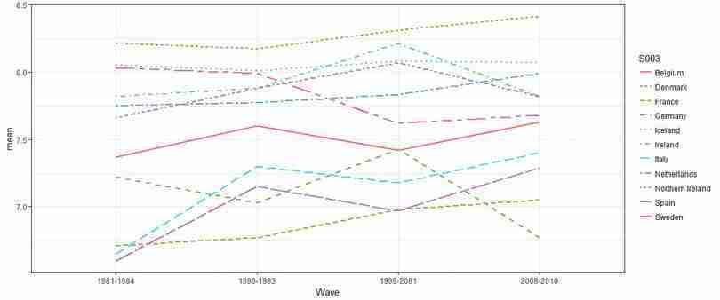
Line chart of average life satisfaction across countries and survey waves.
Figure 8.3 Line chart of average life satisfaction across countries and survey waves.
- correlation coefficient
- A numerical measure, ranging between 1 and −1, of how closely associated two variables are—whether they tend to rise and fall together, or move in opposite directions. A positive coefficient indicates that when one variable takes a high (low) value, the other tends to be high (low) too, and a negative coefficient indicates that when one variable is high the other is likely to be low. A value of 1 or −1 indicates that knowing the value of one of the variables would allow you to perfectly predict the value of the other. A value of 0 indicates that knowing one of the variables provides no information about the value of the other.
After describing patterns in our main variables over time, we will use correlation coefficients and scatter plots to look at the relationship between these variables and the other variables in our dataset.
- Using the Wave 4 data:
- Create a table as shown in Figure 8.4 and calculate the required correlation coefficients. For employment status and gender, you will need to create new variables: full-time employment should be equal to 1 if full-time employed and 0 if unemployed, and treated as missing data (left as a blank cell) otherwise. Gender should be 0 if male and 1 if female.
| Variable | Life satisfaction | Work ethic |
|---|---|---|
| Age | ||
| Education | ||
| Full-time employment | ||
| Gender | ||
| Self-reported health | ||
| Income | ||
| Number of children | ||
| Relative income | ||
| Life satisfaction | 1 | |
| Work ethic | 1 |
Correlation between life satisfaction, work ethic and other variables, Wave 4.
Figure 8.4 Correlation between life satisfaction, work ethic and other variables, Wave 4.
- Interpret the coefficients, paying close attention to how the variables are coded. (For example, you could comment on the absolute magnitude and sign of the coefficients). Explain whether the relationships implied by the coefficients are what you expected (for example, would you expect life satisfaction to increase or decrease with health, income, etc.)
R walk-through 8.8 Creating dummy variables and calculating correlation coefficients
To obtain the correlation coefficients between variables, we have to make sure that all variables are numeric. However, the data on sex and employment status are coded using text, so we need to create two new variables (
genderandemployment). (We choose to create a new variable rather than overwrite the original variable so that even if we make a mistake, the raw data is still preserved). We can use theifelsefunction to make the value of the variable conditional on whether a logical statement (e.g.X001 == "Male") is satisfied or not. As shown below, we can nestifelsestatements to create more complex conditions, which is useful if the variable contains more than two values. We used twoifelsestatements for the unemployment variable (X028) so that the new variable will be 1 for full-time employed, 0 for unemployed, and NA if neither condition is satisfied.Although we had previously removed observations with missing values (‘NA’), we have reintroduced ‘NA’ values in the previous step when creating the
employmentvariable. This would cause problems when obtaining the correlation coefficients using thecorfunction, so we include the optionuse = "pairwise.complete.obs"to exclude observations containing ‘NA’ from the calculations.lifesat_data %>% # We only require Wave 4. subset(S002EVS == "2008-2010") %>% # Create a gender variable mutate(gender = as.numeric( ifelse(X001 == "Male", 0, 1))) %>% # Provide nested condition for employment mutate(employment = as.numeric( ifelse(X028 == "Full time", 1, ifelse(X028 == "Unemployed", 0, NA)))) %>% select(X003, Education_1, employment, gender, A009, X047D, X011_01, percentile, A170, work_ethic) %>% # Store output in matrix cor(., use = "pairwise.complete.obs") -> M # Only interested in two columns, so use matrix indexing M[, c("A170", "work_ethic")]## A170 work_ethic ## X003 -0.08220504 0.13333312 ## Education_1 0.09363900 -0.14535643 ## employment 0.18387286 -0.02710835 ## gender -0.02105535 -0.04781557 ## A009 0.37560287 -0.07320865 ## X047D 0.23542497 -0.15226999 ## X011_01 -0.01729372 0.08925452 ## percentile 0.29592968 -0.18679869 ## A170 1.00000000 -0.03352464 ## work_ethic -0.03352464 1.00000000
Next we will look at the relationship between employment status and life satisfaction, and investigate the paper’s hypothesis that this relationship varies with a country’s average work ethic.
- Using the data from Wave 4, carry out the following:
- Create a table showing the average life satisfaction according to employment status (showing the full-time employed, retired, and unemployed categories only) with country (
S003) as the row variable, and employment status (X028) as the column variable. Comment on any differences in average life satisfaction between these three groups, and whether social norms is a plausible explanation for these differences.
- Use the table from Question 4(a) to calculate the difference in average life satisfaction (full-time employed minus unemployed, and full-time employed minus retired).
- Make a separate scatterplot for each of these differences in life satisfaction, with average work ethic on the horizontal axis and difference in life satisfaction on the vertical axis.
- For each difference (employed vs unemployed, employed vs retired), calculate and interpret the correlation coefficient between average work ethic and difference in life satisfaction.
R walk-through 8.9 Calculating group means
Calculate average life satisfaction and differences in average life satisfaction
We can achieve the tasks in Question 4(a) and (b) in one go using an approach similar to that used in R walk-through 8.5, although now we are interested in calculating the average life satisfaction by country and employment type. Once we have tabulated these means, we can compute the difference in the average values. We will create two new variables:
D1for the difference between the average life satisfaction for full-time employed and unemployed, andD2for the difference in average life satisfaction for full-time employed and retired individuals.# Set the employment types that we want to report employment_list = c("Full time", "Retired", "Unemployed") df.employment lifesat_data %>% # Select Wave 4 subset(S002EVS == "2008-2010") %>% # Select only observations with these employment types subset(X028 %in% employment_list) %>% # Group by country and then employment type group_by(S003, X028) %>% # Calculate the mean by country/employment type group summarize(mean = mean(A170)) %>% # Reshape to one row per country spread(X028, mean) %>% # Create the difference in means mutate(D1 = `Full time` - Unemployed, D2 = `Full time` - Retired) kable(df.employment, format = "markdown")|S003 | Full time| Retired| Unemployed| D1| D2| |:------------------|---------:|--------:|----------:|----------:|----------:| |Albania | 6.634561| 5.807339| 6.066038| 0.5685232| 0.8272215| |Armenia | 6.037671| 4.853333| 5.459016| 0.5786548| 1.1843379| |Austria | 7.435950| 7.741936| 6.074074| 1.3618763| -0.3059851| |Belarus | 6.099162| 5.617391| 5.606061| 0.4931014| 0.4817707| |Belgium | 7.717014| 7.834951| 6.366667| 1.3503472| -0.1179376| |Bosnia Herzegovina | 7.332447| 7.006173| 6.771812| 0.5606347| 0.3262740| |Bulgaria | 6.177007| 4.972973| 4.693878| 1.4831297| 1.2040343| |Croatia | 7.305668| 6.478964| 7.165644| 0.1400238| 0.8267036| |Cyprus | 7.384401| 7.031746| 6.560000| 0.8244011| 0.3526551| |Czech Republic | 7.302135| 6.885086| 6.065217| 1.2369173| 0.4170491| |Denmark | 8.541315| 8.205426| 7.200000| 1.3413153| 0.3358890| |Estonia | 6.925117| 6.253444| 4.971429| 1.9536884| 0.6716735| |Finland | 7.817073| 8.018692| 5.767442| 2.0496313| -0.2016184| |France | 7.200637| 6.974093| 6.242424| 0.9582127| 0.2265437| |Georgia | 6.116667| 4.690377| 5.421446| 0.6952203| 1.4262901| |Germany | 7.258114| 6.848548| 4.608466| 2.6496488| 0.4095667| |Great Britain | 7.532934| 7.930796| 6.025641| 1.5072931| -0.3978617| |Greece | 7.152113| 6.621622| 5.980392| 1.1717205| 0.5304911| |Hungary | 6.645941| 5.890000| 4.858407| 1.7875342| 0.7559413| |Iceland | 8.203857| 8.446808| 7.230769| 0.9730875| -0.2429518| |Ireland | 7.895735| 7.828571| 7.181818| 0.7139164| 0.0671632| |Italy | 7.427083| 7.440594| 6.595745| 0.8313387| -0.0135107| |Kosovo | 6.297710| 6.038462| 6.784461| -0.4867512| 0.2592484| |Latvia | 6.516854| 5.928058| 5.305085| 1.2117692| 0.5887964| |Lithuania | 6.586387| 5.631387| 4.530612| 2.0557752| 0.9550006| |Luxembourg | 7.866221| 8.240224| 5.500000| 2.3662207| -0.3740027| |Macedonia | 7.193059| 6.671296| 6.609418| 0.5836403| 0.5217623| |Malta | 7.700405| 7.760234| 5.954546| 1.7458594| -0.0598291| |Moldova | 7.117318| 5.976744| 6.071429| 1.0458899| 1.1405742| |Montenegro | 7.632967| 7.216495| 7.473186| 0.1597809| 0.4164722| |Netherlands | 8.037037| 7.945245| 7.000000| 1.0370370| 0.0917921| |Northern Cyprus | 6.738095| 6.444444| 5.642857| 1.0952381| 0.2936508| |Northern Ireland | 7.677419| 7.769231| 7.540540| 0.1368788| -0.0918114| |Norway | 8.193182| 8.264000| 8.000000| 0.1931818| -0.0708182| |Poland | 7.464692| 6.574830| 7.063291| 0.4014013| 0.8898626| |Portugal | 6.838527| 5.878906| 5.438597| 1.3999304| 0.9596207| |Romania | 7.135392| 6.574713| 7.407407| -0.2720155| 0.5606793| |Russian Federation | 6.861436| 5.702290| 6.404255| 0.4571804| 1.1591456| |Serbia | 7.170673| 6.673203| 6.731517| 0.4391556| 0.4974705| |Slovakia | 7.468384| 6.710145| 6.118644| 1.3497400| 0.7582391| |Slovenia | 7.834211| 7.130435| 6.760000| 1.0742105| 0.7037757| |Spain | 7.336870| 7.209945| 7.191781| 0.1450892| 0.1269253| |Sweden | 7.877315| 8.173554| 6.515151| 1.3621633| -0.2962389| |Switzerland | 8.037528| 8.115578| 5.761905| 2.2756228| -0.0780503| |Turkey | 6.500000| 6.606965| 5.762542| 0.7374582| -0.1069652| |Ukraine | 6.344398| 5.444444| 4.949367| 1.3950313| 0.8999539|Make a scatterplot, sorted according to work ethic
In order to plot the differences ordered by the average work ethic, we first need to get all data from Wave 4 (using
subset), summarize thework_ethicvariable by country (group_bythensummarize), and store the results in a temporary dataframe (df.work.ethic).df.work_ethic lifesat_data %>% subset(S002EVS == "2008-2010") %>% select(S003, work_ethic) %>% group_by(S003) %>% summarize(mean_work = mean(work_ethic))We can now combine the average
work_ethicdata with the table containing the difference in means (usinginner_jointo match the data correctly by country) and make a scatterplot usingggplot. This process can be repeated for the difference in means between full-time employed and retired individuals by changingy = D1toy = D2in theggplotfunction.df.employment %>% # Combine with the average work ethic data inner_join(., df.work_ethic, by = "S003") %>% ggplot(., aes(y = D1, x = mean_work)) + geom_point(stat = "identity") + xlab("Work ethic") + ylab("Difference") + ggtitle("Difference in wellbeing between the full-time employed and the unemployed") + theme_bw() + # Rotate the country names theme(axis.text.x = element_text( angle = 90, hjust = 1), plot.title = element_text(hjust = 0.5))To calculate correlation coefficients, use the
corfunction. You can see that the correlation between average work ethic and difference in life satisfaction is quite weak for employed vs unemployed, but moderate and positive for employed vs retired.# Full-time vs unemployed cor(df.employment$D1, df.work_ethic$mean_work)## [1] -0.1575654# Full-time vs retired cor(df.employment$D2, df.work_ethic$mean_work)## [1] 0.4842609
So far we have described the data using tables and charts, but have not made any statements about whether what we observe is consistent with an assumption that work ethic has no bearing on differences in life satisfaction between different subgroups. In the next part, we will assess the relationship between employment status and life satisfaction and assess whether the observed data lead us to reject the above assumption.
Part 8.3 Confidence intervals for difference in the mean
Note
You will need to have done Questions 1–5 in Part 8.1 before doing this part. Part 8.2 is not necessary but is helpful to get an idea of what the data looks like.
Learning objectives for this part
- calculate and interpret confidence intervals for the difference in means between two groups.
The aim of this project was to look at the empirical relationship between employment and life satisfaction.
When we calculate differences between groups, we collect evidence which may or may not support a hypothesis that life satisfaction is identical between different subgroups. Economists often call this testing for statistical significance. In Part 6.2 of Empirical Project 6, we constructed 95% confidence intervals for means, and used a rule of thumb to assess our hypothesis that the two groups considered were identical (at the population level) in the variable of interest. Now we will learn how to construct confidence intervals for the difference in two means, which allows us to make such a judgment on the basis of a single confidence interval.
Remember that the width of a confidence interval depends on the standard deviation and number of observations. (Read Part 6.2 of Empirical Project 6 to understand why.) When making a confidence interval for a sample mean (such as the mean life satisfaction of the unemployed), we use the sample standard deviation and number of observations in that sample (unemployed people) to obtain the standard error of the sample mean.
When we look at the difference in means (such as life satisfaction of employed minus unemployed), we are using data from two groups (the unemployed and the employed) to make one confidence interval. To calculate the standard error for the difference in means, we use the standard errors (SE) of each group:
This formula requires the two groups of data to be independent, meaning that the data from one group is not related, paired, or matched with data from the other group. This assumption is reasonable for the life satisfaction data we are using. However, if the two groups of data are not independent, for example if the same people generated both groups of data (as in the public goods experiments of Empirical Project 2), then we cannot use this formula.
Once we have the new standard error and number of observations, we can calculate the width of the confidence interval (distance from the mean to one end of the interval) as before. The width of the confidence interval tells us how precisely the difference in means was estimated, and this precision tells us how compatible the sample data is with the hypothesis that there is no difference between the population means. If the value 0 falls outside the 95% confidence interval, this implies that the data is unlikely to have been sampled from a population with equal population means. For example, if the estimated difference is positive, and the 95% confidence interval is not wide enough to include 0, we can be reasonably confident that the true difference is positive too. In other words, it tells us that the p-value for the difference we have found is less than 0.05, so we would be very unlikely to find such a big difference if the population means were in fact identical.
In Figure 8.6, for Great Britain, we can be reasonably confident that the true difference in average life satisfaction between the full-time employed and the unemployed is positive. However, for Spain, we do not have strong evidence of a real difference in mean life satisfaction.
- We will apply this method to make confidence intervals for differences in life satisfaction. Choose three countries: one with an average work ethic in the top third of scores, one in the middle third, and one in the lower third. (See R walk-through 6.3 for help on calculating confidence intervals and adding them to a chart.)
-
In Question 4 of Part 8.2 you computed the average life satisfaction score by country and employment type (using Wave 4 data). Repeat this procedure to obtain the standard error for the means for each of your chosen countries.
Create a table for these countries, showing the average life satisfaction score, standard deviation of life satisfaction, and number of observations, with country (
S003) as the row variable, and employment status (full-time employed, retired, and unemployed only) as the column variable.
- Use your table from Question 1(a) to calculate the difference in means (full-time employed minus unemployed, and full-time employed minus retired), the standard deviation of these differences, the number of observations, and the confidence interval.
- Use R’s
t.testfunction to determine the 95% confidence interval width of the difference in means and compare your results with Question 1(b).
- Plot a column chart for your chosen countries showing the difference in life satisfaction (employed vs unemployed and employed vs retired) on the vertical axis, and country on the horizontal axis (sorted according to low, medium, and high work ethic). Add the confidence intervals from Question 1(c) to your chart.
- Interpret your findings from Question 1(d), commenting on the size of the observed differences in means, and the precision of your estimates.
R walk-through 8.10 Calculating confidence intervals and adding error bars
We will use Turkey, Spain, and Great Britain as example countries in the top, middle, and bottom third of work ethic scores respectively.
In the tasks in Questions 1(a) and (b) we will obtain the means, standard errors, and 95% confidence intervals step-by-step, then for Question 1(c) we show how to use a shortcut to obtain confidence intervals from a single function.
Calculate confidence intervals manually
We obtained the difference in means in R walk-through 8.9 (
D1andD2), so now we can calculate the standard error of the means for each country of interest.# List chosen countries country_list c("Turkey", "Spain", "Great Britain") df.employment.se lifesat_data %>% # Select Wave 4 subset(S002EVS == "2008-2010") %>% # Select the employment types we are interested in subset(X028 %in% employment_list) %>% # Select countries subset(S003 %in% country_list) %>% # Group by country and employment type group_by(S003, X028) %>% # Calculate the standard error of each group mean summarize(se = sd(A170) / sqrt(n())) %>% spread(X028, se) %>% # Calculate the SE of difference mutate(D1_SE = sqrt(`Full time`^2 + Unemployed^2), D2_SE = sqrt(`Full time`^2 + Retired^2))We can now combine the standard errors with the difference in means, and compute the 95% confidence interval width.
df.employment  df.employment %>%
  # Select chosen countries
  subset(S003 %in% country_list) %>%
  # We only need the differences.
  select(-`Full time`, -Retired, -Unemployed) %>%
  # Join the means with the respective SEs
  inner_join(., df.employment.se, by = "S003") %>%
  select(-`Full time`, -Retired, -Unemployed) %>%
  # Compute confidence interval width for both differences
  mutate(CI_1 = 1.96 * D1_SE, CI_2 = 1.96 * D2_SE) %>%
  print()
## # A tibble: 3 x 7 ## # Groups: S003 [3] ## S003 D1 D2 D1_SE D2_SE CI_1 CI_2 #### 1 Great Britain 1.51 -0.398 0.267 0.154 0.524 0.302 ## 2 Spain 0.145 0.127 0.265 0.168 0.520 0.330 ## 3 Turkey 0.737 -0.107 0.229 0.231 0.449 0.452 We now have a table containing the difference in means, the standard error of the difference in means, and the confidence intervals for each of the two differences. (Recall that
D1is the difference between the average life satisfaction for full-time employed and unemployed, andD2is the difference in average life satisfaction for full-time employed and retired individuals.)Calculate confidence intervals using the
t.testfunctionWe could obtain the confidence intervals directly by using the
t.testfunction. First we need to prepare the data in two groups. In the following example we go through the difference in average life satisfaction for full-time employed and unemployed individuals in Turkey, but the process can be repeated for the difference between full-time employed and retired individuals by changing the code appropriately (also for your other two chosen countries).We start by selecting the data for full-time and unemployed people in Turkey, and storing it in two separate temporary matrices (arrays of rows and columns) called
turkey_fullandturkey_unemployedrespectively, which is the format needed for thet.testfunction.turkey_full lifesat_data %>% # Select Wave 4 only subset(S002EVS == "2008-2010") %>% # Select country subset(S003 == "Turkey") %>% # Select employment type subset(X028 == "Full time") %>% # We only need the life satisfaction data. select(A170) %>% # We have to set it as a matrix for t.test. as.matrix() # Repeat for second group turkey_unemployed lifesat_data %>% subset(S002EVS == "2008-2010") %>% subset(S003 == "Turkey") %>% subset(X028 == "Unemployed") %>% select(A170) %>% as.matrix()We can now use the
t.testfunction on the two newly created matrices. We also set the confidence level to 95%. Thet.testfunction produces quite a bit of output, but we are only interested in the confidence interval, which we can obtain by using$conf.int.turkey_ci t.test(turkey_full, turkey_unemployed, conf.level = 0.95)$conf.int turkey_ci## [1] 0.2873459 1.1875704 ## attr(,"conf.level") ## [1] 0.95We can then calculate the difference in means by finding the midpoint of the interval (
(turkey_ci[2] + turkey_ci[1])/2is 0.7374582), which should be the same as the figures obtained in Question 1(b) (df.employment[3, 2]is 0.7374582).Add error bars to the column charts
We can now use these confidence intervals (and widths) to add error bars to our column charts. To do so, we use the
geom_errorbaroption, and specify the lower and upper levels of the confidence interval for theyminandymaxoptions respectively. In this case it is easier to use the results from Questions 1(a) and (b), as we already have the values for the difference in means and the CI width stored as variables.ggplot(df.employment, aes(x = S003, y = D1)) + geom_bar(stat = "identity") + geom_errorbar(aes(ymin = D1 - CI_1, ymax = D1 + CI_1), width = .2) + ylab("Difference in means") + xlab("Country") + theme_bw() + ggtitle("Difference in wellbeing (full-time and unemployed)")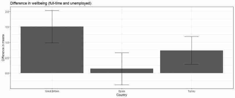
Difference in life satisfaction (wellbeing) between full-time employed and unemployed.
Figure 8.7 Difference in life satisfaction (wellbeing) between full-time employed and unemployed.
Again, this can be repeated for the difference in life satisfaction between full-time employed and retired. Remember to change
y = D1toy = D2, and change the upper and lower limits for the error bars.
- The method we used to compare life satisfaction relied on making comparisons between people with different employment statuses, but a person’s employment status is not entirely random. We cannot therefore make causal statements such as ‘being unemployed causes life satisfaction to decrease’. Describe how we could use the following methods to assess better the effect of being unemployed on life satisfaction, and make some statements about causality:
- a natural experiment
- panel data (data on the same individuals, taken at different points in time).
