Empirical Project 12 Working in R
Download the code
To download the code chunks used in this project, right-click on the download link and select ‘Save Link As…’. You’ll need to save the code download to your working directory, and open it in RStudio.
Don’t forget to also download the data into your working directory by following the steps in this project.
Getting started in R
For this project you will need the following packages:
-
tidyverse, to help with data manipulation -
readxl, to import an Excel spreadsheet -
knitr, to format tables -
ineq, to calculate inequality measures -
rvest, to import tables directly from websites -
zoo, to format times and dates.
If you need to install any of these packages, run the following code:
install.packages(c("tidyverse", "readxl", "knitr",
  "ineq", "rvest", "zoo"))
You can import the libraries now, or when they are used in the R walk-throughs below.
library(tidyverse)
library(readxl)
library(knitr)
library(ineq)
library(rvest)
library(zoo)
Part 12.1 Inequality
Learning objectives for this part
- draw Lorenz curves and calculate Gini coefficients
- assess the effect of a policy on income inequality
- convert nominal values to real values (extension).
One reason cited for Scheme $6,000 was to share the gains from economic growth among everyone in the society. We will be using household income data collected by the Hong Kong government to assess the potential effects of this scheme.
Download the data. The spreadsheet contains information about household incomes for certain percentiles of the population. These incomes are ‘pre-intervention’, meaning that they do not include the effects of handouts or policy interventions from the government. (If you are curious about the difference between the two tables in this spreadsheet, see the extension section ‘Nominal and real values’ at the end of Part 12.1.)
- Using the table ‘Monthly real household income (pre-tax, $HKD)’, plot a separate line chart for each percentile, with year on the horizontal axis and income on the vertical axis. Describe any patterns you see over time.
R walk-through 12.1 Importing a specified range of data from a spreadsheet
We start by importing the data. The data provided in the Excel spreadsheet is not in the usual format of one variable per column (known as ‘long’ format). Instead the first tab contains two separate tables, and we need the second table. We can therefore use the
range =option of theread_excelfunction to specify the cells in the spreadsheet to import (note that variable headers for the years are included).library(tidyverse) library(knitr) library(readxl) # Set your working directory to the correct folder. # Insert your file path for 'YOURFILEPATH'. setwd("YOURFILEPATH") # Import the data, stating the cell range income read_excel("Project-12-datafile.xlsx", range = "A13:I18") # Rename the first column names(income)[1] "percentile"We can use the
ggplotfunction to make a line chart showing the change in real income on the vertical axis (y = real_inc) and year on the horizontal axis (x = Year) for each of the percentile groups (group = percentile) on a single chart as follows.income %>% gather(Year, real_inc, `2009`:`2016`) %>% ggplot(., aes(y = real_inc, x = Year, group = percentile, color = percentile)) + geom_line(size = 1) + theme_bw() + ylab("Monthly real household income (HKD)")However, plotting all percentile groups using the same scale hides a lot of variation within each percentile group. So, we should create a separate chart for each percentile group. As an example, we will plot the chart for the 15th percentile.
First, we use the
gatherfunction to reshape the data into the format that R uses to plot charts. Then we use thefilterfunction to select data for the 15th percentile only and usemutateto convertYearto a numeric variable (otherwise, R will not know the years are numbers and cannot plot the chart). Finally, we usegglotto make the line chart as before.income %>% # Reshape the data gather(Year, real_inc, `2009`:`2016`) %>% # Select only data for 15th percentile filter(percentile == "15th") %>% # Set 'Year' as a numeric variable so we can plot a line mutate(Year = as.numeric(Year)) %>% ggplot(., aes(y = real_inc, x = Year)) + geom_point(size = 2) + geom_line(size = 1) + theme_bw() + ylab( "Monthly real household income for 15th percentile")
Now we will use this data to draw Lorenz curves and compare changes in the income distribution for 2011–2012. One way to do this is to make the following simplifying assumptions:
- There are 100 households in the economy (so we can think of each percentile as corresponding to one household).
- Households between the 15th and 25th percentile have the same income as the household in the 15th percentile, households between the 25th and 50th percentile have the same income as the household in the 25th percentile, and so on. (Households below the 15th percentile earn nothing.)
- Draw Lorenz curves for 2011 and 2012 by carrying out the following:
- Create a new column for 2012 only, showing incomes following the $6,000 handout. Assume that nothing else has changed except for the cash handout. (Remember that this amount was given to all households, including those with no income.)
- Calculate the economy-wide earnings in 2011 and 2012 (with the cash handout included). (Hint: Multiply the income of a given percentile by the number of households assumed to earn that amount.)
- Use your answers to Question 2(b) to complete the table in Figure 12.3 below. (The second row also shows zeros in 2011 because the bottom 15% of households earned nothing.) For help on how to calculate cumulative shares, see R walk-through 5.1.
| Cumulative share of the population (%) | Perfect equality line | Cumulative share of income in 2011 (%) | Cumulative share of income in 2012 (%) |
|---|---|---|---|
| 0 | 0 | 0 | 0 |
| 15 | 15 | 0 | |
| 25 | 25 | ||
| 50 | 50 | ||
| 75 | 75 | ||
| 85 | 85 | ||
| 100 | 100 | 100 | 100 |
Cumulative share of income, for some percentiles of the population.
Figure 12.3 Cumulative share of income, for some percentiles of the population.
- Draw the Lorenz curves for 2011 and 2012 in the same chart, with cumulative share of population on the horizontal axis and cumulative share of income on the vertical axis. Add the perfect equality line to your chart, and add a chart legend.
R walk-through 12.2 Calculating cumulative income shares and plotting a Lorenz curve
Questions 2(a)–(c) can be completed in one stage using the piping technique, although there are a number of steps. The piping operator (
%>%) from thetidyversepackage allows us to perform multiple functions, one after another. (For more information on piping operators, see The University of Manchester’s Econometric Computing Learning Resource.)First, we use the
selectfunction to get the relevant variables. Then, we remove the ‘th’ suffix in thepercentilevalues using theseparatefunction, and convert them to numeric values using themutatefunction (as in R walk-through 12.1). We then userbind(which stands for ‘row bind’) to add an extra row for the 0th percentile, andcbind(‘column bind’) to add a column representing the number of households in each percentile group (assuming 100 households in the economy).Now, we use the
mutatefunction to create new variables containing the information we need to draw the Lorenz curve. We create a new variable called2012_handoutthat adds $6,000 to each value for the year 2012. We calculate the economy-wide income for each percentile group by multiplying the income values with the number of households, storing these in the variables2011_incomeand2012_income. To complete Figure 12.3, we need to calculate the cumulative income for each percentile group. To sort the data from the lowest to highest percentile groups we use thearrangefunction. Next we use thecumsumfunction to calculate the cumulative sum of economy-wide incomes for each year, storing these in the variables2011_sumand2012_sum.Finally we tidy up the data to reflect Figure 12.3 by making sure that the 0th percentile has no share of the income and the 100th percentile has 100% of the cumulative income.
df.new  income %>%
  # Select the required variables
  select(percentile, `2011`, `2012`) %>%
  # Separate words from numbers
  separate(percentile, "percentile", "th") %>%
  # Change character variable to numeric variable
  mutate(percentile = as.numeric(percentile)) %>%
  # Add observation for 0th percentile
  rbind(c(0, 0, 0)) %>%
  # Order percentile values from low to high
  arrange(percentile) %>%
  # Add column for the number of households in each group
  cbind(households = c(15, 10, 25, 25, 10, 15)) %>%
  mutate(`2012_handout` = `2012` + 6000) %>%
  # Economy-wide income
  mutate(`2011_income` = `2011` * households,
    `2012_income` = `2012_handout` * households) %>%
  # Relative share in 2011
  mutate(`2011_cum` =
    cumsum(`2011_income`) / sum(`2011_income`) * 100) %>%
  # Relative share in 2012
  mutate(`2012_cum` =
    cumsum(`2012_income`) / sum(`2012_income`) * 100) %>%
  # Drop interim variables
  select(percentile, households,
    `2011_cum`, `2012_cum`) %>%
  # Tidy up the table to normalize 0 and 100 percentiles
  mutate(percentile = percentile + households) %>%
  select(-households) %>%
  rbind(c(0, 0, 0), .)

kable(df.new, format = "markdown", digits = 2)
| percentile| 2011_sum| 2012_sum| |----------:|--------:|--------:| | 0| 0.00| 0.00| | 15| 0.00| 3.91| | 25| 2.74| 8.44| | 50| 15.09| 24.53| | 75| 41.42| 50.37| | 85| 60.50| 67.09| | 100| 100.00| 100.00|Using the data from Questions 2(a)–(c) we can plot the Lorenz curve using the
ggplotfunction. Note that we use thepercentilevariable to draw the line of perfect equality.df.new %>% # Create variable for perfect equality mutate(equality = percentile) %>% # Reshape into long format for plotting gather(year, cum_income, `2011_cum`:equality) %>% ggplot(., aes(y = cum_income, x = percentile, group = year, color = year)) + geom_line(size = 1) + geom_point(size = 2) + theme_bw() + ylab("Cumulative share of income (%)") + xlab("Cumulative share of population (%)")
Now we will compare the Gini coefficients in 2011, 2012, and 2013 (a year after the policy came into effect).
- Calculate the Gini coefficient by carrying out the following:
- Create a table as in Figure 12.5, and fill in the remaining values (some values for 2011 have been filled in for you). The first column should contain the numbers 1 to 100, in intervals of 1, and the remaining columns should contain the incomes earned by a household at that percentile (using the same assumption as in Question 2). Remember that the 2012 data should include the cash handout. To obtain more accurate answers, use two decimal places instead of rounding incomes to the nearest dollar.
| Percentile | 2011 | 2012 | 2013 |
|---|---|---|---|
| 1 | 0.00 | ||
| 2 | 0.00 | ||
| 3 | 0.00 | ||
| … | |||
| 98 | 44,516.67 | ||
| 99 | 44,516.67 | ||
| 100 | 44,516.67 |
Incomes earned by each percentile of the population.
Figure 12.5 Incomes earned by each percentile of the population.
- Using the
ineqfunction, calculate the Gini coefficient for each year.
- Based on the Gini coefficients from Question 3(b), what effect did the $6,000 handout appear to have on income inequality in the short run, and in the long run? Suggest some explanations for what you observe.
R walk-through 12.3 Generating Gini coefficients
Create table containing percentiles
To create the percentiles for every percentile in our 100 household economy we need to take the income for each percentile group and expand that for every household in the respective percentile group. For example, there are 15 households in the bottom percentile group having zero income for 2011 and 2013, and $6,000 in 2012. For the 15th percentile group there are 15 households that will share the same income value, and so on for the other percentile groups.
To achieve this expansion, we first create a new variable (
households) that contains the number of households in each percentile group. Then for each group we can use thesliceandrepfunctions together to copy the values for2011,2012, and2013within each percentile group. Therepfunction takes a sequence of 1 to 6 (in other words the number of groups) and copies each number in the sequence by the corresponding value in thehouseholdsvariable. The result is a variable containing 15 1s, 10 2s, 25 3s, and so on. Thesplicefunction then uses this index to reference each observation in the data, for example where the index value is 1 the bottom percentile group is selected, where the index value is 2 the 15th percentile group is selected, and so on.Once the expansion is complete we order the data by row and generate a new sequence from 1 to 100 to represent the percentile. The final result is the dataframe called
df.new.df.new income %>% select(`2011`, `2012`, `2013`) %>% rbind(c(0, 0, 0)) %>% # Apply the $6,000 handout to 2012 mutate(`2012` = `2012` + 6000) %>% # Arrange by ascending incomes in 2011 arrange(`2011`) %>% # Specify number of households in each group mutate(households = c(15, 10, 25, 25, 10, 15)) %>% group_by(households) %>% # Repeat values within each percentile group slice(rep(1:n(), each = households)) %>% rowwise() %>% arrange(`2011`) %>% # Create a sequence from 1 to 100 for percentiles mutate(percentile = seq(1:n())) %>% select(percentile, `2011`, `2012`, `2013`) # Check the first and last five percentiles to compare # with Figure 12.5. head(df.new, 5)## # A tibble: 5 x 4 ## percentile `2011` `2012` `2013` #### 1 1 0 6000 0 ## 2 2 0 6000 0 ## 3 3 0 6000 0 ## 4 4 0 6000 0 ## 5 5 0 6000 0 tail(df.new, 5)## # A tibble: 5 x 4 ## percentile `2011` `2012` `2013` #### 1 96 44516. 50544. 45270. ## 2 97 44516. 50544. 45270. ## 3 98 44516. 50544. 45270. ## 4 99 44516. 50544. 45270. ## 5 100 44516. 50544. 45270. Calculate Gini coefficients
Using the
ineqfunction from theineqpackage, it is straightforward to obtain the Gini coefficient for each year.library(ineq) ineq(df.new$`2011`)## [1] 0.4687603ineq(df.new$`2012`)## [1] 0.3440174ineq(df.new$`2013`)## [1] 0.4698187
- In our analysis we assumed that the $6,000 handout was the only policy that affected households in 2012. In reality a household’s disposable income will also depend on taxes and transfers. Without doing additional calculations, explain what would happen to the shape of the Lorenz curve and inequality in 2012 if:
- households in and below the 15th percentile received cash transfers from the government
- households in and above the 75th percentile had to pay income tax.
Extension Nominal and real values
In this extension section, we will discuss how the table ‘Monthly nominal household income (pre-tax, $HKD)’ taken from the Hong Kong Poverty Situation Report 2016 was used to create the table ‘Monthly real household income (pre-tax, $HKD)’, and why we needed to make this conversion.
- inflation
- An increase in the general price level in the economy. Usually measured over a year. See also: deflation, disinflation.
The difference between real and nominal income is that real income takes inflation into account. You may be familiar with the concept of inflation, which is an increase in the general price level in the economy. Usually inflation is measured by taking a fixed bundle of goods and services and looking at how much it would cost to buy that bundle, compared to a reference year. (For more details about real vs nominal variables, see the Einstein ‘Comparing income at different times, and across different countries’ in Section 1.2 of The Economy.) If the bundle has become more expensive, then we conclude that the price level in the economy has increased.
In this case, the values from 2010 onwards have been adjusted to account for the fact that prices have increased since 2009, so the same income would be able to purchase fewer goods and services. Without making this adjustment, we would conclude that households in the 15th percentile had the same purchasing power in 2009 and 2010, when in fact they do not as they can buy fewer goods in 2010 because of the overall price increase.
- Convert nominal values to real values, using 2009 as the reference year:
- To understand what happens to a given nominal value over time due to inflation, create a table as in Figure 12.6 below, and fill it in according to the percentage increases shown. (These percentages were taken from the Monthly Digest of Statistics.) (For example, $1 in 2009 would be $1 × (1 + (2.40/100)) = $1.024 in 2010.) For greater accuracy, round your answers to three decimal places. With a starting value of $1 in 2009, what would the value be in 2016?
Year Percentage increase (from previous year) Inflation index 2009 1.000 2010 2.40 1.024 2011 5.30 2012 4.10 2013 4.30 2014 4.40 2015 3.00 2016 2.40 Creating an index-based series from percentage increases.
Figure 12.6 Creating an index-based series from percentage increases.
- Use this table to convert nominal incomes to real incomes by dividing the nominal income by the corresponding value in the third column (for example, divide nominal incomes in 2010 by 1.024 to get the value in 2009 terms). You should get the same values as in the ‘real household income’ table.
Extension R walk-through 12.4 Converting nominal incomes to real incomes
To obtain the real income values, we need to divide the income for each percentile group by the inflation index created in Question 5(a). Recall that we have only imported the real income data from the Excel spreadsheet and not the nominal income data, so we will first import the nominal income data (
nom_income). Note that in the code below, the inflation index is entered as a vector (list of numbers) calledinflation(with the same number of elements as the number of years in the data) and this is multiplied (element-wise) by each row of the income data using thesweepfunction.The result is the dataframe called
real_income. We use thekablefunction to make a neat table showing the values of this dataframe.# Import the nominal income data nom_income read_excel("Project 12 datafile.xlsx", range = "A3:I8") inflation c(1, 1.024, 1.078, 1.122, 1.171, 1.222, 1.259, 1.289) # Only multiply columns with income data by the inflation # index real_income sweep(nom_income[, -1], MARGIN = 2, inflation, "/") %>% # Reattach the percentile column cbind(percentile = c(85, 75, 50, 25, 15), .) kable(real_income, format = "markdown", digits = 2)| percentile| 2009| 2010| 2011| 2012| 2013| 2014| 2015| 2016| |----------:|-----:|-------:|--------:|--------:|--------:|--------:|--------:|--------:| | 85| 43300| 43945.31| 44515.67| 44563.28| 45260.46| 45171.85| 47656.87| 47090.77| | 75| 31000| 31250.00| 32273.86| 32531.19| 34158.84| 33306.06| 34789.52| 34910.78| | 50| 17400| 17578.12| 17806.27| 17825.31| 18616.57| 18494.27| 19062.75| 19394.88| | 25| 8000| 8203.12| 8346.69| 8823.53| 8539.71| 8592.47| 8737.09| 8533.75| | 15| 4500| 4394.53| 4637.05| 4456.33| 4355.25| 4091.65| 3971.41| 3878.98|
Part 12.2 Government popularity
Learning objectives for this part
- assess the effect of a policy on government popularity.
One possible reason why the government implemented Scheme $6,000 was to gain public approval, since there was some pressure on the government to spend the surplus on alleviating current social issues rather than reinvesting it (for example, in pension schemes). We will use a public opinion poll conducted by the University of Hong Kong to assess whether this scheme could have improved public satisfaction with the government.
- Think about the groups who would be affected by this scheme (for example, the government or members of the public). Who would be likely to support or oppose this scheme, and why?
Download the data:
- Go to the overall performance results page on the HKU POP website, which contains half-yearly survey data on the overall performance of the government.
- Under the subheading ‘Collapsed data’, import the data contained in this table using R. (The data is not available in Excel format, so you will have to import the data manually.)
R walk-through 12.5 Importing data directly from a website
It is quite common to use data from publicly-available websites that is presented in a table, but is not available in a spreadsheet to download. Although we could copy and paste this data into a spreadsheet and then import that into R, we could instead use the
rvestpackage to read the data in such a table directly into a dataframe. The R-bloggers site provides details on how to do this in a guide to usingrvest. We will store this table in a dataframe calledoverall.library(rvest) # When copying this code to R you need to ensure that the # url is presented in one line. url "https://www.hkupop.hku.hk/english/popexpress/sargperf/sarg/halfyr/datatables.html" overall url %>% html() %>% html_nodes(xpath = '//*[@id="popexpress"]/table[2]') %>% html_table(header = TRUE) overall overall[[1]]Note that if the technicalities of the procedure described above are too complicated, you can still proceed by manually copying and pasting the data into a spreadsheet and then importing it into R.
- R will recognize the data you have imported as text, but to make charts, the data needs to be in number format (the % signs need to be removed). Follow the steps in R walk-through 12.6 below to reformat all columns.
- Read the HKU POP survey methods page for a description of how the survey data was collected. Explain whether you think the sample is representative of the target population, and discuss some limitations of the survey method.
R walk-through 12.6 Cleaning imported data
The names of each column from the imported data are long and contain a mixture of alphabet sets; we can rename the variables using the
namesproperty of a dataframe.Then we use the
gsubfunction to find and replace all instances of the ‘%’ sign in the data with an empty string (""), and useas.numericto convert all variables (except the date variable) to be numeric variables (currently R thinks these are text instead of numbers because they had a ‘%’ sign when imported).names(overall) c("Date", "Total Sample", "Sub-sample", "Positive", "Half-half", "Negative", "DKHS", "Total", "Net Value") overall overall %>% mutate_all(funs(gsub("%", "", .))) %>% mutate_at(vars(-Date), funs(as.numeric)) str(overall)## 'data.frame': 43 obs. of 9 variables: ## $ Date : chr "7-12/2018" "1-6/2018" "7-12/2017" "1-6/2017" ... ## $ Total Sample: num 3025 12092 12201 12181 12074 ... ## $ Sub-sample : num 1761 7225 8750 7380 7167 ... ## $ Positive : num 36 35.7 39.6 28.5 24.3 25.1 24.2 27.1 27 27.6 ... ## $ Half-half : num 22.1 21.1 22.2 21.3 24.7 22.5 27.3 25.7 24.6 27.2 ... ## $ Negative : num 40.7 42.2 35.7 49.1 49.3 51.2 47.4 45.9 47.1 43.7 ... ## $ DKHS : num 1.1 1 2.5 1.1 1.7 1.2 1 1.2 1.3 1.5 ... ## $ Total : num 100 100 100 100 100 100 100 100 100 100 ... ## $ Net Value : num -4.7 -6.6 3.9 -20.7 -25 -26.1 -23.2 -18.8 -20 -16.1 ...
- Assess public satisfaction with the government by carrying out the following:
- Make a line chart with overall public satisfaction (net value, which is the difference between percentage of positive and negative responses) on the vertical axis, and time (Jan–June 2006 to the latest period available) on the horizontal axis. Comment on any trends in overall public satisfaction over this time period.
- Go to the POP polls main data page and choose one or two other indicators that are directly related to the policy (for example, improving people’s
Degree of prosperityorDegree of equality). Find a table of the data by clicking ‘Content’, then ‘Table’ (if half-yearly data is not available, choose the most similar time interval). Import the data into R, and reformat the variable of interest as in Question 2.
- For each of your chosen indicators, make a separate line chart as in Question 3(a) and comment on any similarities to or differences from the chart in Question 3(a). (Since some indicators may be measured on a different scale, focus on changes over time.)
- Do you think the scheme had the intended effect on government popularity? Besides the scheme, what other factors or events could explain the observed patterns?
R walk-through 12.7 Cleaning data and setting dates
For Question 3(a), before we can plot the imported data in R, we need to format the data variable so that R understands the chronological order of the data. The imported data has the
Datevariable, which is a text string using ‘1-6’ to represent January to June and ‘7-12’ for July to December. This format is not useful for ordering the data because R cannot determine the sequential order of numbers that are stored as text.There are a number of ways that R can deal with times and dates. In this example we are going to use the
yearmonfunction from thezoolibrary as this focuses on using monthly data. Although we don’t have monthly data, we can use thegsubfunction to replace the ‘1-6’ text string with ‘jan-’ and ‘7-12’ with ‘july-’, in other words we are going to use January and July to represent the first and second half of each year respectively.Once we have the months in a format that R can understand, we use the
as.yearmonfunction to set theDatevariable to the date format (using the%b-%Yoption; further details on date formats in R can be found in the Dates and Times in R page).We can use the
scale_x_yearmonfunction when plotting the line chart to ensure that the dates on the horizontal axis are labelled correctly.library(zoo) overall %>% mutate_at(vars(Date), funs( gsub("1-6/", "jan-", .))) %>% mutate_at(vars(Date), funs( gsub("7-12/", "july-", .))) %>% mutate(Date = as.yearmon(Date, "%b-%Y")) %>% subset(Date >= "Jan 2006") %>% ggplot(., aes(x = Date, y = `Net Value`)) + geom_line(size = 1) + theme_bw() + scale_x_yearmon(format = "%b-%Y") + ylab("Net satisfaction")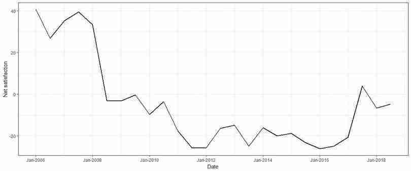
Net public satisfaction with the government’s performance over time.
Figure 12.7 Net public satisfaction with the government’s performance over time.
For Question 3(b), in this example we use the variable
Improving People's Livelihood. Repeating the import and cleaning processes from R walk-through 12.5, we can directly read in the relevant data.# When copying this code to R you need to ensure that the # url is presented in one line. url "https://www.hkupop.hku.hk/english/popexpress/sargperf/live/halfyr/datatables.html" improvement url %>% html() %>% html_nodes(xpath = '//*[@id="popexpress"]/table[2]') %>% html_table(header = TRUE) improvement improvement [[1]] names(improvement) c("Date", "Total Sample", "Sub-sample", "Positive", "Half-half", "Negative", "DKHS", "Total", "Net Value") improvement improvement %>% mutate_all(funs(gsub("%", "", .)))%>% mutate_at(vars(-Date), funs(as.numeric))For Question 3(c), repeat the steps taken for 3(a).
improvement %>%
  mutate_at(vars(Date), funs(
    gsub("1-6/", "jan-", .))) %>%
  mutate_at(vars(Date), funs(
    gsub("7-12/", "july-", .))) %>%
  mutate(Date = as.yearmon(Date, "%b-%Y")) %>%
  subset(Date >= "Jan 2006" ) %>%
  ggplot(., aes(x = Date, y = `Net Value`)) +
    geom_line(size = 1) + theme_bw() +
    scale_x_yearmon(format = "%b-%Y") +
    ylab("Net satisfaction")
- In 2018, the government decided to do another cash handout. Read the article ‘Hong Kong cash handout scheme will cost government HK$330 million to administer’ and discuss how this scheme differs from the 2011 scheme. Explain whether you think this policy is an improvement over the 2011 scheme.
- Suppose you are a policymaker in a developed country with a large budget surplus, and one of the government’s aims is to reduce income inequality. Would you recommend that the government implement a scheme similar to either the 2011 or 2018 scheme? If you recommend a cash handout, suggest some modifications that could make the scheme more effective. If not, suggest other policies that may be more effective in reducing inequality. You may find it helpful to research policies aimed at reducing income inequality, for example Universal Basic Income, which some countries have tried.)
