Empirical Project 5 Working in Google Sheets
Part 5.1 Measuring income inequality
Learning objectives for this part
- draw Lorenz curves
- calculate and interpret the Gini coefficient
- interpret alternative measures of income inequality.
One way to visualize the income distribution in a population is to draw a Lorenz curve. This curve shows the entire population along the horizontal axis from the poorest to the richest. The height of the curve at any point on the vertical axis indicates the fraction of total income received by the fraction of the population, shown on the horizontal axis.
We will start by using income decile data from the Global Consumption and Income Project to draw Lorenz curves and compare changes in the income distribution of a country over time. Note that income here refers to market income, which does not take into account taxes or government transfers (see Section 5.10 of Economy, Society, and Public Policy for further details).
To answer the question below:
- Go to the Globalinc website and download the Excel file containing the data by clicking ‘xlsx’.
- Save it in an easily accessible location, such as a folder on your Desktop or in your personal folder.
- Choose two countries that you would like to compare and filter the data so only the values for 1980 and 2014 are visible. You will be using this data as the basis for your Lorenz curves. Copy and paste the filtered data (all columns) into a new tab in your spreadsheet.
To draw Lorenz curves, we need to calculate the cumulative share of total income owned by each decile (these will be the vertical axis values). The cumulative income share of a particular decile is the proportion of total income held by that decile and all the deciles below it. For example, if Decile 1 has 1/10 of total income and Decile 2 has 2/10 of total income, the cumulative income share of Decile 2 is 3/10 (or 0.3).
- In this new tab, make one table (as shown in Figure 5.1) for each country and year (four tables total). Use the country data you have selected to fill in each table. (Remember that each decile represents 10% of the population.)
| Cumulative share of the population (%) | Cumulative share of income (%) |
|---|---|
| 0 | 0 |
| 10 | |
| 20 | |
| 30 | |
| 40 | |
| 50 | |
| 60 | |
| 70 | |
| 80 | |
| 90 | |
| 100 |
Cumulative share of income owned, for each decile of the population.
Figure 5.1 Cumulative share of income owned, for each decile of the population.
Google Sheets walk-through 5.1 Creating a table showing cumulative shares
The data
We will be using data from Afghanistan and Albania for this example. The data has been copied and pasted into a new tab on the spreadsheet. We will make a cumulative table for Afghanistan in 1980. (The other three tables are made in the same way.)
Figure 5.2a We will be using data from Afghanistan and Albania for this example. The data has been copied and pasted into a new tab on the spreadsheet. We will make a cumulative table for Afghanistan in 1980. (The other three tables are made in the same way.)
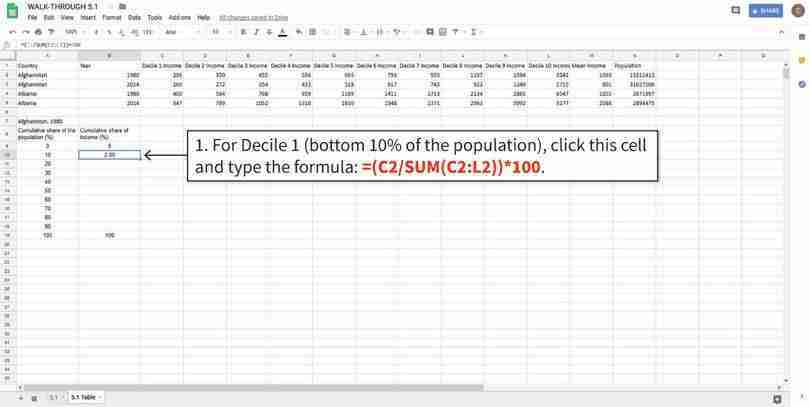
Calculate the cumulative share of income using the SUM function
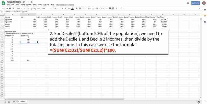
To calculate the cumulative share of income, we need to add up all the incomes corresponding to that decile and all smaller deciles, and then divide by the sum of all incomes. The SUM function adds up all cells in the selection. This value tells us that the bottom 10% of the people own 2% of the total income in the population.
Figure 5.2b To calculate the cumulative share of income, we need to add up all the incomes corresponding to that decile and all smaller deciles, and then divide by the sum of all incomes. The SUM function adds up all cells in the selection. This value tells us that the bottom 10% of the people own 2% of the total income in the population.
Calculate the cumulative share of income using the SUM function
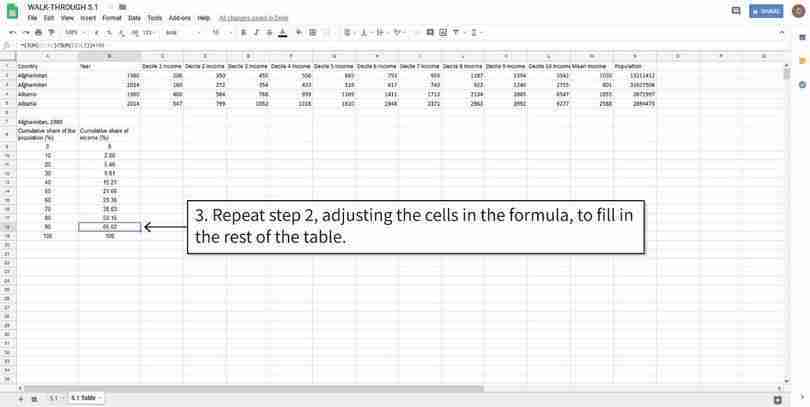
Decile 2 and the remaining deciles are calculated slightly differently from Decile 1, because we have to also include the incomes of lower deciles in the calculation.
Figure 5.2c Decile 2 and the remaining deciles are calculated slightly differently from Decile 1, because we have to also include the incomes of lower deciles in the calculation.
Calculate the cumulative share of income using the SUM function
You can use this table to plot a Lorenz curve with the first column as the horizontal axis values, and the second column as the vertical axis values.
Figure 5.2d You can use this table to plot a Lorenz curve with the first column as the horizontal axis values, and the second column as the vertical axis values.
- Use the tables you have made to draw Lorenz curves for each country in order to visually compare the income distributions over time.
- Draw a line chart with cumulative share of population on the horizontal axis and cumulative share of income on the vertical axis. Plot one chart per country (each chart should have two lines, one for 1980 and one for 2014). Make sure to include a chart legend, and label your axes and chart appropriately.
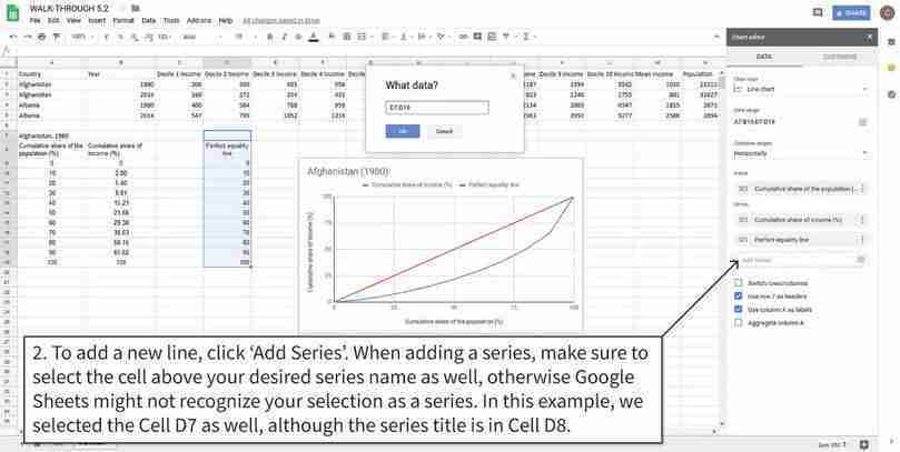
- Follow the steps in Google Sheets walk-through 5.2 to add a straight line representing perfect equality to each chart. (Hint: If income was shared equally across the population, the bottom 10% of people would have 10% of the total income, the bottom 20% would have 20% of the total income, and so on.)
Google Sheets walk-through 5.2 Drawing the perfect equality line
The data
We will use the Lorenz curve for Afghanistan in 1980 as an example. The values we need to plot the perfect equality line are given in Cells C9 to C19 (labelled ‘perfect equality line’). You will notice that these values are the same as those in Cells A9 to A19, because the perfect equality line is where the horizontal and vertical axis values are equal to each other.
Figure 5.3a We will use the Lorenz curve for Afghanistan in 1980 as an example. The values we need to plot the perfect equality line are given in Cells C9 to C19 (labelled ‘perfect equality line’). You will notice that these values are the same as those in Cells A9 to A19, because the perfect equality line is where the horizontal and vertical axis values are equal to each other.
Add the required cells to the line chart
For the perfect equality line to show up on the chart, we need to add it as a separate data series.
Figure 5.3b For the perfect equality line to show up on the chart, we need to add it as a separate data series.
- Using your Lorenz curves:
- Compare the distribution of income across time for each country.
- Compare the distribution of income across countries for each year (1980 and 2014).
- Suggest some explanations for any similarities and differences you observe. (You may want to research your chosen countries to see if there were any changes in government policy, political events, or other factors that may affect the income distribution.)
A rough way to compare income distributions is to use a summary measure such as the Gini coefficient. The Gini coefficient ranges from 0 (complete equality) to 1 (complete inequality). It is calculated by dividing the area between the Lorenz curve and the perfect equality line, by the total area underneath the perfect equality line. Intuitively, the further away the Lorenz curve is from the perfect equality line, the more unequal the income distribution is, and the higher the Gini coefficient will be.
- Using a Gini coefficient calculator, calculate the Gini coefficient for each of your Lorenz curves. You should have four coefficients in total. Label each Lorenz curve with its corresponding Gini coefficient, and check that the coefficients are consistent with what you see in your charts. (Hint: In the Gini calculator, paste the list of incomes by decile into the box provided, and then add commas between the income values.)
Now we will look at other measures of income inequality to see how they can be used with the Gini coefficient to summarize a country’s income distribution. Instead of summarizing the entire income distribution like the Gini coefficient does, we can take the ratio of incomes at two points in the distribution. For example, the 90/10 ratio takes the ratio of the top 10% of incomes (Decile 10) to the lowest 10% of incomes (Decile 1). A 90/10 ratio of five means that the richest 10% of the population earn five times more than the poorest 10%. The higher the ratio, the higher the inequality between these two points in the distribution.
-
Look at the following ratios:
- 90/10 ratio = the ratio of Decile 10 income to Decile 1 income
- 90/50 ratio = the ratio of Decile 10 income to Decile 5 income (the median)
- 50/10 ratio = the ratio of Decile 5 income (the median) to Decile 1 income.
- For each of these ratios, explain why policymakers might want to compare the two deciles in the income distribution.
- What kinds of policies or events could affect these ratios?
We will now compare these summary measures (ratios and the Gini coefficient) for a larger group of countries, using OECD data. The OECD has annual data for different ratio measures of income inequality for 42 countries around the world, and has an interactive chart function that plots them for you.
Go to the OECD website to access the data. You will see a chart similar to Figure 5.4, showing data for 2015. The countries are ranked from smallest to largest Gini coefficient on the horizontal axis, and the vertical axis gives the Gini coefficient.
- Compare summary measures of inequality for all available countries on the OECD website:
- Plot the data for the ratio measures by changing the variable selected in the drop-down menu ‘Gini coefficient’. The three ratio measures we looked at previously are called ‘Interdecile P90/P10’, ‘Interdecile P90/P50’, and ‘Interdecile P50/P10’, respectively. (If you click the ‘Compare variables’ option, you can plot more than one variable (except the Gini coefficient) on the same chart.)
- For each measure, give an intuitive explanation of how it is measured and what it tells us about income inequality. (For example: What do the larger and smaller values of this measure mean? Which parts of the income distribution does this measure use?)
- Do countries that rank highly on the Gini coefficient also rank highly on the ratio measures, or do the rankings change depending on the measure used? Based on your answers, explain why it is important to look at more than one summary measure of a distribution.
The Gini coefficient and the ratios we have used are common measures of inequality, but there are other ways to measure income inequality.
- Go to the Chartbook of Economic Inequality, which contains five measures of income inequality, including the Gini coefficient, for 25 countries around the world.
- Choose two measures of income inequality that you find interesting (excluding the Gini coefficient). For each measure, give an intuitive explanation of how it is measured and what we can learn about income inequality from it. You may find the page on ‘Inequality measures’ helpful. (For example: What do larger or smaller values of this measure mean? Which parts of the income distribution does this measure use?)
- On the Chartbook of Economic Inequality main page, charts of these measures are available for all countries shown in green on the map. For two countries of your choice, look at the charts and explain what these measures tell us about inequality in those countries.
Part 5.2 Measuring other kinds of inequality
Learning objectives for this part
- research other dimensions of inequality and how they are measured.
There are many ways to measure income inequality, but income inequality is only one dimension of inequality within a country. To get a more complete picture of inequality within a country, we need to look at other areas in which there may be inequality in outcomes. We will explore two particular areas, focusing on the measures used and their limitations:
- health inequality
- gender inequality in education.
First, we will look at how researchers have measured inequality in health-related outcomes. Besides income, health is an important aspect of wellbeing, partly because it determines how long an individual will be alive to enjoy his or her income. If two people had the same annual income throughout their lives, but the one person had a much shorter life than the other, we might say that the distribution of wellbeing is unequal, despite annual incomes being equal.
As with income, inequality in life expectancy can be measured using a Gini coefficient. In the study ‘Mortality inequality’, researcher Sam Peltzman (2009) estimated Gini coefficients for life expectancy based on the distribution of total years lived (life-years) across people born in a given year (birth cohort). If everybody born in a given year lived the same number of years, then the total years lived would be divided equally among these people (perfect equality). If a few people lived very long lives but everybody else lived very short lives, then there would be a high degree of inequality (Gini coefficient close to 1).
We will now look at mortality inequality Gini coefficients for ten countries around the world. First, download the data:
- Go to the ‘Health Inequality’ section of the Our World in Data website. Under the heading ‘Mortality Inequality’, click the ‘Data’ button at the bottom of the chart shown.
- Click the blue button that appears to download the data in csv format.
- Using the mortality inequality data:
- Plot all the countries on the same line chart, with Gini coefficient on the vertical axis and year (1952–2002) on the horizontal axis. Make sure to include a legend showing country names and label the axes appropriately.
- Describe any general patterns in mortality inequality over time, as well as any similarities and differences between countries.
- Now compare the Gini coefficients in the first year of your line chart (1952) with the last year (2002).
- For the year 1952, sort the countries according to their mortality inequality Gini coefficient from smallest to largest. Plot a column chart showing these Gini coefficients on the vertical axis, and country on the horizontal axis. Add data labels to display the Gini coefficient for each country.
- Repeat Question 2(a) for the year 2002.
- Comparing your charts for 1952 and 2002, have the rankings between countries changed? Suggest some explanations for any observed changes. (You may want to do some additional research, for example, look at the healthcare systems of these countries.)
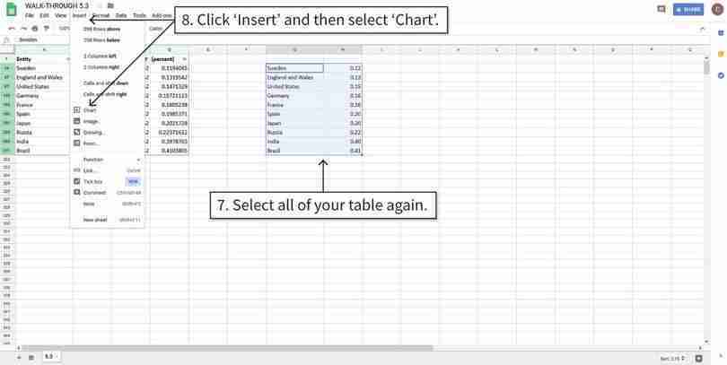
Google Sheets walk-through 5.3 Drawing a column chart with sorted values
Sort the data from smallest to largest Gini coefficient
We will use the Gini coefficients for 1952 as an example. The data has been filtered to show values for the year 1952 only.
Figure 5.5a We will use the Gini coefficients for 1952 as an example. The data has been filtered to show values for the year 1952 only.
Round the Gini coefficients to two decimal places
We will label the chart columns with the corresponding Gini coefficients, so we will first round the data to two decimal places to avoid making the chart look too crowded.
Figure 5.5e We will label the chart columns with the corresponding Gini coefficients, so we will first round the data to two decimal places to avoid making the chart look too crowded.
Draw a column chart
Now we will make a column chart with the sorted and rounded Gini coefficients.
Figure 5.5f Now we will make a column chart with the sorted and rounded Gini coefficients.
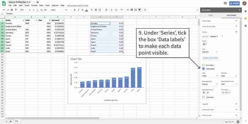
Add data labels to the columns
Data labels will make the vertical values easier to see, especially for values that are very close to each other. After step 9, the Gini coefficients will appear in boxes above the columns.
Figure 5.5g Data labels will make the vertical values easier to see, especially for values that are very close to each other. After step 9, the Gini coefficients will appear in boxes above the columns.
Note: Questions 3 and 4 can be done independently of each other.
Other measures of health inequality, such as those used by the World Health Organization (WHO), are based on access to healthcare, affordability of healthcare, and quality of living conditions. Choose one of the following measures of health inequality to answer Question 3:
- access to essential medicines
- basic hospital access
- composite coverage index.
The composite coverage index is a weighted score of coverage for eight different types of healthcare.
To download the data for your chosen measure:
- If you choose to look at either the access to essential medicines or the basic hospital access measure, go to the WHO’s Universal Health Coverage Data Portal, click on the tab ‘Explore UHC Indicators’, and select your chosen measure.
- A drop-down menu with three buttons will appear: ‘Map’ (or ‘Graph’) shows a visual description of the data, ‘Data’ contains the data files, and ‘Metadata’ contains information about your chosen measure.
- Click on the ‘Data’ button, then select ‘CSV table’ from the ‘Download complete data set as’ list.
- If you choose to look at the composite coverage index measure, go to WHO’s Global Health Observatory data repository. The index is given for subgroups of the population, by economic status, education, and place of residence. Choose one of these categories, and download the data by clicking ‘CSV table’ from the ‘Download complete data set as’ list. You can read further information about this index in the WHO’s technical notes.
- For your chosen measure:
- Explain how it is constructed and what outcomes it assesses.
- Create an appropriate chart to summarize the data for all available countries. (You can replicate a chart shown on the website or draw a similar chart.)
- Explain what your chart shows about health inequality within and between countries, and discuss the limitations of using this measure (for example, measurement issues or other aspects of inequality that this measure ignores).
Since an individual’s income and available options in later life partly depend on their level of education, inequality in educational access or attainment can lead to inequality in income and other outcomes. Gender inequality can be measured by the share of women at different levels of attainment. We will focus on the aspect of gender inequality in educational attainment, using data from the Our World in Data website, to make our own comparisons between countries and over time. Choose one of the following measures to answer Question 4:
- gender gap in primary education (share of enrolled female primary education students)
- share of women, between 15 and 19 years old, with no education
- share of women, 15 years and older, with no education.
To download the data for your chosen measure:
- Go to the ‘Educational Mobility and Inequality’ section of the Our World in Data website, and find the chart for your chosen measure.
- Click the ‘Data’ button at the bottom of the chart, then click the blue button that appears to download the data in csv format.
- For your chosen measure:
- Choose ten countries that have data from 1980 to 2010. Plot your chosen countries on the same line chart, with year on the horizontal axis and share on the vertical axis. Make sure to include a legend showing country names and label the axes appropriately.
- Describe any general patterns in gender inequality in education over time, as well as any similarities and differences between countries.
- Calculate the change in the value of this measure between 1980 and 2010 for each country chosen. Sort these countries according to this value, from the smallest change to largest change. Now plot a column chart showing the change (1980 to 2010) on the vertical axis, and country on the horizontal axis. Add data labels to display the value for each country.
- Which country had the largest change? Which country had the smallest change?
- Suggest some explanations for your observations in Questions 4(b) and (d). (You may want to do some background research on your chosen countries.)
- Discuss the limitations of using this measure to assess the degree of gender inequality in educational attainment and propose some alternative measures.
