Empirical Project 1 Solutions
These are not model answers. They are provided to help students, including those doing the project outside a formal class, to check their progress while working through the questions using the Excel, R, or Google Sheets walk-throughs. There are also brief notes for the more interpretive questions. Students taking courses using Doing Economics should follow the guidance of their instructors.
Note
These solutions are based on data downloaded in January 2018. Your solutions may differ slightly if using more updated data.
Part 1.1 The behaviour of average surface temperature over time
- According to the source mentioned in the question:
‘Temperature anomalies indicate how much warmer or colder it is than normal for a particular place and time. For the GISS analysis, normal always means the average over the 30-year period 1951–1980 for that place and time of year. This base period is specific to GISS, not universal. But note that trends do not depend on the choice of the base period: If the absolute temperature at a specific location is two degrees higher than a year ago, so is the corresponding temperature anomaly, no matter what base period is selected, since the normal temperature used as base point is the same for both years.
Note that regional mean anomalies (in particular global anomalies) are not computed from the current absolute mean and the 1951–1980 mean for that region, but from station temperature anomalies. Finding absolute regional means encounters significant difficulties that create large uncertainties. This is why the GISS analysis deals with anomalies rather than absolute temperatures. For a more detailed discussion of that topic, see The elusive absolute surface air temperature.’
There are many valid ways to summarize this in your own words, for example:
Temperature anomaly measures, at any given place and time, the difference between observed temperature and the reference long-term average, or ‘normal’ temperature value. The long-term average is typically computed by averaging 30 or more years of data. The GISS analysis, for example, uses the average temperature from the period 1951–1980. A positive anomaly indicates that the observed temperature is warmer than the baseline long-term average temperature.
The use of anomalies, compared to other measures such as absolute temperature, allows for a more accurate representation of temperatures over larger areas. It provides a frame of reference that allows for more meaningful comparisons between locations.
The compilation of other indicators, such as absolute average temperatures, are difficult and controversial. The absolute average temperature data is more susceptible to uncertainties and inaccuracies. Temperature stations are unevenly distributed, in regions with very few stations, interpolation must be made over large areas. The temperature at a mountain top is lower than at the bottom. If a mountainous area is in general cooler than the baseline in a given month, the anomaly will show that temperatures for both locations (the top and bottom areas of a mountain) are below the reference value. If we use absolute temperature, however, the disparity between the measures at a mountain top and bottom would be quite large. Using anomalies also diminishes problems when stations are added, removed or missing.
- Solution figure 1.1 shows an example chart for January.
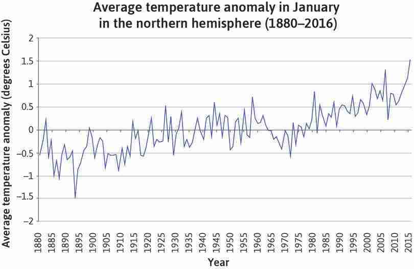
An example of a line chart with average temperature anomaly for January on the vertical axis and time (1880–2016) on the horizontal axis.
Solution figure 1.1 An example of a line chart with average temperature anomaly for January on the vertical axis and time (1880–2016) on the horizontal axis.
- Line charts for each season, using average temperature anomaly for that season on the vertical axis and time (1880–2016) on the horizontal axis, are shown in Solution figures 1.2–1.5.
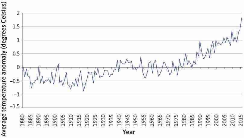
A line chart showing average temperature anomaly for spring.
Solution figure 1.2 A line chart showing average temperature anomaly for spring.
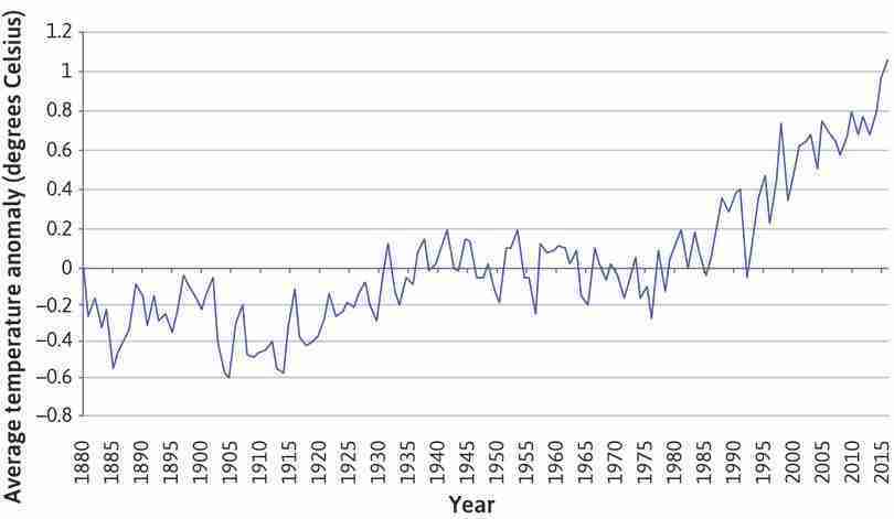
A line chart showing average temperature anomaly for summer.
Solution figure 1.3 A line chart showing average temperature anomaly for summer.
- An example of a line chart showing the annual average temperature anomaly is shown in Solution figure 1.6.
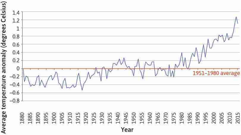
A line chart with annual average temperature anomaly on the vertical axis and time (1880–2016) on the horizontal axis.
Solution figure 1.6 A line chart with annual average temperature anomaly on the vertical axis and time (1880–2016) on the horizontal axis.
- Solution figures 1.1 and 1.6 show that temperature has been increasing over time. The average temperature anomaly initially fluctuated around a relatively low mean between 1880 and 1920, and then fluctuated around a higher mean value between 1920 and 1975. From about 1975, temperature anomalies were positive and displayed an increasing trend, indicating that absolute temperatures are also increasing. The overall positive relationship between temperature and time shown by the charts provides evidence to support the presence of global warming.
- We are concerned about global temperature changes over time, so it is vital to look at the behaviour of the same variable over time. While averages of temperature taken over longer periods (one year or one decade) are more useful at revealing the overall trend of global warming, the averages taken over shorter periods (such as seasons) can give us more detailed information about the underlying mechanisms of global warming. Seasonal and monthly data can help us see the difference in patterns compared to what we observe in the annual data. For example, we could see if the rising annual average temperatures are due to temperatures rising only in a few months, or due to temperatures rising in all months.
- Figure 1.4 is reproduced below. Both charts show temperature anomalies over time, but Solution figure 1.6 uses a shorter time frame (the years 1880–present, compared to 1000–2006). The vertical axis variables are slightly different: Solution figure 1.6 uses the deviation from the mean temperature in 1951–1980, while Figure 1.4 uses deviation from the mean temperature in 1961–1990.
- Both charts show a similar pattern in temperature anomalies from 1880 onwards. However, Figure 1.4 shows that temperatures have undergone large fluctuations in the past (for example from 1300–1450), and there were certain points in time before the Industrial Revolution where temperatures were similar to the 1951–1980 levels (for example, 1000 and the late 1300s–early 1400s).
- Taken together, the charts suggest that there are probably many reasons for temperature fluctuations (not just human activity), but that temperatures have increased since the 1980s, to levels never seen in the past millennium. The government should therefore be concerned about climate change.
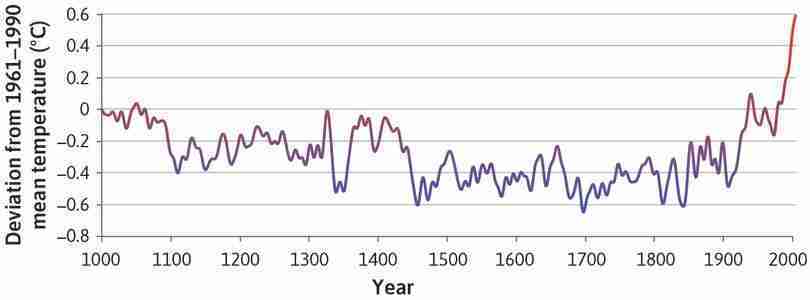
Northern hemisphere temperatures over the long run (1000–2006).
Figure 1.4 Northern hemisphere temperatures over the long run (1000–2006).
Part 1.2 Variation in temperature over time
- Solution figures 1.7 and 1.8 show the variation in temperature over time for the periods 1951–1980 and 1981–2010 respectively.
| Range of temperature anomaly (T) | Frequency |
|---|---|
| −0.30 | 0 |
| −0.25 | 2 |
| −0.20 | 7 |
| −0.15 | 6 |
| −0.10 | 8 |
| −0.05 | 12 |
| 0.00 | 7 |
| 0.05 | 14 |
| 0.10 | 12 |
| 0.15 | 11 |
| 0.20 | 8 |
| 0.25 | 3 |
| 0.30 | 0 |
| 0.35 | 0 |
| 0.40 | 0 |
| 0.45 | 0 |
| 0.50 | 0 |
| 0.55 | 0 |
| 0.60 | 0 |
| 0.65 | 0 |
| 0.70 | 0 |
| 0.75 | 0 |
| 0.80 | 0 |
| 0.85 | 0 |
| 0.90 | 0 |
| 0.95 | 0 |
| 1.00 | 0 |
| 1.05 | 0 |
A frequency table for 1951–1980.
Solution figure 1.7 A frequency table for 1951–1980.
| Range of temperature anomaly (T) | Frequency |
|---|---|
| −0.30 | 0 |
| −0.25 | 0 |
| −0.20 | 0 |
| −0.15 | 0 |
| −0.10 | 1 |
| −0.05 | 3 |
| 0.00 | 2 |
| 0.05 | 7 |
| 0.10 | 1 |
| 0.15 | 5 |
| 0.20 | 3 |
| 0.25 | 4 |
| 0.30 | 7 |
| 0.35 | 7 |
| 0.40 | 4 |
| 0.45 | 6 |
| 0.50 | 8 |
| 0.55 | 4 |
| 0.60 | 4 |
| 0.65 | 5 |
| 0.70 | 7 |
| 0.75 | 4 |
| 0.80 | 6 |
| 0.85 | 2 |
| 0.90 | 0 |
| 0.95 | 0 |
| 1.00 | 0 |
| 1.05 | 0 |
A frequency table for 1981–2010.
Solution figure 1.8 A frequency table for 1981–2010.
- Solution figures 1.9 and 1.10 are column charts showing the distribution of temperatures for 1951–1980 and 1981–2010.
- From Solution figures 1.9 and 1.10, you can see that the distribution of summer temperature anomalies has been shifting to the right. This means more and more months have been hotter than they were before. The distribution in 1981–2010 is also flatter than that of 1951–1980. This, however, does not necessarily mean that temperature variability around the world has been increasing. Many climate scientists have pointed out that this is merely a reflection of the fact that different parts of the world are warming up at different speeds.
- In the period 1951–1980, the value corresponding to the 3rd decile is −0.1, and the value corresponding to the 7th decile is 0.11. Temperature anomalies below −0.1 are therefore considered ‘cold’, and temperature anomalies above 0.11 are considered ‘hot’.
- In the period 1981–2010, 2.2% of temperatures would be considered ‘cold’ (compared to 30% in 1951–1980), and 84.4% of temperatures would be considered ‘hot’ (compared to 30% in 1951–1980). The increase in the percentage of ‘hot’ weather and decrease in the percentage of ‘cold’ weather suggests that we are experiencing hotter weather more frequently in 1981–2010.
- Solution figure 1.11 shows the mean and variance separately for the following time periods: 1921–1950, 1951–1980, and 1981–2010.
| 1921–1950 | 1951–1980 | 1981–2010 | |
|---|---|---|---|
| Mean | |||
| DJF | −0.06 | −0.0007 | 0.52 |
| MAM | −0.06 | 0.0007 | 0.50 |
| JJA | −0.05 | 0.0007 | 0.41 |
| SON | 0.07 | 0.0003 | 0.43 |
| Variance | |||
| DJF | 0.06 | 0.05 | 0.07 |
| MAM | 0.03 | 0.03 | 0.07 |
| JJA | 0.02 | 0.01 | 0.06 |
| SON | 0.02 | 0.03 | 0.10 |
Mean and variance per season for periods 1921–1950, 1951–1980, and 1981–2010.
Solution figure 1.11 Mean and variance per season for periods 1921–1950, 1951–1980, and 1981–2010.
- Temperature in most seasons appears to be more variable in 1981–2010 compared to 1951–1980 or 1921–1950 (and the mean anomaly in each season has increased in each period for most seasons).
The temperature anomalies in DJF have a larger variance than those in JJA. The variance in DJF is about three times larger than that in JJA, particularly until 1980. For the period 1981–2010, the JJA temperature anomalies start becoming more variable.
- The column charts in Question 2(a) (Solution figures 1.9 and 1.10) and the table in Question 5(a) (Solution figure 1.11) suggest that temperatures are becoming more variable over time. However, (as stated in the article), many scientists argue that the increasing spread is merely a reflection of the fact that some regions of the world are warming faster than others. The government should look at temperature variability in their particular region to see if there is a similar pattern to that of the northern hemisphere in general, before deciding how much to spend on mitigating the effects of extreme weather events.
Part 1.3 Carbon emissions and the environment
- The location of the observatory at the summit of Mauna Loa means the data is representative of the globe. This is because the observatory is surrounded by miles of bare lava, eliminating the influence of CO2 absorbed or emitted locally by plants, soils, and human activities. Data collected at the observatory is selected to minimize the effects of anomalies and other shocks. The measurements are also calibrated rigorously and frequently, and compared to others taken at laboratories using different methods. Systematic and persistent biases are less than 0.2 ppm (parts per million), indicating that the measurements are highly accurate.
- Both measures are constructed based on monthly mean CO2 mole fraction. The mole fraction of CO2, expressed as parts per million (ppm), is the number of molecules of CO2 in every one million molecules of dried air (water vapor removed). The trend mean mole fraction for each month is determined by removing the seasonal cycles. Trend values are linearly interpolated for missing values. The interpolated value is the sum of the average seasonal cycle value and the trend value.
The data shows that the levels of CO2 are typically higher when recorded in spring and summer as plants absorb and consume more CO2 in these months than in autumn and winter. During autumn and winter, plants decrease photosynthesis and become net producers of CO2. Many scientists argue that climate change has led to higher rates of photosynthesis during growth seasons and higher rates of exhalation in autumn and winter. Climate change can therefore increase the seasonality of CO2 levels.
- The graph in Solution figure 1.12 suggests a positive relationship between CO2 and time.
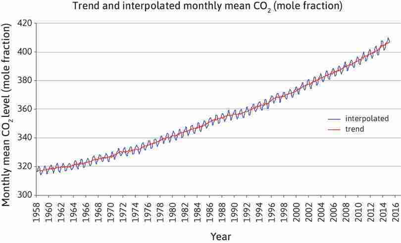
Trend and interpolated monthly mean CO2 (mole fraction).
Solution figure 1.12 Trend and interpolated monthly mean CO2 (mole fraction).
- The scatterplot in Solution figure 1.13 plots CO2 levels against temperature anomaly for June.
- Solution figure 1.13 shows data for the month of June. The (Pearson) correlation coefficient is 0.92, indicating a strong positive linear association between the two variables. When CO2 levels increase, temperatures increase.
-
Limitations of the Pearson correlation coefficient include:
- an inability to detect non-linear relationships between variables (for example, if data followed a U-shaped pattern). The correlation coefficient simply measures the strength of the linear relationship between variables.
- an inability to determine whether there is a causal relationship between the variables.
- The months chosen to produce Solution figures 1.14 and 1.15 are January and December. The correlation coefficient for January is 0.82, and the correlation coefficient for December is 0.81, both indicating a strong positive linear correlation.
- Spurious correlation occurs when two variables appear to be correlated while there is not actually a cause-and-effect relationship between them. The correlation observed can be due to coincidence or a third variable driving both variables. Two events or variables are correlated when they happen or change together. Causation occurs when one variable changes as a result of changes in another variable.
- An example related to CO2 levels is that the number of people attaining primary, secondary, or university education has increased over time, and so have CO2 levels. However, it’s difficult to argue that CO2 levels cause more people to go to school, or that more people going to school would directly cause CO2 levels to rise. Rather, it’s more likely that greater educational attainment is an indirect effect of economic development, which is the cause of increased CO2 levels.
-
The number of people who have drowned by falling into a pool is closely correlated to the number of films that Nicolas Cage has appeared in. The correlation is a result of coincidence as there are no reasonable and testable links between the variables.
Another example is US spending on science, space, and technology is correlated with suicides by hanging, strangulation, and suffocation. The two variables could both be driven by a common third variable. For example, rising levels of competition in modern societies can raise the need for technological progress and excellence, affecting both variables positively. This causes the two variables to be correlated.
