Empirical Project 1 Working in R
Download the code
To download the code chunks used in this project, right-click on the download link and select ‘Save Link As…’. You’ll need to save the code download to your working directory, and open it in RStudio.
Don’t forget to also download the data into your working directory by following the steps in this project.
Getting started in R
If you have worked with R and have the software installed on your machine, you can begin this project. If you have not, watch the videos ‘Installing R and RStudio’ and ‘RStudio orientation’ for guidance on installing and using RStudio.
Part 1.1 The behaviour of average surface temperature over time
Learning objectives for this part
- use line charts to describe the behaviour of real-world variables over time.
In the questions below, we look at data from NASA about land–ocean temperature anomalies in the northern hemisphere. Figure 1.1 is constructed using this data, and shows temperatures in the northern hemisphere over the period 1880–2016, expressed as differences from the average temperature from 1951 to 1980. We start by creating charts similar to Figure 1.1, in order to visualize the data and spot patterns more easily.
Before plotting any charts, download the data and make sure you understand how temperature is measured:
- Go to NASA’s Goddard Institute for Space Studies website.
- Under the subheading ‘Combined Land-Surface Air and Sea-Surface Water Temperature Anomalies’, select the CSV version of ‘Northern Hemisphere-mean monthly, seasonal, and annual means’ (right-click and select ‘Save Link As…’).
- The default name of this file is NH.Ts+dSST.csv. Give it a suitable name and save it in an easily accessible location, such as a folder on your Desktop or in your personal folder.
- In this dataset, temperature is measured as ‘anomalies’ rather than as absolute temperature. Using NASA’s Frequently Asked Questions section as a reference, explain in your own words what temperature ‘anomalies’ means. Why have researchers chosen this particular measure over other measures (such as absolute temperature)?
First we have to import the data into R.
R walk-through 1.1 Importing the datafile into R
We want to import the datafile called ‘NH.Ts+dSST.csv’ into R.
We start by setting our working directory using the
setwdcommand. This command tells R where your datafiles are stored. In the code below, replace ‘YOURFILEPATH’ with the full filepath that indicates the folder in which you have saved the datafile. If you don’t know how to find the path to your working folder, see the ‘Technical Reference’ section.setwd("YOURFILEPATH")Since our data is in csv format, we use the
read.csvfunction to import the data into R. We will call our file ‘tempdata’ (short for ‘temperature data’).Here you can see commands to R which are spread across two lines. You can spread a command across multiple lines, but you must adhere to the following two rules for this to work. First, the line break should come inside a set of parenthesis (i.e. between
(and)or straight after the assignment operator (). Second, the line break must not be inside a string (whatever is inside quotes) or in the middle of a word or number.tempdata read.csv("NH.Ts+dSST.csv", skip = 1, na.strings = "***")When using this function, we added two options. If you open the spreadsheet in Excel, you will see that the real data table only starts in Row 2, so we use the
skip = 1option to skip the first row when importing the data. When looking at the spreadsheet, you can see that missing temperature data is coded as"***". In order for R to recognize the non-missing temperature data as numbers, we use thena.strings = "***"option to indicate that missing observations in the spreadsheet are coded as"***".To check that the data has been imported correctly, you can use the
headfunction to view the first six rows of the dataset, and confirm that they correspond to the columns in the csv file.head(tempdata)## Year Jan Feb Mar Apr May Jun Jul Aug Sep Oct Nov ## 1 1880 -0.57 -0.41 -0.28 -0.38 -0.12 -0.24 -0.25 -0.26 -0.29 -0.34 -0.39 ## 2 1881 -0.21 -0.27 -0.01 -0.04 -0.07 -0.38 -0.07 -0.04 -0.25 -0.42 -0.44 ## 3 1882 0.21 0.20 -0.01 -0.38 -0.33 -0.39 -0.38 -0.15 -0.18 -0.54 -0.34 ## 4 1883 -0.61 -0.70 -0.17 -0.29 -0.34 -0.27 -0.10 -0.27 -0.35 -0.23 -0.42 ## 5 1884 -0.24 -0.13 -0.67 -0.64 -0.43 -0.53 -0.49 -0.52 -0.46 -0.42 -0.49 ## 6 1885 -1.01 -0.37 -0.21 -0.54 -0.57 -0.49 -0.38 -0.46 -0.33 -0.31 -0.29 ## Dec J.D D.N DJF MAM JJA SON ## 1 -0.51 -0.34 NA NA -0.26 -0.25 -0.34 ## 2 -0.30 -0.21 -0.23 -0.33 -0.04 -0.16 -0.37 ## 3 -0.43 -0.23 -0.22 0.04 -0.24 -0.31 -0.35 ## 4 -0.27 -0.34 -0.35 -0.58 -0.27 -0.21 -0.33 ## 5 -0.40 -0.45 -0.44 -0.22 -0.58 -0.51 -0.45 ## 6 0.00 -0.41 -0.45 -0.60 -0.44 -0.44 -0.31Before working with the important data, we use the
strfunction to check that the data is formatted correctly.str(tempdata)## 'data.frame': 138 obs. of 19 variables: ## $ Year: int 1880 1881 1882 1883 1884 1885 1886 1887 1888 1889 ... ## $ Jan : num -0.57 -0.21 0.21 -0.61 -0.24 -1.01 -0.69 -1.08 -0.54 -0.33 ... ## $ Feb : num -0.41 -0.27 0.2 -0.7 -0.13 -0.37 -0.69 -0.6 -0.61 0.32 ... ## $ Mar : num -0.28 -0.01 -0.01 -0.17 -0.67 -0.21 -0.58 -0.37 -0.59 0.05 ... ## $ Apr : num -0.38 -0.04 -0.38 -0.29 -0.64 -0.54 -0.35 -0.43 -0.26 0.12 ... ## $ May : num -0.12 -0.07 -0.33 -0.34 -0.43 -0.57 -0.36 -0.28 -0.18 -0.07 ... ## $ Jun : num -0.24 -0.38 -0.39 -0.27 -0.53 -0.49 -0.44 -0.21 -0.06 -0.15 ... ## $ Jul : num -0.25 -0.07 -0.38 -0.1 -0.49 -0.38 -0.21 -0.23 0.01 -0.12 ... ## $ Aug : num -0.26 -0.04 -0.15 -0.27 -0.52 -0.46 -0.48 -0.53 -0.21 -0.19 ... ## $ Sep : num -0.29 -0.25 -0.18 -0.35 -0.46 -0.33 -0.35 -0.18 -0.15 -0.28 ... ## $ Oct : num -0.34 -0.42 -0.54 -0.23 -0.42 -0.31 -0.33 -0.41 0.01 -0.37 ... ## $ Nov : num -0.39 -0.44 -0.34 -0.42 -0.49 -0.29 -0.46 -0.21 -0.04 -0.63 ... ## $ Dec : num -0.51 -0.3 -0.43 -0.27 -0.4 0 -0.18 -0.45 -0.28 -0.58 ... ## $ J.D : num -0.34 -0.21 -0.23 -0.34 -0.45 -0.41 -0.43 -0.42 -0.24 -0.19 ... ## $ D.N : num NA -0.23 -0.22 -0.35 -0.44 -0.45 -0.41 -0.39 -0.26 -0.16 ... ## $ DJF : num NA -0.33 0.04 -0.58 -0.22 -0.6 -0.46 -0.62 -0.53 -0.1 ... ## $ MAM : num -0.26 -0.04 -0.24 -0.27 -0.58 -0.44 -0.43 -0.36 -0.34 0.03 ... ## $ JJA : num -0.25 -0.16 -0.31 -0.21 -0.51 -0.44 -0.38 -0.32 -0.09 -0.15 ... ## $ SON : num -0.34 -0.37 -0.35 -0.33 -0.45 -0.31 -0.38 -0.27 -0.06 -0.43 ...You can see that all variables are formatted as numerical data (
num), so R correctly recognizes that the data are numbers.
Now create some line charts using monthly, seasonal, and annual data, which help us look for general patterns over time.
- Choose one month and plot a line chart with average temperature anomaly on the vertical axis and time (from 1880 to the latest year available) on the horizontal axis. Label each axis appropriately and give your chart a suitable title (Refer to Figure 1.1 as an example.)
R walk-through 1.2 Drawing a line chart of temperature and time
The data is formatted as numerical (
num) data, so R recognizes each variable as a series of numbers (instead of text), but does not recognize that these numbers correspond to the same variable for different time periods (known as ‘time series data’ in economics). Letting R know that we have time series data will make coding easier later (especially with making graphs). You can use thetsfunction to specify that a variable is a time series. Make sure to amend the code below so that the end year (end = c()) corresponds to the latest year in your dataset (our example uses 2017).tempdata$Jan ts(tempdata$Jan, start = c(1880), end = c(2017), frequency = 1) tempdata$DJF ts(tempdata$DJF, start = c(1880), end = c(2017), frequency = 1) tempdata$MAM ts(tempdata$MAM, start = c(1880), end = c(2017), frequency = 1) tempdata$JJA ts(tempdata$JJA, start = c(1880), end = c(2017), frequency = 1) tempdata$SON ts(tempdata$SON, start = c(1880), end = c(2017), frequency = 1) tempdata$J.D ts(tempdata$J.D, start = c(1880), end = c(2017), frequency = 1)Note that we placed each of these quarterly series in the relevant middle month. You could do the same for the remaining series, but we will only use the series above in this R walk-through.
We can now use these variables to draw line charts using the
plotfunction. As an example, we will draw a line chart using data for January (tempdata$Jan) for the years 1880–2016. Thetitleoption on the next line adds a chart title, and theablineoption draws a horizontal line according to our specifications. Make sure to amend the code below so that your chart title corresponds to the latest year in your dataset (our example uses 2016).# Set line width and colour plot(tempdata$Jan, type = "l", col = "blue", lwd = 2, ylab = "Annual temperature anomalies", xlab = "Year") # Add a title title("Average temperature anomaly in January in the northern hemisphere (1880-2016)") # Add a horizontal line (at y = 0) abline(h = 0, col = "darkorange2", lwd = 2) # Add a label to the horizontal line text(2000, -0.1, "1951-1980 average")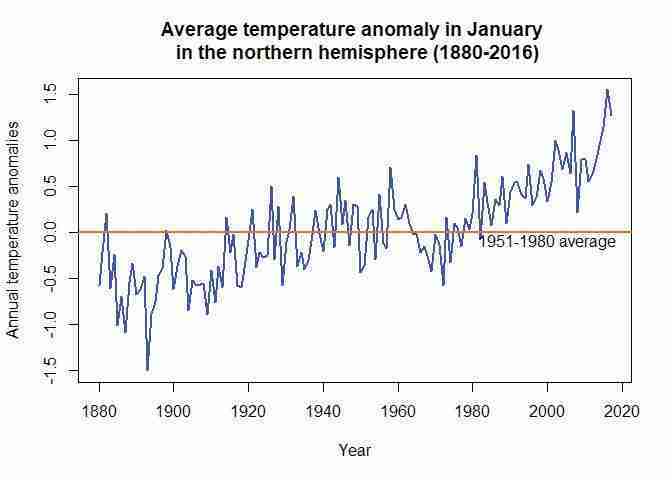
Northern hemisphere January temperatures (1880–2016).
Figure 1.2 Northern hemisphere January temperatures (1880–2016).
Try different values for
typeandcolin theplotfunction to figure out what these options do (some online research could help).xlabandylabdefine the respective axis titles.It is important to remember that all axis and chart titles should be enclosed in quotation marks (
""), as well as any words that are not options (for example, colour names or filenames).
-
Extra practice: The columns labelled
DJF,MAM,JJA, andSONcontain seasonal averages (means). For example, theMAMcolumn contains the average of the March, April, and May columns for each year. Plot a separate line chart for each season, using average temperature anomaly for that season on the vertical axis and time (from 1880 to the latest year available) on the horizontal axis.
- The column labelled
J–Dcontains the average temperature anomaly for each year.
- Plot a line chart with annual average temperature anomaly on the vertical axis and time (from 1880 to the latest year available) on the horizontal axis. Your chart should look like Figure 1.1.
Extension: Add a horizontal line that intersects the vertical axis at 0, and label it ‘1951–1980 average’.
- What do your charts from Questions 2 to 4(a) suggest about the relationship between temperature and time?
R walk-through 1.3 Producing a line chart for the annual temperature anomalies
This is where the power of programming languages becomes evident: to produce the same line chart for a different variable, we simply take the code used in R walk-through 1.2 and replace the variable name
Janwith the name for the annual variable (J.D). Again, make sure to amend the code so that your chart title corresponds to the latest year in your data (our example uses 2016).# Set line width and colour plot(tempdata$J.D, type = "l", col = "blue", lwd = 2, ylab = "Annual temperature anomalies", xlab = "Year") # \n creates a line break title("Average annual temperature anomaly \n in the northern hemisphere (1880-2016)") # Add a horizontal line (at y = 0) abline(h = 0, col = "darkorange2", lwd = 2) # Add a label to the horizontal line text(2000, -0.1, "1951-1980 average")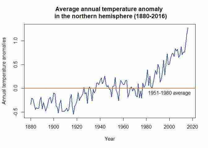
Northern hemisphere annual temperatures (1880–2016).
Figure 1.3 Northern hemisphere annual temperatures (1880–2016).
- You now have charts for three different time intervals: month (Question 2), season (Question 3), and year (Question 4). For each time interval, discuss what we can learn about patterns in temperature over time that we might not be able to learn from the charts of other time intervals.
- Compare your chart from Question 4 to Figure 1.4, which also shows the behaviour of temperature over time using data taken from the National Academy of Sciences.
- Discuss the similarities and differences between the charts. (For example, are the horizontal and vertical axes variables the same, or do the lines have the same shape?)
- Looking at the behaviour of temperature over time from 1000 to 1900 in Figure 1.4, are the observed patterns in your chart unusual?
- Based on your answers to Questions 4 and 5, do you think the government should be concerned about climate change?
Part 1.2 Variation in temperature over time
Learning objectives for this part
- summarize data in a frequency table, and visualize distributions with column charts
- describe a distribution using mean and variance.
Aside from changes in the mean temperature, the government is also worried that climate change will result in more frequent extreme weather events. The island has experienced a few major storms and severe heat waves in the past, both of which caused serious damage and disruption to economic activity.
Will weather become more extreme and vary more as a result of climate change? A New York Times article uses the same temperature dataset you have been using to investigate the distribution of temperatures and temperature variability over time. Read through the article, paying close attention to the descriptions of the temperature distributions.
We can use the mean and median to describe distributions, and we can use deciles to describe parts of distributions. To visualize distributions, we can use column charts (sometimes referred to as frequency histograms). We are now going to create similar charts of temperature distributions to the ones in the New York Times article, and look at different ways of summarizing distributions.
- frequency table
- A record of how many observations in a dataset have a particular value, range of values, or belong to a particular category.
In order to create a column chart using the temperature data we have, we first need to summarize the data using a frequency table. Instead of using deciles to group the data, we use intervals of 0.05, so that temperature anomalies with a value from −0.3 to −0.25 will be in one group, a value greater than −0.25 and up to 0.2 in another group, and so on. The frequency table shows us how many values belong to a particular group.
- Using the monthly data for June, July, and August, create two frequency tables similar to Figure 1.5 for the years 1951–1980 and 1981–2010 respectively. The values in the first column should range from −0.3 to 1.05, in intervals of 0.05. See R walk-through 1.3 for how to do this.
| Range of temperature anomaly (T) | Frequency |
|---|---|
| −0.30 | |
| −0.25 | |
| … | |
| 1.00 | |
| 1.05 |
Figure 1.5 A frequency table.
- Using the frequency tables from Question 1:
- Plot two separate column charts (frequency histograms) for 1951–1980 and 1981–2010 to show the distribution of temperatures, with frequency on the vertical axis and the range of temperature anomaly on the horizontal axis. Your charts should look similar to those in the New York Times article.
- Using your charts, describe the similarities and differences (if any) between the distributions of temperature anomalies in 1951–1980 and 1981–2010.
R walk-through 1.4 Creating frequency tables and histograms
Since we will be looking at data from different subperiods (year intervals) separately, we will create a categorical variable (a variable that has two or more categories) that indicates the subperiod for each observation (row). In R this type of variable is called a ‘factor variable’. When we create a factor variable, we need to define the categories that this variable can take.
tempdata$Period
  factor(NA, levels =
    c("1921-1950", "1951-1980", "1981-2010"),
    ordered = TRUE)
We created a new variable called
Periodand defined the possible categories (which R refers to as ‘levels’). Since we will not be using data for some years (before 1921 and after 2010), we wantPeriodto take the value ‘NA’ (not available) for these observations (rows), and the appropriate category for all the other observations (between 1921–2010). One way to do this is by definingPeriodas ‘NA’ for all observations, then change the values ofPeriodfor the observations in 1921–2010.tempdata$Period[(tempdata$Year > 1920) & (tempdata$Year < 1951)] "1921-1950" tempdata$Period[(tempdata$Year > 1950) & (tempdata$Year < 1981)] "1951-1980" tempdata$Period[(tempdata$Year > 1980) & (tempdata$Year < 2011)] "1981-2010"We need to use all monthly anomalies from June, July, and August, but they are currently in three separate columns. We will use the
c(combine) function to create one new variable (calledtemp_summer) that contains all these values.# Combine the temperature data for June, July, and August temp_summer c(tempdata$Jun, tempdata$Jul, tempdata$Aug)There are many ways to achieve the same result. One alternative is to use the
unlistfunction and apply it to Columns 7 to 9 (containing the data for June to August) oftempdata.temp_summer unlist(tempdata[,7:9],use.names = FALSE)Now we have one long variable (
temp_summer), with the monthly temperature anomalies for the three months (from 1880 to the latest year) attached to each other. But remember that we want to make separate calculations for each category inPeriod(1921–1950, 1951–1980, 1981–2010). To make a variable showing the categories for thetemp_summervariable, we use thecfunction again.# Mirror the Period information for temp_sum temp_Period c(tempdata$Period, tempdata$Period, tempdata$Period) # Repopulate the factor information temp_Period factor(temp_Period, levels = 1:nlevels(tempdata$Period), labels = levels(tempdata$Period))After using the
cfunction, we had to use thefactorfunction again to tell R that our new variabletemp_Periodis a factor variable.We have now created the variables needed to make frequency tables and histograms (
temp_summerandtemp_Period). To obtain the frequency table for 1951–1980, we use thehistfunction on the monthly temperature anomalies from the period ‘1951–1980’:temp_summer[(temp_Period == "1951-1980")]. The optionplot = FALSEtells R not to make a plot of this information. (See what happens if you set it toTRUE.)hist(temp_summer[(temp_Period == "1951-1980")], plot = FALSE)## $breaks ## [1] -0.30 -0.25 -0.20 -0.15 -0.10 -0.05 0.00 0.05 0.10 0.15 0.20 ## [12] 0.25 ## ## $counts ## [1] 2 7 6 7 14 6 14 12 10 9 3 ## ## $density ## [1] 0.4444444 1.5555556 1.3333333 1.5555556 3.1111111 1.3333333 3.1111111 ## [8] 2.6666667 2.2222222 2.0000000 0.6666667 ## ## $mids ## [1] -0.275 -0.225 -0.175 -0.125 -0.075 -0.025 0.025 0.075 0.125 0.175 ## [11] 0.225 ## ## $xname ## [1] "temp_summer[(temp_Period == \"1951-1980\")]" ## ## $equidist ## [1] TRUE ## ## attr(,"class") ## [1] "histogram"From the output you can see that we can get the temperature ranges (the values in
$breakscorrespond to Column 1 of Figure 1.5) and the frequencies ($counts), which is all we need to create a frequency table. However, in our case the frequency table is merely a temporary input required to produce a histogram.We can make the three histograms we need all at once, using the
histogramfunction from themosaicpackage.The function below includes multiple commands:
| temp_Periodsplits the data according to its category, given bytemp_Period.type = "count"indicates that we want to display the counts (frequencies) in each category.breaks = seq(-0.5, 1.3, 0.1)gives a sequence of numbers −0.5, −0.4, …, 1.3, which are boundaries for the categories.main = "Histogram of temperature anomalies"gives Figure 1.6 its title.# Load the library we use for the following command. library(mosaic) histogram(~ temp_summer | temp_Period, type = "count", breaks = seq(-0.5, 1.3, 0.10), main = "Histogram of Temperature anomalies", xlab = "Summer temperature distribution")To explain what a histogram displays, we refer to the histogram for the period from 1921–1950. Notice the vertical bars that are centred at values such as –0.35, –0.25, –0.15, –0.05, and so forth. We will look first at the highest of the bars, which is centred at –0.15. This bar represents values of the temperature anomalies that fall in the interval from –0.2 to –0.1. The height of this bar is a representation of how many values fall into this interval, (23 observations, in this case). As it is the highest bar, this indicates that this is the interval in which the largest proportion of temperature anomalies fell for the period from 1921 to 1950. As you can see, there are virtually no temperature anomalies larger than 0.3. The height of these bars gives a useful overview of the distribution of the temperature anomalies.
Now consider how this distribution changes as we move through the three distinct time periods. The distribution is clearly moving to the right for the period 1981–2010, which is an indication that the temperature is increasing; in other words, an indication of global warming.
- variance
- A measure of dispersion in a frequency distribution, equal to the mean of the squares of the deviations from the arithmetic mean of the distribution. The variance is used to indicate how ‘spread out’ the data is. A higher variance means that the data is more spread out. Example: The set of numbers 1, 1, 1 has zero variance (no variation), while the set of numbers 1, 1, 999 has a high variance of 221,334 (large spread).
Now we will use our data to look at different aspects of distributions. Firstly, we will learn how to use deciles to determine which observations are ‘normal’ and ‘abnormal’, and then learn how to use variance to describe the shape of a distribution.
- The New York Times article considers the bottom third (the lowest or coldest one-third) of temperature anomalies in 1951–1980 as ‘cold’ and the top third (the highest or hottest one-third) of anomalies as ‘hot’. In decile terms, temperatures in the 1st to 3rd decile are ‘cold’ and temperatures in the 7th to 10th decile or above are ‘hot’ (rounded to the nearest decile). Use R’s
quantilefunction to determine what values correspond to the 3rd and 7th decile across all months in 1951–1980.
R walk-through 1.5 Using the
quantilefunctionFirst, we need to create a variable that contains all monthly anomalies in the years 1951–1980. Then, we use R’s
quantilefunction to find the required percentiles (0.3 and 0.7 refer to the 3rd and 7th deciles, respectively).Note: You may get slightly different values to those shown here if you are using the latest data.
# Select years 1951 to 1980
temp_all_months  subset(tempdata,
  (Year >= 1951 & Year <= 1980))

# Columns 2 to 13 contain months Jan to Dec.
temp_51to80  unlist(temp_all_months[, 2:13])

# c(0.3, 0.7) indicates the chosen percentiles.
perc  quantile(temp_51to80, c(0.3, 0.7))

# The cold threshold
p30  perc[1]
p30
## 30% ## -0.1# The hot threshold p70 perc[2] p70## 70% ## 0.11
- Based on the values you found in Question 3, count the number of anomalies that are considered ‘hot’ in 1981–2010, and express this as a percentage of all the temperature observations in that period. Does your answer suggest that we are experiencing hotter weather more frequently in 1981–2010? (Remember that each decile represents 10% of observations, so 30% of temperatures were considered ‘hot’ in 1951–1980.)
R walk-through 1.6 Using the
meanfunctionNote: You may get slightly different values to those shown here if you are using the latest data.
We repeat the steps used in R walk-through 1.5, now looking at monthly anomalies in the years 1981–2010. We can simply change the year values in the code from R walk-through 1.5.
# Select years 1951 to 1980
temp_all_months  subset(tempdata,
  (Year >= 1981 & Year <= 2010))

# Columns 2 to 13 contain months Jan to Dec.
temp_81to10  unlist(temp_all_months[, 2:13])
Now that we have all the monthly data for 1981–2010, we want to count the proportion of observations that are smaller than –0.1. This is easily achieved with the following lines of code:
paste("Proportion smaller than p30")## [1] "Proportion smaller than p30"temp temp_81to10 < p30 mean(temp)## [1] 0.01944444What we did was first create a variable called
temp, which equals 1 (TRUE) for all the monthly temperature anomalies intemp_81to10that are smaller than the 30th percentile value (temp_81to10 < p30), and 0 (FALSE) otherwise. The mean of this variable is the proportion of 1s. Here we find that 0.019 (= 1.9%) of observations are smaller thanp30. That means that between 1951 and 1980, 30% of observations for the temperature anomaly were smaller than –0.10, but between 1981 and 2010 only about two per cent of months are considered cold. That is a large change.Let’s check whether we get a similar result for the number of observations that are larger than 0.11.
paste("Proportion larger than p70")## [1] "Proportion larger than p70"mean(temp_81to10 > p70)## [1] 0.8444444
- The New York Times article discusses whether temperatures have become more variable over time. One way to measure temperature variability is by calculating the variance of the temperature distribution. For each season (
DJF,MAM,JJA, andSON):
- Calculate the mean (average) and variance separately for the following time periods: 1921–1950, 1951–1980, and 1981–2010.
- For each season, compare the variances in different periods, and explain whether or not temperature appears to be more variable in later periods.
R walk-through 1.7 Calculating and understanding mean and variance
One way to calculate mean and variance is to use the
mosaicpackage introduced in R walk-through 1.4. (Remember to first install themosaicpackage and load it into R withlibrary(mosaic).)# Only run if you haven't loaded mosaic yet library(mosaic) paste("Mean of DJF temperature anomalies across periods")## [1] "Mean of DJF temperature anomalies across periods"mean(~DJF|Period,data = tempdata)## 1921-1950 1951-1980 1981-2010 ## -0.0573333333 -0.0006666667 0.5206666667paste("Variance of DJF anomalies across periods")## [1] "Variance of DJF anomalies across periods"var(~DJF|Period,data = tempdata)## 1921-1950 1951-1980 1981-2010 ## 0.05907540 0.05361333 0.07149609Using the data in tempdata (
data = tempdata), we calculated the mean (mean) and variance (var) of variable~DJFseparately for (|) each value ofPeriod. Themosaicpackage allows us to calculate the means/variances for each period all at once. Ifmosaicis not loaded, you will get the error message:Error in mean(~DJF \| Period, data = tempdata) : unused argument (data = tempdata).Looking at the results, it appears that it is not only the mean (December, January, and February) temperature anomaly that increases through 1981–2010, but also the variance.
Let’s calculate the variances through the periods for the other seasons.
paste("Variance of MAM anomalies across periods")## [1] "Variance of MAM anomalies across periods"var(~MAM|Period,data = tempdata)## 1921-1950 1951-1980 1981-2010 ## 0.03029069 0.02661333 0.07535126paste("Variance of JJA anomalies across periods")## [1] "Variance of JJA anomalies across periods"var(~JJA|Period,data = tempdata)## 1921-1950 1951-1980 1981-2010 ## 0.01726713 0.01459264 0.06588690paste("Variance of SON anomalies across periods")## [1] "Variance of SON anomalies across periods"var(~SON|Period,data = tempdata)## 1921-1950 1951-1980 1981-2010 ## 0.02421437 0.02587920 0.10431506We recognize that the variances seem to remain fairly constant across the first two periods, but they do increase markedly for the 1981–2010 period.
We can plot a line chart to see these changes graphically. (This type of chart is formally known as a ‘time-series plot’). Make sure to change the chart title according to the latest year in your data (here we used 2016).
plot(tempdata$DJF, type = "l", col = "blue", lwd = 2,
  ylab = "Annual temperature anomalies", xlab = "Year")

# \n creates a line break
title("Average temperature anomaly in DJF and JJA \n in the northern hemisphere (1880-2016)")

# Add a horizontal line (at y = 0)
abline(h = 0, col = "darkorange2", lwd = 2)
lines(tempdata$JJA, col = "darkgreen", lwd = 2)

# Add a label to the horizontal line
text(1895, 0.1, "1951-1980 average")
legend(1880, 1.5, legend = c("DJF", "JJA"),
  col = c("blue", "darkgreen"),
  lty = 1, cex = 0.8, lwd = 2)
- Using the findings of the New York Times article and your answers to Questions 1 to 5, discuss whether temperature appears to be more variable over time. Would you advise the government to spend more money on mitigating the effects of extreme weather events?
Part 1.3 Carbon emissions and the environment
Learning objectives for this part
- use scatterplots and the correlation coefficient to assess the degree of association between two variables
- explain what correlation measures and the limitations of correlation.
- correlation
- A measure of how closely related two variables are. Two variables are correlated if knowing the value of one variable provides information on the likely value of the other, for example high values of one variable being commonly observed along with high values of the other variable. Correlation can be positive or negative. It is negative when high values of one variable are observed with low values of the other. Correlation does not mean that there is a causal relationship between the variables. Example: When the weather is hotter, purchases of ice cream are higher. Temperature and ice cream sales are positively correlated. On the other hand, if purchases of hot beverages decrease when the weather is hotter, we say that temperature and hot beverage sales are negatively correlated.
- correlation coefficient
- A numerical measure, ranging between 1 and −1, of how closely associated two variables are—whether they tend to rise and fall together, or move in opposite directions. A positive coefficient indicates that when one variable takes a high (low) value, the other tends to be high (low) too, and a negative coefficient indicates that when one variable is high the other is likely to be low. A value of 1 or −1 indicates that knowing the value of one of the variables would allow you to perfectly predict the value of the other. A value of 0 indicates that knowing one of the variables provides no information about the value of the other.
The government has heard that carbon emissions could be responsible for climate change, and has asked you to investigate whether this is the case. To do so, we are now going to look at carbon emissions over time, and use another type of chart, the scatterplot, to show their relationship to temperature anomalies. One way to measure the relationship between two variables is correlation. R walk-through 1.8 explains what correlation is and how to calculate it in R.
In the questions below, we will make charts using the CO2 data from the US National Oceanic and Atmospheric Administration. Download the Excel spreadsheet containing this data. Save the data as a csv file and import it into R.
- The CO2 data was recorded from one observatory in Mauna Loa. Using an Earth System Research Laboratory article as a reference, explain whether or not you think this data is a reliable representation of the global atmosphere.
- The variables
trendandinterpolatedare similar, but not identical. In your own words, explain the difference between these two measures of CO2 levels. Why might there be seasonal variation in CO2 levels?
Now we will use a line chart to look for general patterns over time.
- Plot a line chart with interpolated and trend CO2 levels on the vertical axis and time (starting from January 1960) on the horizontal axis. Label the axes and the chart legend, and give your chart an appropriate title. What does this chart suggest about the relationship between CO2 and time?
We will now combine the CO2 data with the temperature data from Part 1.1, and then examine the relationship between these two variables visually using scatterplots, and statistically using the correlation coefficient. If you have not yet downloaded the temperature data, follow the instructions in Part 1.1.
- Choose one month and add the CO2 trend data to the temperature dataset from Part 1.1, making sure that the data corresponds to the correct year.
- Make a scatterplot of CO2 level on the vertical axis and temperature anomaly on the horizontal axis.
- Calculate and interpret the (Pearson) correlation coefficient between these two variables.
- Discuss the shortcomings of using this coefficient to summarize the relationship between variables.
R walk-through 1.8 Scatterplots and the correlation coefficient
First we will use the
read.csvfunction to import the CO2 datafile into R, and call itCO2data.CO2data read.csv("1_CO2 data.csv")This file has monthly data, but in contrast to the data in
tempdata, the data is all in one column (this is more conventional than the column per month format). To make this task easier, we will pick the June data from the CO2 emissions and add them as an additional variable to thetempdatadataset.R has a convenient function called
mergeto do this. First we create a new dataset that contains only the June emissions data (‘CO2data_june’).CO2data_june CO2data[CO2data$Month == 6,]Then we use this data in the
mergefunction. Themergefunction takes the original ‘tempdata’ and the ‘CO2data’ and merges (combines) them together. As the two dataframes have a common variable,Year, R automatically matches the data by year.(Extension: Look up
?mergeor Google ‘How to use the R merge function’ to figure out whatall.xdoes, and to see other options that this function allows.)names(CO2data)[1] "Year" tempCO2data merge(tempdata, CO2data_june)Let us have a look at the data and check that it was combined correctly:
head(tempCO2data[, c("Year", "Jun", "Trend")])## Year Jun Trend ## 1 1958 0.04 314.85 ## 2 1959 0.14 315.92 ## 3 1960 0.18 317.36 ## 4 1961 0.19 317.48 ## 5 1962 -0.10 318.27 ## 6 1963 -0.02 319.16To make a scatterplot, we use the
plotfunction. R’s default chart forplotis a scatterplot, so we do not need to specify the chart type. One new option that applies to scatterplots ispch =, which determines the appearance of the data points. The number 16 corresponds to filled-in circles, but you can experiment with other numbers (from 0 to 25) to see what the data points look like.plot(tempCO2data$Jun, tempCO2data$Trend, xlab = "Temperature anomaly (degrees Celsius)", ylab = "CO2 levels (trend, mole fraction)", pch = 16, col = "blue") title("Scatterplot for CO2 emissions and temperature anomalies")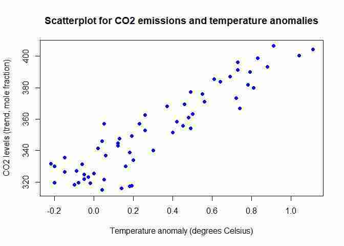
CO2 emissions and northern hemisphere June temperatures (1958–2016).
Figure 1.8 CO2 emissions and northern hemisphere June temperatures (1958–2016).
The
corfunction calculates the correlation coefficient. Note: You may get slightly different results if you are using the latest data.cor(tempCO2data$Jun, tempCO2data$Trend)## [1] 0.9157744In this case, the correlation coefficient tells us that the data is quite close to resembling an upward-sloping straight line (as seen on the scatterplot). There is a strong positive association between the two variables (higher temperature anomalies are associated with higher CO2 levels).
One limitation of this correlation measure is that it only tells us about the strength of the upward- or downward-sloping linear relationship between two variables, in other words how closely the scatterplot aligns along an upward- or downward-sloping straight line. The correlation coefficient cannot tell us if the two variables have a different kind of relationship (such as that represented by a wavy line).
Note: The word ‘strong’ is used for coefficients that are close to 1 or −1, and ‘weak’ is used for coefficients that are close to 0, though there is no precise range of values that are considered ‘strong’ or ‘weak’.
If you need more insight into correlation coefficients, you may find it helpful to watch online tutorials such as ‘Correlation coefficient intuition’ from the Khan Academy.
As we are dealing with time-series data, it is often more instructive to look at a line plot, as a scatterplot cannot convey how the observations relate to each other in the time dimension. If you were to check the variable types (using
str(tempCO2data)), you would see that the data is not yet in time-series format. We could continue with the format as it is, but for plotting purposes it is useful to let R know that we are dealing with time-series data. We therefore apply thetsfunction as we did in Part 1.1.tempCO2data$Jun ts(tempCO2data$Jun, start = c(1958), end = c(2017), frequency = 1) tempCO2data$Trend ts(tempCO2data$Trend, start = c(1958), end = c(2017), frequency = 1)Let’s start by plotting the June temperature anomalies.
plot(tempCO2data$Jun, type = "l", col = "blue", lwd = 2,
  ylab = "June temperature anomalies", xlab = "Year")

title("June temperature anomalies and CO2 emissions")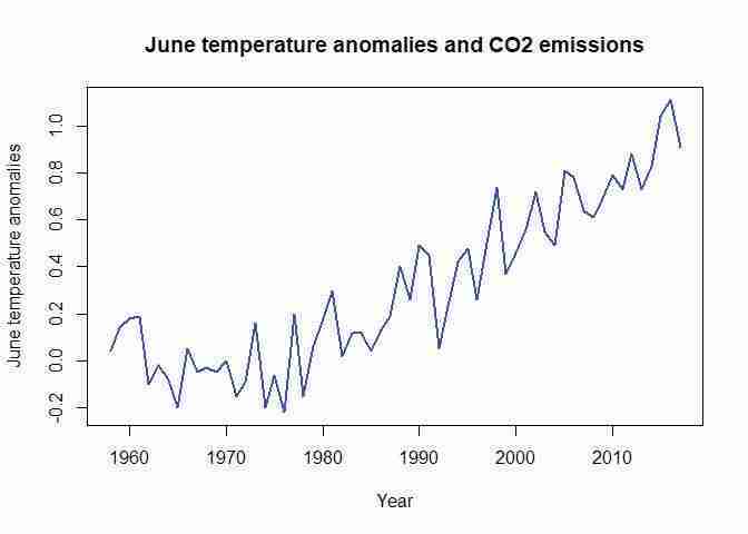
Northern hemisphere June temperatures (1958–2016).
Figure 1.9 Northern hemisphere June temperatures (1958–2016).
Typically, when using the
plotfunction we would now only need to add the line for the second variable using thelinescommand. The issue, however, is that the CO2 emissions variable (Trend) is on a different scale, and the automatic vertical axis scale (from –0.2 to about 1.2) would not allow for the display ofTrend. To resolve this issue you can introduce a second vertical axis using the commands below. (Tip: You are unlikely to remember the exact commands required, however you can Google ‘R plot 2 vertical axes’ or a similar search term, and then adjust the code you find so it will work on your dataset.)# Create extra margins used for the second axis par(mar = c(5, 5, 2, 5)) plot(tempCO2data$Jun, type = "l", col = "blue", lwd = 2, ylab = "June temperature anomalies", xlab = "Year") title("June temperature anomalies and CO2 emissions") # This puts the next plot into the same picture. par(new = T) # No axis, no labels plot(tempCO2data$Trend, pch = 16, lwd = 2, axes = FALSE, xlab = NA, ylab = NA, cex = 1.2) axis(side = 4) mtext(side = 4, line = 3, 'CO2 emissions') legend("topleft", legend = c("June temp anom", "CO2 emis"), lty = c(1, 1), col = c("blue", "black"), lwd = 2)
- causation
- A direction from cause to effect, establishing that a change in one variable produces a change in another. While a correlation gives an indication of whether two variables move together (either in the same or opposite directions), causation means that there is a mechanism that explains this association. Example: We know that higher levels of CO2 in the atmosphere lead to a greenhouse effect, which warms the Earth’s surface. Therefore we can say that higher CO2 levels are the cause of higher surface temperatures.
- spurious correlation
- A strong linear association between two variables that does not result from any direct relationship, but instead may be due to coincidence or to another unseen factor.
This line graph not only shows how the two variables move together in general, but also clearly demonstrates that both variables display a clear upward trend over the sample period. This is an important feature of many (not all) time series variables, and is important for the interpretation (see the ‘Find out more’ box on spurious correlations that follows).
- Extra practice: Choose two months and add the CO2 trend data to the temperature dataset from Part 1.1, making sure that the data corresponds to the correct year. Create a separate chart for each month. What do your charts and the correlation coefficients suggest about the relationship between CO2 levels and temperature anomalies?
Even though two variables are strongly correlated with each other, this is not necessarily because one variable’s behaviour is the result of the other (a characteristic known as causation). The two variables could be spuriously correlated. The following example illustrates spurious correlation:
A child’s academic performance may be positively correlated with the size of the child’s house or the number of rooms in the house, but could we conclude that building an extra room would make a child smarter, or doing well at school would make someone’s house bigger? It is more plausible that income or wealth, which determines the size of home that a family can afford and the resources available for studying, is the ‘unseen factor’ in this relationship. We could also determine whether income is the reason for this spurious correlation by comparing exam scores for children whose parents have similar incomes but different house sizes. If there is no correlation between exam scores and house size, then we can deduce that house size was not ‘causing’ exam scores (or vice versa).
See this TEDx Talk for more examples of the dangers of confusing correlation with causation.
- Consider the example of spurious correlation described above.
- In your own words, explain spurious correlation and the difference between correlation and causation.
- Give an example of spurious correlation, similar to the one above, for either CO2 levels or temperature anomalies.
- Choose an example of spurious correlation from Tyler Vigen’s website. Explain whether you think it is a coincidence, or whether this correlation could be due to one or more other variables.
Find out more What makes some correlations spurious?
In the spurious correlations website given in Question 6(c), most of the examples you will see involve data series (variables) that are trending (meaning that they tend to increase or decrease over time). If you calculate a correlation between two variables that are trending, you are bound to find a large positive or negative correlation coefficient, even if there is no plausible explanation for a relationship between the two variables. For example, ‘per capita cheese consumption’ (which increases over time due to increased disposable incomes or greater availability of cheese) has a correlation coefficient of 0.95 with the ‘number of people who die from becoming tangled in their bedsheets’ (which also increases over time due to a growing population and a growing availability of bedsheets).
The case for our example (the relationship between temperature and CO2 emissions) is slightly different. There is a well-known chemical link between the two. So we understand how CO2 emissions could potentially cause changes in temperature. But in general, do not be tempted to conclude that there is a causal link just because a high correlation coefficient can be seen. Be very cautious when attaching too much meaning to high correlation coefficients when the data displays trending behaviour.
This part shows that summary statistics, such as the correlation coefficient, can help identify possible patterns or relationships between variables, but we cannot draw conclusions about causation from them alone. It is also important to think about other explanations for what we see in the data, and whether we would expect there to be a relationship between the two variables.
- natural experiment
- An empirical study exploiting naturally occurring statistical controls in which researchers do not have the ability to assign participants to treatment and control groups, as is the case in conventional experiments. Instead, differences in law, policy, weather, or other events can offer the opportunity to analyse populations as if they had been part of an experiment. The validity of such studies depends on the premise that the assignment of subjects to the naturally occurring treatment and control groups can be plausibly argued to be random.
However, there are ways to determine whether there is a causal relationship between two variables, for example, by looking at the scientific processes that connect the variables (as with CO2 and temperature anomalies), or by using a natural experiment. To read more about how natural experiments help evaluate whether one variable causes another, see Section 1.8 of Economy, Society, and Public Policy. In Empirical Project 3, we will take a closer look at natural experiments and how we can use them to identify causal links between variables.
