Empirical Project 6 Working in Google Sheets
Part 6.1 Looking for patterns in the survey data
Learning objectives for this part
- explain how survey data is collected, and describe measures that can increase the reliability and validity of survey data
- use column charts and box and whisker plots to compare distributions
- calculate conditional means for one or more conditions, and compare them on a bar chart
- use line charts to describe the behaviour of real-world variables over time.
First download the data used in the paper to understand how this information was collected. The dataset is publicly available and free of charge, but you will need to create a user account in order to access it.
- Go to the World Management Survey data registration page.
- On the middle right-hand side of the page, click the ‘Register’ button.
- Fill in the form with the required details, then click ‘Register’.
- An account activation link will be sent to the email you provided. Click on it to activate your account.
- Now go to the World Management Survey data download page.
- In the subsection ‘Download the public WMS data now’, click the ‘Download Now’ button.
- In the ‘Login’ section, enter your account’s email and password, then click ‘Login’.
- Under the heading ‘Manufacturing: 2004–2010 combined survey data (AMP)’, click the ‘Download’ button.
- Unzip the files in the downloaded zip folder into your working directory (the folder you will be working from).
- You may also find it helpful to download the Bloom et al. paper ‘Management practices across firms and countries’.
- To learn about how Bloom et al. (2012) conducted their survey, read the sections ‘How Can Management Practices Be Measured?’ and ‘Validating the Management Data’ (pages 5–9) of their paper.
- Briefly describe how the interviews with managers were conducted, and explain some methods the researchers used to improve the reliability and validity of their data. (There are a few technical terms that you may not understand, but these are not necessary for answering this question.)
- Three aspects of management practices were evaluated: monitoring, targets, and incentives. Do you think that these are the best criteria for assessing management practices? What (if any) important aspects of management are not included in this assessment? (You may also find it helpful to refer to the ‘Contingent Management’ section on pages 23–25 of the paper.)
Now we will create some charts to summarize the data and make comparisons across countries, industries (manufacturing, healthcare, retail, and education), and firm characteristics.
- In ‘Manufacturing: 2004–2010 combined survey data (AMP)’, open the Excel document ‘AMP_graph_manufacturing.csv’. Use this data on manufacturing firms to do the following:
- In a new tab, create a table like Figure 6.2a, showing the average management scores for all the firms in each of the twenty countries, and fill it in with the required values. The variables for the overall score and three individual criteria are ‘management’, ‘monitor’, ‘target’, and ‘people’. You may find it helpful to use Google Sheets’ PivotTable option—see Google Sheets walk-through 3.1 if you need guidance. For each criterion, rank countries from highest to lowest, then create and fill in a table like Figure 6.2b (see Google Sheets walk-through 4.4 for help on how to assign ranks). Do countries with a high overall rank also tend to rank highly on individual criteria?
| Country | Overall management (mean) | Monitoring management (mean) | Targets management (mean) | Incentives management (mean) |
|---|---|---|---|---|
Mean of management scores.
Figure 6.2a Mean of management scores.
| Country | Overall management (rank) | Monitoring management (rank) | Targets management (rank) | Incentives management (rank) |
|---|---|---|---|---|
Rank according to management scores.
Figure 6.2b Rank according to management scores.
- Create a bar chart showing the average overall management score (the variable ‘management’) for each country, ordered from highest to lowest. (Hint: You will need to sort your data from highest to lowest so it appears correctly in the chart.) Your chart should look similar to Figure 6.1.
- Compare your chart with Figure 1 in Bloom et al. (2012). Can you explain why your chart is slightly different? (Hint: See the note at the bottom of Figure 1.)
To look at how management quality varies within countries, instead of just looking at the mean we can use column charts to visualize the entire distribution of scores (as in Empirical Project 1). To compare distributions, we have to use the same horizontal axis, so we will first need to make a frequency table for each distribution to be used. Also, since each country has a different number of observations, we will use percentages instead of frequencies as the vertical axis variable.
- For three countries of your choice and for the US, carry out the following:
- Using the overall management score (variable ‘management’), create and fill in a frequency table similar to Figure 6.3 below for the US, and separately for each chosen country. The values in the first column should range from 1 to 5, in intervals of 0.2. (Hint: To count observations for a specific country only, you will need to use the IF function and FREQUENCY function together, as shown in Google Sheets walk-through 6.1).
| Range of management score | Frequency | Percentage of firms (%) |
|---|---|---|
| 1.00 | ||
| 1.20 | ||
| … | ||
| 4.80 | ||
| 5.00 |
Frequency table for overall management score.
Figure 6.3 Frequency table for overall management score.
- Plot a column chart for each country to show the distribution of management scores, with the percentage of firms on the vertical axis and the range of management scores on the horizontal axis. On each country’s chart, plot the distribution of the US on top of that country’s distribution, as shown in Google Sheets walk-through 6.2.
- Describe any visual similarities and differences between the distributions of your chosen countries and that of the US. (Hint: For example look at where the distribution is centred, the percentages of observations on the left tail or the right tail of the distribution, and how spread out the scores are.)
Google Sheets walk-through 6.1 Using the IF function
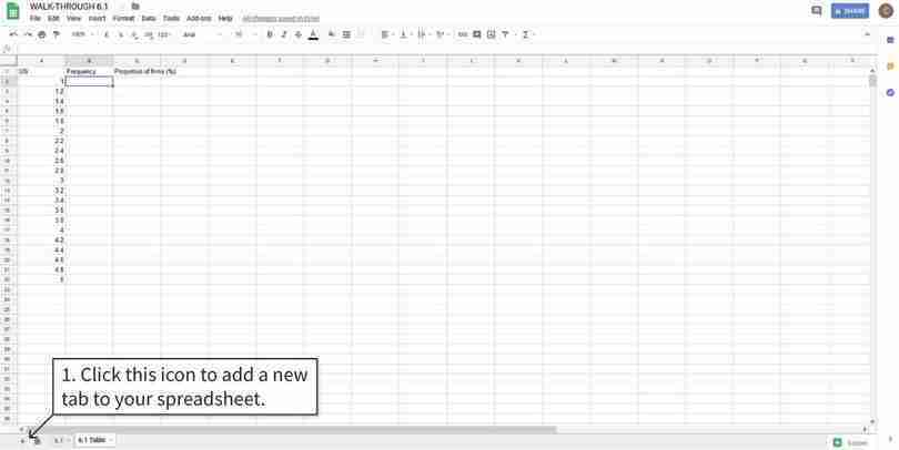
How to use Google Sheets’ IF function within another function.
Figure 6.4 How to use Google Sheets’ IF function within another function.
The data
In this example, we will make a frequency table for the US data in Columns A to C. It’s a good idea to put all the tables in a separate place from the data.
Figure 6.4a In this example, we will make a frequency table for the US data in Columns A to C. It’s a good idea to put all the tables in a separate place from the data.
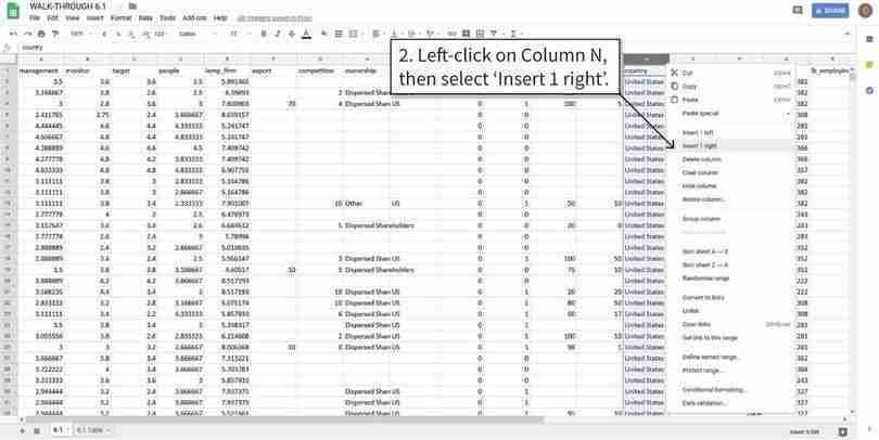
Add a new column to the original spreadsheet
We will create a new column that shows data for the US only, and blank cells for other countries.
Figure 6.4b We will create a new column that shows data for the US only, and blank cells for other countries.
Use the IF function to display relevant data values
The IF function will display the value in Column A if the data satisfies the condition we specified (Column N is the “United States”) and leave the cells blank if the condition is not satisfied.
Figure 6.4c The IF function will display the value in Column A if the data satisfies the condition we specified (Column N is the “United States”) and leave the cells blank if the condition is not satisfied.
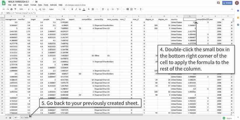
Apply the formula to the remaining cells
After step 5, the data is ready to put in a frequency table.
Figure 6.4d After step 5, the data is ready to put in a frequency table.
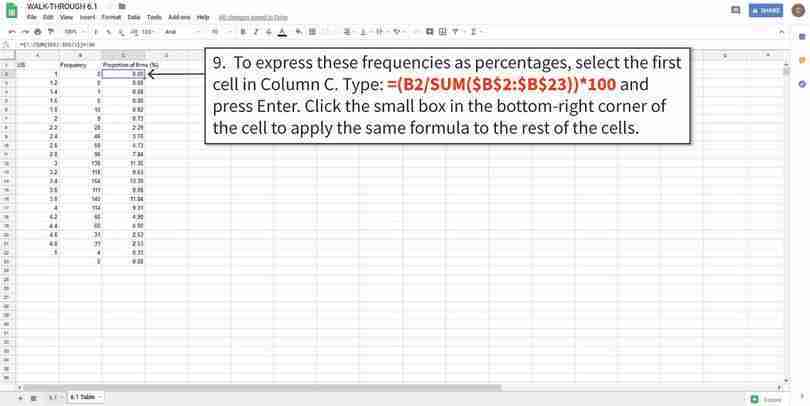
Using frequencies to calculate percentages
The $ symbol in the formula tells Google Sheets to keep these row or column numbers the same when copying the formula to other cells. We used it here because we are dividing the frequency value by the total number of observations (Cells B2 to B23).
Figure 6.4h The $ symbol in the formula tells Google Sheets to keep these row or column numbers the same when copying the formula to other cells. We used it here because we are dividing the frequency value by the total number of observations (Cells B2 to B23).
Google Sheets walk-through 6.2 Overlaying one column chart over another
The data
In this example, we use data for the US (Columns A to C) and Chile (Columns F to H), and plot a column chart of the percentages in Columns C and H (see the steps in walk-through 6.1 for how to calculate these).
Figure 6.5a In this example, we use data for the US (Columns A to C) and Chile (Columns F to H), and plot a column chart of the percentages in Columns C and H (see the steps in walk-through 6.1 for how to calculate these).
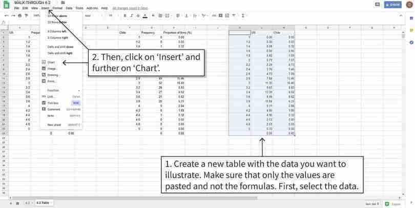
Plot a column chart
We will create a new table showing only the data we want to include in the chart (Columns C and H). Then we select this table and create a column chart.
Figure 6.5b We will create a new table showing only the data we want to include in the chart (Columns C and H). Then we select this table and create a column chart.
Change the appearance of the chart columns
You can change the shading and other visual aspects of the columns so that the distributions of both countries are clearly visible.
Figure 6.5e You can change the shading and other visual aspects of the columns so that the distributions of both countries are clearly visible.
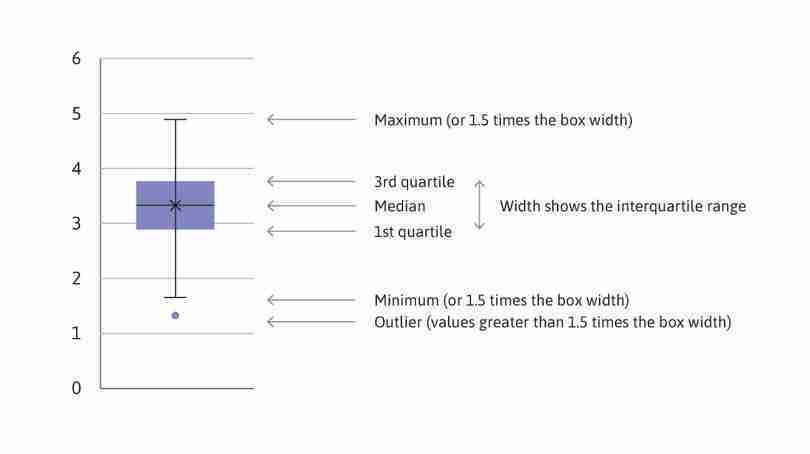
- box and whisker plot
- A graphic display of the range and quartiles of a distribution, where the first and third quartile form the ‘box’ and the maximum and minimum values form the ‘whiskers’.
Another way to visualize distributions is a box and whisker plot, which shows some parts of a distribution rather than the whole distribution. We can use box and whisker plots to compare particular aspects of distributions more easily than when looking at the entire distribution.
As shown in Figure 6.7, the ‘box’ consists of the first quartile (value corresponding to the bottom 25 per cent, or 25th percentile, of all values), the median, and the third quartile (75th percentile). The ‘whiskers’ are the minimum and maximum values. (In Google Sheets, the ‘whiskers’ may not be the actual maximum or minimum, since any values larger than 1.5 times the width of the box are considered outliers and are shown as separate points.)
Example of a box and whisker plot.
(Note: In Google Sheets, the mean value is sometimes denoted by X. In general, the median may not be in the centre of the box, and can differ greatly from the mean. Using the data shown in Figure 6.7 for a variable from the dataset, the mean and median are very similar.)
Figure 6.7
Example of a box and whisker plot.
(Note: In Google Sheets, the mean value is sometimes denoted by X. In general, the median may not be in the centre of the box, and can differ greatly from the mean. Using the data shown in Figure 6.7 for a variable from the dataset, the mean and median are very similar.)
- Using the same countries you chose in Question 3:
- Make a box and whisker plot for each country and the US, showing the distribution of management scores. You can either make a separate chart for each country or show all countries in the same plot. To check that your plots make sense, compare your box and whisker plots to the distributions from Question 3.
- Use your box and whisker plots to add to your comparisons from Question 3(b).
Google Sheets walk-through 6.3 Drawing box and whisker plots
How to create box and whisker plots.
Figure 6.8 How to create box and whisker plots.
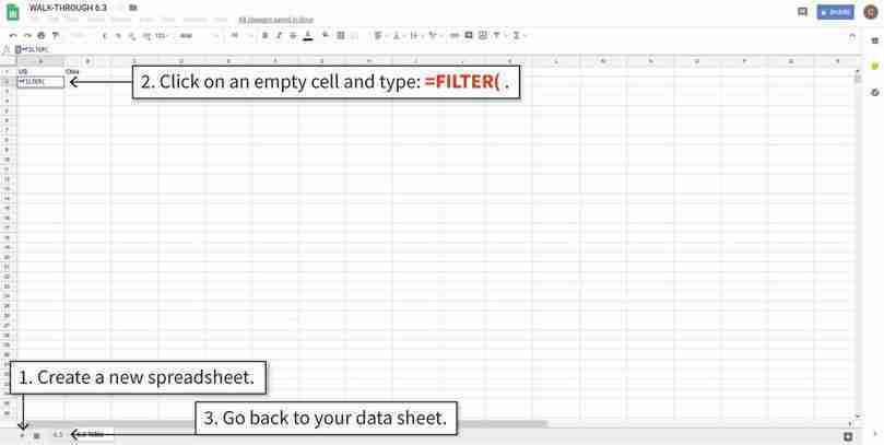
The data
In this example, we will use data for the US (Column A) and Chile (Column B). To create a box and whisker plot of more than one variable, each variable needs to be in a separate column. We will filter, then copy and paste the required data into a new tab in Google Sheets.
Figure 6.8a In this example, we will use data for the US (Column A) and Chile (Column B). To create a box and whisker plot of more than one variable, each variable needs to be in a separate column. We will filter, then copy and paste the required data into a new tab in Google Sheets.
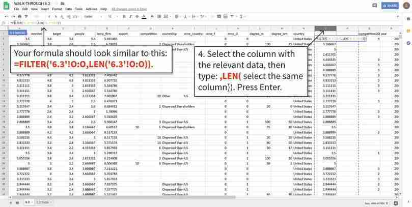
Filter the data
We previously used the IF function to create new columns (O and P) that only contain data for the US and Chile, respectively (walk-through 6.1 explains how to use the IF function). We can then use the FILTER function to select cells in those columns that contain values (i.e. are not empty).
Figure 6.8b We previously used the IF function to create new columns (O and P) that only contain data for the US and Chile, respectively (walk-through 6.1 explains how to use the IF function). We can then use the FILTER function to select cells in those columns that contain values (i.e. are not empty).
Calculate the values needed for the box and whisker plots
To make a box and whisker plot, we need to make a summary table showing the minimum and maximum values, as well as the 1st and 3rd quartiles. The minimum and maximum values are calculated using the MIN and MAX functions (see walk-through 2.5). Note that your table should look like the one shown, with countries as the row variable.
Figure 6.8d To make a box and whisker plot, we need to make a summary table showing the minimum and maximum values, as well as the 1st and 3rd quartiles. The minimum and maximum values are calculated using the MIN and MAX functions (see walk-through 2.5). Note that your table should look like the one shown, with countries as the row variable.
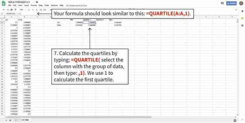
Calculate the values needed for the box and whisker plots
The QUARTILE function finds the value corresponding to the specified quartile.
Figure 6.8e The QUARTILE function finds the value corresponding to the specified quartile.
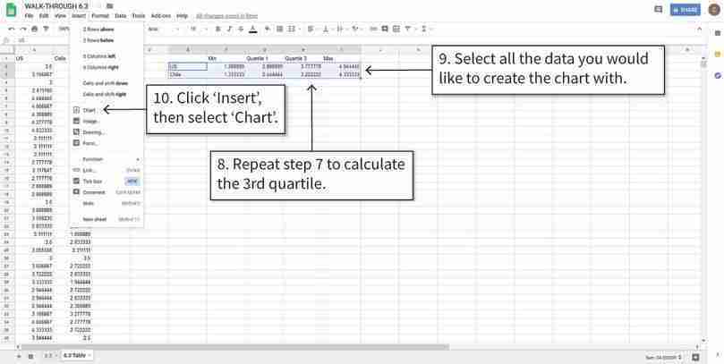
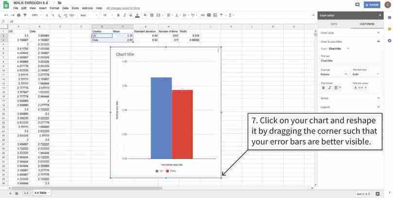
Create box and whisker plots
We can now use the summary table to make the box and whisker plot.
Figure 6.8f We can now use the summary table to make the box and whisker plot.
From the manufacturing data, firms in the US seem to be managed better (on average) than firms in other countries. To investigate whether this is the case in other sectors, we will use data gathered on hospitals and schools.
- Using the data for hospitals and schools (AMP_graph_public.csv):
- Create a table for hospitals and schools, showing the mean management score and criteria score (monitoring, targets, incentives) for each country, as in Figure 6.2a. (Hint: You may find it helpful to use Google Sheets’ PivotTable option—see Google Sheets walk-through 3.1.)
- Make separate bar charts for hospitals and schools showing the mean overall management score for each country, sorted from highest to lowest, as in Figure 6.1. Are the country rankings similar to those in manufacturing?
- Using your average criteria scores from Question 5(a), suggest some explanations for the observed rankings in either hospitals or schools. (You may find it helpful to research healthcare or educational policies and reforms in those countries to support your explanations.)
Part 6.2 Do management practices differ between countries?
Learning objectives for this part
- calculate conditional means for one or more conditions, and compare them on a bar chart
- construct confidence intervals and use them to assess differences between groups.
Using the management survey data collected by Bloom et al. (2012), we can compare average management scores across countries and industries. When we find differences between groups in the survey, we are interested in what that tells us about the true differences in management practices between the countries.
- confidence interval
- A range of values centred around the sample mean value, with a corresponding percentage (usually 90%, 95%, or 99%). When we use a sample to calculate a 95% confidence interval, there is a probability of 0.95 that we will get an interval containing the true value of interest.
In Empirical Project 2, we used p-values to assess differences between groups. A p-value tells us how unusual it would be to observe the differences between groups that we did, assuming our hypothesis is correct (and additional model assumptions about the data hold). If the p-value is small, we might then conclude that the data is not compatible with our assumptions (e.g. that the two groups were drawn from populations with the same mean), and that there is a real difference between the underlying populations. Now we will use another method that helps us to allow for random variation when we interpret data, called a confidence interval.
When we work with data we usually have only a small sample from the entire population of interest. For example, the World Management Survey collects information from a selection of all the firms in a particular country. If we calculate the average management score for the sample, we have an estimate of the average management score across all firms in the country (the ‘true value’) but it may not be a very accurate estimate—especially if the sample is small and management scores vary a lot between firms.
A 95% confidence interval is a range of possible values within which the true value might lie. It is estimated from the mean and standard deviation of the data. As in the process of calculating p-values, we use a standard method that gives a good estimate provided that certain statistical conditions are satisfied. We cannot be certain that the true value lies in the range; we might have the bad luck to pick an atypical sample, in which case our estimate of the confidence interval would be atypical too. But we can say that when we use this method, there is a 95% probability that we will find an interval that contains the true value. One way to interpret this is to say that if we were able to repeat the process of sampling and calculating confidence intervals many times, roughly 95% of these confidence intervals would contain the true value.
As the name suggests, confidence intervals tell us how much confidence we can place in our estimates, or in other words, how precisely the sample mean is estimated. The confidence interval gives us a margin of error for our estimate of the true value. If the data varies a lot, the 95% confidence interval may be quite wide. If we have plenty of data, and the standard deviation is low, the estimate will be more precise and the 95% interval will be narrow.
Rule of thumb for comparing means
When comparing two distributions, if neither mean is in the 95% confidence interval for the other mean, the p-value for the difference in means is less than 5%.
This rule of thumb is handy when looking at charts. If two 95% confidence intervals don’t overlap, we can say immediately that the observed difference between the means for the two groups is unlikely to have arisen by chance alone (given that our hypothesis that there were no differences in the populations from which these groups were drawn and that our other assumptions about the data, such as random sampling, are correct). For a more definite conclusion, we can calculate the actual p-value (see Empirical Project 2) or construct a confidence interval for the difference in means. (This method involves more mathematics so we will discuss that in Empirical Project 8.)
It is possible to calculate a confidence interval for any probability: however wide the 95% confidence interval, a 99% confidence interval would be wider, and an 80% one would be narrower. 95% is a common choice: it gives us quite a high degree of confidence, and to go higher tends to lead to very wide intervals. We will use 95% confidence intervals throughout this project.
To sum up: A confidence interval is a range of values centred around the sample mean value, with a corresponding percentage (usually 90%, 95%, or 99%). When we use a sample to calculate a 95% confidence interval, there is a probability of 0.95 that we will get an interval containing the true value of interest.
We will now build on the results from the Bloom et al. (2012) paper by using 95% confidence intervals to make comparisons between the mean overall management score for different countries and types of firms. The confidence interval for the population mean (mean management score for that country) is centred around the sample mean. To determine the width of the interval, we use the standard deviation and number of firms.
- First look at manufacturing firms in different countries. Using the manufacturing data (AMP_graph_manufacturing.csv) for three countries of your choice and for the US:
- Create a summary table for the overall management score as shown in Figure 6.9, with one row for each country. (Hint: Use Google Sheets’ Pivot Table option.)
| Country | Mean | Standard deviation | Number of firms |
|---|---|---|---|
Summary table for manufacturing firms.
Figure 6.9 Summary table for manufacturing firms.
- Use Google Sheets’ CONFIDENCE.T function to determine the width of the 95% confidence interval (this is the distance from the mean to one end of the interval). See Google Sheets walk-through 6.4 for help on how to do this. You should get a different number for each country.
- Plot a column chart showing the mean management score and add the confidence intervals to your chart.
- Use the width of the confidence intervals to describe how precisely each mean was estimated.
- Using your chart from Question 1(c) and this rule of thumb, what can you say about the differences between the US management score, and the scores of other countries? How would your results change if you use a different specified probability (for example, 99%)?
Google Sheets walk-through 6.4 Creating confidence intervals and adding them to a chart
Calculate the width of the confidence interval
In this example we will use data for the US and Chile (shown in Columns A and B). To calculate the width of the 95% confidence interval (distance from the mean to one end of the interval), we first need to calculate the standard deviation and number of observations for each country. The 0.05 in the CONFIDENCE function is 1 − 0.95 (our specified probability).
Figure 6.10a In this example we will use data for the US and Chile (shown in Columns A and B). To calculate the width of the 95% confidence interval (distance from the mean to one end of the interval), we first need to calculate the standard deviation and number of observations for each country. The 0.05 in the CONFIDENCE function is 1 − 0.95 (our specified probability).
Add error bars to the chart
The ‘error bars’ option in Google Sheets plots confidence intervals. We will use the calculated width values from step 1 to determine the size of the error bars.
Figure 6.10d The ‘error bars’ option in Google Sheets plots confidence intervals. We will use the calculated width values from step 1 to determine the size of the error bars.
Resize the column chart
If the confidence intervals are too narrow to be seen clearly, you can make the chart larger.
Figure 6.10f If the confidence intervals are too narrow to be seen clearly, you can make the chart larger.
- Using the data for hospitals or schools (AMP_graph_public.csv), using all available countries:
- Create a summary table like Figure 6.9 for the overall management score, with one row for each country. (Hint: Use Google Sheets’ PivotTable option.) Add a column containing the widths of the confidence intervals for the country means.
- Plot a column chart, showing the confidence intervals. Compare the management practices in the US with those in other countries. Are there any countries for which you can be confident that management practices are either better, or worse, on average than in the US? Explain your answer.
- Look at the width of your confidence intervals and the corresponding standard deviation and number of observations for each one. Explain whether or not the relationship between them is what you would expect.
Part 6.3 What factors affect the quality of management?
Learning objectives for this part
- calculate conditional means for one or more conditions, and compare them on a bar chart
- construct confidence intervals and use them to assess differences between groups
- evaluate the usefulness and limitations of survey data for determining causality.
Besides documenting and comparing management practices across industries and countries, another purpose of the World Management Survey was to investigate factors that affect management quality.
One possible factor affecting differences in management is firm ownership. To look at the data for this factor in the healthcare and education sectors, we will focus on broad groups (public vs privately-owned firms), and for manufacturing firms we will focus on different kinds of private ownership.
- Using the data for hospitals and schools (AMP_graph_public.csv):
- Create a pivot table for hospitals and schools, showing the average management score, standard deviation (StdDev), and number of observations, with ‘country’ as the row variable, and ‘ownership’ (public or private) and ‘ind’ as the column variables.
- Use your pivot table from Question 1(a) to calculate the confidence interval widths for management in public and private hospitals. Then do the same for schools.
- Plot a bar chart (one for hospitals and another for schools) showing the means from Question 1(a) and the confidence intervals from Question 1(b). Describe the differences between public and private firms within countries and compare management scores for the same firm type across countries. (For example, is one type of firm generally better managed than the other? Are there similar patterns for hospitals and schools? If you have done Question 5 in Part 6.1, you may want to discuss whether the rankings change after conditioning on ownership type.
Besides ownership type, management practices may vary depending on firm size, though it is difficult to predict what the relationship between these variables might be. Larger firms have more employees and could be more difficult to manage well, but may also attract more experienced managers. We will look at the conditional means for manufacturing firms, depending on whether they are above or below the median number of employees (calculated from the data), and see if there is a clear relationship.
- Using the data for manufacturing firms (AMP_graph_manufacturing.csv):
- In a new column in the original spreadsheet, use Google Sheets’ IF function (see Google Sheets walk-through 6.1) to create a variable that equals ‘Smaller’ if a firm has less than the median number of employees (330) and ‘Larger’ otherwise. In natural log terms, ‘Smaller’ corresponds to log employment of less than 5.80.
- For two countries of your choice and the US, create a pivot table showing the mean overall management score, standard deviation, and number of observations, with ‘country’ and ‘ownership’ as the row variables, and firm size (from Question 2(a)) as the column variable. (Note: When there is only one observation in a group, there is no standard deviation.)
- Use your pivot table from Question 2(b) to calculate the confidence interval width for each firm size and ownership type.
- Plot a column chart for each country, showing the means from Question 2(b) and the confidence intervals from Question 2(c). Describe any patterns you observe across ownership types and firm size in each country.
Google Sheets walk-through 6.5 Using the IF function
How to use the IF function.
Figure 6.11 How to use the IF function.
The data
This is what the manufacturing data looks like. We will create a new variable in Column T, according to the log employment values in Column E. We have labelled our new column ‘size’ (Cell T1).
Figure 6.11a This is what the manufacturing data looks like. We will create a new variable in Column T, according to the log employment values in Column E. We have labelled our new column ‘size’ (Cell T1).
Create a new variable
After completing step 2, you will have a variable for firm size. We used the IF function to fill the cells in Column T with the word ‘Smaller’ if log employment is smaller than 5.8, otherwise the cell is filled with the word ‘Larger’.
Figure 6.11b After completing step 2, you will have a variable for firm size. We used the IF function to fill the cells in Column T with the word ‘Smaller’ if log employment is smaller than 5.8, otherwise the cell is filled with the word ‘Larger’.
So far we have looked at associations between firm characteristics and management practices, but have not made any causal statements. We will now discuss the difficulties with making causal statements using this data and examine how we might determine the direction of causation.
- For each of the following variables, explain how it could affect management practices, and then explain how management practices could affect it:
- education level of managers (percentage with a college degree)
- number of competitors
- firm size (number of employees).
- One way to establish the direction of causation is through a randomized field experiment. Read the discussion on pages 22–23 of the Bloom et al. paper (the section ‘Experimental Evidence on Management Quality and Firm Performance’) about one such experiment that was conducted in Indian textile factories.
- Briefly describe the idea behind a randomized field experiment, and explain, with reference to the results of the experiment in India, whether we can use it to determine the direction of causation between management practice and firm performance. The paper ‘Does Management Matter? Evidence from India’ provides more details about the experiment (pages 9–10 are particularly useful).
- Figure 12 in the paper shows productivity in treatment and control firms over time, with 95% confidence intervals. Use the information in the chart to describe the effect of the treatment on firm productivity.
