Empirical Project 2 Working in R
Download the code
To download the code chunks used in this project, right-click on the download link and select ‘Save Link As…’. You’ll need to save the code download to your working directory, and open it in RStudio.
Don’t forget to also download the data into your working directory by following the steps in this project.
Getting started in R
For this project you will need the following packages:
-
tidyverse, to help with data manipulation -
readxl, to import an Excel spreadsheet.
If you need to install either of these packages, run the following code:
install.packages(c("readxl", "tidyverse"))
You can import the libraries now, or when they are used in the R walk-throughs below.
library(readxl)
library(tidyverse)
Part 2.1 Collecting data by playing a public goods game
Learning objectives for this part
- collect data from an experiment and enter it into a spreadsheet
- use summary measures, for example, mean and standard deviation, and line charts to describe and compare data.
Note
You can still do Parts 2.2 and 2.3 without completing this part of the project.
Before taking a closer look at the experimental data, you will play a public goods game like the one in the introduction with your classmates to learn how experimental data can be collected. If your instructor has not set up a game, follow the instructions below to set up your own game.
Instructions How to set up the public goods game
Form a group of at least four people. (You may also want to set a maximum of 8 or 10 players to make the game easier to play). Choose one person to be the game administrator. The administrator will monitor the game, while the other people play the game.
Administrator
- Create the game: Go to the ‘Economics Games’ website, scroll down to the bottom of the page, and click ‘Create a Multiplayer Game and Get Logins’. Then click ‘Externalities and public goods’. Under the heading ‘Voluntary contribution to a public good’, click ‘Choose this Game’. Enter in the number of people playing the game, and select ‘1’ for the number of universes. Then click ‘Get Logins’. A pop-up will appear, showing the login IDs and passwords for the players and for the administrator.
- Start the game: Give each player a different login ID. The game should be played anonymously, so make sure that players do not know the login IDs of other players. You are now ready to start the first round of the game. There are ten rounds in total.
- Confirm that all the rounds are complete: On the top right corner of the webpage, click ‘Login’, enter your login ID and password, and then click the green ‘Login’ button. You will be taken to the game administration page, which will show the average contribution in each round, and the results of the round just played. Wait until all the players have finished playing ten rounds before refreshing this page.
- Collect the game results: Once the players have finished playing ten rounds, refresh this page. The table at the top of the page will now show the average contribution (in euros) for each of the ten rounds played. Select the whole table, then copy and paste it into a new worksheet in Excel.
Players
- Login: Once the administrator has created the game, go to the ‘Economics Games’ website. On the top right corner, click ‘Login’, enter the login ID and password that your administrator has given you, then click the green ‘Login’ button. You will be taken to the public goods game that your administrator has set up.
- Play the first round of the game: Read the instructions at top of the page carefully before starting the game. In each round, you must decide how much to contribute to the public good. Enter your choice for each universe (group of players) that you are a part of (if the same players are in two universes, then make the same contribution in both), then click ‘Validate’.
- View the results of the first round: You will then be shown the results of the first round, including how much each player (including yourself) contributed, the payoffs, and the profits. Click ‘Next’ to start the next round.
- Complete all the rounds of the game: Repeat steps 2 and 3 until you have played ten rounds in total, then collect the results of the game from your administrator.
Use the results of the game you have played to answer the following questions.
- Make a line chart with average contribution as the vertical axis variable, and period (from 1 to 10) on the horizontal axis. Describe how average contributions have changed over the course of the game.
R walk-through 2.1 Plotting a line chart with multiple variables
Use the data from your own experiment to answer Question 1. As an example, we will use the data for the first three cities of the dataset that will be introduced in Part 2.2.
Here you can see commands to R which are spread across two lines. You can spread a command across multiple lines, but you must adhere to the following two rules for this to work. First, the line break should come inside a set of parenthesis (i.e. between
(and)or straight after the assignment operator (). Second, the line break must not be inside a string (whatever is inside quotes) or in the middle of a word or number.Period seq(1, 10) Copenhagen c(14.1, 14.1, 13.7, 12.9, 12.3, 11.7, 10.8, 10.6, 9.8, 5.3) Dniprop c(11.0, 12.6, 12.1, 11.2, 11.3, 10.5, 9.5, 10.3, 9.0, 8.7) Minsk c(12.8, 12.3, 12.6, 12.3, 11.8, 9.9, 9.9, 8.4, 8.3, 6.9) # Put the data into a data frame data_ex data.frame(Period, Copenhagen, Dniprop, Minsk) plot(data_ex$Period, data_ex$Copenhagen, ylim = c(4, 16), ylab = "Average contribution", type = "l", col = "blue", lwd = 2) # Select colour and line width lines(data_ex$Dniprop, col = "red", lwd = 2) lines(data_ex$Minsk, col = "green", lwd = 2) title("Average contribution to public goods game: without punishment") legend("bottomleft", lwd = 2, lty = 1, cex = 1.2, legend = c("Copenhagen", "Dniprop", "Minsk"), col = c("blue", "red", "green"))
- Compare your line chart with Figure 3 of Herrmann et al. (2008).1 Comment on any similarities or differences between the results (for example, the amount contributed at the start and end, or the change in average contributions over the course of the game).
- Can you think of any reasons why your results are similar to (or different from) those in Figure 3? You may find it helpful to read the ‘Experiments’ section of the Herrmann et al. (2008) study for a more detailed description of how the experiments were conducted.
Part 2.2 Describing the data
Learning objectives for this part
- use summary measures, for example, mean and standard deviation, and column charts to describe and compare data.
Note
You can still do Parts 2.2 and 2.3 without completing this part of the project.
We will now use the data used in Figures 2A and 3 of Herrmann et al. (2008), and evaluate the effect of the punishment option on average contributions. Rather than compare two charts showing all of the data from each experiment, as the authors of the study did, we will use summary measures to compare the data, and show the data from both experiments (with and without punishment) on the same chart.
First, download and save the data. The spreadsheet contains two tables:
- The first table shows average contributions in a public goods game without punishment (Figure 3).
- The second table shows average contributions in a public goods game with punishment (Figure 2A).
You can see that in each period (row), the average contribution varies across countries, in other words, there is a distribution of average contributions in each period.
R walk-through 2.2 Importing the datafile into R
Both the tables you need are in a single Excel worksheet. Note down the cell ranges of each table, in this case
A2:Q12for the without punishment data andA16:Q26for the punishment data. We will now use this range information to import the data into two dataframes (data_Nanddata_Prespectively).
- mean
- A summary statistic for a set of observations, calculated by adding all values in the set and dividing by the number of observations.
- variance
- A measure of dispersion in a frequency distribution, equal to the mean of the squares of the deviations from the arithmetic mean of the distribution. The variance is used to indicate how ‘spread out’ the data is. A higher variance means that the data is more spread out. Example: The set of numbers 1, 1, 1 has zero variance (no variation), while the set of numbers 1, 1, 999 has a high variance of 221,334 (large spread).
# This package provides useful functionality later.
library(tidyverse)
library(readxl)

# Set your working directory to the correct folder.
# Insert your file path for 'YOURFILEPATH'.
setwd("YOURFILEPATH")

data_N  read_excel("Public-goods-experimental-data.xlsx",
  range = "A2:Q12")
data_P  read_excel("Public-goods-experimental-data.xlsx",
  range = "A16:Q26")
Look at the data either by opening the dataframes from the Environment window or by typing
data_Nordata_Pinto the Console.You can see that in each period (row), the average contribution varies across countries; in other words, there is a distribution of average contributions in each period.
The mean and variance are two ways to summarize distributions. We will now use these measures, along with other measures (range and standard deviation) to summarize and compare the distribution of contributions in both experiments.
- Using the data for Figures 2A and 3 of Herrmann et al. (2008):
- Calculate the mean contribution in each period (row) separately for both experiments.
- Plot a line chart of mean contribution on the vertical axis and time period (from 1 to 10) on the horizontal axis (with a separate line for each experiment). Make sure the lines in the legend are clearly labelled according to the experiment (with punishment or without punishment).
- Describe any differences and similarities you see in the mean contribution over time in both experiments.
R walk-through 2.3 Calculating the mean using a loop or the
applyfunctionCalculate mean contribution
We calculate the mean using two different methods, to illustrate that there are usually many ways of achieving the same thing. We apply the first method on
data_N, which uses a loop to calculate the average separately over each column except the first (data_P[row,2:17]ordata_P[row,-1]). We use the second method (theapplyfunction) ondata_P.# Use a loop for data_N data_N$meanC 0 for (row in 1:nrow(data_N)) { data_N$meanC[row] rowMeans(data_N[row, 2:17]) } # Use the apply function for data_P data_P$meanC apply(data_P[, 2:17], 1, mean)As the name suggests, the
applyfunction applies another function (themeanfunction in this case) to all rows or columns in a dataframe. The second input,1, applies the specified function to all rows indata_P[,2:17]. Typing2would have calculated column means instead (check and see for yourself). Type?applyin your console for more details, or see R walk-through 2.5 for further practice.Plot the mean contribution
Now we will produce a line chart showing the mean contributions.
plot(data_N$Period, data_N$meanC, type = "l", col = "blue", lwd = 2, xlab = "Round", ylim = c(4, 14), ylab = "Average contribution") lines(data_P$meanC, col = "red", lwd = 2) title("Average contribution to public goods game") legend("bottomleft", lty = 1, cex = 1.2, lwd = 2, legend = c("Without punishment", "With punishment"), col = c("blue", "red"))The difference between experiments is stark, as the contributions increase and then stabilize at around $13 when there is punishment, but decrease consistently from around $11 to $4 across the rounds when there is no punishment.
- Instead of looking at all periods, we can focus on contributions in the first and last period. Plot a column chart showing the mean contribution in the first and last period for both experiments. Your chart should look like Figure 2.3.
R walk-through 2.4 Drawing a column chart to compare two groups
To make a column chart, we will use the
barplotfunction. We first extract the four data points we need (Periods 1 and 10, with and without punishment) and place them into a matrix, which we then input into thebarplotfunction.temp_d c(data_N$meanC[1], data_N$meanC[10], data_P$meanC[1], data_P$meanC[10]) temp matrix(temp_d, nrow = 2, ncol = 2, byrow = TRUE) temp## [,1] [,2] ## [1,] 10.57831 4.383769 ## [2,] 10.63876 12.869879barplot(temp, main = "Mean contributions in a public goods game", ylab = "Contribution", beside = TRUE, col = c("Blue", "Red"), names.arg = c("Round 1", "Round 10")) legend("bottomleft", pch = 1, col = c("Blue", "Red"), c("Without punishment", "With punishment"))Tip
Experimenting with these charts will help you to learn how to use R. The details of how to specify the column chart may look complicated, but you can see from Figure 2.3 what the options
main,ylab,colandnames.argdo. To figure out what thebesideoption does, try switching the option fromTRUEtoFALSEand see what happens.
- variance
- A measure of dispersion in a frequency distribution, equal to the mean of the squares of the deviations from the arithmetic mean of the distribution. The variance is used to indicate how ‘spread out’ the data is. A higher variance means that the data is more spread out. Example: The set of numbers 1, 1, 1 has zero variance (no variation), while the set of numbers 1, 1, 999 has a high variance of 221,334 (large spread).
The mean is one useful measure of the ‘middle’ of a distribution, but is not a complete description of what our data looks like. We also need to know how ‘spread out’ the data is in order to get a clearer picture and make comparisons between distributions. The variance is one way to measure spread: the higher the variance, the more spread out the data is.
- standard deviation
- A measure of dispersion in a frequency distribution, equal to the square root of the variance. The standard deviation has a similar interpretation to the variance. A larger standard deviation means that the data is more spread out. Example: The set of numbers 1, 1, 1 has a standard deviation of zero (no variation or spread), while the set of numbers 1, 1, 999 has a standard deviation of 46.7 (large spread).
A similar measure is standard deviation, which is the square root of the variance and is commonly used because there is a handy rule of thumb for large datasets, which is that most of the data (95% if there are many observations) will be less than two standard deviations away from the mean.
- Using the data for Figures 2A and 3 of Herrmann et al. (2008):
- Calculate the standard deviation for Periods 1 and 10 separately, for both experiments. Does the rule of thumb apply? (In other words, are most values within two standard deviations of the mean?)
- As shown in Figure 2.3, the mean contribution for both experiments was 10.6 in Period 1. With reference to your standard deviation calculations, explain whether this means that the two sets of data are the same.
R walk-through 2.5 Calculating and understanding the standard deviation
In order to calculate these standard deviations and variances, we will use the
applyfunction, which we introduced in R walk-through 2.3. As we saw,applyis a command asking R to apply the same function to all the rows or columns of a dataframe, and the basic structure is as follows:apply(dataframe, dimension (rows or columns), the function to apply). So to calculate the variances, we use the following command:data_N$varC apply(data_N[, 2:17], 1, var)Here we take
data_N[, 2:17]and apply thevarfunction to each row (recall that the second input1does this;2would indicate columns). Note that as in R walk-through 2.3, we exclude the first column from the calculation, as that contains the period numbers. The result is saved as a new variable calledvarC.We then apply the same principle to the standard deviation calculation and the
data_Pdataframe.data_N$sdC apply(data_N[, 2:17], 1, sd) data_P$varC apply(data_P[, 2:17], 1, var) data_P$sdC apply(data_P[, 2:17], 1, sd)To determine whether 95% of the observations fall within two standard deviations of the mean, we can use a line chart. As we have 16 countries in every period, we would expect about one observation (0.05 × 16 = 0.8) to fall outside this interval.
citylist  names(data_N[2:17])

plot(data_N$Period, data_N$meanC, type = "l",
  col = "blue", lwd = 2, xlab = "Round",
  ylim = c(0, 20), ylab = "Average contribution")

# mean + 2 sd
lines(data_N$meanC + 2 * data_N$sdC, col = "red", lwd = 2)

# mean – 2 sd
lines(data_N$meanC - 2 * data_N$sdC, col = "red", lwd = 2)

for(i in citylist) {
  points(data_N[[1]], data_N[[i]])
}

title("Contribution to public goods game without punishment")

legend("bottomleft", legend = c("Mean", "+/- 2 sd"),
  col = c("blue", "red"), lwd = 2, lty = 1, cex = 1.2)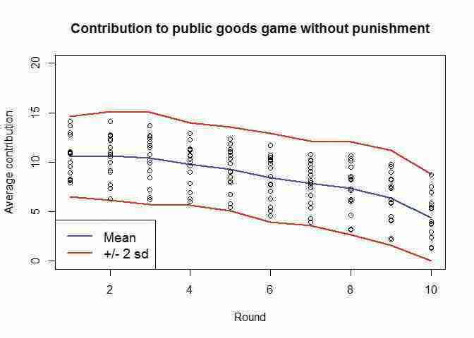
Contribution to public goods game without punishment.
Figure 2.4 Contribution to public goods game without punishment.
None of the observations fall outside the mean ± two standard deviations interval for the public goods game without punishment. Let’s see the equivalent chart for the version with punishment.
citylist  names(data_N[2:17])

plot(data_P$Period, data_P$meanC, type = "l",
  col = "blue", xlab = "Round",
  ylim = c(0, 22), ylab = "Average contribution")

# mean + 2 sd
lines(data_P$meanC + 2 * data_P$sdC, col = "red")

# mean – 2 sd
lines(data_P$meanC - 2 * data_P$sdC, col = "red")

for(i in citylist) {
  points(data_P[[1]], data_P[[i]])
}

title("Contribution to public goods game with punishment")

legend("bottomleft", legend = c("Mean", "+/- 2 sd"),
  col = c("blue", "red"), lty = 1, cex = 1.2)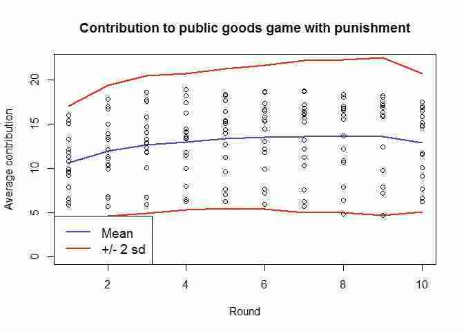
Contribution to public goods game with punishment.
Figure 2.5 Contribution to public goods game with punishment.
Here it looks as if we only have one observation outside the interval (in Period 8). In that aspect the two experiments look similar. However, from comparing these two charts, we see that the game with punishment displays a greater variation of responses than the game without punishment. In other words, there is a larger standard deviation and variance for the observations coming from the game with punishment.
- range
- The interval formed by the smallest (minimum) and the largest (maximum) value of a particular variable. The range shows the two most extreme values in the distribution, and can be used to check whether there are any outliers in the data. (Outliers are a few observations in the data that are very different from the rest of the observations.)
Another measure of spread is the range, which is the interval formed by the smallest (minimum) and the largest (maximum) values of a particular variable. For example, we might say that the number of periods in the public goods experiment ranges from 1 to 10. Once we know the most extreme values in our dataset, we have a better picture of what our data looks like.
- Calculate the maximum and minimum value for Periods 1 and 10 separately, for both experiments.
R walk-through 2.6 Finding the minimum, maximum, and range of a variable
To calculate the range for both experiments and for all periods, we will use the
applyfunction again. You might think it makes sense to use the following command:data_P$rangeC apply(data_P[, 2:17], 1, range)Unfortunately, when you execute this command you are likely to get an error message that reads something like this:
Error in $.data.frame(*tmp*, "rangeC", value = c(5.81818199157715, : replacement has 2 rows, data has 10.Let’s investigate why we get this error message, by picking one data row and calculating the range.
range(data_N[1, 2:17])## [1] 7.958333 14.102941You can see that we get two values - the maximum and the minimum. However, we need the range as a single value (maximum–minimum). The error arises because we tried to save two variables as a single variable. So we first need to calculate the maximum and minimum for our whole dataset (using the
applyfunction) and save this in a new variable calledtemp.temp apply(data_N[, 2:17], 1, range) temp## [,1] [,2] [,3] [,4] [,5] [,6] [,7] ## [1,] 7.958333 6.272727 6.25000 5.97500 5.42500 4.546875 3.921875 ## [2,] 14.102941 14.132353 13.72059 12.89706 12.33824 11.676471 10.779412 ## [,8] [,9] [,10] ## [1,] 3.15625 2.171875 1.300000 ## [2,] 10.63235 9.764706 8.681818Now we use the difference between the respective maximums (Column 2) and minimums (Column 1) to define our new range variable
rangeC.data_N$rangeC temp[2, ] - temp[1, ]And now we do the same for
data_P:temp apply(data_P[,2:17], 1, range) data_P$rangeC temp[2, ] - temp[1, ]Let’s create a chart of the ranges for both experiments for all periods in order to compare them.
plot(data_N$Period, data_N$rangeC, type = "l",
  col = "blue", lwd = 2, xlab = "Round",
  ylim = c(4, 14), ylab = "Range of contributions")

lines(data_P$rangeC, col = "red", lwd = 2)

title("Range of contributions to public goods game")

legend("bottomright", lwd = 2, lty = 1, cex = 1.2,
  legend = c("Without punishment", "With punishment"),
  col = c("blue", "red"), )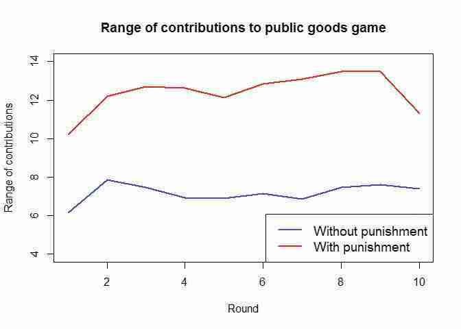
Range of contributions to public goods game.
Figure 2.6 Range of contributions to public goods game.
This chart confirms what we found in R walk-through 2.5, which is that there is a greater spread (variation) of contributions in the game with punishment.
- A concise way to describe the data is in a summary table. With just four numbers (mean, standard deviation, minimum value, maximum value), we can get a general idea of what the data looks like.
- Create a table of summary statistics that displays mean, variance, standard deviation, minimum, maximum and range for Periods 1 and 10 and for both experiments.
- Comment on any similarities and differences in the distributions, both across time and across experiments.
R walk-through 2.7 Creating a table of summary statistics
We have already done most of the work for creating this summary table in R walk-through 2.6. Since we also want to display the minimum and maximum values, we should add these to the dataframes
data_Nanddata_P.data_N$minC apply(data_N[, 2:17], 1, min) data_N$maxC apply(data_N[, 2:17], 1, max) data_P$minC apply(data_P[, 2:17], 1, min) data_P$maxC apply(data_P[, 2:17], 1, max)Now we display the summary statistics in a table. We enclose our command in the
roundfunction, which reduces the number of digits displayed after the decimal point (2 in our case) and makes the table easier to read.print("Public goods game without punishment")## [1] "Public goods game without punishment"# We want to see Rows 1 and 10 and Column 1 (which contains the period number) as well as Columns 18 to 23 (which contain the statistics). round(data_N[c(1, 10), c(1, 18:23)], digits = 2)## # A tibble: 2 x 7 ## Period meanC varC sdC rangeC minC maxC #### 1 1 10.58 4.08 2.02 6.14 7.96 14.10 ## 2 10 4.38 4.78 2.19 7.38 1.30 8.68 We repeat this command for the version with punishment.
# Show two digits
options(signif = 2)
print("Public goods game with punishment")
## [1] "Public goods game with punishment"round(data_P[c(1, 10), c(1, 18:23)], digits = 2)## # A tibble: 2 x 7 ## Period meanC varC sdC rangeC minC maxC #### 1 1 10.64 10.29 3.21 10.20 5.82 16.02 ## 2 10 12.87 15.19 3.90 11.31 6.20 17.51
Part 2.3 Did changing the rules of the game affect behaviour?
Learning objectives for this part
- calculate and interpret the p-value
- evaluate the usefulness of experiments for determining causality, and the limitations of these experiments.
The punishment option was introduced into the public goods game in order to see whether it could help sustain contributions, compared to the game without a punishment option. We will now use a calculation called a p-value to compare the results from both experiments more formally.
By comparing the results in Period 10 of both experiments, we can see that the mean contribution in the experiment with punishment is 8.5 units higher than in the experiment without punishment (see Figure 2.6). Is it more likely that this behaviour is due to chance, or is it more likely to be due to the difference in experimental conditions?
- You can conduct another experiment to understand why we might see differences in behaviour that are due to chance.
- First, flip a coin six times, using one hand only, and record the results (for example, Heads, Heads, Tails, etc.). Then, using the same hand, flip a coin six times and record the results again.
- Compare the outcomes from Question 1(a). Did you get the same number of heads in both cases? Even if you did, was the sequence of the outcomes (for example, Heads, Tails, Tails …) the same in both cases?
The important point to note is that even when we conduct experiments under the same controlled conditions, due to an element of randomness, we may not observe the exact same behaviour each time we do the experiment.
Randomness arises because the statistical analysis is conducted on a sample of data (for example, a small group of people from the entire population), and the sample we observe is only one of many possible samples. Whatever differences we calculate between two samples would almost certainly change if we had observed another pair of samples. Importantly, economists aren’t really interested in whether two samples are actually different, but rather whether the underlying populations, from which the samples were drawn, differ in the characteristics we are interested in (for example, age, income, contributions to the public good). And this is the challenge faced by the empirical economist.
When we are interested in whether a treatment works — in this case, whether having the punishment option makes a difference in how much people contribute to the public good — we want a way to check whether any observed differences could just be due to sample variation.
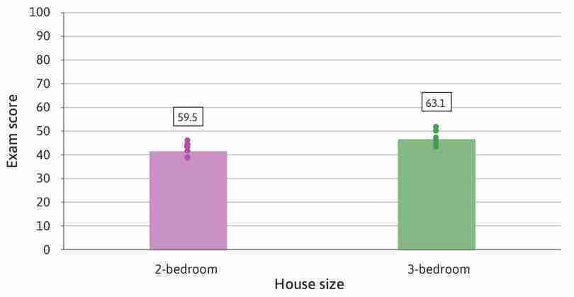
The size of the difference alone cannot tell us whether it might just be due to chance. Even if the observed difference seems large, it could be small relative to how much the data vary. Figures 2.7 and 2.8 show the mean exam score of two groups of high school students and the size of house in which they live (represented by the height of the columns, and reported in the boxes above the columns), with the dots representing the underlying data. Figure 2.7 shows a relatively large difference in means that could have arisen by chance because the data is widely spread out (the standard deviation is large), while Figure 2.8 shows a relatively small difference that looks unlikely to be due to chance because the data is tightly clustered together (the standard deviation is very small). Note that we are looking at two distinct questions here: first, is there a large or small difference in exam score associated with the size of house of the student and second, is that difference likely to have arisen by chance. A social scientist is interested in the answer to both questions. If the difference is large but could easily have occurred by chance or if the difference is very small and unlikely to have occurred by chance, then the results are not suggestive of an important relationship between size of house and exam grade.
An example of a small difference in means that is unlikely to have happened by chance.
Figure 2.8 An example of a small difference in means that is unlikely to have happened by chance.
- p-value
- The probability of observing data at least as extreme as the data collected if a particular hypothesis about the population is true. The p-value ranges from 0 to 1: the lower the probability (the lower the p-value), the less likely it is to observe the given data, and therefore the less compatible the data are with the hypothesis.
To help us decide, we consider the hypothesis that the difference occurred by chance – in other words, we start by hypothesizing that house size does not matter for exam scores. Then we ask how likely it is that we would observe differences at least as extreme as those we actually observe in our sample groups, assuming that our hypothesis is true. The answer to this question is called a p-value. The smaller the p-value, the less likely that we would observe differences at least as extreme as those we did, given our hypothesis. So the smaller this p-value, the smaller our confidence will be in the hypothesis that in the population house size does not matter for exam grades.
Notice that the p-value is not the probability that the hypothesis is correct – the data cannot tell us that probability. It is the probability that we would find a difference as big as the one we have observed if the hypothesis were correct.
We can estimate the p-value from the data, using the sample means and sample deviations. It is calculated by comparing the difference in the means with the amount of variation in the data as measured by the standard deviations. This is a well-established method, although some other statistical assumptions, which we do not discuss, are required to ensure that it gives a good estimate.
When we look at the data in Figure 2.7, we cannot be absolutely certain that there really is a link between house size and exam scores. But if the p-value for the difference in means is very small (for example, 0.02) then we know that there would only be a 2% probability of seeing differences at least as extreme as those we did observe in the sample, given our hypothesis that in the population there was no relationship between house size and exam scores.
- hypothesis test
- A test in which a null (default) and an alternative hypothesis are posed about some characteristic of the population. Sample data is then used to test how likely it is that these sample data would be seen if the null hypothesis was true.
Find out more Hypothesis testing and p-values
The process of formulating a hypothesis about the data, calculating the p-value, and using it to assess whether what we observe is consistent with the hypothesis, is known as a hypothesis test. When we conduct a hypothesis test, we consider two hypotheses: either there is no difference between the populations, in which case the differences we observe must have happened by chance (known as the ‘null hypothesis’); or the populations really are different (known as the ‘alternative hypothesis’). The smaller the p-value, the lower the probability that the differences we observe could have happened simply by chance, i.e. if the null hypothesis were true. The smaller the p-value, the stronger the evidence in favour of the alternative hypothesis.
It is a common, but highly debatable practice, to pick a cutoff level for the p-value, and reject the null hypothesis if the p-value is below this cutoff. This approach has been criticized recently by statisticians and social scientists because the cutoff level is quite arbitrary.
Instead of using a cutoff, we prefer to calculate p-values and use them to assess the strength of the evidence. Whether the statistical evidence is strong enough for us to draw a firm conclusion about the data will always be a matter of judgement.
In particular, you want to make sure that you understand the consequences of concluding that the null hypothesis is not true, and hence that the alternative is true. You may be quite easily prepared to conclude that house sizes and exam scores are related, but much more cautious about deciding that a new medication is more effective than an existing one if you know that this new medication has severe side effects. In the case of the medication, you might want to see stronger evidence against the null hypothesis before deciding that doctors should be advised to prescribe the new medication.
We will calculate the p-value and use it to assess how likely it is that the differences we observe are due to chance.
- Using the data for Figures 2A and 3:
- Use the
t.testfunction to calculate the p-value for the difference in means in Period 1 (with and without punishment).
- What does this p-value tell us about the difference in means in Period 1?
R walk-through 2.8 Calculating the p-value for the difference in means
We need to extract the observations in Period 1 for the data for with and without punishment, and then feed the observations into the
t.testfunction. Thet.testfunction is extremely flexible: if you input two variables (xandy) as shown below, it will automatically test whether the difference in means is due to chance or not (formally speaking, it tests the null hypothesis that the means of both variables are equal).p1_N data_N[1, 2:17] p1_P data_P[1, 2:17] t.test(x = p1_N, y = p1_P)Unfortunately, if you run this code, you are likely to get an error message like this:
Error: Unsupported use of matrix or array for column indexing.The reason for this is that
p1_Nandp1_Pare still ‘tibbles’ (dataframes) with one observation (row) and 16 variables (columns). However, thet.testfunction requires bothxandyto be variables (with one column and many rows), so we need to reformatp1_Nandp1_P. One way to do this is to use thetfunction (which switches the rows and columns; if you are familiar with matrices, this is the same idea as a vector transpose).p1_N t(data_N[1, 2:17]) p1_P t(data_P[1, 2:17]) t.test(x = p1_N, y = p1_P)## ## Welch Two Sample t-test ## ## data: p1_N and p1_P ## t = -0.063782, df = 25.288, p-value = 0.9496 ## alternative hypothesis: true difference in means is not equal to 0 ## 95 percent confidence interval: ## -2.011123 1.890231 ## sample estimates: ## mean of x mean of y ## 10.57831 10.63876This result delivers a p-value of 0.9496. This means it is very likely that the assumption that there are no differences in the populations is likely to be true (formally speaking, we cannot reject the null hypothesis).
The
t.testfunction automatically assumes that both variables were generated by different groups of people. When calculating the p-value, it assumes that the observed differences are partly due to some variation in characteristics between these two groups, and not just the differences in experimental conditions. However, in this case, the same groups of people did both experiments, so there will not be any variation in characteristics between the groups. When calculating the p-value, we account for this fact with thepairedoption.p1_N t(data_N[1, 2:17]) p1_P t(data_P[1, 2:17]) t.test(x = p1_N, y = p1_P, paired = TRUE)## ## Paired t-test ## ## data: p1_N and p1_P ## t = -0.14996, df = 15, p-value = 0.8828 ## alternative hypothesis: true difference in means is not equal to 0 ## 95 percent confidence interval: ## -0.9195942 0.7987027 ## sample estimates: ## mean of the differences ## -0.06044576As you can see, the p-value becomes smaller as we can attribute more of the differences to the ‘with punishment’ treatment, but the p-value is still very large (0.8828), so we still conclude that the differences in Period 1 are likely to be due to chance.
- Using the data for Period 10:
- Use the
t.testfunction to calculate the p-value for the difference in means in Period 10 (with and without punishment).
- What does this p-value tell us about the relationship between punishment, and behaviour in the public goods game?
- With reference to Figure 2.7 and Figure 2.8, explain why we cannot use the size of the difference to directly conclude whether the difference could be due to chance.
- spurious correlation
- A strong linear association between two variables that does not result from any direct relationship, but instead may be due to coincidence or to another unseen factor.
An important point to note is that calculating p-values may not tell us anything about causation. The example of house size and exam scores shown in Figure 2.8, gives us evidence that some kind of relationship between house size and exam scores is very likely. However, we would not conclude that building an extra room automatically makes someone smarter. P-values cannot help us detect these spurious correlations.
However, calculating p-values for experimental evidence can help us determine whether there is a causal link between two variables. If we conduct an experiment and find a difference in outcomes with a low p-value, then we may conclude that the change in experimental conditions is likely to have caused the difference.
- Refer to the results from the public goods games.
- Which characteristics of the experimental setting make it likely that the with punishment option was the cause of the change in behaviour?
- Using Figure 2.6, explain why we need to compare the two groups in Period 1 in order to conclude that there is a causal link between the with punishment option and behaviour in the game.
Experiments can be useful for identifying causal links. However, if people’s behaviour in experimental conditions were different from their behaviour in the real world, our results would not be applicable anywhere outside the experiment.
- Discuss some limitations of experiments, and suggest some ways to address (or partially address) them. (You may find pages 158–171 of the paper ‘What do laboratory experiments measuring social preferences reveal about the real world?’ helpful, as well as the discussion on free riding and altruism in Section 2.6 of Economy, Society, and Public Policy.)
-
Benedikt Herrmann, Christian Thöni, and Simon Gächter. 2008. Figure 3 in ‘Antisocial punishment across societies’. Science Magazine 319 (5868): p. 1365. ↩
