Empirical Project 3 Working in Excel
Excel-specific learning objectives
In addition to the learning objectives for this project, in this section you will learn how to create summary tables using Excel’s PivotTable option.
Part 3.1 Before-and-after comparisons of retail prices
We will first look at price data from the treatment group (stores in Berkeley) to see what happened to the price of sugary and non-sugary beverages after the tax.
- Download the data from the Global Food Research Program’s website, and select the ‘Berkeley Store Price Survey’ Excel dataset.
- The first tab of the Excel file contains the data dictionary. Make sure you read the data description column carefully, and check that each variable is in the Data tab.
- Read ‘S1 Text’, from the journal paper’s supporting information, which explains how the Store Price Survey data was collected.
- In your own words, explain how the product information was recorded, and the measures that researchers took to ensure that the data was accurate and representative of the treatment group. What were some of the data collection issues that they encountered?
- Instead of using the name of the store, each store was given a unique ID number (recorded as store_id on the spreadsheet). Using Excel’s filter function, verify that the number of stores in the dataset is the same as that stated in the ‘S1 Text’ (26). Similarly, each product was given a unique ID number (product_id). How many different products are in the dataset?
Following the approach described in ‘S1 Text’, we will compare the variable price per ounce in US$ cents (price_per_oz_c). We will look at what happened to prices in the two treatment groups before the tax (time = DEC2014) and after the tax (time = JUN2015):
- treatment group one: large supermarkets (store_type = 1)
- treatment group two: pharmacies (store_type = 3).
Before doing this analysis, we will use summary measures to see how many observations are in the treatment and control group, and how the two groups differ across some variables of interest. For example, if there are very few observations in a group, we might be concerned about the precision of our estimates and will need to interpret our results in light of this fact.
Instead of calculating summary measures one by one (as we did in Empirical Project 2), we will use Excel’s PivotTable option to make frequency tables containing the summary measures that we are interested in. The tables should be in a different tab to the data (either all in the same tab, or in separate tabs).
- Use Excel’s PivotTable option to create the following tables:
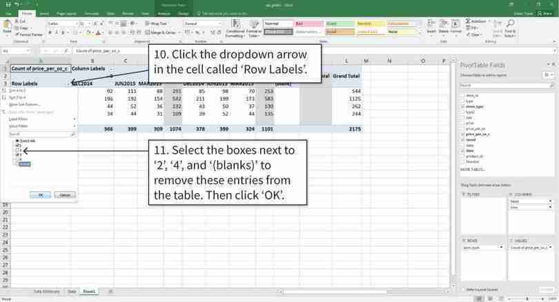
- A frequency table showing the number (count) of store observations (store type) in December 2014 and June 2015, with ‘store type’ as the row variable and ‘time period’ as the column variable. For each store type, is the number of observations similar in each time period?
- A frequency table showing the number of taxed and non-taxed beverages in December 2014 and June 2015, with ‘store type’ as the row variable and ‘taxed’ as the column variable. (‘Taxed’ equals 1 if the sugar tax applied to that product, and 0 if the tax did not apply). For each store type, is the number of taxed and non-taxed beverages similar?
- A frequency table showing the number of each product type (type), with ‘product type’ as the row variable and ‘time period’ as the column variables. Which product types have the highest number of observations and which have the lowest number of observations? Why might some products have more observations than others?
Excel walk-through 3.1 Making a frequency table using Excel’s PivotTable option
Follow the walk-through in the Core Economics website video, or in Figure 3.2, to find out how to make a pivot table in Excel.
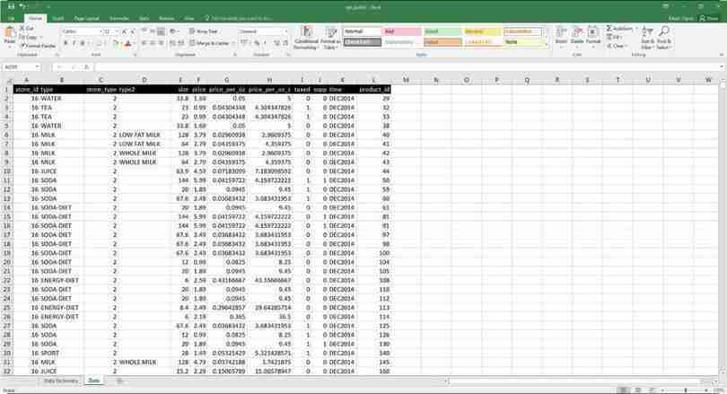
Figure 3.2 How to make a frequency table using Excel’s PivotTable option.
The data
The data will look like this. We will be making a pivot table using Column C (store type) and Column K (time). It will show how many observations of each store type there are in 2 time periods (DEC2014 and JUN2015).
Figure 3.2a The data will look like this. We will be making a pivot table using Column C (store type) and Column K (time). It will show how many observations of each store type there are in 2 time periods (DEC2014 and JUN2015).
Insert a blank pivot table
The pivot table is currently blank. In order to create the table, we will use the variables listed in the menu to fill in the empty boxes shown at the bottom.
Figure 3.2d The pivot table is currently blank. In order to create the table, we will use the variables listed in the menu to fill in the empty boxes shown at the bottom.
Choose the variables to put in the pivot table
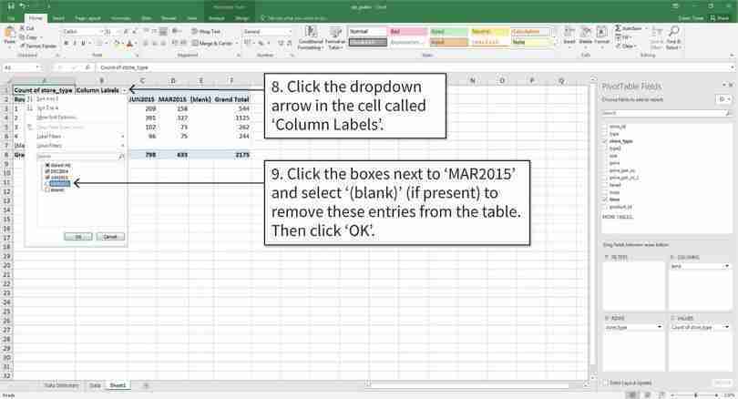
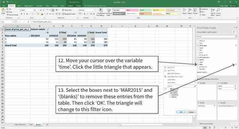
Excel will create a table that looks like the one above. By default it will use all the values of the variables selected (e.g. all time periods). We can remove unnecessary time periods and blank cells by filtering the data.
Figure 3.2e Excel will create a table that looks like the one above. By default it will use all the values of the variables selected (e.g. all time periods). We can remove unnecessary time periods and blank cells by filtering the data.
Filter the values of each variable
After completing step 9, you will have the required table.
Figure 3.2f After completing step 9, you will have the required table.
- conditional mean
- An average of a variable, taken over a subgroup of observations that satisfy certain conditions, rather than all observations.
Besides counting the number of observations in a particular group, we can also use the PivotTable option to calculate the mean by only using observations that satisfy certain conditions (known as the conditional mean). In this case, we are interested in comparing the mean price of taxed and non-taxed beverages, before and after the tax.
- Calculate and compare conditional means:
- Create a table similar to Figure 3.3, showing the average price per ounce (in cents) for taxed and non-taxed beverages separately, with ‘store type’ as the row variable, and ‘taxed’ and ‘time’ as the column variables. To follow the methodology used in the journal paper, make sure to only include products that are present in all time periods, and non-supplementary products (supp = 0).
- Without doing any calculations, summarize any differences or general patterns between December 2014 and June 2015 that you find in the table.
- Would we be able to assess the effect of sugar taxes on product prices by comparing the average price of non-taxed goods with that of taxed goods in any given period? Why or why not?
| Non-taxed | Taxed | |||
|---|---|---|---|---|
| Store type | Dec 2014 | Jun 2015 | Dec 2014 | Jun 2015 |
| 1 | ||||
| 3 | ||||
The average price of taxed and non-taxed beverages, according to time period and store type.
Figure 3.3 The average price of taxed and non-taxed beverages, according to time period and store type.
Excel walk-through 3.2 Making a pivot table with more than two variables
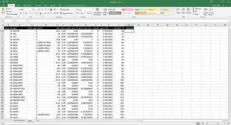
Figure 3.4 How to make a pivot table with more than two variables.
The data
The data will look like this. We will be making a pivot table using Columns C (store type), Column K (time), and Column I (taxed). It will show the average price of taxed and non-taxed beverages in DEC2014 and JUN2015, according to store type.
Figure 3.4a The data will look like this. We will be making a pivot table using Columns C (store type), Column K (time), and Column I (taxed). It will show the average price of taxed and non-taxed beverages in DEC2014 and JUN2015, according to store type.
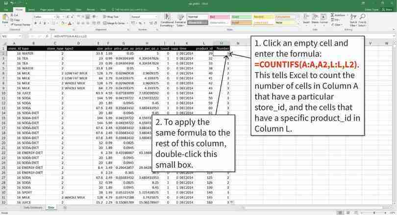
Count the number of times each product appears in the dataset
We only want to look at products that were present in all time periods, to ensure we are comparing the same group of products over time. We will create a new variable (called ‘Number’, shown in Column M) that shows how many periods of data are available for each product. Excel’s COUNTIFS function will help us count the number of observations that satisfy certain conditions.
Figure 3.4b We only want to look at products that were present in all time periods, to ensure we are comparing the same group of products over time. We will create a new variable (called ‘Number’, shown in Column M) that shows how many periods of data are available for each product. Excel’s COUNTIFS function will help us count the number of observations that satisfy certain conditions.
Fill in the pivot table
After step 9, Excel will create a table that looks like the one above. By default, it uses all the available data and shows frequencies instead of means.
Figure 3.4e After step 9, Excel will create a table that looks like the one above. By default, it uses all the available data and shows frequencies instead of means.
Filter the values of each variable
We will filter the data so that only the store types we want (1 and 3) are visible.
Figure 3.4f We will filter the data so that only the store types we want (1 and 3) are visible.
Filter the values of each variable
We will filter the data so that only the time periods we want (DEC2014 and JUN2015) are visible.
Figure 3.4g We will filter the data so that only the time periods we want (DEC2014 and JUN2015) are visible.
Filter the values inside the table
Now we tell Excel to only include products that are available in all time periods (Number = 3), and non-supplementary products (supp = 0).
Figure 3.4h Now we tell Excel to only include products that are available in all time periods (Number = 3), and non-supplementary products (supp = 0).
Filter the values inside the table
Your table should now look like the one shown above. Notice that there are fewer observations (216 compared to 575) because now we are looking at a subgroup of the data.
Figure 3.4i Your table should now look like the one shown above. Notice that there are fewer observations (216 compared to 575) because now we are looking at a subgroup of the data.
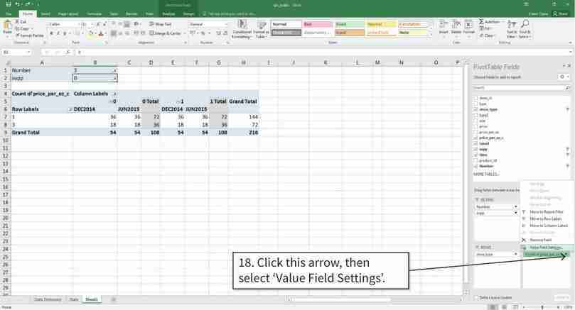
Change the values inside the table to means
Now we change the values shown in the table from frequencies to means.
Figure 3.4j Now we change the values shown in the table from frequencies to means.
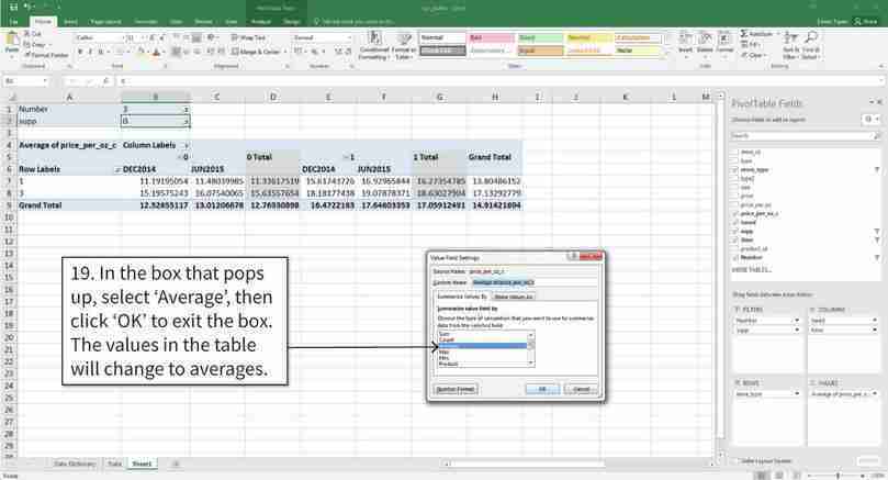
Change the values inside the table to means
In the box that pops up, you can see the different measures that the pivot table can show (for example, the sum, max, or min). We would like the cells to show averages.
Figure 3.4k In the box that pops up, you can see the different measures that the pivot table can show (for example, the sum, max, or min). We would like the cells to show averages.
Remove the ‘Grand total’ rows and columns
By default, the pivot table will have a column showing the mean for each row (for example, the mean for store type 1 in both DEC2014 and JUN2015). We will remove these columns to make our table easier to read.
Figure 3.4l By default, the pivot table will have a column showing the mean for each row (for example, the mean for store type 1 in both DEC2014 and JUN2015). We will remove these columns to make our table easier to read.
In order to make a before-and-after comparison, we will make a chart similar to Figure 2 in the journal paper, to show the change in prices for each store type.
- Using your table from Question 3:
- Calculate the change in the mean price after the tax (price in June 2015 minus price in December 2014) for taxed and non-taxed beverages, by store type.
- Using the values you calculated in Question 4(a), plot a column chart to show this information (as done in Figure 2 of the journal paper) with store type on the horizontal axis and price change on the vertical axis. Label each axis and data series appropriately. You should get the same values as shown in Figure 2.
Excel walk-through 3.3 Making a column chart to compare two groups
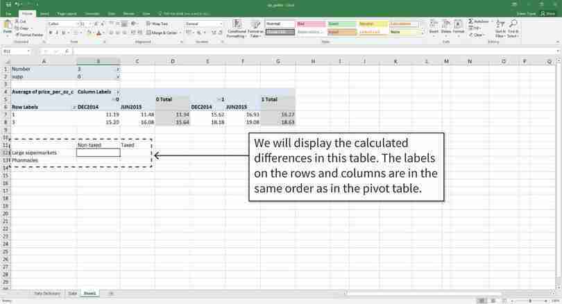
Figure 3.5 How to make a column chart to compare two groups.
Create a table showing differences in means
We will be using the pivot table above to create a column chart. (See Excel walk-through 3.2 for help on how to create the pivot table.) First, we will calculate the difference in mean price for each type of good and store type.
Figure 3.5a We will be using the pivot table above to create a column chart. (See Excel walk-through 3.2 for help on how to create the pivot table.) First, we will calculate the difference in mean price for each type of good and store type.
Create a table showing differences in means
Fill in the table by using the cell formula to calculate the differences required. After step 2, your table will look like the one shown above.
Figure 3.5b Fill in the table by using the cell formula to calculate the differences required. After step 2, your table will look like the one shown above.
Draw a column chart
After step 6, the column chart will look like the one shown above. Notice that Excel has put the columns for taxed and non-taxed products in separate groups, but we want the columns to be grouped according to store type.
Figure 3.5c After step 6, the column chart will look like the one shown above. Notice that Excel has put the columns for taxed and non-taxed products in separate groups, but we want the columns to be grouped according to store type.
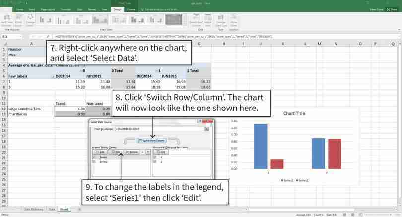
Switch the row and column variable; change the legend and horizontal axis labels
After step 8, the columns will now be grouped according to store type. The next step is to change the labels in the legend, so that ‘Series1’ is renamed as ‘Taxed’ and ‘Series2’ is renamed as ‘Non-taxed’.
Figure 3.5d After step 8, the columns will now be grouped according to store type. The next step is to change the labels in the legend, so that ‘Series1’ is renamed as ‘Taxed’ and ‘Series2’ is renamed as ‘Non-taxed’.
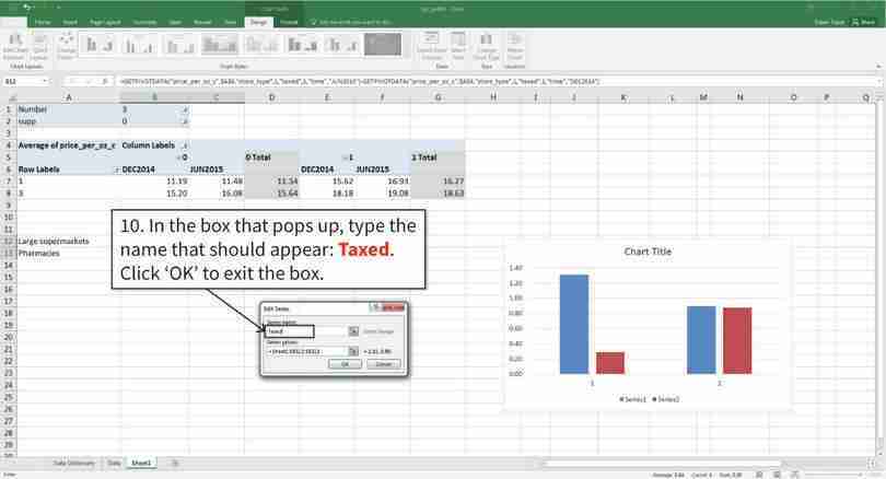
Switch the row and column variable; change the legend and horizontal axis labels
After step 10, ‘Series1’ will be renamed as ‘Taxed’, and this will also show up in the chart legend.
Figure 3.5e After step 10, ‘Series1’ will be renamed as ‘Taxed’, and this will also show up in the chart legend.
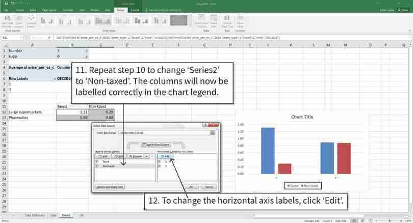
Switch the row and column variable; change the legend and horizontal axis labels
The next step is to change the horizontal axis labels from numbers to store names (‘1’ is ‘Large supermarkets’, and ‘2’ is ‘Pharmacies’).
Figure 3.5f The next step is to change the horizontal axis labels from numbers to store names (‘1’ is ‘Large supermarkets’, and ‘2’ is ‘Pharmacies’).
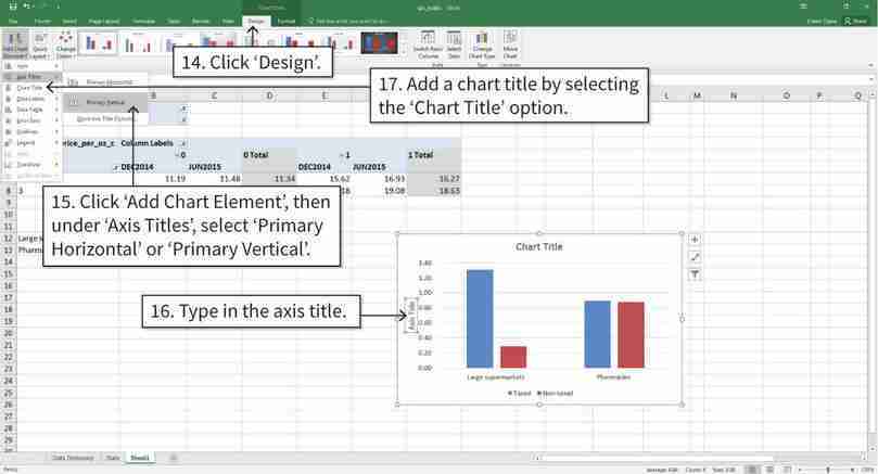
Add axis titles and a chart title
After step 17, your chart will look like the bottom chart of Figure 2 in the journal paper.
Figure 3.5h After step 17, your chart will look like the bottom chart of Figure 2 in the journal paper.
- statistically significant
- When a relationship between two or more variables is unlikely to be due to chance, given the assumptions made about the variables (for example, having the same mean). Statistical significance does not tell us whether there is a causal link between the variables.
To assess whether the difference in mean prices before and after the tax could have happened by chance due to the samples chosen (and there are no differences in the population means), we could calculate the p-value. (Here, ‘population means’ refer to the mean prices before/after the tax that we would calculate if we had all prices for all stores in Berkeley.) The authors of the journal article calculate p-values, and use the idea of statistical significance to interpret them. Whenever they get a p-value of less than 5%, they conclude that the assumption of no differences in the population is unlikely to be true: they say that the price difference is statistically significant. If they get a p-value higher than 5%, they say that the difference is not statistically significant, meaning that they think it could be due to chance variation in prices.
Using a particular cutoff level for the p-value, and concluding that a result is only statistically significant if the p-value is below the cutoff, is common in statistical studies, and 5% is often used as the cutoff level. But this approach has been criticized recently by statisticians and social scientists. The main criticisms raised are that any cutoffs are arbitrary. Instead of using a cutoff, we prefer to calculate p-values and use them to assess the strength of the evidence against our assumption that there are no differences in the population means. Whether the statistical evidence is strong enough for us to draw a conclusion about a policy, such as a sugar tax, will always be a matter of judgement.
Using a particular cutoff level for the p-value, and concluding that a result is only statistically significant if the p-value is below the cutoff, is common in statistical studies, and 5% is often used as the cutoff level. But this approach has been criticized recently by statisticians and social scientists because the cutoff level is quite arbitrary. Instead of using a cutoff, we prefer to calculate p-values and use them to assess the strength of the evidence against our assumption that there are no differences in the population means. Whether the statistical evidence is strong enough for us to draw a conclusion about a policy, such as a sugar tax, will always be a matter of judgement.
According to the journal paper, the p-value is 0.02 for large supermarkets, and 0.99 for pharmacies.
- Based on these p-values and your chart from Question 4, what can you conclude about the difference in means? (You may find the discussion in Part 2.3 helpful.)
Part 3.2 Before-and-after comparisons with prices in other areas
When looking for any price patterns, it is possible that the observed changes in Berkeley were not solely due to the tax, but instead were also influenced by other events that happened in Berkeley and in neighbouring areas. To investigate whether this is the case, the researchers conducted another differences-in-differences analysis, using a different treatment and control group:
- The treatment group: Beverages in Berkeley
- The control group: Beverages in surrounding areas.
The researchers collected price data from stores in the surrounding areas and compared them with prices in Berkeley. If prices changed in a similar way in nearby areas (which were not subject to the tax), then what we observed in Berkeley may not be primarily a result of the tax.
We will be using the data the researchers collected to make our own comparisons.
Download the following files:
- The Excel file containing the price data they collected, including information on the date (year and month), location (Berkeley or Non-Berkeley), beverage group (soda, fruit drinks, milk substitutes, milk, and water), and average price for that month.
- ‘S5 Table’ comparing the neighbourhood characteristics of the Berkeley and non-Berkeley stores.
- Based on ‘S5 Table’, do you think the researchers chose suitable comparison stores? Why or why not?
We will now plot a line chart similar to Figure 3 in the journal paper, to compare prices of similar goods in different locations and see how they have changed over time. To do this, we will need to summarize the data using Excel’s PivotTable option, so that there is one value (the mean price) for each location and type of good in each month.
- Assess the effects of a tax on prices:
- Create a table similar to Figure 3.6 to show the average price in each month for taxed and non-taxed beverages, according to location. Use ‘year and month’ as the row variables, and ‘tax’ and ‘location’ as the column variables. (You may find Excel walk-through 3.2 helpful.)
- Plot the four columns of your table on the same line chart, with average price on the vertical axis and time (months) on the horizontal axis. Describe any differences you see between the prices of non-taxed goods in Berkeley and those outside Berkeley, both before the tax (January 2013 to December 2014) and after the tax (March 2015 onwards). Do the same for prices of taxed goods.
- Based on your chart, is it reasonable to conclude that the sugar tax had an effect on prices?
| Non-taxed | Taxed | |||
|---|---|---|---|---|
| Year/Month | Berkeley | Non-Berkeley | Berkeley | Non-Berkeley |
| January 2013 | ||||
| February 2013 | ||||
| March 2013 | ||||
| … | ||||
| December 2013 | ||||
| January 2014 | ||||
| … | ||||
| February 2016 | ||||
The average price of taxed and non-taxed beverages, according to location and month.
Figure 3.6 The average price of taxed and non-taxed beverages, according to location and month.
How strong is the evidence that the sugar tax affected prices? According to the journal paper, when comparing the mean Berkeley and non-Berkeley price of sugary beverages after the tax, the p-value is smaller than 0.00001, and it is 0.63 for non-sugary beverages after the tax.
- What do the p-values tell us about the difference in means and the effect of the sugar tax on the price of sugary beverages? (You may find the discussion in Part 2.3 helpful.)
The aim of the sugar tax was to decrease consumption of sugary beverages. Figure 3.7 shows the mean number of calories consumed and the mean volume consumed before and after the tax. The researchers reported the p-values for the difference in means before and after the tax in the last column.
| Usual intake | Pre-tax (Nov–Dec 2014), n = 623 |
Post-tax (Nov–Dec 2015), n = 613 |
Pre-tax–post-tax difference | ||
|---|---|---|---|---|---|
| Caloric intake (kilocalories/capita/day) | |||||
| Taxed beverages | 45.1 | 38.7 | −6.4, p = 0.56 | ||
| Non-taxed beverages | 115.7 | 147.6 | 31.9, p = 0.04 | ||
| Volume of intake (grams/capita/day) | |||||
| Taxed beverages | 121.0 | 97.0 | −24.0, p = 0.24 | ||
| Non-taxed beverages | 1,839.4 | 1,896.5 | 57.1, p = 0.22 | ||
| Models account for age, gender, race/ethnicity, income level, and educational attainment. n is the sample size at each round of the survey after excluding participants with missing values on self-reported race/ethnicity, age, education, income, or monthly intake of sugar-sweetened beverages. | |||||
Changes in prices, sales, consumer spending, and beverage consumption one year after a tax on sugar-sweetened beverages in Berkeley, California, US: A before-and-after study.
Figure 3.7 Changes in prices, sales, consumer spending, and beverage consumption one year after a tax on sugar-sweetened beverages in Berkeley, California, US: A before-and-after study.
Lynn D. Silver, Shu Wen Ng, Suzanne Ryan-Ibarra, Lindsey Smith Taillie, Marta Induni, Donna R. Miles, Jennifer M. Poti, and Barry M. Popkin. 2017. Table 1 in ‘Changes in prices, sales, consumer spending, and beverage consumption one year after a tax on sugar-sweetened beverages in Berkeley, California, US: A before-and-after study’. PLoS Med 14 (4): e1002283.
- Based on Figure 3.7, what can you say about consumption behaviour in Berkeley after the tax? Suggest some explanations for the evidence.
- Read the ‘Limitations’ in the ‘Discussions’ section of the paper and discuss the limitations of this study. How could future studies on the sugar tax in Berkeley address these problems? (Some issues you may want to discuss are: the number of stores observed, number of people surveyed, and the reliability of the price data collected.)
- Suppose that you have the authority to conduct your own sugar tax natural experiment in two neighbouring towns, Town A and Town B. Outline how you would conduct the experiment to ensure that any changes in outcomes (prices, consumption of sugary beverages) are due to the tax and not due to other factors. (Hint: think about what factors you need to hold constant.)
