Empirical Project 6 Working in R
Download the code
To download the code chunks used in this project, right-click on the download link and select ‘Save Link As…’. You’ll need to save the code download to your working directory, and open it in RStudio.
Don’t forget to also download the data into your working directory by following the steps in this project.
Getting started in R
For this project you will need the following packages:
-
tidyverse, to help with data manipulation -
ggthemes, to change the look of charts easily.
We will also use the ggplot2 package to produce graphs, but that does come as part of the tidyverse package.
If you need to install either of these packages, run the following code:
install.packages(c("tidyverse","ggthemes"))
You can import the libraries now, or when they are used in the R walk-throughs below.
library(tidyverse)
library(ggthemes)
Part 6.1 Looking for patterns in the survey data
Learning objectives for this part
- explain how survey data is collected, and describe measures that can increase the reliability and validity of survey data
- use column charts and box and whisker plots to compare distributions
- calculate conditional means for one or more conditions, and compare them on a bar chart
- use line charts to describe the behaviour of real-world variables over time.
First download the data used in the paper to understand how this information was collected. The data is publicly available and free of charge, but you will need to create a user account in order to access it.
- Go to the World Management Survey data registration page.
- On the middle right-hand side of the page, click the ‘Register’ button.
- Fill in the form with the required details, then click ‘Register’.
- An account activation link will be sent to the email you provided. Click on it to activate your account.
- Now go to the World Management Survey data download page.
- In the subsection ‘Download the public WMS data now’, click the ‘Download Now’ button.
- In the ‘Login’ section, enter your account’s email and password, then click ‘Login’.
- Under the heading ‘Manufacturing: 2004–2010 combined survey data (AMP)’, click the ‘Download’ button.
- Unzip the files in the downloaded zip folder into your working directory (the folder you will be working from).
- You may also find it helpful to download the Bloom et al. paper ‘Management practices across firms and countries’.
- To learn about how Bloom et al. (2012) conducted their survey, read the sections ‘How Can Management Practices Be Measured?’ and ‘Validating the Management Data’ (pages 5–9) of their paper.
- Briefly describe how the interviews with managers were conducted, and explain some methods the researchers used to improve the reliability and validity of their data. (There are a few technical terms that you may not understand, but these are not necessary for answering this question.)
- Three aspects of management practices were evaluated: monitoring, targets, and incentives. Do you think that these are the best criteria for assessing management practices? What (if any) important aspects of management are not included in this assessment? (You may also find it helpful to refer to the ‘Contingent Management’ section on pages 23–25 of the paper.)
Now we will create some charts to summarize the data and make comparisons across countries, industries (manufacturing, healthcare, retail, and education), and firm characteristics.
- In ‘Manufacturing: 2004–2010 combined survey data (AMP)’, open the file ‘AMP_graph_manufacturing.csv’. Use this data on manufacturing firms to do the following:
- Create a table like Figure 6.2a, showing the average management scores for all the firms in each of the twenty countries, and fill it in with the required values. The variables for the overall score and three individual criteria are ‘management’, ‘monitor’, ‘target’, and ‘people’. You may find it helpful to refer to R walk-through 3.3 if you need guidance. For each criterion, rank countries from highest to lowest, then create and fill in a table like Figure 6.2b (see R walk-through 4.8 for help on how to assign ranks). Do countries with a high overall rank also tend to rank highly on individual criteria?
| Country | Overall management (mean) | Monitoring management (mean) | Targets management (mean) | Incentives management (mean) |
|---|---|---|---|---|
Mean of management scores.
Figure 6.2a Mean of management scores.
| Country | Overall management (rank) | Monitoring management (rank) | Targets management (rank) | Incentives management (rank) |
|---|---|---|---|---|
Rank according to management scores.
Figure 6.2b Rank according to management scores.
- Create a bar chart showing the average overall management score (the variable
management) for each country, ordered from highest to lowest. (Hint: You will need to sort your data from highest to lowest so it appears correctly in the chart.) Your chart should look similar to Figure 6.1.
- Compare your chart with Figure 1 in Bloom et al. (2012). Can you explain why your chart is slightly different? (Hint: See the note at the bottom of Figure 1.)
R walk-through 6.1 Importing data into R and creating tables and charts
Before uploading an Excel or csv file into R, first open the file in a spreadsheet software (like Excel) to understand how the file is structured. From looking at the file we learn that:
- the variable names are in the first row (no need to use the
skipoption)- missing values are represented by empty cells (hence we will use the option
na.strings = "")- the last variable is in Column S, with short variable descriptions in Column U: it is easier to import everything first and remove the unnecessary data afterwards.
We will call our imported data
man_data.# Set your working directory to the correct folder. # Insert your file path for 'YOURFILEPATH'. setwd("YOURFILEPATH") man_data read.csv("AMP_graph_manufacturing.csv", na.strings = "") str(man_data)## 'data.frame': 9207 obs. of 21 variables: ## $ management : num 3.5 3.17 3 2.41 4.44 ... ## $ monitor : num 3.6 3.8 2.8 2.75 4.6 4.8 4.6 4.8 4.8 3.8 ... ## $ target : num 3.6 2.6 3.6 2.4 4.4 4.4 4.6 4.2 4.8 3 ... ## $ people : num 3.5 2.5 3 2.67 4.33 ... ## $ lemp_firm : num 5.99 6.4 7.6 8.04 5.24 ... ## $ export : num NA NA 70 NA NA NA NA NA NA NA ... ## $ competition : int NA 2 4 NA NA NA NA NA NA NA ... ## $ ownership : Factor w/ 9 levels "Dispersed Shareholders",..: NA 1 1 NA NA NA NA NA NA NA ... ## $ mne_country : Factor w/ 77 levels "Argentina","Australia",..: NA NA 72 NA NA NA NA NA NA NA ... ## $ mne_f : int 0 0 0 0 0 0 0 0 0 0 ... ## $ mne_d : int 0 0 1 0 0 0 0 0 0 0 ... ## $ degree_m : int NA 100 100 NA NA NA NA NA NA NA ... ## $ degree_nm : int NA 75 5 NA NA NA NA NA NA NA ... ## $ country : Factor w/ 20 levels "Argentina","Australia",..: 20 20 20 20 20 20 20 20 20 20 ... ## $ competition2004 : int 3 NA NA NA 3 3 3 3 3 3 ... ## $ year : int 2004 2006 2006 2002 2004 2004 2004 2004 2004 2004 ... ## $ sic : int 382 382 382 308 281 281 366 366 357 382 ... ## $ lb_employindex : int 0 0 0 NA 0 0 0 0 0 0 ... ## $ pppgdp : num 11868 13399 14119 10642 11868 ... ## $ X : logi NA NA NA NA NA NA ... ## $ storage..display.....value: Factor w/ 22 levels "----------------------------------------------------------------------------------------------------------------------",..: 21 1 11 15 20 17 10 8 3 16 ...You can see that Column U was imported as two variables,
X(which only contains ‘NAs’) andstorage..display.....value(which contains variable information). We will store the variable information in a new vector (man_varinfo) and remove both variables from theman_datadataset.# Keep the variable information man_varinfo unlist(man_data$ storage..display.....value[1:23]) # Delete last two variables man_data man_data[, !(names(man_data) %in% c("X", "storage..display.....value"))]Let’s look at the variable information.
man_varinfo## [1] variable name type format label variable label ## [2] ---------------------------------------------------------------------------------------------------------------------- ## [3] management float %9.0g * Average of all management questions ## [4] monitor float %9.0g Average of perf1 to perf5 ## [5] target float %9.0g Average of perf6 to perf10 ## [6] people float %9.0g Average of talent1 to talent6 ## [7] lemp_firm float %9.0g Log of 'No. of firm employees as declared in interview' ## [8] export double %10.0g * % of production exported ## [9] competition byte %12.0g * No. of competitors ## [10] ownership str33 %33s * Who owns the firm? ## [11] mne_country str19 %19s * Country of origin of multinational (best guess) ## [12] mne_f byte %9.0g = 1 if foreign MNE ## [13] mne_d byte %9.0g = 1 if domestic MNE ## [14] degree_m byte %8.0g * % of managers with a college degree ## [15] degree_nm float %8.0g * % of non-managers with a college degree ## [16] country str19 %19s Country in which plant is located ## [17] competition2004 byte %9.0g 1=No competitors, 2=A few competitors, 3=Many competitors ## [18] year int %9.0g * SENSITIVE: Accts: Year of Accounts Data ## [19] sic int %8.0g * Three digit US SIC 1987 code (999 is missing) ## [20] lb_employindex byte %10.0g * WB: Rigidity of employment index (0-100) ## [21] pppgdp float %9.0g * IMF: GDP based on PPP valuation of cty GDP (Current international $ - ## [22] Billions) ## [23]## 22 Levels: ---------------------------------------------------------------------------------------------------------------------- ... A few of the variables that have been imported as numbers are actually categorical (‘factor’) variables (
mne_f,mne_d, andcompetition2004). The reason R thought they were numerical variables was because each category was represented by a number (instead of text). We use thefactorfunction to tell R how to treat these variables, and thelabelsoption to define what each number in those variables represents.# Indicates what to call 0 and 1 entries man_data$mne_f factor(man_data$mne_f, labels = c("no MNE_f", "MNE_f")) man_data$mne_d factor(man_data$mne_d, labels = c("no MNE_d", "MNE_d")) # Indicates what to call 1, 2, and 3 entries man_data$competition2004 factor( man_data$competition2004, labels = c("No competitors", "A few competitors", "Many competitors"))When you create new labels, check that the labels have been attached to the correct entries (the labels should be ordered from the lowest to highest entry).
To create the tables, we use piping operators (
%>%) from thetidyversepackage, which allow us to run a series of commands on the same data all at once. For more information on how piping works, refer to a short introduction on using piping operators.1 First, we will group data by country (group_by), then calculate the required summary statistics for each of these groups (summarize), then order the countries according to their overall score (highest to lowest) (arrange). When summarizing the data, in addition to the mean values for the different categories and the overall score, we add a variable recording how many observations we have for each country (obs).library(tidyverse) table_mean man_data %>% group_by(country) %>% summarize(obs = length(management), m_overall = mean(management), m_monitor = mean(monitor), m_target = mean(target), m_incentives = mean(people)) %>% arrange(desc(m_overall)) table_mean## # A tibble: 20 x 6 ## country obs m_overall m_monitor m_target m_incentives #### 1 United States 1225 3.35 3.58 3.26 3.25 ## 2 Germany 646 3.23 3.57 3.22 2.98 ## 3 Japan 176 3.23 3.50 3.34 2.92 ## 4 Sweden 388 3.21 3.64 3.19 2.83 ## 5 Canada 385 3.17 3.55 3.07 2.94 ## 6 UK 1242 3.03 NA 2.98 2.86 ## 7 France 613 3.03 3.43 2.97 2.74 ## 8 Italy 289 3.03 3.26 3.10 2.76 ## 9 Australia 392 3.02 3.29 3.02 2.74 ## 10 New Zealand 106 2.93 3.18 2.96 2.63 ## 11 Mexico 189 2.92 3.29 2.88 2.71 ## 12 Poland 351 2.90 3.12 2.94 2.83 ## 13 Republic of Ireland 106 2.89 3.14 2.81 2.79 ## 14 Portugal 247 2.87 3.27 2.83 2.59 ## 15 Chile 317 2.83 3.14 2.72 2.67 ## 16 Argentina 249 2.76 3.08 2.68 2.56 ## 17 Greece 251 2.73 2.97 2.66 2.58 ## 18 China 746 2.71 2.90 2.63 2.69 ## 19 Brazil 569 2.71 3.06 2.69 2.55 ## 20 India 720 2.67 2.91 2.66 2.63 You can see that
m_monitorfor the UK is recorded asNA, because there is aNAentry for the monitor variable. Themeanfunction, by default, will not produce a mean value if any observations are missing. Doing so allows you to investigate if there is a data issue. Here, this missing observation isn’t really an issue for our analysis—in the code above, we simply add the optionna.rm = TRUEin themeanfunction to calculate the mean, ignoring the missing observation(s).table_mean man_data %>% group_by(country) %>% summarize(obs = length(management), m_overall = mean(management), m_monitor = mean(monitor, na.rm = TRUE), m_target = mean(target), m_incentives = mean(people)) %>% arrange(desc(m_overall)) table_mean## # A tibble: 20 x 6 ## country obs m_overall m_monitor m_target m_incentives #### 1 United States 1225 3.35 3.58 3.26 3.25 ## 2 Germany 646 3.23 3.57 3.22 2.98 ## 3 Japan 176 3.23 3.50 3.34 2.92 ## 4 Sweden 388 3.21 3.64 3.19 2.83 ## 5 Canada 385 3.17 3.55 3.07 2.94 ## 6 UK 1242 3.03 3.34 2.98 2.86 ## 7 France 613 3.03 3.43 2.97 2.74 ## 8 Italy 289 3.03 3.26 3.10 2.76 ## 9 Australia 392 3.02 3.29 3.02 2.74 ## 10 New Zealand 106 2.93 3.18 2.96 2.63 ## 11 Mexico 189 2.92 3.29 2.88 2.71 ## 12 Poland 351 2.90 3.12 2.94 2.83 ## 13 Republic of Ireland 106 2.89 3.14 2.81 2.79 ## 14 Portugal 247 2.87 3.27 2.83 2.59 ## 15 Chile 317 2.83 3.14 2.72 2.67 ## 16 Argentina 249 2.76 3.08 2.68 2.56 ## 17 Greece 251 2.73 2.97 2.66 2.58 ## 18 China 746 2.71 2.90 2.63 2.69 ## 19 Brazil 569 2.71 3.06 2.69 2.55 ## 20 India 720 2.67 2.91 2.66 2.63 Let’s make the table showing the ranks. We use the
mutatefunction, which adds variables calculated from existing variables.table_rank table_mean %>% mutate(r_overall = rank(desc(m_overall)), r_monitor = rank(desc(m_monitor)), r_target = rank(desc(m_target)), r_incentives = rank(desc(m_incentives))) # Select the country variable (Column 1) and the columns # with rank information (7 to 10) table_rank[c(1, 7:10)]## # A tibble: 20 x 5 ## country r_overall r_monitor r_target r_incentives #### 1 United States 1 2 2 1 ## 2 Germany 2 3 3 2 ## 3 Japan 3 5 1 4 ## 4 Sweden 4 1 4 6 ## 5 Canada 5 4 6 3 ## 6 UK 6 7 8 5 ## 7 France 7 6 9 11 ## 8 Italy 8 11 5 9 ## 9 Australia 9 8 7 10 ## 10 New Zealand 10 12 10 16 ## 11 Mexico 11 9 12 12 ## 12 Poland 12 15 11 7 ## 13 Republic of Ireland 13 14 14 8 ## 14 Portugal 14 10 13 17 ## 15 Chile 15 13 15 14 ## 16 Argentina 16 16 17 19 ## 17 Greece 17 18 19 18 ## 18 China 18 20 20 13 ## 19 Brazil 19 17 16 20 ## 20 India 20 19 18 15 Now we use the
ggplotset of functions (part of thetidyversepackage uploaded earlier) to create a bar chart using them_overallvalue intable_mean. To present countries in order of their management score, we specifiedx = reorder(country, m_overall, mean)(usingx = countrywould have ordered the countries alphabetically, which is R’s default option). To switch the horizontal and vertical axis (as in Figure 6.1), we used thecoord_flipoption.ggplot(table_mean, aes(x = reorder(country, m_overall, mean), y = m_overall)) + geom_bar(stat = "identity", position = "identity") + xlab("") + ylab("Average management practice score") + coord_flip() + theme_bw()If you want to switch the order of the bars, use
rev(table_mean$m_overall)andrev(table_mean$country)to reverse the order of the values.
To look at how management quality varies within countries, instead of just looking at the mean we can use column charts to visualize the entire distribution of scores (as in Empirical Project 1). To compare distributions, we have to use the same horizontal axis, so we will first need to make a frequency table for each distribution to be used. Also, since each country has a different number of observations, we will use percentages instead of frequencies as the vertical axis variable.
- For three countries of your choice and for the US, carry out the following:
- Using the overall management score (variable ‘management’), create and fill in a frequency table similar to Figure 6.4 below for the US, and separately for each chosen country. The values in the first column should range from 1 to 5, in intervals of 0.2.
| Range of management score | Frequency | Percentage of firms (%) |
|---|---|---|
| 1.00 | ||
| 1.20 | ||
| … | ||
| 4.80 | ||
| 5.00 |
Frequency table for overall management score.
Figure 6.4 Frequency table for overall management score.
- Plot a column chart for each country to show the distribution of management scores, with the percentage of firms on the vertical axis and the range of management scores on the horizontal axis. On each country’s chart, plot the distribution of the US on top of that country’s distribution, as shown in R walk-through 6.2.
- Describe any visual similarities and differences between the distributions of your chosen countries and that of the US. (Hint: For example, look at where the distribution is centred, the percentage of observations on the left tail or the right tail of the distribution, and how spread out the scores are.)
R walk-through 6.2 Obtaining frequency counts and plotting overlapping histograms
To get frequency counts, use the
cutfunction. This function will count the number of observations that fall within the intervals specified in thebreaksoption (here we specified intervals of 0.2). We store this information in the vectortemp_countsand use thetablefunction to display the table of frequencies.temp_counts cut(man_data$management [man_data$country == "Chile"], breaks=seq(0, 5, 0.2)) table(temp_counts)## temp_counts ## (0,0.2] (0.2,0.4] (0.4,0.6] (0.6,0.8] (0.8,1] (1,1.2] (1.2,1.4] ## 0 0 0 0 0 0 1 ## (1.4,1.6] (1.6,1.8] (1.8,2] (2,2.2] (2.2,2.4] (2.4,2.6] (2.6,2.8] ## 3 6 24 15 30 25 49 ## (2.8,3] (3,3.2] (3.2,3.4] (3.4,3.6] (3.6,3.8] (3.8,4] (4,4.2] ## 52 28 27 21 20 9 6 ## (4.2,4.4] (4.4,4.6] (4.6,4.8] (4.8,5] ## 1 0 0 0To create the required chart, we will use
geom_histogram, part of theggplotset of functions.Let’s first collect one pair of countries, Chile and the US. If you wanted to produce a histogram for the overall (
management) rating, use the following code.g1 ggplot(subset(man_data, country == "Chile"), aes(management)) + geom_histogram(breaks = seq(0, 5, 0.2)) + xlab("Management score") + ylab("Frequency Count") print(g1)Tip: Using
ggplot, it is straightforward to add a second country to the chart. The way to learn is usually to search the Internet (here we searched for ‘r ggplot multiple histograms’).To plot two countries on the same chart, we added the following options:
..density..gives a chart with a total area of 1, which ensures the histograms are plotted using the same scale (the result is a graph with an area of 1). For proportions, we need to scale by multiplying by the bin width (0.2 in this case).fill = countryplots one histogram for each countrybreaks = seq(0, 5, 0.2)sets the breakpoints (intervals) at 0.2, starting from 0 and ending at 5alpha = .5makes the bars semi-transparent (so we can see both histograms at once)position = "identity"overlays the two histogramsscale_fill_discrete(name = "Country")gives a legend title.g1 ggplot(subset(man_data, country %in% c("Chile", "United States")), aes(x = management, y = 0.2 * ..density.., fill = country)) + geom_histogram(breaks = seq(0, 5, 0.2), alpha = .5, position = "identity") + xlab("Management score") + ylab("Density") + ggtitle("Histogram for management score") + scale_fill_discrete(name = "Country") + theme_bw() print(g1)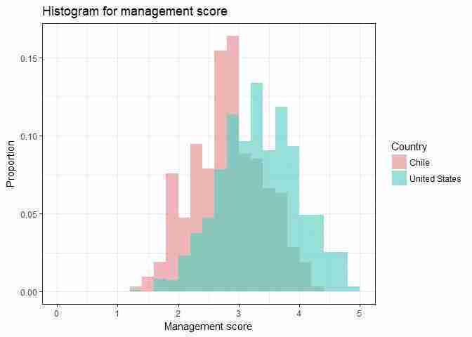
Comparing the distribution of management scores for the US and Chile.
Figure 6.6 Comparing the distribution of management scores for the US and Chile.
- box and whisker plot
- A graphic display of the range and quartiles of a distribution, where the first and third quartile form the ‘box’ and the maximum and minimum values form the ‘whiskers’.
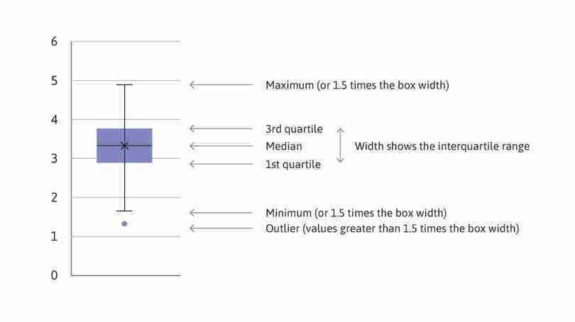
Another way to visualize distributions is a box and whisker plot, which shows some parts of a distribution rather than the whole distribution. We can use box and whisker plots to compare particular aspects of distributions more easily than when looking at the entire distribution.
As shown in Figure 6.7, the ‘box’ consists of the first quartile (value corresponding to the bottom 25 per cent, or 25th percentile, of all values), the median, and the third quartile (75th percentile). The ‘whiskers’ are the minimum and maximum values. (In R, the ‘whiskers’ may not be the actual maximum or minimum, since any values larger than 1.5 times the width of the box are considered outliers and are shown as separate points.)
Example of a box and whisker plot.
(Note: The mean is not shown in R’s default chart setting, but is denoted here by X. In general, the median may not be in the centre of the box, and can differ greatly from the mean. Using the data shown in Figure 6.7 for a variable from the dataset, the mean and median are very similar.)
Figure 6.7
Example of a box and whisker plot.
(Note: The mean is not shown in R’s default chart setting, but is denoted here by X. In general, the median may not be in the centre of the box, and can differ greatly from the mean. Using the data shown in Figure 6.7 for a variable from the dataset, the mean and median are very similar.)
- Using the same countries you chose in Question 3:
- Make a box and whisker plot for each country and the US, showing the distribution of management scores. You can either make a separate chart for each country or show all countries in the same plot. To check that your plots make sense, compare your box and whisker plots to the distributions from Question 3.
- Use your box and whisker plots to add to your comparisons from Question 3(c).
R walk-through 6.3 Creating box and whisker plots
We use exactly the same structure as for the overlapping histograms, this time plotting countries on the horizontal axis (
x = country) and management scores on the vertical axis (y = management). A useful feature ofggplotis that using more or less the same structure, you can create a variety of graphs. In this example, we include a few more countries, as this can be done without overcrowding the figure. To change the look of our chart, we use the optiontheme_solarized().library(ggthemes) g2 ggplot(subset(man_data, country %in% c("Chile", "United States", "Brazil", "Germany", "UK")), aes(x = country, y = management)) + geom_boxplot() + ylab("Management score") + ggtitle("Box and whisker plots for management score") + theme_solarized() print(g2)
From the manufacturing data, firms in the US seem to be managed better (on average) than firms in other countries. To investigate whether this is the case in other sectors, we will use data gathered on hospitals and schools.
- Using the data for hospitals and schools (AMP_graph_public.csv):
- Create a table for hospitals and schools, showing the mean management score and criteria score (monitoring, targets, incentives) for each country, as in Figure 6.2a.
- Make separate bar charts for hospitals and schools showing the mean overall management score for each country, sorted from highest to lowest, as in Figure 6.1. Are the country rankings similar to those in manufacturing?
- Using your average criteria scores from Question 5(a), suggest some explanations for the observed rankings in either hospitals or schools. (You may find it helpful to research healthcare or educational policies and reforms in those countries to support your explanations.)
Part 6.2 Do management practices differ between countries?
Learning objectives for this part
- calculate conditional means for one or more conditions, and compare them on a bar chart
- construct confidence intervals and use them to assess differences between groups.
Using the management survey data collected by Bloom et al. (2012), we can compare average management scores across countries and industries. When we find differences between groups in the survey, we are interested in what that tells us about the true differences in management practices between the countries.
- confidence interval
- A range of values centred around the sample mean value, with a corresponding percentage (usually 90%, 95%, or 99%). When we use a sample to calculate a 95% confidence interval, there is a probability of 0.95 that we will get an interval containing the true value of interest.
In Empirical Project 2, we used p-values to assess differences between groups. A p-value tells us how unusual it would be to observe the differences between groups that we did, assuming our hypothesis is correct (and additional model assumptions about the data hold). If the p-value is small, we might then conclude that the data is not compatible with our assumptions (e.g. that the two groups were drawn from populations with the same mean), and that there is a real difference between the underlying populations. Now we will use another method that helps us to allow for random variation when we interpret data, called a confidence interval.
When we work with data we usually have only a small sample from the entire population of interest. For example, the World Management Survey collects information from a selection of all the firms in a particular country. If we calculate the average management score for the sample, we have an estimate of the average management score across all firms in the country (the ‘true value’) but it may not be a very accurate estimate—especially if the sample is small and management scores vary a lot between firms.
A 95% confidence interval is a range of possible values within which the true value might lie. It is estimated from the mean and standard deviation of the data. As in the process of calculating p-values, we use a standard method that gives a good estimate provided that certain statistical conditions are satisfied. We cannot be certain that the true value lies in the range; we might have the bad luck to pick an atypical sample, in which case our estimate of the confidence interval would be atypical too. But we can say that when we use this method, there is a 95% probability that we will find an interval that contains the true value. One way to interpret this is to say that if we were able to repeat the process of sampling and calculating confidence intervals many times, roughly 95% of these confidence intervals would contain the true value.
As the name suggests, confidence intervals tell us how much confidence we can place in our estimates, or in other words, how precisely the sample mean is estimated. The confidence interval gives us a margin of error for our estimate of the true value. If the data varies a lot, the 95% confidence interval may be quite wide. If we have plenty of data, and the standard deviation is low, the estimate will be more precise and the 95% interval will be narrow.
Rule of thumb for comparing means
When comparing two distributions, if neither mean is in the 95% confidence interval for the other mean, the p-value for the difference in means is less than 5%.
This rule of thumb is handy when looking at charts. If two 95% confidence intervals don’t overlap, we can say immediately that the observed difference between the means for the two groups is unlikely to have arisen by chance alone (given that our hypothesis that there were no differences in the populations from which these groups were drawn and that our other assumptions about the data, such as random sampling, are correct). For a more definite conclusion, we can calculate the actual p-value (see Empirical Project 2) or construct a confidence interval for the difference in means. (This method involves more mathematics so we will discuss that in Empirical Project 8.)
It is possible to calculate a confidence interval for any probability: however wide the 95% confidence interval, a 99% confidence interval would be wider, and an 80% one would be narrower. 95% is a common choice: it gives us quite a high degree of confidence, and to go higher tends to lead to very wide intervals. We will use 95% confidence intervals throughout this project.
To sum up: A confidence interval is a range of values centred around the sample mean value, with a corresponding percentage (usually 90%, 95%, or 99%). When we use a sample to calculate a 95% confidence interval, there is a probability of 0.95 that we will get an interval containing the true value of interest.
We will now build on the results from the Bloom et al. (2012) paper by using 95% confidence intervals to make comparisons between the mean overall management score for different countries and types of firms. The confidence interval for the population mean (mean management score for that country) is centred around the sample mean. To determine the width of the interval, we use the standard deviation and number of firms.
- First look at manufacturing firms in different countries. Using the manufacturing data (AMP_graph_manufacturing.csv) for three countries of your choice and for the US:
- Create a summary table for the overall management score as shown in Figure 6.9 below, with one row for each country.
| Country | Mean | Standard deviation | Number of firms |
|---|---|---|---|
Summary table for manufacturing firms.
Figure 6.9 Summary table for manufacturing firms.
- Determine the width of the 95% confidence interval (this is the distance from the mean to one end of the interval). See R walk-through 6.4 for help on how to do this. You should get a different number for each country.
- Plot a bar chart showing the mean management score and add the confidence intervals to your chart.
- Use the width of the confidence intervals to describe how precisely each mean was estimated.
- Using your chart from Question 1(c) and the rule of thumb, what can you say about the differences between the US management score, and the scores of other countries? How would your results change if you use a different specified probability (for example, 99%)?
R walk-through 6.4 Calculating confidence intervals and adding them to a chart
As in R walk-through 6.1, we use piping operators (
%>%) from thetidyversepackage. First, we takeman_dataand extract the countries we need (filter). Then, we group the data by country (group_by), calculate the required summary measures (summarize), and arrange the data according to the values ofmean_m(revsorts from highest to lowest). We save the final result intable_stats.table_stats man_data %>% filter(country %in% c("Chile", "United States", "Brazil", "Germany", "UK")) %>% group_by(country) %>% summarize(obs = length(management), mean_m = mean(management), sd_m = sd(management, na.rm = TRUE)) %>% arrange(rev(mean_m)) table_stats## # A tibble: 5 x 4 ## country obs mean_m sd_m #### 1 United States 1225 3.35 0.643 ## 2 UK 1242 3.03 0.679 ## 3 Chile 317 2.83 0.599 ## 4 Germany 646 3.23 0.569 ## 5 Brazil 569 2.71 0.685 To get the confidence intervals, we use the
t.testfunction, which calculates them automatically (along with a lot of other information). The confidence interval is stored asconf.int[1:2].# tUS contains a lot of information; $conf.int[1:2] is the # confidence interval. tUS t.test(subset(man_data, country == "United States", select = management)) tUS$conf.int[1:2]## [1] 3.312379 3.384448
- standard error
- A measure of the degree to which the sample mean deviates from the population mean. It is calculated by dividing the standard deviation of the sample by the square root of the number of observations.
We want to add these interval values to
table_stats. In order for R to plot the confidence intervals, instead of the actual values, we need to store the interval values as the amount to add/subtract from the mean value. The easiest way is to calculate the standard error for the sample mean and multiply this by 1.96 (m_err), where 1.96 is the factor required to get a 95% confidence interval (assuming a normal distribution). The confidence interval is then [mean_m − m_err, mean_m + m_err].table_stats man_data %>% filter(country %in% c("Chile", "United States", "Brazil", "Germany", "UK")) %>% group_by(country) %>% summarize(obs = length(management), mean_m = mean(management), sd_m = sd(management, na.rm = TRUE), m_err = 1.96 * sqrt(sd_m^2 / (obs - 1))) %>% arrange(rev(mean_m)) table_stats## # A tibble: 5 x 5 ## country obs mean_m sd_m m_err #### 1 United States 1225 3.35 0.643 0.0360 ## 2 UK 1242 3.03 0.679 0.0378 ## 3 Chile 317 2.83 0.599 0.0660 ## 4 Germany 646 3.23 0.569 0.0439 ## 5 Brazil 569 2.71 0.685 0.0563 Now we can use this information to make a bar chart:
ggplot(table_stats, aes(y = mean_m, x = country)) +
  geom_bar(position = position_dodge(),
    # Use black outlines and add thinner bar outlines
    stat = "identity", colour = "black", size = .3) +
  ylab("Mean management score") + xlab("") +
  geom_errorbar(aes(ymin = mean_m - m_err,
    ymax = mean_m + m_err),
    # Thinner lines for confidence intervals
    size = .6, width = .5, position = position_dodge(.9)) +
  coord_cartesian(ylim = c(2, 4)) +
  theme_bw() +
  theme(axis.text.x = element_text(size = rel(1.5)),
    axis.text.y = element_text(size = rel(1.3)))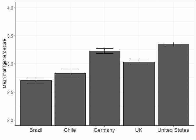
Bar chart of mean management score in manufacturing firms for a selection of countries, with 95% confidence intervals.
Figure 6.10 Bar chart of mean management score in manufacturing firms for a selection of countries, with 95% confidence intervals.
- Using the data for hospitals or schools (AMP_graph_public.csv), using all available countries:
- Create a summary table like Figure 6.9 for the overall management score, with one row for each country. Add a column containing the widths of the confidence intervals for the country means.
- Plot a column chart, showing the confidence intervals. Compare the management practices in the US with those in other countries. Are there any countries for which you can be confident that management practices are either better, or worse, on average than in the US? Explain your answer.
- Look at the width of your confidence intervals and the corresponding standard deviation and number of observations for each one. Explain whether or not the relationship between them is what you would expect.
Part 6.3 What factors affect the quality of management?
Learning objectives for this part
- calculate conditional means for one or more conditions, and compare them on a bar chart
- construct confidence intervals and use them to assess differences between groups
- evaluate the usefulness and limitations of survey data for determining causality.
Besides documenting and comparing management practices across industries and countries, another purpose of the World Management Survey was to investigate factors that affect management quality.
One possible factor affecting differences in management is firm ownership. To look at the data for this factor in the healthcare and education sectors, we will focus on broad groups (public vs privately-owned firms), and for manufacturing firms we will focus on different kinds of private ownership.
- Using the data for hospitals and schools (AMP_graph_public.csv):
- Create a table for hospitals and schools, showing the average management score, standard deviation (StdDev), and number of observations, with
countryas the row variable, andownership(public or private) andindas the column variables.
- Use your table from Question 1(a) to calculate the confidence interval widths for management in public and private hospitals. Then do the same for schools.
- Plot a bar chart (one for hospitals and another for schools) showing the means and the confidence intervals for the management score. Describe the differences between public and private firms within countries and compare management scores for the same firm type across countries. (For example, is one type of firm generally better managed than the other? Are there similar patterns for hospitals and schools? If you have done Question 5 in Part 6.1, you may want to discuss whether the rankings change after conditioning on ownership type.
Besides ownership type, management practices may vary depending on firm size, though it is difficult to predict what the relationship between these variables might be. Larger firms have more employees and could be more difficult to manage well, but may also attract more experienced managers. We will look at the conditional means for manufacturing firms, depending on whether they are above or below the median number of employees (calculated from the data), and see if there is a clear relationship.
- Using the data for manufacturing firms (AMP_graph_manufacturing.csv):
- Create a new variable that equals ‘Smaller’ if a firm has less than the median number of employees (330), and ‘Larger’ otherwise. In natural log terms, ‘Smaller’ corresponds to log employment of less than 5.80.
- For two countries of your choice and the US, create a table showing the mean overall management score, standard deviation, and number of observations, with
countryandownershipas the row variables, and firm size as the column variable. (Note: When there is only one observation in a group, there is no standard deviation.)
- Use your table to calculate the confidence interval width for each firm size and ownership type.
- Plot a bar chart for each country, showing the means and the confidence intervals. Describe any patterns you observe across ownership types and firm size in each country.
R walk-through 6.5 Calculating and adding conditional summary statistics and confidence intervals to a chart
We will use many techniques encountered previously, but first we have to create a new variable that indicates whether a firm is larger or smaller (
size). A firm withlemp_firm> 5.8 is considered larger. We use thefactorfunction to do this.man_data$size factor(man_data$lemp_firm > 5.8, labels = c("small", "large"))We choose Canada, Brazil, and the United States. Again, we use the piping technique to make the table. In the
group_bycommand, we group the variables bysizeandownership(as we did in R walk-through 6.1).table_stats2 man_data %>% filter(country %in% c("Canada", "United States", "Brazil")) %>% group_by(country, ownership, size) %>% summarize(obs = length(management), mean_m = mean(management, na.rm = TRUE), sd_m = sd(management, na.rm = TRUE)) table_stats2## # A tibble: 53 x 6 ## # Groups: country, ownership [?] ## country ownership size obs mean_m sd_m #### 1 Brazil Dispersed Shareholders small 28 3.06 0.667 ## 2 Brazil Dispersed Shareholders large 45 3.48 0.731 ## 3 Brazil Family owned, external CEO small 8 2.82 0.725 ## 4 Brazil Family owned, external CEO large 10 2.99 0.688 ## 5 Brazil Family owned, family CEO small 80 2.50 0.668 ## 6 Brazil Family owned, family CEO large 41 2.70 0.645 ## 7 Brazil Founder small 124 2.35 0.524 ## 8 Brazil Founder large 72 2.66 0.591 ## 9 Brazil Government small 1 4 NaN ## 10 Brazil Government large 2 2.44 1.18 ## # ... with 43 more rows Now we use the variable
sizeas a column variable, so that we can see the summary statistics in two blocks of columns (separately for larger and smaller firms). This is not a standard or straightforward procedure, but an Internet search (for ‘tidyverse spread multiple columns’) gives the following solution.table_stats2_mc table_stats2 %>% gather(variable, value, -(country:size)) %>% unite(temp, size, variable) %>% spread(temp, value) print(table_stats2_mc)## # A tibble: 28 x 8 ## # Groups: country, ownership [28] ## country ownership large_mean_m large_obs large_sd_m small_mean_m #### 1 Brazil Dispersed Share~ 3.48 45 0.731 3.06 ## 2 Brazil Family owned, e~ 2.99 10 0.688 2.82 ## 3 Brazil Family owned, f~ 2.70 41 0.645 2.50 ## 4 Brazil Founder 2.66 72 0.591 2.35 ## 5 Brazil Government 2.44 2 1.18 4 ## 6 Brazil Managers 2.51 7 0.631 2.64 ## 7 Brazil Other 3.01 29 0.541 2.57 ## 8 Brazil Private Equity NA NA NA 3.23 ## 9 Brazil Private Individ~ 2.94 42 0.523 2.69 ## 10 Canada Dispersed Share~ 3.52 53 0.582 3.43 ## # ... with 18 more rows, and 2 more variables: small_obs , ## # small_sd_mTo understand the logic of this command, go through it step by step: first apply
gather(which compiles the values of multiple columns (countryandsizein this case) into a single column), thenunite(which pastes multiple columns into one), and thenspread(takes two columns and spreads them into multiple columns).
So far we have looked at associations between firm characteristics and management practices, but have not made any causal statements. We will now discuss the difficulties with making causal statements using this data and examine how we might determine the direction of causation.
- For each of the following variables, explain how it could affect management practices, and then explain how management practices could affect it:
- education level of managers (percentage with a college degree)
- number of competitors
- firm size (number of employees).
- One way to establish the direction of causation is through a randomized field experiment. Read the discussion on pages 22–23 of the Bloom et al. paper (the section ‘Experimental Evidence on Management Quality and Firm Performance’) about one such experiment that was conducted in Indian textile factories.
- Briefly describe the idea behind a randomized field experiment, and explain, with reference to the results of the experiment in India, whether we can use it to determine the direction of causation between management practice and firm performance. The paper ‘Does Management Matter? Evidence from India’ provides more details about the experiment (pages 9–10 are particularly useful).
- Figure 12 in the paper shows productivity in treatment and control firms over time, with 95% confidence intervals. Use the information in the chart to describe the effect of the treatment on firm productivity.
-
University of Manchester’s Econometric Computing Learning Resource (ECLR). 2018. ‘R AnalysisTidy’. Updated 9 January 2018. ↩
