Empirical project 12 Solutions
These are not model answers. They are provided to help students, including those doing the project outside a formal class, to check their progress while working through the questions using the Excel, R, or Google Sheets walk-throughs. There are also brief notes for the more interpretive questions. Students taking courses using Doing Economics should follow the guidance of their instructors.
Part 12.1 Inequality
-
Separate line charts for each percentile are provided in Solution figures 12.1 to 12.5.
Real incomes have generally increased over time for all percentiles except the 15th percentile.
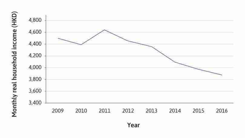
15th percentile of incomes.
Solution figure 12.1 15th percentile of incomes.
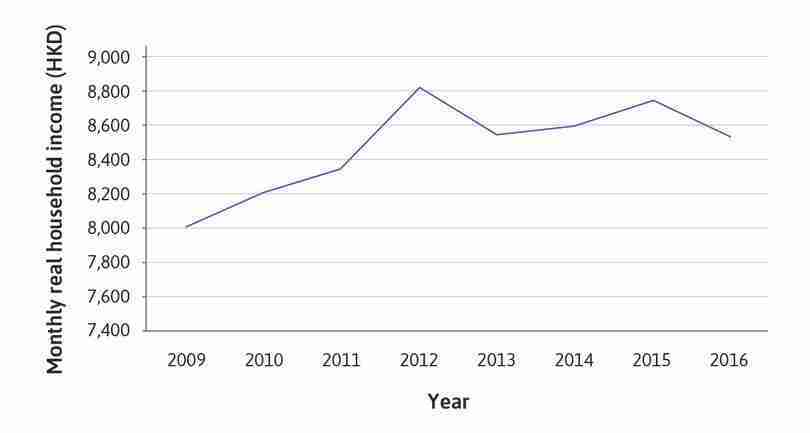
25th percentile of incomes.
Solution figure 12.2 25th percentile of incomes.
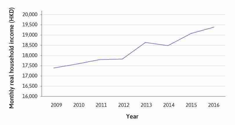
50th percentile of incomes.
Solution figure 12.3 50th percentile of incomes.
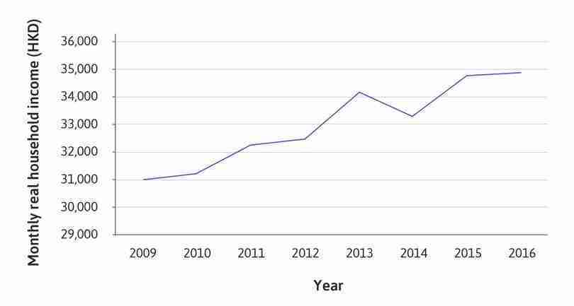
75th percentile of incomes.
Solution figure 12.4 75th percentile of incomes.
- No solution is provided.
- Assuming 100 households, the economy-wide income is $1,690,668 in 2011 and $2,203,815 in 2012.
- Values are rounded to two decimal places, and shown in Solution figure 12.6.
| Cumulative share of the population (%) | Perfect equality line | Cumulative share of income in 2011 (%) | Cumulative share of income in 2012 (%) |
|---|---|---|---|
| 0.00 | 0.00 | 0.00 | 0.00 |
| 15.00 | 15.00 | 0.00 | 3.91 |
| 25.00 | 25.00 | 2.74 | 8.44 |
| 50.00 | 50.00 | 15.09 | 24.53 |
| 75.00 | 75.00 | 41.42 | 50.37 |
| 85.00 | 85.00 | 60.50 | 67.09 |
| 100.00 | 100.00 | 100.00 | 100.00 |
Cumulative share of income, for some percentiles of the population.
Solution figure 12.6 Cumulative share of income, for some percentiles of the population.
- The Lorenz curves are shown in Solution figure 12.7.
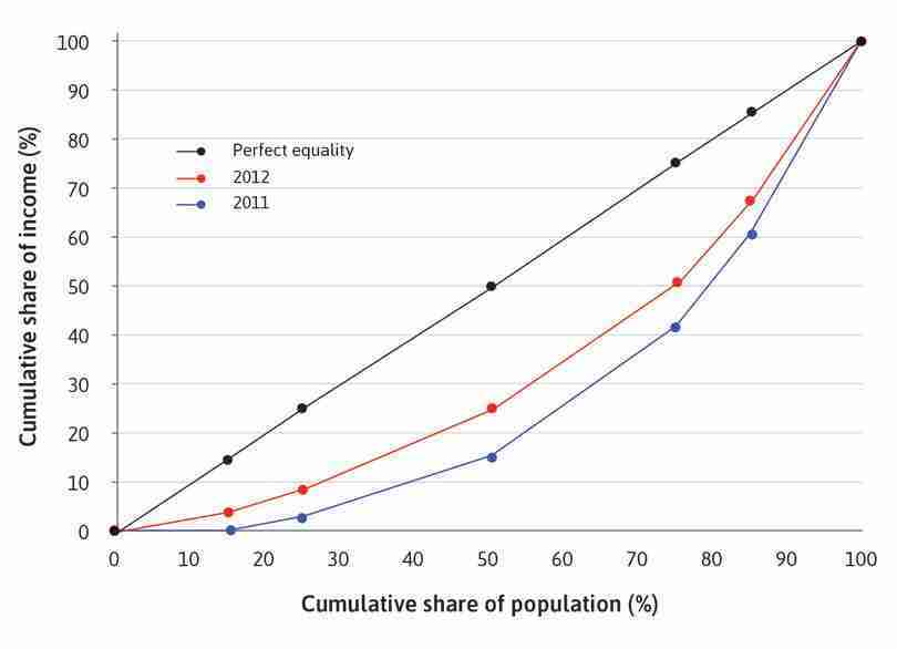
Lorenz curves for 2011 and 2012.
Solution figure 12.7 Lorenz curves for 2011 and 2012.
- The completed table is too large to provide here, but some values for 2012 and 2013 are provided in Solution figure 12.8.
| Percentile | 2011 | 2012 | 2013 |
|---|---|---|---|
| 1 | 0.00 | 6,000.00 | 0.00 |
| 2 | 0.00 | 6,000.00 | 0.00 |
| 3 | 0.00 | 6,000.00 | 0.00 |
| … | |||
| 98 | 44,516.67 | 50,544.18 | 45,270.21 |
| 99 | 44,516.67 | 50,544.18 | 45,270.21 |
| 100 | 44,516.67 | 50,544.18 | 45,270.21 |
Incomes earned by each percentile of the population.
Solution figure 12.8 Incomes earned by each percentile of the population.
- The Gini coefficient is 0.47 in 2011, 0.34 in 2012, and 0.46 in 2013.
-
The $6,000 handout had a noticeable impact on income inequality in 2012, but these impacts did not last until 2013.
One reason that the scheme only had a one-year effect on income inequality after 2012 is that a one-off lump-sum payment did not address the root causes of income inequality (for example, differences in education or qualifications, which determine the job opportunities and wages available to households, or institutions that prevent social mobility). The fact that it was a one-off handout meant that low income households, who are typically credit constrained and unable to borrow were likely to spend it on consumption. The amount was not large enough to pay for training or qualifications or to allow a household to set up a small business.
It is also unlikely that the changes in household income in 2012 were entirely due to the scheme. The incomes of the richer households may have increased more than those of the poorer households, for example due to receiving larger end-of-year bonuses or receiving tax rebates, which could outweigh the $6,000 given in the scheme. If this were the case, the fall in the Gini coefficient would have been moderated by these effects.
- If households currently receiving zero income received additional cash transfers from the government, their cumulative share of income would increase, so the Lorenz curve at that part would move closer to the perfect equality line. Inequality (and the Gini coefficient) would decrease.
- If the richer households had to pay income tax, their cumulative share of income would decrease, so the Lorenz curve at that part would move closer to the perfect equality line. Inequality (and the Gini coefficient) would decrease.
-
Solution figure 12.9 shows the percentage increases over time. Values are rounded to three decimal places.
For the percentage changes in the price level in each year given, an index set at 1 in 2009 would have increased to 1.289, an increase of 28.9%.
| Year | Percentage increase (from previous year) | Inflation index |
|---|---|---|
| 2009 | 1.000 | |
| 2010 | 2.40 | 1.024 |
| 2011 | 5.30 | 1.078 |
| 2012 | 4.10 | 1.122 |
| 2013 | 4.30 | 1.171 |
| 2014 | 4.40 | 1.222 |
| 2015 | 3.00 | 1.259 |
| 2016 | 2.40 | 1.289 |
Creating an index-based series from percentage increases.
Solution figure 12.9 Creating an index-based series from percentage increases.
- No solution is provided.
Part 12.2 Government popularity
-
Supporters of the scheme could include:
- citizens who receive the payment, especially the lower-income households, for whom $6,000 would be a substantial increase in annual income
- government officials and politicians, since the scheme is a visible way to address inequality in society, which could help boost their popularity and help to get them re-elected
- social welfare groups or related organizations, who could view this scheme as one step towards reducing inequality.
Opponents of the scheme could include:
- lower-income people, who may believe that a pay-out independent of need is unfair
- wealthier or more powerful members of society, such as businesspeople, who may believe they made a larger contribution to economic growth and may therefore not perceive an equal split as being fair
- policymakers, who may believe that other programs or policies could be more effective at addressing inequality than a one-off lump-sum payment (for example, additional subsidies for lower-income households, or transfers to lower-income households only).
- No solution is provided.
-
Some measures were taken to ensure the sample was representative, for example:
- The sample is selected according to the gender–age distribution of the population of interest.
- Telephone numbers were randomly generated.
Limitations of the survey method include:
- The website does not specify whether landline numbers or mobile phone numbers are used (or both). Certain age and income groups are more likely to have and use a mobile phone (likewise for landlines), which affects the likelihood of being successfully contacted.
- Certain groups of people are more likely to have the time to complete the survey.
- Only Cantonese people over the age of 18 were surveyed, so this survey does not capture the opinions of other groups of the population (e.g. immigrants who cannot speak Cantonese).
-
The line chart showing overall public satisfaction is provided in Solution figure 12.10.
Overall public satisfaction was initially high from 2006 to the first half of 2008, but dropped in the second half of 2008 and remained low throughout 2009 (which may have prompted the government to take measures to improve their popularity). Overall public satisfaction dropped further from 2010 to 2012, remaining at negative values until the second half of 2017.
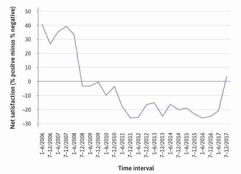
Overall satisfaction with the government (2006–2017).
Solution figure 12.10 Overall satisfaction with the government (2006–2017).
- No solution is provided.
-
Improvement of people’s prosperity is used as an example in Solution figure 12.11.
The general pattern is similar to that of overall satisfaction with the government, with net satisfaction generally decreasing until the second half of 2012, and again in the second half of 2017. The increase in the second half of 2012 is larger, which may be expected since the policy is more directly targeted at this aspect of governance (though net satisfaction is still negative).
-
The scheme did not seem to improve government popularity. When the scheme was announced in 2011, popularity dropped even further, and only rose slightly in the second half of 2012 when the scheme’s implementation had finished. Satisfaction remained at negative net values until the second half of 2017.
However, we cannot simply conclude that the scheme ‘caused’ the drop in government popularity. Other events, such as political scandals, could undermine public support for the government. For example, in 2015, the government was criticized for its handling of the widespread contamination of drinking water. The government could have pursued other policies that were unpopular with the public, for example lowering the minimum wage, or entering a trade agreement that would disadvantage its citizens. It is also possible for popularity to drop due to unfavourable statistical releases, such as bad economic performance data or high unemployment rates.
-
There are many possible points to discuss, including:
- Compared to the 2011 scheme, this scheme is targeted more towards needy households (for example, those who are not homeowners or are not earning enough to pay income tax).
- Another difference is that the amount received depends on need rather than being the same amount for all eligible households.
- Administrative costs are higher than the 2011 scheme (possibly because of the need to verify and calculate the amount given to each eligible household), and the maximum amount distributed is smaller.
-
An example of an argument for recommending the scheme is provided:
The scheme is a visible and tangible way to reduce income inequality, and giving everyone the same lump-sum amount could be seen as being ‘fair’, which could improve public satisfaction with the government. However, when the scheme was actually implemented, there were huge administrative costs involved with registering citizens and arranging the payment. To reduce the administrative burden, instead of doing a direct transfer, the payment could take the form of a tax rebate (for taxpayers) and an increase in existing transfers or subsidies (for non-taxpayers). Also, the payment could be adjusted for the number of dependents that the adult has to support: even though the scheme seemed fair since every adult received the same amount, households with more children (who have greater financial needs) received the same amount as married couples without children.
An example of an argument for not recommending the scheme is provided:
The scheme does not address the root causes of income inequality, so would not affect inequality in the long run. It might be more effective to spend the surplus on providing educational subsidies for low-income households, scholarships for students from low-income households to study at university, or retraining programs for the unemployed.
