You can download our complete – daily updated – Our World in Data COVID-19 database.
What is the global situation now?
Only if we end the pandemic everywhere can we end the pandemic anywhere. The entire world has the same goal: cases of COVID-19 need to go to zero.
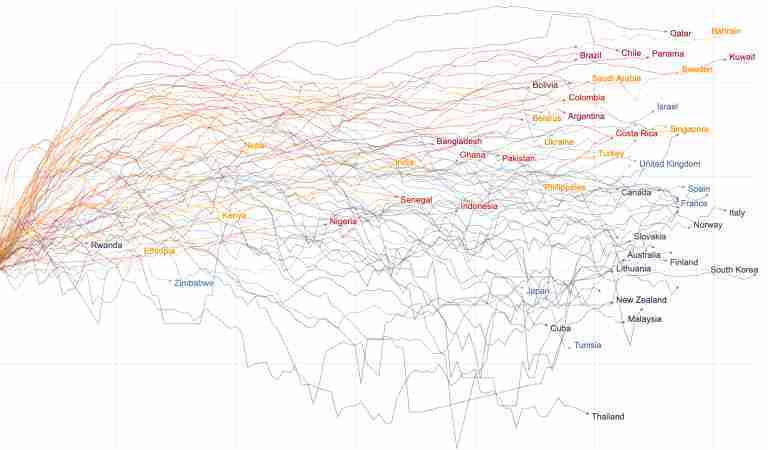
The chart below shows which countries are making progress to this goal and which are not.
The trajectories show the daily number of confirmed cases. But the widely available data on confirmed cases only becomes meaningful when it can be interpreted in light of how much a country is testing. This is why Our World in Data built the global database on COVID-19 testing and the line colors in this chart show whether a country is testing adequately or not.
A country is not testing adequately when it is finding a case for every few tests they perform. Here it is likely that the true number of new cases is much higher than the number of cases that were confirmed by tests. When the positive rate of tests is high the line is shown in shades of red.
Blue lines mean that a country does many tests for each case it finds; the testing effort in these countries is adequate.
→ We explain this chart and the metrics in much more detail further below in the section ‘The chart to monitor the fight against the global pandemic’.
To be safe anywhere, every region in the world needs to make progress against the pandemic – and this means dark blue lines hitting zero.
Progress is possible – some countries bent the curve of new cases and are monitoring the outbreak well. But globally we are very far from the goal and the global number of confirmed cases is rising extremely fast.
→ Open the Data Explorer in a new tab.
Two questions guide this daily updated publication on the global COVID-19 pandemic:
- How can we make progress against the pandemic?
- And, are we making progress?
To answer these questions we need data. But data is not enough. This is especially true in this pandemic because even the best available data is far from perfect. Much of our work therefore focuses on explaining what the data can – and can not – tell us about the pandemic.
Our goal is two-fold:
- To provide reliable, global and open data and research on how the COVID-19 pandemic is spreading, what impact the pandemic has, how we can make progress against the pandemic, and whether the measures countries are taking are successful or not;
- And to build an infrastructure that allows research colleagues – and everyone who is interested – to navigate and understand this data and research.
Before we study how to make progress we should consider the more basic question: is it possible to do so?
The answer is very clear: While some countries have failed in their response to the pandemic, others met the challenge much more successfully. Perhaps the most important thing to know about the pandemic is that it is possible to fight the pandemic.
Responding successfully means two things: limiting the direct and the indirect impact of the pandemic. Countries that have responded most successfully were able to avoid choosing between the two: they avoided the trade-off between a high mortality and a high socio-economic impact of the pandemic. New Zealand has been able to bring infections down and open up their country internally. Other island nations were also able to almost entirely prevent an outbreak (like Taiwan, Australia, and Iceland). But not only islands were able to bend the curve of infections and prevent large outbreaks – Norway, Uruguay, Switzerland, South Korea, and Germany are examples. These countries suffered a smaller direct impact, but they also limited the indirect impacts because they were able to release lockdown measures earlier.
Together with colleagues at the Robert Koch Institute, the Chan School of Public Health, the UK Public Health Rapid Support Team, the London School of Hygiene and Tropical Medicine and other institutions we study countries that responded most successfully in detail.
The point of this work is to understand those countries so that the rest of the world can learn from them. We have published three country specific studies:
- Emerging COVID-19 success story: Vietnam’s commitment to containment
- Emerging COVID-19 success story: Germany’s strong enabling environment
- Emerging COVID-19 success story: South Korea learned the lessons of MERS
Together with epidemiologists Anna Seale, Dave Kennedy, and Daniel Bausch we wrote this introduction to the Pandemic Exemplar project. We will continue this work over the course of the pandemic so that the world can learn from those countries that are most successful in their fight against the pandemic.
Coronavirus Country Profiles
We built 207 country profiles which allow you to explore the statistics on the coronavirus pandemic for every country in the world.
In a fast-evolving pandemic it is not a simple matter to identify the countries that are most successful in making progress against it. Excess mortality and the rate of the confirmed deaths is what we focus on in the sections below, but for a fuller assessment a wider perspective is useful. For this purpose we track the impact of the pandemic across our publication and we built country profiles for 207 countries to study the statistics on the coronavirus pandemic for every country in the world in depth.
Each profile includes interactive visualizations, explanations of the presented metrics, and the details on the sources of the data.
Every country profile is updated daily.
Our 12 most visited country profiles
Every profile includes four sections:
- Deaths: How many deaths from Coronavirus have been reported? Is the number of deaths still increasing? How does the death rate compare to other countries?
- Testing: How much testing for coronavirus do countries conduct? When did they start and how does it compare with other countries?
- Cases: How many cases were confirmed? How many tests did a country do to find one COVID-19 case? And is your country bending the curve?
- Government responses: What measures did countries take in response to the pandemic?
Deaths due to COVID-19
While the Country Profiles provide the in-depth perspective, the chart shown below provides the global, comparative perspective. The trajectories of the death counts make clear just how very differently different countries were impacted.
The steepness of the slope shows how rapidly the death count was rising at a particular moment in the outbreak. The level shows how many people were confirmed to have died due to COVID-19 in each country.
Among the countries with the highest death toll are some of the most populous countries in the world such as the US, Brazil, and Mexico. If you prefer to adjust for the differences in population size you can switch to per capita statistics by clicking the ‘per million people’ tickbox.
We can see three different ways in which the pandemic has affected countries:
- Some countries have not been able to contain the pandemic. The death toll there continues to rise quickly week after week.
- Some countries saw large outbreaks, but then ‘bent the curve’ and brought the number of deaths down again. Italy, Germany, and many European countries followed this trajectory.
- Some were able to prevent a large outbreak altogether. Shown in the chart are South Korea and Norway. These countries had rapid outbreaks, but were then able to reduce the number of deaths very quickly to low numbers.
While some commentaries on the pandemic have the premise that all countries failed to respond well to the pandemic the exact opposite stands out to us: Even at this early stage of the pandemic we see very large differences between countries – as the chart shows. While some suffer terrible outbreaks others have managed to contain rapid outbreaks or even prevented bad outbreaks entirely. It is possible to respond successfully to the pandemic.
→ Open the Explorer in a new tab.
In-depth: The Data on confirmed deaths
Detailed information about the data sources for these death statistics, the definition of what is counted as a death from COVID-19, limitations of cross-country comparisons, and many additional detailed charts can be found in our page dedicated to deaths from the coronavirus.
In-depth: The mortality risk from COVID-19
If someone is infected with COVID-19, how likely is that person to die? In our page dedicated to the mortality risk we explain why it is difficult to answer this question and what we do know – we explain the difference between the infection and the case fatality rate, explain common mistakes in interpreting mortality statistics, and we report the case fatality rate for countries around the world – as always we update it daily.
In-depth: Excess mortality
Excess mortality refers to the number of deaths from all causes above and beyond what we would have expected to see under ‘normal’ conditions.1 In this case, we’re interested in how deaths during the COVID-19 pandemic compare to the average number of deaths over the same period in previous years.
Looking at excess mortality is helpful for understanding the total impact of the pandemic on deaths – both direct and indirect. It helps us understand the direct impact by capturing deaths caused by COVID-19 that were not correctly diagnosed and reported, for example because no test for the virus was conducted. It helps us understand the indirect mortality impact by capturing the many ways in which the pandemic has affected health systems and living conditions. For example, if the pandemic overwhelms health systems or diverts resources away from other health problems, more people may die from non-COVID causes than we would expect. Excess mortality is thus a more comprehensive measure of the impact of the pandemic on deaths than the confirmed COVID-19 death count alone.
The chart here shows excess mortality during the pandemic as the percentage difference between the number of weekly deaths in 2020 and the average number of deaths in the same week over the previous five years (2015–2019) – a measure called the P-score.2
Because the P-score measures percentage difference within a country, it allows for direct comparisons across countries. You can see from the chart that some countries – such as the UK and Spain – suffered high levels of excess mortality, while others – such as Germany and Norway – experienced much more modest increases in mortality.
The P-scores shown here combine all ages and do not account for differences in mortality risk by age and countries’ age distributions.
You can learn in more depth about the P-score and other measures of excess mortality and their comparability across countries in our work with John Muellbauer and Janine Aron.
The COVID-19 pandemic could be (hopefully!) one of the most impactful events in our lifetime. That is because the direct and indirect impacts of COVID-19 are so extraordinarily large.
Once a country experiences a rapid outbreak of the disease it can only respond with one of two bad alternatives: leaving the pandemic unchecked would mean that a very large share of the population would get sick and many would die. But the indirect impacts that result from the alternative – the containment measures of shutting down public life – also lead to widespread suffering: these include higher unemployment, lower production (and therefore increasing rates of poverty), and likely also higher mortality from other causes.
To properly monitor the impact of the pandemic we would need metrics that are unfortunately not available: the total number of deaths due COVID-19 and the metrics that capture the many ways the pandemic indirectly impacts our lives.
The goal of researchers – in our team and elsewhere – is to work towards these ideal measures. In the meantime we have to learn from the metrics that are available currently: the number of confirmed deaths due to COVID-19, excess mortality, and the early results of the ongoing research on the pandemic’s indirect impacts.
To capture both of these are ongoing efforts of our work. Here at Our World in Data we aim to provide a broad perspective on the living conditions of people around the world – from poverty, to education, to human rights, and health more broadly – look at the full list of the topics we work on. In this project, the impact of the pandemic will be one of our focus areas as we move forward.
To end the Coronavirus pandemic, we have a clear and simple goal: cases need to go to zero everywhere.
Viruses don’t respect borders – even the 1918 influenza pandemic reached remote islands within months, and that was long before the days of global air travel. It is therefore the entire world that needs to make progress against the virus if we want to prevent a situation where countries either need to lock themselves off from the rest of the world or suffer recurring COVID-19 outbreaks.
Only if we end the pandemic everywhere can the pandemic end anywhere.
If the total number of cases was known it would be straightforward to build a good visualization to monitor the pandemic. We would simply report new cases over time – a chart that the literature refers to as the epidemic curve, often shortened to epi curve.
However, with the COVID-19 pandemic we are in the unfortunate situation that the number of total cases is not known. Only a fraction of total cases – those confirmed by a test – is known.
This means that we need to be able to monitor the number of confirmed cases and the testing that a country does. Because no academically sound organization built a database on testing we here at Our World in Data spend much of our work on building the required international testing database that allows us to make sense of the available counts of confirmed cases.
Below we will explain in more detail what we can learn from this chart, but the quick summary of this chart is that each line in this chart shows you the new confirmed cases over time – that part of the chart is simply the classic epi curve – while the line color shows you the quality of the data at each point in time: the rate of tests that are positive. Darker shades of blue indicate a low positive rate, which means that a country is testing very widely so that the confirmed case count is likely closer to the true total number of cases.
The chart allows everyone to monitor whether the world is successful in the fight against the pandemic: what the world needs to achieve is that all lines turn into dark blue and hit zero.
Related charts:
How you can interact with this chart
- Clicking on any country in the chart highlights that country. If you click on several countries you can create a view in which you can compare several countries.
- Any country you might not see immediately you can find via the ‘Select Countries’ in the bottom left. Just type the name in the search box there.
- To focus on the countries you highlighted click on ‘Zoom to selection’.
- The default view on a logarithmic y-axis is helpful to compare the growth rates between countries: on a logarithmic axis the steepness of the line corresponds to the growth rate. [Here is an explanation for how to read logarithmic axes.]
- But in this chart – as in many of our charts – you can switch to a linear axis – just click on ‘Linear’ in the top left.
Why are not all countries included in this chart?
- For a country to be included in this chart, we require data on testing for this country (here is our testing database – all sources are documented there and we report for which countries we were not able to find testing data.)
- If you are interested in the number of confirmed cases for a country not shown here, have a look at the Data Explorer, you’ll find the data there.
As the chart title says, the epi curve for each country shows the number of confirmed cases only: those cases that were confirmed by a laboratory test.
Confirmed cases are only a fraction of the number of total cases. The question is: how big of a fraction of the total number of cases are confirmed? This is not known, but we can get an indication by looking at the extent of testing.
How big a fraction of total cases get confirmed depends on how much a country actually tests. To understand the spread of the disease we need to interpret the number of cases – the epidemic curve – in light of how much testing for COVID-19 the country actually does.
For this reason we at Our World in Data built a global database on testing. We made it available for everyone – epidemiologists, the WHO, the UN, and many governments rely on our database for their daily work. We update it continuously.
When we decided to build the testing database we did so because we wanted to build this chart: one that brings together the epi curve with the relevant information about how much a country actually tests to allow everyone to monitor the quality of the reported data. We can only include countries in this chart for which we have data on testing. You can find the complete overview – including a detailed description of each source – in our testing database here. Our data covers currently 66% of the world population.
Just as it is not informative to look at case counts in isolation it is also not informative to look at the number of tests in isolation. We need to see the number of tests in relation to the size of the outbreak: countries with large outbreaks need to do much more testing to monitor the spread of the pandemic than countries where the disease is under control. See the work of our colleague Joe Hasell who looked at this in detail.
Based on this principle we calculate a quality metric for the case counts that answers the question: what share of tests in a particular country confirm a case of COVID-19?
This metric is referred to as the positive rate or positivity rate.3
The world map here shows this data – it is exactly the same data shown as the line color in the chart above.
By moving the time-line below the map you can see how this metric has changed around the world; by clicking on a country you can see how it changed in every country.
The world map shows enormous differences across countries:
- Some countries, like Australia, South Korea and Slovenia do hundreds, or even thousands of tests for each case they find – the positive rate of these countries is therefore below 1% or even 0.1%.
- Others, such as Mexico, Nigeria, and Bangladesh do very few tests – five or fewer – for every confirmed case. Their positive rate is very high.
Countries that do very few tests per confirmed case are unlikely to be testing widely enough to find all cases. The WHO has suggested a positive rate lower than 10% – but better lower than 3% – as a general benchmark of adequate testing.4
The countries that have a positive rate below 3% are shown in shades of blue. Those that have a positive rate higher than 5% are shown in shades of red.
In countries that test very little in relation to their outbreak – shown in shades of red in the chart – many cases are likely to go unreported. In these countries, the number of confirmed cases indicated may represent only a fraction of the total number of cases.
Only countries for which we have data on testing are included in this world map (here is our testing database – all sources are documented there and we report for which countries we were not able to find testing data.)
What stands out from this chart is that the differences between countries are indeed very large. In the charts below we highlight countries that make these differences especially clear.
- The data for Slovakia, Thailand, New Zealand, South Korea, and Germany shows that these countries monitored the outbreak well from the start or caught up rapidly after an initial outbreak. Eventually they were able to bend the curve and bring down the number of confirmed cases, while increasing the ratio of tests to confirmed cases. These are not the only countries that achieved this; you can add for example Austria, Iceland, Slovenia, Tunisia, or Latvia to the chart and you will find similar trajectories.
- The data for Brazil, Mexico, the United States, Panama, India, Pakistan, South Africa, and Nigeria shows that these countries test little relative to the size of the outbreak. Additionally these countries report unfortunately still very high daily case counts – their lines are red and far from zero.
In the early phase of the outbreak there was not always a big difference between these two groups, but while the first group of countries managed to catch up with the outbreak, the second one did not achieve this yet.
You can of course select other countries too. By hovering over the epi curves – or finding a country via ‘Select countries’ in the bottom left – you can see how the testing relative to the size of the outbreak has changed over time for each country.
We believe it is the most important chart to track the global outbreak of COVID-19. It shows us whether reported cases go to zero and crucially gives us an indication of how good that reporting is.
As all our work on the pandemic we will update this chart every day so that you can monitor whether the world is making progress to our global goal or not.
To be safe anywhere, every region in the world needs to make progress against the pandemic – and this means dark blue lines hitting zero. Currently we are far from it.
But just as the chart before that focused on confirmed deaths, it is clear that a rapid, devastating outbreak is not the fate that countries inevitably face. We need to look at the countries that responded most successfully and learn what allows to make progress against the pandemic.
- Fighting the pandemic: What can everyone of us do to flatten the curve?
- 1] Wash your hands
- 2] Wear a mask
- 3] Watch your distance
- 4] Risk communication and public awareness
- Fighting the pandemic: What can we do as a society to make progress against the pandemic?
- 1] Science and medical innovation
- 2] Data and research
- 3] Widespread testing
- 4] Policy responses to limit the spread of the disease
The best possible future would be one in which humanity eradicates the virus entirely.
Humanity has eradicated infectious diseases before, but only twice: Rinderpest, a disease that infected primarily cattle, was eradicated in 2011, and smallpox was declared eradicated in 1980. The eradication of smallpox is surely one of humanity’s greatest success stories – once an extremely terrible disease, it was eradicated thanks to global vaccination campaigns. These efforts have likely saved more than 100 million lives since. In our entry on smallpox you find the data and research on smallpox – and the history of how it was eradicated.
However, since we currently lack any pharmaceutical defense against COVID-19 it is clear that eradication is at best a hopeful possibility far beyond our current horizon. We will have to share our planet with SARS-CoV-2, the virus that causes COVID-19, for a long time.
What we need to avoid: rapid, large outbreaks
Before we get into how to make progress against the virus, let’s think about what we need to avoid.
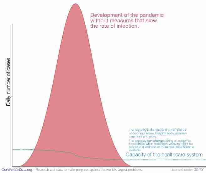
The very worst that can happen are rapid outbreaks that lead to many people being infected in the same area at the same time.
A doctor can help 10,000 patients one after the other, but a doctor can not help 10,000 patients when they are all sick at the same time. A large number of sick people can exceed the capacity of the healthcare system (as the illustration shows).
When this becomes a reality many die untreated. And as more healthcare workers get sick themselves, the capacity of healthcare systems declines at just the time when it is most needed.
Unfortunately this has already happened several times during the pandemic: the need for healthcare was much greater than what the system was able to offer in the North of Italy, Madrid, New York City, and several other places around the world.
Without adequate countermeasures the rate of infection is high and the disease spreads very rapidly as we’ve seen in these places.
In these times the risk for all patients, not just COVID-19 patients, can be much higher than normal. Patients who suffer from common causes of death – like cancers or cardiovascular diseases – might no longer be able to access their regular care. And others might postpone seeing a doctor because their are afraid to get infected with COVID-19 and thereby miss a diagnosis. The ensuing increase of deaths is what the statistics on excess mortality capture.
What we need to achieve: suppression or at least mitigation – to provide healthcare and win time for innovation we need to flatten the curve
Rapid outbreaks are the default with COVID-19. If we are not monitoring the situation closely and do not aim to slow the rate of infection it will spread rapidly through large parts of the population.5
All countermeasures have the same goal: to slow the rate of infection.
This is the logic of ‘flattening the curve’. The aim is to slow the spread of the disease so that we reduce the peak and can care for all – or at least a larger share – of the people that need care.
These strategies come in two intensities: mitigation and suppression.6
- The goal of a mitigation strategy is to slow the rate of infection, but it isn’t so ambitious as to reduce the reproduction number (Rt) – the expected number of secondary cases generated by each case – below 1. As Rt remains above 1 the pandemic develops with a single peak due to the build-up of herd immunity.
- The goal of a suppression strategy is to reduce Rt below 1 and keep the total number of infections so low that herd immunity will never be achieved. The hope is that a vaccine will become available which will provide the immunity instead.
We know that it is possible to bring down the Rt and to flatten the curve. Countries in many regions in the world – South Korea, Germany, and Uruguay for example – have shown that it is very much possible to mitigate and even suppress the pandemic.
Countries that kept the rate of infection low were able to avoid a sharp peak of the epidemic and the number of people who were sick at the same time remained within the capacity of the healthcare system.
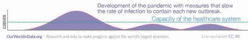
There is a second reason why it is important to flatten the curve: Slowing down the pandemic means that scientists have time to develop tools to fight the virus.
Scientists around the world are working on solutions to fight this pandemic – better tests, medication, and in the best scenario, a vaccine – but this takes time. By slowing the pandemic we give scientists more time to develop the technology we all need.
What are the means to reach this goal and win time and provide healthcare for all that need it?
Fighting the pandemic: What can everyone of us do to flatten the curve?
Some measures against the pandemic are beyond what any individual can do. The development of a vaccine, R&D in pharmaceutical research, building the infrastructure to allow large-scale testing, and coordinated policy responses require large-scale collaboration and are society-wide efforts. We will explore these later.
But, as with all big problems, there are many ways to make progress and some of the most important measures are up to all of us.
In the fight against the pandemic we are in the fortunate situation that what is good for ourselves is also good for everyone else. By protecting yourself you are slowing the spread of the pandemic.
You and everyone else have the same two clear personal goals during this pandemic: Don’t get infected and don’t infect others.
To not get infected you have to do what you can to prevent the virus from entering your body through your mouth, nose, or eyes. To not infect others your goal is to prevent the virus from traveling from your body to the mouth, nose or eyes of somebody else.
What can you do? How can all of us – you and me – do our part to flatten the curve? The three main measures are called the three Ws: Wash your hands, wear a mask, watch your distance.
1] Wash your hands
Washing your hands is your superpower in the fight against the pandemic.
Since soap is so very common and cheap it is easy to fail to appreciate how powerful it is. But the virus most likely enters your body via your hands and the research is clear that washing your hands with simple soap and water is the best thing you can do to protect yourself from infection.7
We have previously written about how the importance of hand-washing was discovered in the 19th century and how it contributed to the large decline of maternal mortality since.
Soap feels nice to our skin, but to viruses it is extremely destructive. Coronaviruses, like many other viruses, are wrapped into an envelope protein.8 Soap can break this outer layer of the coronavirus apart. Additionally, hand-washing with soap makes our hands slippery and the mechanical motion of washing rips the viruses away from your skin and down the drain.9
But many of us don’t know how to use this superpower. If you don’t know how to wash your hands, let this nurse teach you. To get the right mindset for your most important job of 2020: Wash your hands like you just cut some chillies and now have to put contact lenses in.
In addition to serious hand-washing you can also take care to not get the virus on your hands in the first place – no handshakes – and ensure that you don’t get it from your hand into your body, which means do not touch your face.
Not touching your face is harder than it might first appear. We touch our face much more often than we realize.10 When soap and water are not available it is recommended that you use hand sanitizer – to be effective the sanitizer needs to be more than 60% ethanol (or >70% of isopropyl alcohol)11. But soap and water are the better protection – medical microbiologist Manal Mohammed wrote an excellent summary of how to keep your hands clean.
2] Wear a mask
The coronavirus is transmitted from one person to the next via small droplets produced by coughing, sneezing, and talking.12
Facemasks aim to prevent the spread of the virus from one person to the next.
You don’t only wear the mask for your own protection. Mask wearing is altruistic too. The research clearly suggests that masks help to reach both of the main goals: They reduce the risk for the wearer to get infected – and they also reduce the risk of the wearer infecting others.
A systematic review and meta-analysis by Chu et al. (2020), published in The Lancet, found that the use of face masks would result in a large reduction of the risk of infection.13
More references can be found at the footnote here.14
3] Watch your distance
Some viruses can travel extremely far through the air. The measles virus, for example, can remain in the air for up to two hours and travel many dozen meters.15
Luckily the coronavirus does not travel as far. But it too can travel some distance and to interrupt the chain of transmission it’s important to avoid being close to other people that might be infecting you. The British NHS recommends that you “stay at least 2 meters (3 steps) away from anyone you do not live with.”16
This is sometimes called ‘social distancing’, but since in these days of modern communication we can be social even if we are not physically close, physical distancing is more accurate.
It is not a nice experience, but during a pandemic physical distancing is a nice thing to do. It means no hugging, no handshakes, and staying at least 2 meters (6 feet) from others.
In many countries the governments set restrictions that have the same goal of restricting proximity between people – travel restrictions, school closures, workplace closures. We will look at these policy responses to the pandemic further below.
The reason to stay home is not necessarily that you are scared for your own health, but to protect those who need to be out.
Some of us can’t stay home. Doctors, cashiers, bakers and many others have to go to work. That’s why if you are fortunate enough to be able to stay at home, you should.
If you can stay at home, stay at home to protect those who need to be out for society to function. You depend on all of those that have to be out – they all depend on you to not get sick.
Some places are more dangerous than others. In their successful response to the pandemic Japan has emphasized that the risk of infection is especially high in the “three Cs” – these three Cs should be avoided to reduce the risk of getting infected:17
- Closed spaces with poor ventilation,
- Crowded spaces,
- Close-contact settings in which people are talking face-to-face.
The risk is especially high if two or three of the Cs come together.
4] Risk communication and public awareness
A fourth way in which everyone can contribute to the fight against the pandemic is in explaining what you know and making it understandable for everyone to follow the three Ws and for society to achieve the big social goals below.
Most countries in the world run public information campaigns – here is our regularly updated world map on information campaigns around the world.
This page here is one of our efforts to communicate the scientific knowledge about the pandemic. Beyond this we teamed up with our friends from the YouTube channel Kurzgesagt and collaborated with them to make this video on the COVID-19 pandemic. So far it has been seen by more than 25 million on YouTube, and many others on other platforms where it was reposted.

We hope that we convinced some of you that we don’t have to accept a fast pandemic as our fate. We know how to slow the speed of infection and flatten the curve. Let’s do it.
You can help by spreading your knowledge about the pandemic and by teaching others how they can protect themselves and those around them.
Fighting the pandemic: What can we do as a society to make progress against the pandemic?
Slowing down the pandemic is the goal of all of us right now. And as explained above the best way to contribute to this goal is to not get infected yourself – by washing your hands, wearing a mask, and watching your distance.
Beyond the individual level we can join forces to achieve even more. Cooperation is the strength of our species and our most promising strategy to make progress against the pandemic is the global collaboration in science, technology, and political organization.
1] Science and medical innovation
Humanity made a lot of progress against big problems before – if you have doubts, read our Short History of Global Living Conditions.
Innovation – our collaborative success in research and development – were often key to our success. Scientific breakthroughs made it possible to make decisive progress against problems that seemed insurmountable before. “Science is the only news,” as Stewart Brand put it.
Big innovations now could make all the difference between a pandemic that spreads around the globe and requires us to live a life in constant worry of new outbreaks or the possibility that we find the technological innovation to protect ourselves from the virus.
In recent decades humanity has been extraordinarily successful in the fight against viruses and bacteria – we found vaccines against diseases that once killed millions every year, we reduced child mortality around the world, and in every region of the world we now live twice as long as our ancestors just a few generations ago. In this pandemic too, we can hope – but not expect – that science comes to the rescue.
The biggest game changer would be an effective and safe vaccine against COVID19.
Why is a vaccine so important?
The pandemic will come to an end when the world population has immunity against the disease. Not the entire world population needs to be immune, but a sufficiently large fraction, this is the ‘herd immunity threshold’.18
The question is how this immunity threshold will be reached. There are two ways:
- One possible future is that more and more people get infected with the virus and thereby acquire immunity against future infections. This will likely take a long time and it obviously involves many people getting sick and dying from the disease.
- The alternative is to acquire this immunity of large share of the population through a vaccine instead of people getting sick with the disease.
Until there is a vaccine more and more people will contract the disease and the rapid rise of cases will only come to an end when the world population has reached the immunity threshold in this natural way. This ‘natural way’ of immunizing the world population will involve a large number of deaths and constant individual protection and political responses with the goal outlined above: reducing the rate of infection so that not too many people contract the disease at the same time.
The development of a safe vaccine holds the promise that we can avoid this future.
We are on the way to a vaccine against COVID-19 – several Vaccine Trackers monitor the progress:
The problem is that it is hard to develop vaccines; it’s costly and it takes a lot of time. We have previously looked into the history of vaccine development. The measles vaccine was found relatively rapidly: it took only 10 years from the discovery of the pathogen to the development of the first vaccine. But for typhoid it took more than a century, and for some diseases for which we know the pathogens for more than a century (like malaria) we still haven’t found an effective vaccine.
The hope is that for COVID-19 we will beat all previous records and get to a safe vaccine much faster than ever before.
Several institutions maintain the websites in which they list COVID-19 candidate vaccines that are currently being developed:
- WHO Vaccine Tracker – The WHO is tracking the COVID-19 candidate vaccines that are under development here.
- Milken Institute Vaccine Tracker – The Milken Institute publishes – and regularly updates – a tracker of possible treatments and vaccines for COVID-19 that scientists are currently working on.19
- London School of Hygiene & Tropical Medicine Vaccine Tracker – The LSHTM tracker is updated weekly and shows the current stage of each development.
- New York Times – The NYT tracker includes brief summaries of each development.
2] Data and research
Without data we would have no chance to respond appropriately to the pandemic. Providing reliable, global and open data and research on the COVID-19 pandemic is our goal at Our World in Data.
In the following four pages we provide information and tools for how to use our data and charts.

3] Widespread testing
As explained above: without testing there is no data on the number of cases, and without data no country can respond appropriately to the pandemic.
This is why we made the global data on testing our focus here at Our World in Data. We built the most reliable database on testing and on our dedicated page you can find the data, the country-by-country documentation and a clear explanation of why testing matters.
The most important metric is neither the number of cases nor the number of tests, but the metric that brings these two counts together: the rate of tests that confirm a case. This metric – the positive rate – was shown above on this page.
4] Policy responses to limit the spread of the disease
Only if people are close to each other can the virus travel from one person to the next; that’s why ‘Watch your distance’ is one of the three Ws – keeping distance means breaking the chain of infections.
Individually however we can not always easily choose to stay away from each other. Many of us have to go to work, others have to go to school. In these cases it can be helpful for the government to intervene and set up policies that have the goal to slow the spread of the virus by enforcing physical distance between people.
These measures restrict the freedom of individuals and are socially very costly – kids learn less and adults earn less. It is therefore important to study and learn which policy measures are most successful and least costly and adopt these. The approach that we followed here at Our World in Data is to learn the lessons from those countries that responded successfully. You find three in-depth studies of three of the more successful countries in our work on the Pandemic Exemplars:
One of the most severe policy responses are stay-at-home requirements or household lockdowns.
The map here shows which measures different countries have currently in place. But it is also possible to study the past months: by moving the time slider below the map you can see how these policies have changed in each country over the course of the pandemic.
Countries are grouped into four categories:
- Countries that currently have no measures in place
- Recommended not to leave the house
- Required to not leave the house with exceptions for daily exercise, grocery shopping, and ‘essential’ trips
- Required to not leave the house with minimal exceptions (e.g. allowed to leave only once every few days, or only one person can leave at a time, etc.)
Note that there may be sub-national or regional differences in restrictions. The policy categories shown may not apply at all sub-national levels. A country is coded as having these restrictions if at least some sub-national regions have implemented them.
These two interactive maps show where schools and workplaces are closed as a response to the pandemic. Here too it is possible to see the change over time by moving the time slider below the maps.
This interactive map shows which countries have implemented restrictions on international travel. From March onwards many countries closed their borders.
Charts on other travel restrictions:
The policy response data presented in the maps above is maintained by our colleagues from Oxford’s public policy school, the Blavatnik School of Government. They publish it as the Coronavirus Government Response Tracker (OxCGRT).
The OxCGRT researchers also calculate a summary measure of nine of the response metrics called the Government Stringency Index.
The nine metrics used to calculate the Government Stringency Index are: school closures; workplace closures; cancellation of public events; restrictions on public gatherings; closures of public transport; stay-at-home requirements; public information campaigns; restrictions on internal movements; and international travel controls.
The map here presents this metric. By clicking on any country you can how the response has changed in each country over time.
How effective have these policies been in reducing contact between people? What impact has it had on how people across the world work, live, and which places they visit?
We can get some insights on this from the data that Google presents in its COVID-19 Community Mobility Reports. Using anonymized data provided by apps such as Google Maps, the company has produced a regularly updated dataset that shows how peoples’ movements have changed throughout the pandemic.1
This new dataset from Google measures visitor numbers to specific categories of location (e.g. grocery stores, parks, train stations) every day and compares this change relative to baseline day before the pandemic outbreak. Baseline days represent a normal value for that day of the week, given as median value over the five‑week period from January 3rd to February 6th 2020. Measuring it relative to a normal value for that day of the week is helpful because people obviously often have different routines on weekends versus weekdays.
Our mission at Our World in Data is to provide the research and data on the world’s largest problems and how to make progress against them.
In recent work we have researched several of the risk factors for COVID-19:
We would like to acknowledge and thank a number of people in the development of this work: Carl Bergstrom, Bernadeta Dadonaite, Natalie Dean, Jason Hendry, Adam Kucharski, Moritz Kraemer and Eric Topol for their very helpful and detailed comments and suggestions on earlier versions of this work. Tom Chivers we would like to thank for his editorial review and feedback.
And we would like to thank the many hundreds of readers who give us feedback on this work every day. Your feedback is what allows us to continuously clarify and improve it. We very much appreciate you taking the time to write. We cannot respond to every message we receive, but we do read all feedback and aim to take the many helpful ideas into account. Thank you all.