7 Firms and markets for goods and services
7.1 Introduction
- Technological and cost advantages of large-scale production favour large firms.
- Firms producing differentiated products choose price and quantity to maximize their profits, taking into account the product demand curve and the cost function.
- Firms with fewer competitors have more power to set prices, and so achieve higher profit margins.
- When consumers and firm owners interact in markets, the gains from trade are shared, but when prices are set above marginal cost there is market failure and deadweight loss.
- The responsiveness of consumers to a price change is measured by the elasticity of demand.
- Economic policymakers use estimates of elasticities of demand to design tax policies, and reduce firms’ market power through competition policy.
- In some cases, competition can determine a market equilibrium in which both buyers and sellers are price-takers. This is called a competitive equilibrium, and it ensures that all possible gains from trade are realized.
- Shifts in supply or demand, known as shocks, will cause a period of adjustment in prices.
Ernst F. Schumacher’s Small is Beautiful,1 published in 1973, advocated small-scale production by individuals and groups in an economic system designed to emphasize happiness rather than profits. In the year the book was published, the firms Intel and FedEx each employed only a few thousand people in the US. Forty years later, Intel employed around 108,000 people and FedEx more than 300,000.
Most firms are much smaller than this, but in all high-income economies, most people work for large firms. For example, in 2015, 53% of US private-sector employees worked in firms with at least 500 employees. Firms grow because their owners can make more money if they expand, and people with money to invest get higher returns from owning stock in large firms. Employees in large firms are also paid more.
Figure 7.1 shows the growth measured by numbers of employees of some highly successful US firms during the twentieth century. (Note that Ford’s employment in the US peaked before 1980, and more recent data shows that employment in the US by Walmart has fallen to 1.5 million in 2016, though it still employs 2.3 million globally.)
Firm size in the US: Number of employees (1900–2006).
Figure 7.1 Firm size in the US: Number of employees (1900–2006).
Erzo G. J. Luttmer. 2011. ‘On the Mechanics of Firm Growth’. The Review of Economic Studies 78 (3): pp. 1042–68.
Why are some firms more successful than others? And why do some firms grow while others remain small or go out of business? Firms have many decisions to make: for example, how to choose, design, and advertise products that will attract customers; how to produce at lower cost and at a higher quality than their competitors; or how to recruit and retain employees who can make these things happen. In this unit, we look at one of the most important of these decisions: how to choose the price of a product, and therefore the quantity to produce. This depends on demand—that is, the willingness of potential consumers to pay for the product—and production costs. We also look at markets, in which the decisions of firms and consumers come together to determine the allocation of goods and services.
7.2 Economies of scale and the cost advantages of large-scale production
Why have firms like Walmart, Intel, and FedEx grown so large? An important reason why a large firm may be more profitable than a small firm is that the large firm produces its output at lower cost per unit. This may be possible for two reasons:
- Technological advantages: Large-scale production often uses fewer inputs per unit of output.
- Cost advantages: In larger firms, costs that don’t depend on number of units produced (such as advertising), have a smaller effect on the cost per unit. Larger firms may be able to purchase their inputs at a lower cost because they have more bargaining power.
Technological advantages
- economies of scale
- These occur when doubling all of the inputs to a production process more than doubles the output. The shape of a firm’s long-run average cost curve depends both on returns to scale in production and the effect of scale on the prices it pays for its inputs. Also known as: increasing returns to scale. See also: diseconomies of scale.
- increasing returns to scale
- These occur when doubling all of the inputs to a production process more than doubles the output. The shape of a firm’s long-run average cost curve depends both on returns to scale in production and the effect of scale on the prices it pays for its inputs. Also known as: economies of scale. See also: decreasing returns to scale, constant returns to scale.
Economists use the term economies of scale or increasing returns to describe the technological advantages of large-scale production. For example, if doubling the amount of every input that the firm uses triples the firm’s output, then the firm exhibits increasing returns.
Economies of scale may result from specialization within the firm, which allows employees to do the task they do best and minimizes training time by limiting the skill set that each worker needs. Economies of scale may also occur for purely engineering reasons. For example, transporting more of a liquid requires a larger pipe, but doubling the capacity of the pipe increases its diameter (and the material necessary to construct it) by much less than a factor of two.
Cost advantages
- fixed costs
- Costs of production that do not vary with the number of units produced.
- research and development
- Expenditures by a private or public entity to create new methods of production, products, or other economically relevant new knowledge.
There is usually a fixed cost of production to a firm. It does not depend on the number of units, and so would be the same whether the firm produced one unit or many. Examples of fixed costs include:
- Marketing expenses: For example, advertising. The cost of a 30-second advertisement during the television coverage of the US Super Bowl football game in 2017 was $5.5 million, which would be justifiable only if a large number of units would be sold as a result.
- Innovation: For example, research and development (R&D), product design, acquiring a production licence, or obtaining a patent for a particular technique.
- Lobbying: The cost of trying to influence government bodies, or of contributions to election campaigns and public relations expenditures, are more or less independent of the level of the firm’s output.
- decreasing returns to scale
- These occur when doubling all of the inputs to a production process less than doubles the output. Also known as: diseconomies of scale. See also: increasing returns to scale.
- network economies of scale
- These exist when an increase in the number of users of an output of a firm implies an increase in the value of the output to each of them, because they are connected to each other.
- diseconomies of scale
- These occur when doubling all of the inputs to a production process less than doubles the output. Also known as: decreasing returns to scale. See also: economies of scale.
These fixed costs mean that, even if there were decreasing returns to scale (also known as diseconomies of scale), cost per unit may still fall if the firm increased its output.
Large firms have more bargaining power than small firms when negotiating with suppliers. This means they are also able to purchase their inputs on more favourable terms.
Demand advantages
Large size can also benefit a firm in selling its product, if people are more likely to buy a product or service that already has a lot of users. For example, a software application is more useful when everybody else uses a compatible version. These demand-side benefits of scale are called network economies of scale. There are many examples in technology-related markets.
Organizational disadvantages
Production by a small group of people is therefore often too costly to compete with larger firms. But while small firms typically either grow or die, there are limits to growth known as diseconomies of scale, or decreasing returns.
A larger firm needs more layers of management and supervision. Firms typically organize themselves as hierarchies in which employees are supervised by those at a higher level and, as the firm grows, the organizational costs will grow as a proportion of the firm’s overall costs.
Outsourcing
Sometimes it is cheaper to outsource production of part of the product than to manufacture it within the firm. For example, Apple would be even more gigantic if its employees produced the touchscreens, chipsets, and other components that make up the iPhone and iPad, rather than purchasing these parts from Toshiba, Samsung, and other suppliers. Apple’s outsourcing strategy limits the firm’s size and increases the size of Toshiba, Samsung, and other firms that produce Apple’s components. In our ‘Economist in action’ video Richard Freeman, an economist who specializes in labour markets, explains some of the consequences of outsourcing.
Question 7.1 Choose the correct answer(s)
Which of the following are factors that contribute to a firm’s diseconomies of scale?
- Doubling of the capacity of a pipe requires less than doubling of the material required to construct it. This leads to economies of scale.
- Fixed costs per unit of output decrease as the level of output increases. This leads to economies of scale.
- If you only have one employee, then you can make sure that he works hard. You cannot do this when there are 100 workers. This leads to diseconomies of scale.
- The network effect occurs when people are more likely to buy the firm’s product or service if there are already a lot of users (for example, word processing software). This contributes to the firm’s economies of scale.
7.3 The demand curve and willingness to pay
The story of the British retailer, Tesco, founded in 1919 by Jack Cohen, suggests one pricing strategy for firms.
Jack Cohen began as a street market trader in the East End of London. The traders would gather at dawn each day and, at a signal, race to their favourite stall site, known as a pitch. Cohen perfected the technique of throwing his cap to claim the most desirable pitch. He opened his first store in 1931. In the 1950s, Cohen began opening supermarkets on the US model, adapting quickly to this new style of operation. Tesco became the UK market leader in 1995, and now employs almost 500,000 people in Europe and Asia.
Today, Tesco’s pricing strategy aims to appeal to all segments of the market, labelling some of its own-brand products as Finest and others as Value. The BBC Money Programme summarized the three Tesco commandments as ‘be everywhere’, ‘sell everything’, and ‘sell to everyone’.
‘Pile it high and sell it cheap,’ was Jack Cohen’s motto. In 2017, Tesco was ranked ninth by sales among the world’s retailers. Keeping the price low, as Cohen recommended, is one possible strategy for a firm seeking to maximize its profits. Even though the profit on each item is small, the low price may attract so many customers that total profit is high.
Other firms adopt quite different strategies. Apple sets high prices for iPhones and iPads, increasing its profits by charging a price premium rather than lowering prices to reach more customers. For example, between April 2010 and March 2012, profit per unit on Apple iPhones was between 49% and 58% of the price. During the same period, Tesco’s operating profit per unit was between 6.0% and 6.5%.
The demand curve and differentiated products
- demand curve
- The curve that gives the quantity consumers will buy at each possible price.
To decide what price to charge and how much to produce, a firm needs information about demand—how much potential consumers are willing to pay for its product. This information, as you know from the discussion of the effect of taxes on sales of sugary drinks (in Unit 3), is summarized in a demand curve.
Shoppers buying ready-to-eat breakfast cereals often face a bewildering choice of dozens of varieties each with distinct attributes. The table below gives some of the largest selling cereals in the US among brands targeted at ‘families’ (other categories are ‘kids’ and ‘adults’). As you can see, the prices vary considerably. (Prices are stated per pound, and there are 2.2 pounds in 1 kg.)
| Brand | Company | Average price ($) per pound |
|---|---|---|
| Cheerios | General Mills | 2.644 |
| Honey-Nut Cheerios | General Mills | 3.605 |
| Apple-Cinnamon Cheerios | General Mills | 3.480 |
| Corn Flakes | Kellogg | 1.866 |
| Raisin Bran | Kellogg | 3.214 |
| Rice Krispies | Kellogg | 2.475 |
| Frosted Mini-Wheats | Kellogg | 3.420 |
| Frosted Wheat Squares | Nabisco | 3.262 |
| Raisin Bran | Post | 3.046 |
Sales of major ready-to-eat breakfast cereals in the US (1992).
Figure 7.2 Sales of major ready-to-eat breakfast cereals in the US (1992).
Jerry A. Hausman. 1996. ‘Valuation of new goods under perfect and imperfect competition’. In The Economics of New Goods. pp. 207–48. Chicago: University of Chicago Press.
In 1996, economist Jerry Hausman used data on weekly sales of breakfast cereals to estimate how the weekly quantity of cereal that customers in a typical city wished to buy would vary with its price per pound. Figure 7.3 shows the demand curve for Apple Cinnamon Cheerios.
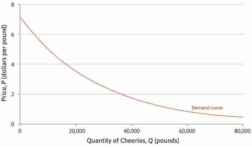
Estimated demand for Apple Cinnamon Cheerios.
Figure 7.3 Estimated demand for Apple Cinnamon Cheerios.
Adapted from Figure 5.2 in Jerry A. Hausman. 1996. ‘Valuation of New Goods under Perfect and Imperfect Competition’. In The Economics of New Goods, pp. 207–48. Chicago, IL: University of Chicago Press.
The demand curve provides an answer to the hypothetical question: ‘For each possible price that might be charged, how many pounds of cereal would be purchased?’ From the figure, we could pick some hypothetical price, say $3 per pound and ask: ‘If this price were charged, how many pounds would be purchased?’ The answer is 25,000 pounds of Apple Cinnamon Cheerios. For most products, the lower the price, the more customers wish to buy.
- differentiated product
- A product produced by a single firm that has some unique characteristics compared to similar products of other firms.
Breakfast cereals are differentiated products. Each brand is produced by just one firm and has some unique nutritional, taste, and other characteristics that distinguish it from the brands sold by other firms.
Many other consumer goods and services are also differentiated products. If you want to buy a car, a mobile phone, or a washing machine, it is not just the price that matters—you will want to find a brand and model with characteristics that match your own preferences. You might consider the design, the quality, or the service the manufacturer offers, rather than always choosing the cheapest.
What this means is that even if there are many firms selling similar products, each firm is alone as a seller of its particular type and brand. Only one firm sells General Mills Apple Cinnamon Cheerios: General Mills.
Willingness to pay and demand
From the point of view of the firm selling such a product, this means that it faces a downward-sloping demand curve like the one for Apple Cinnamon Cheerios. To see why the demand curve for a differentiated product slopes downward, think about an imaginary firm, called Language Perfection (LP), which offers lessons in English, Arabic, Mandarin, Spanish, and other languages. LP provides tutors offering one-on-one training at a public location of the learner’s choice (a coffee shop, library, or park, for example). There are many other firms offering language lessons in LP’s city, some of them in classroom settings, some online, and some, like LP, one-on-one.
The language lessons being offered by these firms differ in a great many ways. (To get some sense of how language lessons are a differentiated product, go online and search for lessons, and notice how many different choices you will have, even after you have chosen the language you want to learn.) Some will offer advanced courses, some accelerated teaching, others specialize in learning technical, business, or medical terms, while others are aimed at students or tourists. In some, you go to the tutor’s location; in others, the tutor comes to you.
The potential language learners are even more different from one another than the firms offering the teaching. For some, the kind of course offered by LP might be exactly what they want, so they would buy the course even if the price was high. Others might be seeking something a little different from the LP course, and so would sign up with LP only at a low price.
Consumers differ not only in what they are looking for, but also in how much money they can afford to spend.
- willingness to pay (WTP)
- An indicator of how much a person values a good, measured by the maximum amount he or she would pay to acquire a unit of the good. See also: willingness to accept.
These differences are the basis of the demand curve. Think of all of the possible buyers and arrange them in order, starting with the person who would purchase LP’s Spanish-language course at the highest price. Next in order is the person who would be willing to pay almost the highest price but not quite, and so on, ending with the person who would sign up for LP’s course only if the price were very low. The highest price a person would be willing to pay for the course is called the individual’s willingness to pay (WTP).
A person will buy the course if the price is less than or equal to his or her WTP. Suppose we line up the consumers in order of WTP, with the highest first, and plot a graph to show how the WTP varies along the line (Figure 7.4). You can see from the figure, for example, that at a price of $700, nobody would buy the course; if the course were offered free, 100 people would sign up.
If we choose any price, say P = $255, the graph shows the number of consumers whose WTP is greater than or equal to P. In this case, 60 consumers are willing to pay $255 or more, so the demand for LP’s course at a price of $255 is 60.
The points on and under the demand curve in Figure 7.4, shaded and labelled as the ‘feasible set’, are all of the prices and quantities sold that are feasible for the firm. The feasible point that we picked out is labelled as A. But the firm could also set a price of $255 and admit just 50 students to their course, even if more than that would be willing to pay the price. The demand curve is the boundary of the feasible set and so it is another example of the feasible frontier.
The law of demand dates back to the seventeenth century and is attributed to Gregory King (1648–1712) and Charles Davenant (1656–1714). King was a herald at the College of Arms in London, who produced detailed estimates of the population and wealth of England. Davenant, a politician, published the Davenant-King law of demand in 1699, using King’s data. It described how the price of corn would change depending on the size of the harvest. For example, he calculated that a ‘defect’, or shortfall, of one-tenth (10%) would raise the price by 30%.
Because we have arranged the potential buyers in order of their willingness to pay, it follows that if P is lower, there is a larger number of consumers willing to buy, so the demand is higher. Demand curves are often drawn as straight lines, as in this example, although there is no reason to expect them to be straight in reality—the demand curve for Apple Cinnamon Cheerios is not straight. But we do expect demand curves to slope downward—as the price rises, the quantity demanded falls. In other words, when the available quantity is low, the cereal can be sold at a high price. This relationship between price and quantity is sometimes known as the law of demand.
Question 7.2 Choose the correct answer(s)
Figure 7.5 depicts two alternative demand curves, D and D′, for a product. Based on this graph, which of the following are correct?
- On demand curve D, the firm can sell 10 units when the price is €5,000.
- When Q = 70, the corresponding price on D′ is €3,000.
- D′ can be seen as just a rightward (or upward) shift of D, by 40 units—for any price, the firm can sell 40 more units on D′ than on D.
- With an output of 30 units, the firm can charge €4,000 more on D′ than on D.
Price discrimination
If you were the owner of the firm, LP, how would you choose the price for the Spanish-language course?
- price discrimination
- A selling strategy in which different prices for the same product are set for different buyers or groups of buyers, or per-unit prices vary depending on the number of units purchased.
The first thought the owner might have is that she should go to the person with the greatest willingness to pay and offer the course at a price slightly below that person’s WTP, ensuring that the person would buy. Then she would move on to the person with the next greatest WTP and offer the course at a price just below that customer’s WTP, and so on. This practice is called price discrimination. If the owner could do this, LP would make the most money possible from selling introductory Spanish instruction to this population.
But price discrimination—at least, the type that is finely tuned so that each individual pays a different price just below that customer’s willingness to pay—is generally impossible. The seller has no way of determining the WTP of each potential buyer. The seller cannot find out by simply asking, because the potential buyer would often lie, so as to be able to buy the course at a lower price.
Another reason why price discrimination is not the rule is that a buyer who purchased the course (or any good) at a low price could then resell it to someone with a higher willingness to pay, ending up by making a profit.
Some firms are able to practice a less individualized form of price discrimination—lower prices for customers whose willingness to pay might be less due to lower income, for example. Lower prices charged for students or the elderly are examples of price discrimination of this type. But for the most part, the product is sold at a single price to all customers.
This price will be on the demand curve, because that maps out the feasible frontier facing the firm: it shows the maximum quantity that is demanded at any price the firm sets. The law of demand—the fact that the feasible frontier facing the firm slopes downward—means that the firm faces a trade-off. If it must sell its product at the same price to everyone, then selling more means a lower price, and a higher price means selling less. As in our other examples of feasible frontiers, the slope of the demand curve is a marginal rate of transformation (MRT), in this case of price into quantity.
Before finding out how the firm decides at which single price on the demand curve to sell the Spanish-language course, we need to introduce the concepts of costs and profits.
7.4 Profits, costs, and the isoprofit curve
Imagining that you are the owner of a firm, your profits are the difference between sales revenue and production costs. So, before we can calculate profits, we need to know the production costs.
Let’s assume that LP is a very simple firm with a single owner. The owner employs tutors to teach a ten-hour Spanish course, with one tutor for each student. Production costs to the owner, per student, would be:
- Providing printed materials to the students: These cost $30 per student.
- The tutor’s time: The tutor costs $30 an hour, for ten hours.
- The owner’s time: We value this at what she would earn if she were employed elsewhere. We know that she could close her firm and get a job as a manager of someone else’s language school, making $60 an hour. She spends, on average, half an hour per student per course, so the opportunity cost of her time, per student, per course, would be $30.
Therefore, the cost to the owner, per student, per course, would be: 30 + (30 × 10) + 30 = $360.
- constant returns to scale
- These occur when doubling all of the inputs to a production process doubles the output. The shape of a firm’s long-run average cost curve depends both on returns to scale in production and the effect of scale on the prices it pays for its inputs. See also: increasing returns to scale, decreasing returns to scale.
- unit cost
- Total cost divided by number of units produced.
We assume that LP can simply hire more tutors and provide materials at the same costs, however many courses are offered (so the firm has constant returns to scale). Unit costs are constant at $360 for any level of the firm’s output (number of courses actually offered).
To maximize profit, the owner should produce exactly the quantity she expects to sell, and no more. Then revenue, costs, and profit are given by:
So we have a formula for profit:
Using this formula, the owner can calculate the profit for any hypothetical combination of price and quantity.
For example, if she sells 25 courses at $480, her profits are ($480 − $360) × 25 = $3,000. Similarly, selling 60 courses at $410 would give profits of ($410 − $360) × 60 = $3,000. And selling 100 courses at $390 would also give profits of ($390 − $360) × 100 = $3,000.
- isoprofit curve
- A curve on which all points yield the same profit.
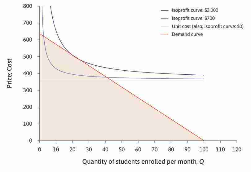
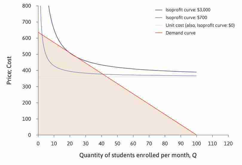
Work through the analysis of Figure 7.6 to see that there are many other combinations of price and number of courses sold per month that would give the owner profits of $3,000. The curve joining up all the combinations giving profits of $3,000 is called an isoprofit curve.
There will be an isoprofit curve where profits are zero—we have already seen that it is the average cost curve and it will be a horizontal line in Figure 7.6 at P = C = $360.
Just as indifference curves join points in a diagram that give the same level of utility, isoprofit curves join points that give the same level of total profit. Because it is the owner who gets the profits, we can think of the isoprofit curves as the owner’s indifference curves—the owner is indifferent between the hypothetical combinations of price and quantity that would give her the same profit.
Isoprofit curves for the production of LP Spanish-language courses.
Figure 7.6 Isoprofit curves for the production of LP Spanish-language courses.
Other ways to make the same profit
She could make $3,000 profit, not only by selling 25 courses at $480 (point A), but also by selling 60 courses at $410 (point B), or 100 courses at a price of $390 (point C).
Figure 7.6b She could make $3,000 profit, not only by selling 25 courses at $480 (point A), but also by selling 60 courses at $410 (point B), or 100 courses at a price of $390 (point C).
Isoprofit curve—$3,000
There are many other ways to make a profit of $3,000. The isoprofit curve here shows all the possible ways of making a $3,000 profit.
Figure 7.6c There are many other ways to make a profit of $3,000. The isoprofit curve here shows all the possible ways of making a $3,000 profit.
Isoprofit curve—$700
The $700 isoprofit curve shows all the combinations of P and Q for which profit is equal to $700. The cost of each course is $360, so profit = (P − 360) × Q. This means that isoprofit curves slope downward. To make a profit of $700, P would have to be very high if Q was less than 5. But if Q = 80, the owner could make this profit with a low P.
Figure 7.6d The $700 isoprofit curve shows all the combinations of P and Q for which profit is equal to $700. The cost of each course is $360, so profit = (P − 360) × Q. This means that isoprofit curves slope downward. To make a profit of $700, P would have to be very high if Q was less than 5. But if Q = 80, the owner could make this profit with a low P.
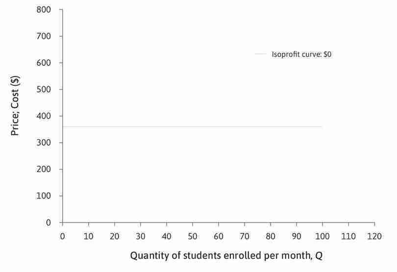
Zero-profit isocost curve—the average cost curve
The horizontal line shows the choices of price and quantity where profit is zero; if she sets a price of $360, she would be selling each course for exactly what it cost.
Figure 7.6e The horizontal line shows the choices of price and quantity where profit is zero; if she sets a price of $360, she would be selling each course for exactly what it cost.
Question 7.3 Choose the correct answer(s)
A firm’s cost of production is €12 per unit of output. If P is the price of the output good and Q is the number of units produced, which of the following statements are correct?
- At (Q, P) = (2,000, 20), profit = (20 − 12) × 2,000 = €16,000.
- At (Q, P) = (1,200, 24), profit = (24 − 12) × 1,200 = €14,400. At (Q, P) = (2,000, 20), profit = (20 − 12) × 2,000 = €16,000. Therefore, (2,000, 20) is on a higher isoprofit curve.
- At (Q, P) = (2,000, 20), profit = (20 − 12) × 2,000 = €16,000. At (Q, P) = (4,000, 16), profit = (16 − 12) × 4,000 = €16,000. Therefore, these two points are on the same isoprofit curve.
- At P = 12 the firm makes no profit. Therefore (5,000, 12) will be on a horizontal isoprofit curve representing zero profit.
7.5 The isoprofit curves and the demand curve
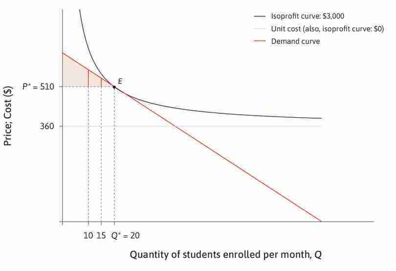
To achieve a high profit, the owner would like both price and quantity to be as high as possible. She prefers points on higher isoprofit curves, but she is constrained by the demand curve. If she chooses a high price, she will be able to sell only a small quantity; if she wants to sell a large quantity, she must choose a low price.
The demand curve determines what is feasible. Figure 7.7 shows the isoprofit curves and demand curve together. The owner faces a similar problem to Alexei, the student in Unit 4, who wanted to choose the point in his feasible set at which his utility was maximized. The owner should choose a feasible price and quantity combination that will maximize her profit.
The profit-maximizing choice of price and quantity for LP Spanish-language courses.
Figure 7.7 The profit-maximizing choice of price and quantity for LP Spanish-language courses.
The profit-maximizing choice
The owner would like to choose a combination of P and Q on the highest possible isoprofit curve in the feasible set.
Figure 7.7a The owner would like to choose a combination of P and Q on the highest possible isoprofit curve in the feasible set.
Zero profits on the average cost curve
The horizontal line shows the choices of price and quantity at which profit is zero; if the owner sets a price of $360, she would be selling each course for exactly what it cost.
Figure 7.7b The horizontal line shows the choices of price and quantity at which profit is zero; if the owner sets a price of $360, she would be selling each course for exactly what it cost.
Profit-maximizing choices
The owner would choose a price and quantity corresponding to a point on the demand curve. Any point below the demand curve would be feasible, such as selling 30 courses at a price of $200, but she would make more profit if she raised the price.
Figure 7.7c The owner would choose a price and quantity corresponding to a point on the demand curve. Any point below the demand curve would be feasible, such as selling 30 courses at a price of $200, but she would make more profit if she raised the price.
Maximizing profit at E
The owner reaches the highest possible isoprofit curve while remaining in the feasible set by choosing point E, where the demand curve is tangent to an isoprofit curve. She should choose P = $510, selling Q = 20 courses.
Figure 7.7d The owner reaches the highest possible isoprofit curve while remaining in the feasible set by choosing point E, where the demand curve is tangent to an isoprofit curve. She should choose P = $510, selling Q = 20 courses.
The owner’s best strategy is to choose point E in Figure 7.7—she should produce 20 courses and sell the course at a price of $510, making $3,000 profit. Just as in the case of Alexei in Unit 4, the optimal combination of price and quantity involves balancing two trade-offs:
- marginal rate of substitution (MRS)
- The trade-off that a person is willing to make between two goods. At any point, this is the slope of the indifference curve. See also: marginal rate of transformation.
- marginal rate of transformation (MRT)
- A measure of the trade-offs a person faces in what is feasible. Given the constraints (feasible frontier) a person faces, the MRT is the quantity of some good that must be sacrificed to acquire one additional unit of another good. At any point, it is the slope of the feasible frontier. See also: feasible frontier, marginal rate of substitution.
- The isoprofit curve is the owner’s indifference curve: Its slope at any point represents the trade-off she is willing to make between P and Q—her MRS. She would be willing to substitute a high price for a lower quantity if she obtained the same profit.
- The slope of the demand curve is the trade-off she is constrained to make: It is her MRT, or the rate at which the demand curve allows her to ‘transform’ quantity into price. She cannot raise the price without lowering the quantity, because fewer consumers will buy a more expensive product.
These two trade-offs balance at the profit-maximizing choice of P and Q.
To see a different way of finding the profit-maximizing price using the concept of marginal revenue, go to Section 7.6 in The Economy.
The owner of Language Perfection (LP) may not have thought about the decision in this way.
Perhaps she remembered past experience in setting prices too low or too high (trial and error), or did some market research. However she made the choice, we expect that a firm could discover a profit-maximizing price and quantity. The purpose of our economic analysis is not to model the owner’s thought process to get to this point, but to understand the outcome, and its relationship to the firm’s cost and consumer’s demand.
However, the owner may have conducted a thought experiment that we can relate to the model. Suppose she thinks first about how many courses she could sell if she were to charge only what it costs to produce them. This is where the demand curve intersects the cost curve, and she would make zero profits. If instead she charged a price just above the cost of production, she would now be making a profit. Imagine what happens as she continues moving leftwards along the demand curve. Initially, she will be crossing higher and higher isoprofit curves, due to the effect of a slightly higher price on her profits. But at a certain point, she will discover that if she increases the price further, her profits would begin to fall—in other words, she will start crossing ever-lower isoprofit curves. The point on the demand curve that touches the highest possible isoprofit curve is the combination of price and quantity on the demand curve at which profits are maximized. So, that is the price she will set. Graphically, it is where the isoprofit curve is tangent to the demand curve.
Like the cost curve, which is the isoprofit curve for zero profits, the other isoprofit curves are independent of the demand curve. A shift in the cost curve will shift the family of isoprofit curves with it. A shift in the demand curve will not.
Question 7.4 Choose the correct answer(s)
The table represents market demand Q for a good at different prices P.
| Q | 100 | 200 | 300 | 400 | 500 | 600 | 700 | 800 | 900 | 1,000 |
| P | €270 | €240 | €210 | €180 | €150 | €120 | €90 | €60 | €30 | €0 |
The firm’s unit cost of production is €60. Based on this information, which of the following are correct?
- At Q = 100, profit = (270 − 60) × 100 = €21,000.
- At Q = 400, profit = (180 − 60) × 400 = €48,000. If you calculate the profit for each point on the demand curve you will see that profit is lower at the other points.
- The maximum profit is attained at Q = 400, where profit = (180 − 60) × 400 = €48,000.
- The firm will make a loss (negative profit) at all outputs above 800. At exactly 800, the profit is zero.
Question 7.5 Choose the correct answer(s)
Which of the following statements regarding the marginal rate of substitution (MRS) and the marginal rate of transformation (MRT) of a profit-maximizing firm are correct?
- The MRT is how much the firms have to drop the price for an incremental increase in demand. It is the slope of the demand curve.
- This is the definition of the MRS. It is the slope of the isoprofit curves.
- The MRT is the slope of the demand curve.
- When MRT > MRS, the slope of the demand curve is steeper than the slope of the isoprofit curve that intersects the demand curve. This means that, for a unit decrease in output, firms are able to increase the price more than the amount required to keep their profit constant. Therefore, to increase profit, they should decrease output.
Exercise 7.1 Changes in the market
Draw diagrams to show how the curves in Figure 7.7 would change in each of the following cases:
- A rival company producing a similar Spanish-language course slashes its prices.
- The cost of hiring tutors for LP’s course rises to $35 per hour (instead of $30).
- LP introduces a local advertising campaign costing $20 per month.
In each case, explain what would happen to the price and the profit.
7.6 Gains from trade
- economic rent
- A payment or other benefit received above and beyond what the individual would have received in his or her next best alternative (or reservation option). See also: reservation option.
- total surplus
- The total gains from trade received by all parties involved in the exchange. It is measured as the sum of the consumer and producer surpluses. See: joint surplus.
- gains from exchange
- The benefits that each party gains from a transaction compared to how they would have fared without the exchange. Also known as: gains from trade. See also: economic rent.
Remember from Unit 5 that, when people engage voluntarily in an economic interaction, they do so because it makes them better off—they can obtain a surplus called economic rent, meaning the difference between how much they gain by this interaction compared to not engaging in the interaction. The total surplus for the parties involved is a measure of the gains from exchange (also known as gains from trade).
We can analyse the outcome of the economic interactions between consumers and a firm’s owner—just as we did for Angela and Bruno in Unit 5—and calculate the total surplus and the way it is shared.
We have assumed that the rules of the game for allocating language courses to consumers are:
- A firm’s owner decides how many items to produce: The owner sets a single price at which admission to the course will be sold to all consumers.
- Then individual consumers decide whether to buy or not: No consumer buys more than one course.
In the interactions between a firm like Language Perfection and its consumers, there are potential gains for both the owner and the students, as long as LP is able to hire tutors to teach the course at a cost less than its value to a consumer. (The tutors may also benefit from the pay they receive, but we will not consider their benefits or costs in this example.)
Recall that the demand curve shows the WTP of each of the potential consumers. A consumer whose WTP is greater than the price will buy the good and receive a surplus, since the value of the course to that customer is higher than the price.
And if the price paid by the customer is greater than what it costs the firm to offer the course, the owner receives a surplus too. This surplus is higher than the amount the owner would earn as a manager in another language company, which we have included in the cost of producing the course. Figure 7.8 shows how to find the total surplus for the firm and its consumers, when LP sets the price to maximize its profits.
The firm set its profit-maximizing price
P* = $510, and it sells Q* = 20 courses per month, the 20th consumer, whose WTP is $510, is just indifferent between buying and not buying a course, so that particular buyer’s surplus is equal to zero.
Figure 7.8a P* = $510, and it sells Q* = 20 courses per month, the 20th consumer, whose WTP is $510, is just indifferent between buying and not buying a course, so that particular buyer’s surplus is equal to zero.
A higher WTP
Other buyers were willing to pay more. The tenth consumer, whose WTP is $574, makes a surplus of $64, shown by the vertical line at the quantity 10.
Figure 7.8b Other buyers were willing to pay more. The tenth consumer, whose WTP is $574, makes a surplus of $64, shown by the vertical line at the quantity 10.
The consumer surplus
To find the surplus obtained by consumers, we add together the surplus of each buyer. This is shown by the shaded triangle between the demand curve and the line where price is P*. This measure of the consumer’s gains from trade is the consumer surplus.
Figure 7.8d To find the surplus obtained by consumers, we add together the surplus of each buyer. This is shown by the shaded triangle between the demand curve and the line where price is P*. This measure of the consumer’s gains from trade is the consumer surplus.
The producer surplus on a single lesson
Similarly, the firm makes a producer surplus of $150 on each course sold—the difference between the price ($510) and the unit cost ($360). The vertical line in the diagram shows the producer surplus on the twelfth course, but it is the same for every course sold—the distance between P* and the unit cost line.
Figure 7.8e Similarly, the firm makes a producer surplus of $150 on each course sold—the difference between the price ($510) and the unit cost ($360). The vertical line in the diagram shows the producer surplus on the twelfth course, but it is the same for every course sold—the distance between P* and the unit cost line.
- consumer surplus
- The consumer’s willingness to pay for a good minus the price at which the consumer bought the good, summed across all units sold.
- producer surplus
- The price at which a firm sells a good minus the minimum price at which it would have been willing to sell the good, summed across all units sold.
In Figure 7.8, the shaded area above P* measures the consumer surplus, and the shaded area below P* is the producer surplus. We see from the relative size of the two areas in Figure 7.8 that, in this market, the firm obtains a greater share of the surplus.
As in the voluntary contracts between Angela and Bruno in Unit 5, both parties gain in the market for learning Spanish. The division of the gains is determined by bargaining power. In this case, the firm is the only seller of this course, and can set a high price and obtain a high share of the gains, knowing that those who value the course highly have no alternative but to accept. The firm has many other potential customers, and so people have no power to bargain for a better deal.
Consumer surplus, producer surplus, and profit
- The consumer surplus is a measure of the benefits of participation in the market for consumers.
- The producer surplus is closely related to the firm’s profit. In our example they are exactly the same thing, but that is because we have assumed that the firm doesn’t have any fixed costs.
- In general, the profit is equal to the producer surplus minus the firm’s fixed costs. The firm LP would have fixed costs if, for example, it paid for advertising for its courses.
- The total surplus arising from trade in this market, for the firm and consumers together, is the sum of consumer and producer surplus.
Evaluating the outcome using the Pareto efficiency criterion
- Pareto efficient
- An allocation with the property that there is no alternative technically feasible allocation in which at least one person would be better off, and nobody worse off.
Is the allocation of Spanish-language courses in this market Pareto efficient? To answer this question, we need to know all the technically feasible outcomes. These are combinations of price and quantity on the demand curve, where the price is no lower than the cost of production. If there is another technically feasible outcome in which at least one person (customer or owner) is better off and no one is worse off, then the outcome is not Pareto efficient.
Beginning at the allocation E in Figure 7.8, and considering the customers, it is clear that there are some consumers who do not purchase the course at the firm’s chosen price, but who would nevertheless be willing to pay more than it would cost the firm to produce the course, namely $360.
- Pareto improvement
- A change that benefits at least one person without making anyone else worse off. See also: Pareto dominant.
But we also know that, at any price below $510 (the profit-maximizing price at point E), profits are lower (the owner would be on an isoprofit curve with lower profits). It appears that a Pareto improvement is not possible because, although consumers would be better off, the owner would be worse off.
But evaluating whether the outcome is Pareto efficient does not mean the rules of the game must be kept unchanged. If there is a technically feasible allocation in which at least one person is better off and nobody is worse off, then E is not Pareto efficient.
If LP could practise price discrimination, it could offer one more Spanish course and sell it to the 21st consumer at a price lower than $510 but higher than the production cost. (The other 20 customers would continue to pay $510.) This would be a Pareto improvement—both the firm and the 21st consumer would be better off; the other 20 would be no worse off. The firm’s profit on the 21st course sold would be lower than on the 20th but total profits would rise. Remember that the isoprofit curve is drawn assuming that all customers pay the same price. We need to add the profit on the 21st course to $3,000 to calculate the firm’s total profits.
The 21st consumer benefits from being able to buy the language course.
This example shows that the potential gains from trade in the market for this type of language course have not been exhausted at E.
- marginal cost
- The addition to total costs associated with producing one additional unit of output.
The cost of producing one more unit of output is called the marginal cost. In practice, marginal costs may depend on the level of production. For example, if the firm had to pay overtime rates to achieve higher levels of output, the marginal cost of a course might be higher at high levels of production. But, in our simple model of LP Spanish courses, we have assumed that every course costs $360 to produce, irrespective of the total number of courses sold. In this case, the marginal cost of a course is the same as the unit cost—it is $360, however many courses are produced.
In Figure 7.9 we have drawn the demand curve again, as well as the marginal cost line, which is a horizontal line at $360. Look at point F, where the two lines cross. You can see that the forty-third consumer has a WTP that is equal to the marginal cost of a course. For the forty-second consumer, the willingness to pay exceeds the cost, so not offering the forty-second course would not be efficient. For the forty-fourth consumer, the willingness to pay is less than the cost, so offering more than 43 courses would also not be efficient.
Figure 7.9 shows that the total surplus, which we can think of as the pie to be shared between the owner and LP’s customers, would be the highest possible if the firm produced 43 courses and sold them for $360.
Producing at F would be Pareto efficient
If fewer than 43 courses were produced, there would be unexploited gains—some consumers would be willing to pay more for another course than it would cost to make. If more than 43 courses were produced, they could only be sold at a loss. Producing and selling 43 courses would be Pareto efficient.
Figure 7.9b If fewer than 43 courses were produced, there would be unexploited gains—some consumers would be willing to pay more for another course than it would cost to make. If more than 43 courses were produced, they could only be sold at a loss. Producing and selling 43 courses would be Pareto efficient.
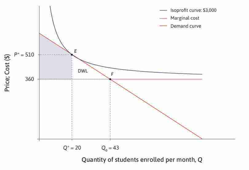
The total surplus at E is smaller
The total surplus is smaller at E than F. The difference is called the deadweight loss. It is the white triangle between Q = 20, the demand curve and the marginal cost line.
Figure 7.9c The total surplus is smaller at E than F. The difference is called the deadweight loss. It is the white triangle between Q = 20, the demand curve and the marginal cost line.
- deadweight loss
- A loss of total surplus relative to a Pareto-efficient allocation.
Since the firm chooses E rather than F, there is a loss of potential surplus, known as the deadweight loss.
It might seem confusing that the firm chooses E when we said that, at this point, it would be possible for both the consumers and the owner to be better off. That is true, but only if LP could practise price discrimination—if courses could be sold to other consumers at a lower price than to the first 20 consumers. The owner chooses E because that is the best she can do given the rules of the game (setting one price for all consumers). To sell 43 courses without price discrimination, she would have to set a price of $360, so her profits would be zero.
The allocation that results from price-setting by the producer of a differentiated product like Language Perfection’s Spanish course is Pareto inefficient. The owner uses the firm’s bargaining power to set a price that is higher than the marginal cost of a course. The firm keeps the price high by producing a quantity that is too low, relative to the Pareto-efficient allocation.
Exercise 7.2 below shows that, in an unlikely scenario in which the firm could engage in price discrimination and charge different prices for each buyer, it would be possible to achieve a Pareto-efficient allocation.
Exercise 7.2 Changing the rules of the game
- Suppose that Language Perfection had sufficient information and enough bargaining power to charge each individual consumer the maximum they would be willing to pay. Draw the demand curve and marginal cost line (as in Figure 7.9), and indicate on your diagram:
- the number of courses sold
- the highest price paid by any consumer
- the lowest price paid by any consumer
- the consumer and producer surplus.
- Give examples of goods that are sold in this way.
- Why is price discrimination not common practice? Explain your reasons.
- Some firms charge different prices to different groups of consumers, for example, airlines may charge higher fares for last-minute travellers. Why would they do this, and what effect would it have on the consumer and producer surpluses?
- Now suppose that price discrimination is impossible, and that it becomes very easy for language firms to set up in the city in which LP operates. How could this give consumers more bargaining power?
- Under these rules, how many courses would be sold?
- Under these rules, what would the producer and consumer surpluses be?
Question 7.6 Choose the correct answer(s)
Which of the following statements are correct?
- To be more precise, each consumer receives a surplus equal to the difference between the WTP and the price, and consumer surplus is the sum of the surpluses of all consumers.
- Producer surplus is the difference between the firm’s revenue and its marginal costs. This is not the same as profit, because—unlike the case of the firm, LP—there may be fixed costs of production. The profit is the producer surplus minus the fixed costs.
- The deadweight loss is the loss of potential total surplus due to the firm producing below the Pareto-efficient level. It is the sum of the surplus losses of both the consumers and the producer.
- All possible gains would be achieved at the Pareto-efficient output level. But the profit-maximizing choice of a firm producing a differentiated good is not Pareto efficient.
7.7 Price-setting, market power, and public policy
Our analysis of pricing applies to any firm producing and selling a product that is in some way different from that of any other firm. In the nineteenth century, Augustin Cournot,2 carried out a similar analysis using the example of bottled water from ‘a mineral spring which has just been found to possess salutary properties possessed by no other’. Cournot referred to this as a case of monopoly—in a monopolized market, there is only one seller. He showed, as we have done, that the firm would set a price greater than the marginal cost.
- monopoly
- A firm that is the only seller of a product without close substitutes. Also refers to a market with only one seller. See also: monopoly power, natural monopoly.
- monopolistic competition
- A market in which each seller has a unique product but there is competition among firms because firms sell products that are close substitutes for one another.
- oligopoly
- A market with a small number of sellers of the same good, giving each seller some market power.
- market failure
- When markets allocate resources in a Pareto-inefficient way.
- profit margin
- The difference between the price and the marginal cost.
- price markup
- The price minus the marginal cost, divided by the price. It is inversely proportional to the elasticity of demand for this good.
A more common market structure is called monopolistic competition. In this case each firm sells a unique product, like Cheerios, but there are other firms selling products that, while unique, are very similar in the minds (or tastes) of consumers, like Cornflakes.
Great economists Augustin Cournot
Augustin Cournot (1801–1877) was a French economist, now most famous for his model of oligopoly (a market with a small number of firms). Cournot’s 1838 book, Recherches sur les Principes Mathématiques de la Théorie des Richesses (Research on the Mathematical Principles of the Theory of Wealth), introduced a new mathematical approach to economics, although he feared it would ‘draw on me … the condemnation of theorists of repute’. Cournot’s work influenced other nineteenth-century economists, such as Marshall and Walras, and established the basic principles we still use to think about the behaviour of firms. Although he used algebra rather than diagrams, Cournot’s analysis of demand and profit maximization was very similar to ours.
We saw in Section 7.3 that, when the producer of a differentiated good sets a price above the marginal cost of production, the market outcome is not Pareto efficient. When trade in a market results in a Pareto-inefficient allocation, we describe this as a case of market failure.
The deadweight loss gives us a measure of the unexploited gains from trade. The deadweight loss is high when the gap between the price and the marginal cost, which we call the firm’s profit margin, is high. More precisely, what matters is the markup—the profit margin as a proportion of the price.
What determines the markup chosen by the firm? To answer this question, we need to think again about how consumers behave.
Markets with differentiated products reflect differences in the preferences of consumers as well as differences in their incomes. Like those wishing to learn a language, people who want to buy a car, for example, are looking for different combinations of characteristics. A consumer’s willingness to pay for a particular model will depend not only on its characteristics, but also on the characteristics and prices of similar types of cars sold by other firms.
When consumers can choose between several similar cars, the demand for each of these cars is likely to be quite responsive to prices. If the price of the Ford Fiesta, for example, were to rise, demand would fall because people would choose to buy one of the other brands instead. Conversely, if the price of the Fiesta were to fall, demand would increase because consumers would be attracted away from the other cars.
The more similar the other cars are to the Fiesta, the more responsive consumers will be to price differences. Only those with the highest brand loyalty to Ford, and those with a strong preference for a characteristic of the Fiesta that other cars do not possess, would fail to respond. Therefore, the firm will not be able to raise the price much without losing consumers. To maximize its profits, it will choose a low markup.
Price elasticity of demand and market power
- price elasticity of demand
- The percentage change in demand that would occur in response to a 1% increase in price. We express this as a positive number. Demand is elastic if this is greater than 1, and inelastic if less than 1.
- monopoly rents
- A form of profits, which arise due to restricted competition in selling a firm’s product.
- substitutes
- Two goods for which an increase in the price of one leads to an increase in the quantity demanded of the other. See also: complements.
- market power
- An attribute of a firm that can sell its product at a range of feasible prices, so that it can benefit by acting as a price-setter (rather than a price-taker).
The responsiveness of consumers to price changes can be measured by calculating the price elasticity of demand, which, as we saw in Unit 3, is defined as the percentage fall in the quantity demanded in response to a 1% rise in the price. If you think about the graph of a demand curve—with quantity as the horizontal axis variable and price as the vertical axis variable—you can see that the elasticity of demand for a good will be high when its demand curve is relatively flat, and low when it is slopes steeply downward.
In contrast, the manufacturer of a very specialized type of car, quite different from any other brand in the market, faces little competition and hence less elastic demand. It can set a price well above marginal cost without losing customers. Such a firm is earning monopoly rents (profits over and above its production costs), arising from its position as the only supplier of this type of car.
A firm will be in a strong position if there are few firms producing close substitutes for its own brand, because it faces little competition. Its elasticity of demand will be relatively low. We say that such a firm has market power. It will have sufficient bargaining power in its relationship with customers to set a high markup without losing them to competitors. This was the case with LP, because it was the only firm selling one-on-one Spanish-language courses in its city.
Thus, the main difference between monopoly and monopolistic competition is that the price elasticity of demand is low in the case of monopoly, because there are no competing firms selling close substitutes for the firm’s product. By contrast, a monopolistically competitive firm faces a more elastic demand curve because, if it raises prices, consumers will switch to other firms selling close substitutes. Joan Robinson pioneered the economic theory of market competition among firms that were neither monopolies nor the price-taking firms that are the basis of the model of perfect competition.
Great economists Joan Robinson (1903–1983)
A letter to a female student in 1970, from Paul Samuelson, perhaps the most influential economist of the twentieth century, concluded: ‘P.S. Do study economics. Perhaps the best economist in the world happens also to be a woman (Joan Robinson).’
Robinson earned respect and recognition in 1933 with her first major work, The Economics of Imperfect Competition. She challenged the conventional wisdom by developing an analysis of what we now call monopolistic competition. Facing a downward-sloping demand curve, firms act as price-setters, not price-takers.3
She was a member of the small circle at the University of Cambridge that John Maynard Keynes drew upon to comment on and refine his General Theory, published in 1936. In 1937 she published Introduction to the Theory of Employment, which made Keynes’ work accessible to students.
That Robinson’s much-lauded intellectual achievements were not crowned with a Nobel prize has drawn much speculation. Was it because of her relentless critique of what she called ‘mainstream’ economics including, very pointedly, Samuelson’s ideas?
Her advice to teachers of economics was to ‘start from the beginning to discuss various types of economic system. Every society (except Robinson Crusoe) has to have some rules of the game for organizing production and the distribution of the product.’ She also urged economists to ‘displace the theory of the relative prices of commodities from the centre of the picture.’4
Competition policy
This discussion helps to explain why policymakers may be concerned about firms that have few competitors. Market power allows the firms to set high prices—and make high profits—at the expense of consumers. Potential consumer surplus is lost both because few consumers buy, and because those who buy pay a high price. The owners of the firm benefit, but overall there is a deadweight loss.
A firm selling a niche product catering for the preferences of a small number of consumers (such as a luxury car brand like a Lamborghini) is unlikely to attract the attention of policymakers, despite the loss of consumer surplus. But if one firm is becoming dominant in a large market, governments may intervene to promote competition. In 2000, the European Commission prevented the proposed merger of Volvo and Scania, on the grounds that the merged firm would have a dominant position in the heavy-trucks market in Ireland and the Nordic countries. In Sweden the combined market share of the two firms was 90%. The merged firm would almost have been a monopoly—the extreme case of a firm that has no competitors at all.
- cartel
- A group of firms that collude in order to increase their joint profits.
- competition policy
- Government policy and laws to limit monopoly power and prevent cartels. Also known as: antitrust policy.
- antitrust policy
- Government policy and laws to limit monopoly power and prevent cartels. Also known as: competition policy.
When there are only a few firms in a market, they may form a cartel—a group of firms that colludes to keep the price high. By working together and behaving as a monopoly rather than competing, the firms can increase profits. A well-known example is OPEC, an association of oil-producing countries. OPEC members jointly agree to set production levels to control the global price of oil. Following sharp increase in oil prices in 1973 and again in 1979, the OPEC cartel played a major role in sustaining these high oil prices at a global level.
While cartels between private firms are illegal in many countries, firms often find ways to cooperate in the setting of prices so as to maximize profits. Policy to limit market power and prevent cartels is known as competition policy, or antitrust policy in the US.
Dominant firms may exploit their position by strategies other than high prices. In a famous antitrust case at the end of the twentieth century, the US Department of Justice accused Microsoft of behaving anticompetitively by ‘bundling’ its own web browser, Internet Explorer, with its Windows operating system.5 In the 1920s, an international group of companies making electric light bulbs—including Philips, Osram, and General Electric—formed a cartel that agreed to a policy of ‘planned obsolescence’ to reduce the lifetime of their bulbs to 1,000 hours, so that consumers would have to replace them more quickly.6
Exercise 7.3 Multinationals or independent retailers?
Imagine that you are a politician in a town in which a multinational retailer is planning to build a new superstore. A local campaign is protesting that it will drive small independent retailers out of business, thereby reducing consumer choice and changing the character of the area. Supporters of the plan argue, in turn, that this will only happen if consumers prefer the supermarket.
Which side are you on? Explain the reasons for your choice.
Question 7.7 Choose the correct answer(s)
Which of the following statements regarding the film industry are correct?
- There are fixed costs (such as hiring actors and a production team) that companies must recover. Capping the price at marginal cost would lead to firms being unable to cover their fixed costs.
- The marginal cost of producing additional copies of a film is typically low—once the first copy is produced, subsequent copies are cheap to reproduce.
- The fact that the price is above marginal cost means that there is market failure, as there are some potential buyers whose willingness to pay exceeds the marginal cost but falls short of the market price. This creates a deadweight loss.
- The film industry is quite competitive, as consumers have many close substitutes. The price is above marginal cost because of the high fixed costs of hiring actors, technicians, and a director; purchasing rights to the script; and advertising (known as first copy costs).
Question 7.8 Choose the correct answer(s)
Suppose that a multinational retailer is planning to build a new superstore in a small town. Which of the following arguments could be correct?
- The availability of close substitutes implies elastic demands for those goods.
- Close substitutability between goods implies competition between providers, which typically results in lower prices.
- If the local retailers are driven out, the multinational will have more market power. It will face less elastic demand and be able to raise prices without losing customers.
- High differentiability (low substitutability) implies less elastic demand.
7.8 Product selection, innovation, and advertising
The profits that the owners of a firm can achieve depend on the demand curve for its product, which in turn depends on the preferences of consumers and competition from other firms. But the firm may be able to move the demand curve to increase profits by changing its selection of products, or through advertising.7
Parker Brothers first marketed a property-trading board game under the name Monopoly in 1935. In a series of court cases in the 1970s, Parker Brothers attempted to prevent Ralph Anspach, an economics professor, from selling a game called Anti-Monopoly. Anspach claimed that Parker Brothers did not have exclusive rights to sell Monopoly, since the company had not originally invented it.
After the court ruled in favour of Anspach, many competing versions of Monopoly appeared on the market. After a change in the law, Parker Brothers established the right to the Monopoly trademark in 1984, so Monopoly is now a monopoly again.
When deciding what goods to produce, the firm would ideally like to find a product that is both attractive to consumers and has different characteristics from the products sold by other firms. In this case, demand would be high (many consumers would wish to buy it at each price) and the elasticity low. Of course, this is not likely to be easy. A firm wishing to make a new type of sportswear, or type of car, knows that there are already many brands on the market. But technological innovation may provide opportunities to get ahead of competitors. In 1997, Toyota developed the first mass-produced hybrid car, the Prius. For many years afterwards, other manufacturers produced few similar cars, and Toyota effectively monopolized the hybrid market. By 2013, there were several competing brands, but the Prius remained the market leader, with more than 50% of hybrid sales.
If a firm has invented or created a new product, it may be able to prevent competition altogether by claiming exclusive rights to produce it, using patent or copyright laws. For example, Parker Brothers spent years in court fighting to keep their monopoly of Monopoly. This kind of legal protection of monopoly may help to provide incentives for research and development of new products, but at the same time limits the gains from trade.
Advertising is another strategy that firms can use to influence demand. It is widely used by both car manufacturers and breakfast cereal producers. When products are differentiated, the firm can use advertising to inform consumers about the existence and characteristics of its product, attract them away from its competitors, and create brand loyalty.
According to Schonfeld and Associates, a firm of market analysts, advertising of breakfast cereals in the US is about 5.5% of total sales revenue—about 3.5 times higher than the average for manufactured products. The data in Figure 7.10 is for the highest-selling 35 breakfast cereal brands sold in the Chicago area in 1991 and 1992. The graph shows the relationship between market share and quarterly expenditure on advertising.
If you investigated the breakfast cereals market more closely, you would see that market share is not closely related to price. But it is clear from Figure 7.10 that the brands with the highest share are also the ones that spend the most on advertising. Matthew Shum, an economist, analysed cereal purchases in Chicago using this dataset, and showed that advertising was more effective than price discounts in stimulating demand for a brand.8 Since the best-known brands were also the ones spending most on advertising, he concluded that the main function of advertising was not to inform consumers about the product, but rather to increase brand loyalty and encourage consumers of other cereals to switch.
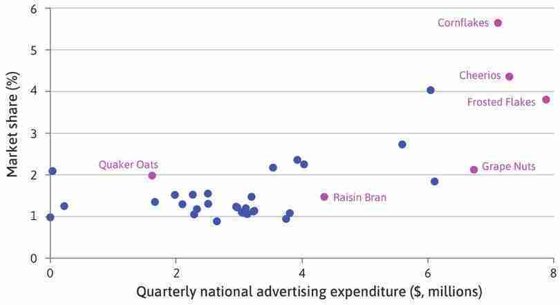
Advertising expenditure and market share of breakfast cereals in Chicago (1991–1992).
Figure 7.10 Advertising expenditure and market share of breakfast cereals in Chicago (1991–1992).
Figure 1 in Matthew Shum. 2004. ‘Does Advertising Overcome Brand Loyalty? Evidence from the Breakfast-Cereals Market’. Journal of Economics & Management Strategy 13 (2): pp. 241–72.
7.9 Buying and selling: Demand and supply in a competitive market
So far, we have considered the case of a differentiated product sold by just one firm. In the market for such a product there is one seller with many buyers. Now we look at markets in which many buyers and sellers interact, and show how the market price is determined by both the preferences of consumers and the costs of suppliers.
WTP is a useful concept for buyers in online auctions, such as eBay. If you want to bid for an item, one way to do it is to set a maximum bid equal to your WTP, which will be kept secret from other bidders. For how to do this on eBay, see their online customer service centre. eBay will place bids automatically on your behalf until you are the highest bidder, or until your maximum is reached. You will win the auction if, and only if, the highest bid is less than or equal to your WTP.
For a simple model of a market with many buyers and sellers, think about the potential for trade in second-hand copies of a recommended textbook for a university economics course. Demand for the book comes from students who are about to begin the course, and they will differ in their willingness to pay. No one will pay more than the price of a new copy in the campus bookshop. Below that, students’ WTP may depend on how hard they work, how important they think the book is, and on their available resources for buying books.
Figure 7.11 shows the demand curve. As we did for Language Perfection, we line up all the consumers in order of willingness to pay, highest first. The first student is willing to pay $20, the 20th is willing to pay $10, and so on. For any price, P, the graph tells you how many students would be willing to buy—it is the number whose WTP is at or above P.
- willingness to accept (WTA)
- The reservation price of a potential seller, who will be willing to sell a unit only for a price at least this high. See also: reservation price, willingness to pay.
- reservation price
- The lowest price at which someone is willing to sell a good (keeping the good is the potential seller’s reservation option). See also: reservation option.
The demand curve represents the WTP of buyers. Similarly, supply depends on the sellers’ willingness to accept (WTA) money in return for books.
The supply of second-hand books comes from students who have previously completed the course, who will differ in the amount they are willing to accept—that is, their reservation price. Recall from Unit 5 that Angela was willing to enter into a contract with Bruno only if it gave her at least as much utility as her reservation option (no work and survival rations). Here, the reservation price of a potential seller represents the value to her of keeping the book, and she will only be willing to sell for a price at least that high. Poorer students (who are keen to sell so that they can afford other books) and those no longer studying economics may have lower reservation prices.
Online auctions like eBay allow sellers to specify their WTA. If you sell an item on eBay you can set a reserve price, which will not be disclosed to the bidders. See eBay’s online customer service centre for how to set a reserve price on their platform. You are telling eBay that the item should not be sold unless there is a bid at (or above) that price. Therefore, the reserve price should correspond to your WTA. If no one bids your WTA, the item will not be sold.
- supply curve
- The curve that shows the number of units of output that would be produced at any given price. For a market, it shows the total quantity that all firms together would produce at any given price.
We can draw a supply curve by lining up the sellers in order of their reservation prices (their WTAs). Figure 7.12 is an example of a supply curve. To do this, we put the sellers who are most willing to sell—those who have the lowest reservation prices—first, so the graph of reservation prices slopes upward.
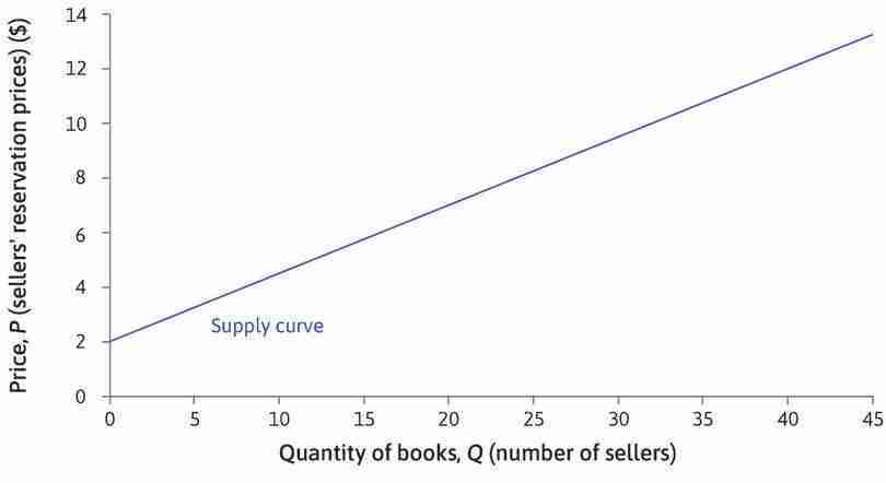
Reservation price
The first seller has a reservation price of $2 and will sell at any price above that.
Figure 7.12a The first seller has a reservation price of $2 and will sell at any price above that.
Supply curves slope upward
If you choose a particular price, say $10, the graph shows how many books would be supplied (Q) at that price—in this case, it is 32. The supply curve slopes upward: the higher the price, the more students will be willing to sell.
Figure 7.12d If you choose a particular price, say $10, the graph shows how many books would be supplied (Q) at that price—in this case, it is 32. The supply curve slopes upward: the higher the price, the more students will be willing to sell.
For any price, the supply curve shows the number of students willing to sell at that price—that is, the number of books that will be supplied to the market. We have drawn the supply and demand curves as straight lines for simplicity. In practice, they are more likely to be curves, with the exact shape depending on how valuations of the book vary among the students.
Question 7.9 Choose the correct answer(s)
As a student representative, one of your roles is to organize a second-hand textbook market between the current and former first-year students. After a survey, you estimate the demand and supply curves. For example, you estimate that pricing the book at $7 would lead to a supply of 20 books and a demand of 26 books. Which of the following statements are correct?
- The rumour would make the former first-year students less willing to sell. Their WTAs would rise, shifting the supply curve upwards. Equivalently, the number of students willing to supply their book at each price would be lower.
- From the supply curve, we can see that supply would double to 40 if the price were increased to $12.
- The rumour would shift the demand curve downwards.
- The maximum demand attainable is 40 at zero price.
Exercise 7.4 Selling strategies and reservation prices
Consider three possible methods to sell a car that you own:
- advertise it in the local newspaper
- take it to a car auction
- offer it to a second-hand car dealer.
- Would your reservation price be the same in each case? Why?
- If you used the first method, would you advertise it at your reservation price?
- Which method do you think would result in the highest sale price?
- Which method would you choose? Give reasons for your choice.
The equilibrium price
What will happen in the market for this textbook? That will depend on the market institutions that bring buyers and sellers together. If students need to rely on word of mouth, then when a buyer finds a seller they can try to negotiate a deal that suits both of them. But each buyer would like to be able to find a seller with a low reservation price, and each seller would like to find a buyer with a high willingness to pay. Before concluding a deal with one trading partner, both parties would like to know about other trading opportunities.
Traditional market institutions often brought many buyers and sellers together in one place. Many of the world’s great cities grew up around marketplaces and bazaars along ancient trading routes such as the Silk Road between China and the Mediterranean. In the Grand Bazaar of Istanbul, one of the largest and oldest covered markets in the world, shops selling carpets, gold, leather, and textiles cluster together in different areas.
With modern communications and online marketplaces, sellers can advertise their goods and buyers can more easily find out what is available and where to buy it. But in some cases, it is still convenient for many buyers and sellers to meet. Large cities have markets for meat, fish, vegetables, or flowers, where buyers can inspect the produce and compare prices.
At the end of the nineteenth century, the economist Alfred Marshall introduced his model of supply and demand using a similar example to our case of second-hand books. Most English towns had a corn exchange—also known as a grain exchange—a building in which farmers met with merchants to sell their grain. In Principles of Economics: Book Five: General Relations of Demand, Supply, and Value, Marshall described how the supply curve of grain would be determined by the prices that farmers would be willing to accept, and the demand curve by the willingness to pay of merchants. Then he argued that, although the price ‘may be tossed hither and thither like a shuttlecock’ in the ‘higgling and bargaining’ of the market, it would never be very far from the particular price at which the quantity demanded by merchants was equal to the quantity the farmers would supply.9
- excess supply
- A situation in which the quantity of a good supplied is greater than the quantity demanded at the current price. See also: excess demand.
- Nash equilibrium
- A set of strategies, one for each player in the game, such that each player’s strategy is a best response to the strategies chosen by everyone else.
- equilibrium
- A model outcome that does not change unless an outside or external force is introduced that alters the model’s description of the situation.
- marginal utility
- The additional utility resulting from a one-unit increase of a given variable.
Marshall called the price that equated supply and demand the equilibrium price. If the price was above the equilibrium, farmers would want to sell large quantities of grain, but few merchants would want to buy—there would be excess supply. Then, even the merchants who were willing to pay that much would realize that farmers would soon have to lower their prices and would wait until they did. Similarly, if the price was below the equilibrium, sellers would prefer to wait rather than sell at that price. If, at the going price, the amount supplied did not equal the amount demanded, Marshall reasoned that some sellers or buyers could benefit by charging some other price. In modern terminology, we would say that the going price was not a Nash equilibrium. The price would tend to settle at an equilibrium level, where demand and supply were equated.
Marshall’s supply and demand model can be applied to markets in which all sellers are selling identical (not differentiated) goods, so buyers are equally willing to buy from any seller.
Great economists Alfred Marshall
Alfred Marshall (1842–1924) was a founder—with Léon Walras—of what is termed the neoclassical school of economics. His Principles of Economics, first published in 1890, was the standard introductory textbook for English speaking students for 50 years. An excellent mathematician, Marshall provided new foundations for the analysis of supply and demand by using calculus to formulate the workings of markets and firms and to express key concepts such as marginal costs and marginal utility. The concepts of consumer and producer surplus are also attributed to Marshall. His conception of economics as an attempt to ‘understand the influences exerted on the quality and tone of a man’s life by the manner in which he earns his livelihood …’ is close to our own definition of the field.10
Sadly, much of the wisdom in Marshall’s text has rarely been taught by his followers. Marshall paid attention to facts—and to ethics. His observation that large firms could produce at lower unit costs than small firms was integral to his thinking, but it never found a place in the neoclassical school. And he insisted that:
Ethical forces are among those of which the economist must take account. Attempts have indeed been made to construct an abstract science with regard to the actions of an economic man who is under no ethical influences and who pursues pecuniary gain … selfishly. But they have not been successful. (Principles of Economics, 1890)
While advancing the use of mathematics in economics, he also cautioned against its misuse. In a letter to A. L. Bowley, a fellow mathematically inclined economist, he explained his own ‘rules’ as follows:
- Use mathematics as a shorthand language, rather than as an engine of inquiry.
- Keep to them [that is, stick to the maths] till you have done.
- Translate into English.
- Then illustrate by examples that are important in real life.
- Burn the mathematics.
- If you can’t succeed in 4, burn 3. This last I did often.11
Marshall was Professor of Political Economy at the University of Cambridge between 1885 and 1908. In 1896, he circulated a pamphlet to the University Senate, objecting to a proposal to allow women to be granted degrees. Marshall prevailed, and women would wait until 1948 before being granted academic standing at Cambridge on a par with men.
Nevertheless, his work was motivated by a desire to improve the material conditions of working people:
Now at last we are setting ourselves seriously to inquire whether it is necessary that there should be any so-called ‘lower classes’ at all: that is, whether there need be large numbers of people doomed from their birth to hard work in order to provide for others the requisites of a refined and cultured life, while they themselves are prevented by their poverty and toil from having any share or part in that life. … The answer depends in a great measure upon facts and inferences, which are within the province of economics; and this is it which gives to economic studies their chief and their highest interest. (Principles of Economics, 1890)
Would Marshall now be satisfied with the contribution that modern economics has made to creating a more just economy?
To apply the supply and demand model to the textbook market, we assume that all the books are identical (although in practice some may be in better condition than others) and that a potential seller can advertise a book for sale by announcing its price on a local website. We would expect most trades to occur at similar prices. Buyers and sellers could easily observe all the advertised prices, so if some books were advertised at $10 and others at $5, buyers would be queuing to pay $5; these sellers would quickly realize that they could charge more, while no one would want to pay $10, so these sellers would have to lower their prices.
We can find the equilibrium price by drawing the supply and demand curves on one diagram, as in Figure 7.13. At a price P* = $8, the supply of books is equal to demand—24 buyers are willing to pay $8 and 24 sellers are willing to sell. The equilibrium quantity is Q* = $24.
Equilibrium in the market for second-hand books.
Figure 7.13 Equilibrium in the market for second-hand books.
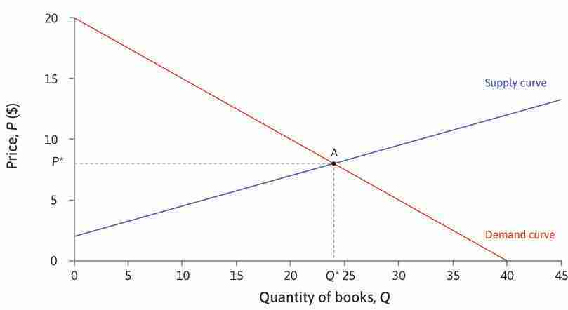
The market-clearing price
At a price P* = $8, the quantity supplied is equal to the quantity demanded: Q* = 24. The market is in equilibrium. We say that the market clears at a price of $8.
Figure 7.13b At a price P* = $8, the quantity supplied is equal to the quantity demanded: Q* = 24. The market is in equilibrium. We say that the market clears at a price of $8.
A price above the equilibrium price—excess supply
At a price greater than $8 more students would wish to sell, but not all of them would find buyers. There would be excess supply, so these sellers would want to lower their price.
Figure 7.13c At a price greater than $8 more students would wish to sell, but not all of them would find buyers. There would be excess supply, so these sellers would want to lower their price.
A price below the equilibrium price—excess demand
At a price less than $8, there would be more buyers than sellers—excess demand—so sellers could raise their prices. Only at $8 is there no tendency for change.
Figure 7.13d At a price less than $8, there would be more buyers than sellers—excess demand—so sellers could raise their prices. Only at $8 is there no tendency for change.
- market-clearing price
- At this price there is no excess supply or excess demand. See also: equilibrium.
The market-clearing price is $8—that is, supply is equal to demand at this price—all buyers who want to buy, and all sellers who want to sell, can do so. The market is in equilibrium. In everyday language, something is in equilibrium if the forces acting on it are in balance, so that it remains still. We say that a market is in equilibrium if the actions of buyers and sellers have no tendency to change the price or the quantities bought and sold, until there is a change in market conditions. At the equilibrium price for textbooks, all those who wish to buy or sell are able to do so, so there is no tendency for change.
Not all online markets for books are in competitive equilibrium. Michael Eisen, a biologist, noticed that an out-of-print text, The Making of a Fly, was listed for sale on Amazon by two reputable sellers, with prices starting at $1,730,045.91 (+$3.99 shipping). Over the next week prices rose rapidly, peaking at $23,698,655.93, before dropping to $106.23. Eisen explains why in his blog.
Price-taking
- price-taker
- Characteristic of producers and consumers who cannot benefit by offering or asking any price other than the market price in the equilibrium of a competitive market. They have no power to influence the market price.
- excess demand
- A situation in which the quantity of a good demanded is greater than the quantity supplied at the current price. See also: excess supply.
- competitive equilibrium
- A market outcome in which all buyers and sellers are price-takers, and at the prevailing market price, the quantity supplied is equal to the quantity demanded.
Will a market always be in equilibrium? No—when conditions change, it will take time for the market participants to adjust; while that happens, goods may be bought and sold at non-equilibrium prices. But, as Marshall argued, people would want to change their prices if there was excess supply or demand and would expect these changes to eventually move the economy toward a market equilibrium.
In the textbook market that we have described, individual students accept the prevailing equilibrium price determined by the supply and demand curves. This is because they could not benefit by offering to buy or sell at a price different from the equilibrium price. No one would trade with a seller asking a higher price or a buyer offering a lower one, because anyone could find an alternative seller or buyer with a better price.
The participants in this market equilibrium are price-takers, because there is sufficient competition from other buyers and sellers that the best they can do is to trade at the same price. They are free to choose other prices, but in contrast to the case when there is either excess supply or excess demand, when the market is in equilibrium they cannot benefit by doing so.
On both sides of the market, competition eliminates bargaining power. We describe the equilibrium in such a market as a competitive equilibrium. A competitive equilibrium is a Nash equilibrium because, given what all other actors are doing (trading at the equilibrium price), no actor can do better than to continue what they are doing (also trading at the equilibrium price).
In contrast, the seller of a differentiated product can set its price, because there are no close competitors. But the buyers are price-takers. In the example of Language Perfection, there are many consumers wanting to buy a Spanish-language course, so individual consumers have no power to negotiate a more advantageous deal—they have to accept the price that other consumers are paying.
Exercise 7.5 Price-takers
Think about some of the goods you buy: perhaps different kinds of food, clothes, transport tickets, or electronic goods.
- Are there many sellers of these goods?
- Do you try to find the lowest price in each case?
- If not, why not?
- For which goods would price be your main criterion?
- Use your answers to help you decide if the sellers of these goods are price-takers. Are there goods for which you, as a buyer, are not a price-taker?
Question 7.10 Choose the correct answer(s)
Figure 7.14 shows the demand and the supply curves for a textbook. The curves intersect at (Q, P) = (24, 8). Which of the following statements are correct?
Supply and demand for textbooks.
Figure 7.14 Supply and demand for textbooks.
- At $10, the price is above the equilibrium price of $8 and there is an excess supply of books.
- At $8, all buyers with a WTP at $8 or above can be matched with all sellers with a WTA of $8 or less. If one of these sellers raised their price to $9, the buyer could find another seller willing to accept less.
- At $8, the quantity demanded is equal to the quantity supplied—that is, the market clears.
- The maximum level of demand is 40, but 16 of these will be unfulfilled as their willingness to pay is below the market clearing price of $8.
7.10 Demand and supply in a competitive market: Bakeries
In the second-hand textbook example, both buyers and sellers are individual consumers. Now we look at an example in which the sellers are firms producing output. We know how the firm sets the price and quantity of a differentiated product, and that the price depends on whether there is competition from firms selling quite similar products—if there is competition, demand will be elastic, and the firm will be unable to set a high price because that would cause consumers to switch to other similar brands.
If there are many firms producing identical products, and consumers can easily switch from one firm to another, then firms will be price-takers in equilibrium. They will be unable to benefit from attempting to trade at a price different from the prevailing price.
To understand how price-taking firms behave, consider a city in which many small bakeries produce bread and sell it directly to consumers. Figure 7.15 shows what the market demand curve (the total daily demand for bread of all consumers in the city) might look like. It is downward-sloping as usual because, at higher prices, fewer consumers will be willing to buy.
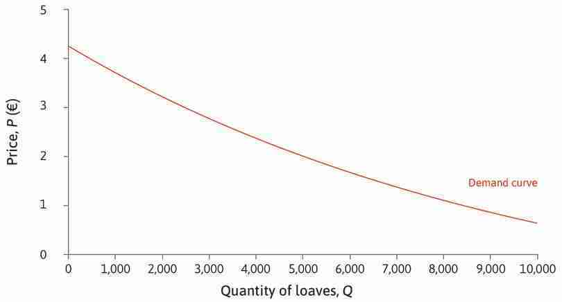
The market demand curve for bread.
Figure 7.15 The market demand curve for bread.
Suppose that you are the owner of one small bakery. You have to decide what price to charge and how many loaves to produce each morning. Suppose that neighbouring bakeries are selling loaves identical to yours at €2.35. The loaf is a large baguette. This is the prevailing market price; you will not be able to sell loaves at a higher price than other bakeries, because no one would buy—you are a price-taker.
What you should do depends on your costs of production—and, in particular, on your marginal costs. You may have some fixed costs, for example, the rent you pay on your premises—but you have to pay these irrespective of the number of loaves you produce. It is the additional costs of actually making each loaf of bread—the cost of the ingredients, and what you have to pay your employees for the time it takes to bake a loaf—that determine whether you should produce 30, 50 or 100 loaves per day. Having installed mixers, ovens, and other equipment, the marginal cost of each extra loaf may be relatively low, as long as you don’t exceed the capacity of your equipment.
Figure 7.16 illustrates this situation. Your bakery has the capacity to produce up to 120 loaves per day. Below that level, the marginal cost of a loaf is €1.50. The horizontal line at P* = €2.35 represents the demand for bread from your bakery—because you are a price-taker, each loaf you produce can be sold for €2.35.
In this example, it is easy to find the profit-maximizing price and quantity without drawing isoprofit curves. Work through the analysis of Figure 7.16 to see how this is done.
The marginal cost of a loaf
Whatever quantity of loaves you decide to produce between 0 and 120, the cost of making one more loaf—that is, the marginal cost—is €1.50.
Figure 7.16a Whatever quantity of loaves you decide to produce between 0 and 120, the cost of making one more loaf—that is, the marginal cost—is €1.50.
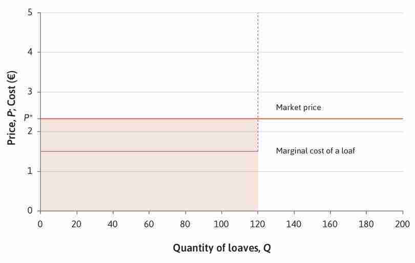
Price-taking
The bakery is a price-taker. The market price is P* = €2.35. If you choose a higher price, customers will go to other bakeries. Your feasible set of prices and quantities is the shaded area below the horizontal line at P*, where the price is less than or equal to €2.35, and the quantity is less than or equal to 120.
Figure 7.16c The bakery is a price-taker. The market price is P* = €2.35. If you choose a higher price, customers will go to other bakeries. Your feasible set of prices and quantities is the shaded area below the horizontal line at P*, where the price is less than or equal to €2.35, and the quantity is less than or equal to 120.
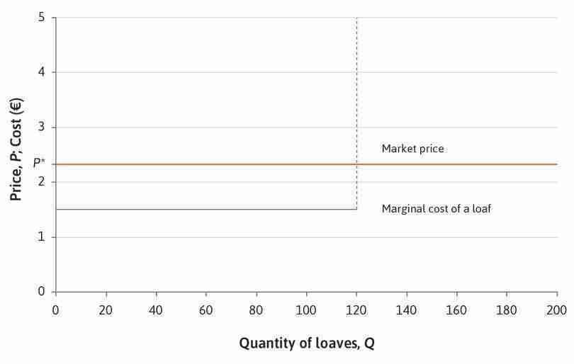
The profit-maximizing price
However many loaves you produce, you should sell them at €2.35 each. A higher price is not feasible, and a lower price would bring less profit.
Figure 7.16d However many loaves you produce, you should sell them at €2.35 each. A higher price is not feasible, and a lower price would bring less profit.
The profit-maximizing quantity
On every loaf you produce up to 120, you can make a surplus of €2.35 − €1.50=€0.85. You can increase your profit by making as many as possible. Your profit-maximizing quantity is Q* = 120.
Figure 7.16e On every loaf you produce up to 120, you can make a surplus of €2.35 − €1.50=€0.85. You can increase your profit by making as many as possible. Your profit-maximizing quantity is Q* = 120.
Your optimal choice is P* = €2.35 and Q* = 120; since your marginal cost is less than the market price, you maximize profit by making as many loaves as possible. Your profit will be the total surplus on 120 loaves minus your fixed costs.
What would you do if the market price changed? As long as it remains above €1.50, your profit-maximizing choice remains the same. But if the price fell below €1.50, you should immediately stop making bread. In that case, you would make a loss on any loaf produced.
Even if the market price were a little above €1.50, you might make a loss overall if your fixed costs were high. In this case, you still do the best you can by producing 120 loaves—at least the surplus will help you to cover part of the fixed costs. But in the longer term you would need to consider whether it is worth continuing in business. If you expect market conditions to remain bad, it might be best to sell up and leave the market—you could obtain a better return on your capital elsewhere.
The market supply curve
The market for bread in the city has many consumers and many bakeries. Let’s suppose initially there are 20 bakeries, differing in their marginal costs and their production capacity. Costs differ across bakeries because they specialize in producing different kinds of bread. Those that specialize in making large baguettes have the lowest marginal costs; for other bakeries to supply this type of bread, they need to switch employees who are more skilled in other types of bread production to baguette baking and their costs are higher. Similarly, the equipment of the non-specialist bakeries is less suited to producing baguettes, which is another reason their marginal costs are higher. As bakeries less and less suited to produced large baguettes supply the market, marginal costs rise, as shown in Figure 7.17.
Each bakery will decide how many loaves to produce in the same way:
- When the market price is above its marginal cost: It will produce and sell its maximum output.
- When the market price is below its marginal cost: It will make none of this kind of bread.
We can work out how much each bakery will supply at any given market price. To find the market supply curve, we just add up the total amount that all the bakeries will supply at each price.
We can do this in the same way as for second-hand textbooks. Figure 7.17 shows how to find the market supply by lining the 20 bakeries up in order of their marginal costs.
The market supply curve
To draw the market supply, we line up the 20 bakeries in order of their marginal costs—lowest first—and plot the marginal cost of each one, up to the maximum number of loaves it can produce.
Figure 7.17a To draw the market supply, we line up the 20 bakeries in order of their marginal costs—lowest first—and plot the marginal cost of each one, up to the maximum number of loaves it can produce.
The next bakery
The next one has marginal cost €1.10 and can make 240 loaves per day.
Figure 7.17c The next one has marginal cost €1.10 and can make 240 loaves per day.
Market supply when the price is P*
If the price is P*, only the bakeries with marginal cost less than or equal to P* will produce bread. If the price was €3, the graph shows that total market supply would be 3,140 loaves.
Figure 7.17e If the price is P*, only the bakeries with marginal cost less than or equal to P* will produce bread. If the price was €3, the graph shows that total market supply would be 3,140 loaves.
If there were many more bakeries in the city, more bread would be produced and there would be many more ‘steps’ on the supply curve. Rather than drawing them all, it is easier to approximate market supply with a smooth curve. Figure 7.18 shows an approximate market supply curve when there are many firms.
The market supply curve: Many bakeries.
Figure 7.18 The market supply curve: Many bakeries.
Notice that the supply curve tells us two different things. If we choose any price, it tells us how many loaves, in total, the bakeries would produce. But remember that, to construct it, we plotted the marginal cost of each loaf of bread in increasing order of marginal costs. So, if we choose a particular quantity (7,000, say) and use the curve to find the corresponding value on the vertical axis (€2.74), this tells us that the marginal cost of the 7,000th loaf is €2.74. In other words, the market supply curve is the marginal cost curve for all the bread produced in the city.
Competitive equilibrium
Now we know both the demand curve (Figure 7.15) and the supply curve (Figure 7.18) for the bread market as a whole. Figure 7.19 shows that the competitive equilibrium price is exactly €2.00. At this price, the market clears—consumers demand 5,000 loaves per day, and firms supply 5,000 loaves per day.
Since the equilibrium is the point where the demand curve crosses the marginal cost curve, we know that—in equilibrium—both the willingness to pay of the 5,000th consumer, and the marginal cost of the 5,000th loaf, are equal to the market price.
7.11 Competitive equilibrium: Gains from trade, allocation, and distribution
Buyers and sellers of bread voluntarily engage in trade because both benefit. Their mutual benefits from the equilibrium allocation can be measured by the consumer and producer surpluses introduced in Section 7.7. Any buyer whose willingness to pay for a good is higher than the market price, receives a surplus—the difference between the WTP and the price paid. Similarly, if the marginal cost of producing an item is below the market price, the producer receives a surplus. Figure 7.20 shows how to calculate the total surplus (the gains from trade) at the competitive equilibrium in the market for bread, in the same way as we did for the market for language courses (monopolistic competition).
Equilibrium in the bread market: Gains from trade.
Figure 7.20 Equilibrium in the bread market: Gains from trade.
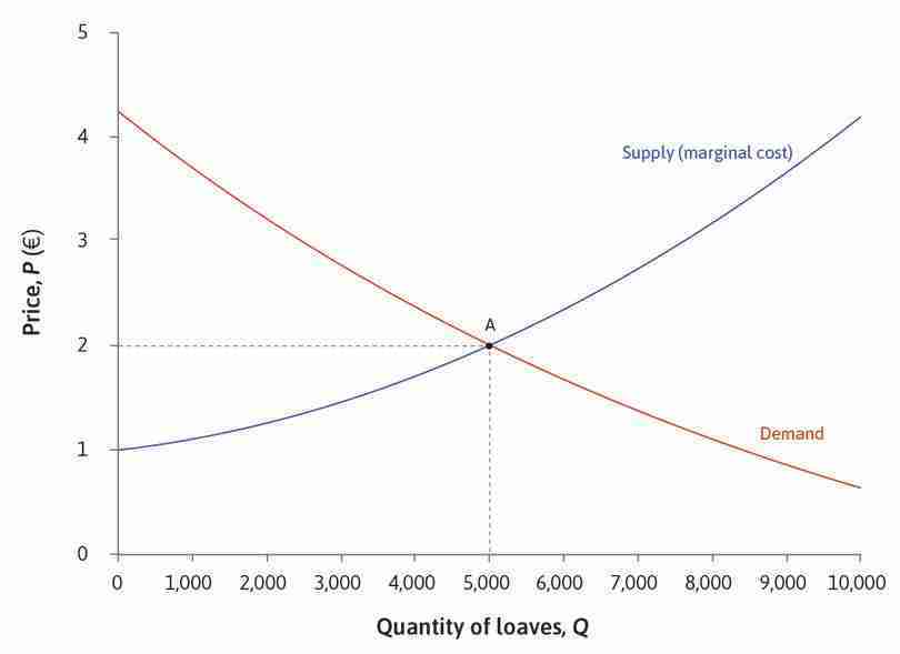
The consumer surplus
At the equilibrium price of €2.00 in the bread market, a consumer who is willing to pay €3.50 obtains a surplus of €1.50.
Figure 7.20a At the equilibrium price of €2.00 in the bread market, a consumer who is willing to pay €3.50 obtains a surplus of €1.50.
The producer surplus
Remember that the producer’s surplus on a unit of output is the difference between the price at which it is sold and the marginal cost of producing it. The marginal cost of the 2,000th loaf is €1.25; since it is sold for €2.00, the producer obtains a surplus of €0.75.
Figure 7.20c Remember that the producer’s surplus on a unit of output is the difference between the price at which it is sold and the marginal cost of producing it. The marginal cost of the 2,000th loaf is €1.25; since it is sold for €2.00, the producer obtains a surplus of €0.75.
Total surplus
The shaded area below €2.00 is the sum of the bakeries’ surpluses on every loaf that they produce. The whole shaded area shows the sum of all gains from trade in this market, known as the total surplus.
Figure 7.20d The shaded area below €2.00 is the sum of the bakeries’ surpluses on every loaf that they produce. The whole shaded area shows the sum of all gains from trade in this market, known as the total surplus.
When the market for bread is in equilibrium with the quantity of loaves supplied equal to the quantity demanded, the total surplus is the area below the demand curve and above the supply curve.
Notice how the equilibrium allocation in this market differs from the allocation of a differentiated product, such as LP’s Spanish course. The equilibrium quantity of bread is at the point where the market supply curve (which is also the marginal cost curve) crosses the demand curve; the total surplus is the whole of the area between the two curves. Figure 7.16 showed that the owner of LP chose to produce a quantity below the point where the marginal cost curve meets the demand curve, reducing the total surplus.
The competitive equilibrium allocation of bread has the property that the total surplus is maximized. The surplus would be smaller if fewer than 5,000 loaves were produced; if more than 5,000 loaves were produced, the surplus on the extra loaves would be negative—they would cost more to make than consumers were willing to pay.
Joel Waldfogel, an economist, gave his chosen discipline a bad name by suggesting that gift-giving at Christmas may result in a deadweight loss. If you receive a gift that is worth less to you than it cost the giver, he argued that the surplus from the transaction is negative. Do you agree?
At the equilibrium, all the potential gains from trade are exploited, which means there is no deadweight loss. This property—that the combined consumer and producer surplus is maximized at the point where supply equals demand—holds in general. If both buyers and sellers are price-takers, the competitive equilibrium allocation maximizes the sum of the gains achieved by trading in the market.
Pareto efficiency
At the competitive equilibrium allocation of bread, it is not possible to make any of the consumers or firms better off (that is, to increase the surplus of any individual) without making at least one of them worse off. Provided that what happens in this market does not affect anyone other than the participating buyers and sellers, we can say that the equilibrium allocation is Pareto efficient.
Pareto efficiency follows from three assumptions we have made about the bread market.
Price-taking
The participants are price-takers. They have no market power. When a particular buyer trades with a particular seller, each of them knows that the other can find an alternative trading partner willing to trade at the market price. Competition prevents sellers from raising the price in the way that the producer of a differentiated good would do.
A complete contract
The exchange of a loaf of bread for money is governed by a complete contract between buyer and seller. If you find there is no loaf of bread in the bag marked ‘Bread’ when you get home, you can get your money back. Compare this with the incomplete employment contract in Unit 6, in which the firm can buy the worker’s time, but cannot be sure how much effort the worker will put in. We will see in Unit 8 that this leads to a Pareto-inefficient allocation in the labour market.
No effects on others
We have implicitly assumed that what happens in this market affects no one except the buyers and sellers. To assess Pareto efficiency, we need to consider everyone affected by the allocation. If, for example, the early morning activities of bakeries disrupt the sleep of local residents, then there are additional costs of bread production and we ought to take the costs to the bakeries’ neighbours into account too. Then, we may conclude that the equilibrium allocation is not Pareto efficient after all. We will investigate this type of problem in Unit 11.
Fairness and efficiency
Remember from Unit 5 that there are two criteria for assessing an allocation—efficiency and fairness. Even if we think that the market allocation is Pareto efficient, we should not conclude that it is necessarily a desirable one. What can we say about fairness in the case of the bread market? We could examine the distribution of the gains from trade between producers and consumers. Figure 7.20 shows that both consumers and firms obtain a surplus; in this example consumer surplus is slightly higher than producer surplus. You can see that this happens because the demand curve is relatively steep (inelastic) compared with the supply curve.
We might also want to consider the market participants’ standard of living. For example, if a poor student buys a book from a rich student, we might think that an outcome in which the buyer paid less than the market price (closer to the seller’s reservation price) would be better, because it would be fairer. Or, if the consumers in the bread market were exceptionally poor, we might decide to pass a law setting a maximum bread price lower than €2.00 to achieve a fairer (although Pareto-inefficient) outcome.
Maurice Stucke, an antitrust lawyer, asks if competition in a market economy is always good.
The Pareto efficiency of a competitive equilibrium allocation is often interpreted as a powerful argument in favour of markets as a means of allocating resources. But we need to be careful not to exaggerate the value of this result:
- The allocation may not be Pareto efficient: We might not have taken everything into account.
- There are other important considerations: Fairness, for example.
- Price-takers are hard to find in real life: It is not as easy as you might think to find markets where all participants are price-takers. Goods (including bread) are rarely identical, and participants don’t always know what prices are available.
Watch ‘Economist in action’, Kathryn Graddy explain how she collected data on the price of whiting from the Fulton Fish Market in New York and what she found out about the model of perfect competition.
Exercise 7.6 Surplus and deadweight loss
- Sketch a diagram to illustrate the competitive market for bread, showing the equilibrium where 5,000 loaves are sold at a price of €2.00.
- Suppose that the bakeries get together to form a cartel. They agree to raise the price to €2.70, and jointly cut production to supply the number of loaves that consumers demand at that price. Shade the areas on your diagram to show the consumer surplus, producer surplus, and deadweight loss caused by the cartel.
- For what kinds of goods would you expect the supply curve to be highly elastic?
- Draw diagrams to illustrate how the share of the gains from trade obtained by producers depends on the elasticity of the supply curve.
Question 7.11 Choose the correct answer(s)
Which of the following statements about a competitive equilibrium allocation are correct?
- The allocation maximizes the total surplus, but the does not mean it is best for everyone in the market—for example, we may think it is unfair.
- This must be true, since the allocation maximizes the total surplus.
- The equilibrium allocation may not be Pareto efficient if it affects someone other than the buyers or sellers.
- This is a general property of competitive equilibrium.
Question 7.12 Choose the correct answer(s)
Figure 7.20 shows the demand and supply curves in the bread market and the distribution of surplus in competitive equilibrium. Ceteris paribus, which of the following would affect the distribution of gains from trade between consumers and producers?
- Setting the price below the Pareto efficient price P* would result in the consumers claiming a higher share. Similarly, a price above P* results in the producers claiming a higher share.
- The more inelastic the demand is, the steeper the demand curve and the larger the consumer surplus. The same reasoning applies to the supply curve.
- Total quantity determines the total gains from trade, but not the distribution of it (which depends on the relative slope of the supply and demand curves).
- The steeper the marginal cost curve, the steeper the supply curve and the higher the producer surplus claimed by producers.
7.12 Changes in supply and demand
Quinoa is a cereal crop grown on the Altiplano, a high barren plateau in the Andes of South America. It is a traditional staple food in Peru and Bolivia. In recent years, as its nutritional properties have become known, there has been a huge increase in demand from richer, health-conscious consumers in Europe and North America. Figures 7.21a–c show how the market changed. You can see in Figures 7.21a and 7.21b that, between 2001 and 2011, the price of quinoa trebled and production almost doubled. Figure 7.21c indicates the strength of the increase in demand—in real terms, spending on imports of quinoa rose from just $2.4 million to over $40 million over 10 years. Note that the increase in spending on quinoa reflects the increase in the price shown in Figure 7.21b as well as the purchase of higher quantities of the grain.
Jose Daniel Reyes and Julia Oliver. ‘Quinoa: The Little Cereal That Could’. The Trade Post. 22 November 2013. Underlying data from Food and Agriculture Organization of the United Nations. FAOSTAT Database.
For the producer countries, these changes are a mixed blessing. While their staple food has become expensive for poor consumers, farmers—who are amongst the poorest—are benefiting from the boom in export sales. Other countries are now investigating whether quinoa can be grown in different climates, and France and the US have become substantial producers.
Jose Daniel Reyes and Julia Oliver. ‘Quinoa: The Little Cereal That Could’. The Trade Post. 22 November 2013. Underlying data from Food and Agriculture Organization of the United Nations. FAOSTAT Database.
How can we explain the rapid increase in the price of quinoa? In this section, we look at the effects of changes in demand and supply, illustrating our model by the real-world case of quinoa.
Jose Daniel Reyes and Julia Oliver. ‘Quinoa: The Little Cereal That Could’. The Trade Post. 22 November 2013. Underlying data from Food and Agriculture Organization of the United Nations. FAOSTAT Database.
The supply of quinoa
At the beginning of the current century, there was ample land for growing quinoa on the Altiplano, and farmers producing other crops could easily switch to quinoa as the price rose. As a result, the initial increase in production between 2001 and 2007 to meet rising demand did not raise costs. This means that the supply curve was virtually flat. But in order to allow the continued output of quinoa after 2007, land less suited for the crop had to be brought into use, and the new farmers taking up the crop were giving up the production of other crops on which they had been making adequate incomes. As a result, costs rose. To represent this, we show the supply curve in Figure 7.23 becoming increasingly steep as production rose.
An increase in demand
As in the case of demand for language courses or Apple Cinnamon Cheerios, the demand curve for quinoa sloped downwards, as is shown by D2001 in Figure 7.23. The original equilibrium was at point A.
The new fashion among North American and European consumers for eating quinoa meant that for any given price of the crop, the tonnes of quinoa purchased rose. In other words, the demand curve for quinoa shifted to the right. You could also say that it shifted up, meaning that the price that was sufficient to allow the sales of any given quantity of quinoa had now increased. This is shown in Figure 7.23 (see the new demand curve labelled ‘2008’).
The increase in demand destroys the old equilibrium (the supply and demand curves no longer cross at A). With the new demand curve and initially with no change in sales of quinoa or in the price, there were a great many potential consumers whose willingness to pay for quinoa exceeded the price.
Market disequilibrium and adjustment to a new equilibrium
- disequilibrium
- A situation in which at least one of the actors can benefit by altering his or her actions and therefore changing the situation, given what everybody else is doing.
Thus, point A was no longer a Nash equilibrium because at least some of the producers would have realized that they could raise their prices without reducing their sales. The original price and quantity are termed a disequilibrium because, at point A, someone can benefit by changing the price. The reason is that at the initial price, there is excess demand. The increase in demand set off the sequence of events shown in Figure 7.22.
| An increase in the willingness to pay for quinoa | |
| ⇩ | |
| The demand curve shifts out | |
| ⇩ | |
| The original price and quantity are now not a Nash equilibrium | |
| ⇩ | |
| Some producers raise their prices, increasing their profits | |
| ⇩ | ⇩ |
| New producers start quinoa production | Existing farmers produce more |
Disequilibrium in demand for quinoa.
Figure 7.22 Disequilibrium in demand for quinoa.
Figure 7.22 describes what economists call a disequilibrium adjustment process, which is simply how market actors react when the existing situation is not an equilibrium. How long will this process go on? It will continue until the combination of higher prices and greater production has eliminated the excess demand, shown in Figure 7.23 as point C.
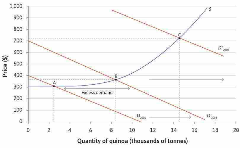
An increase in the demand for quinoa.
Figure 7.23 An increase in the demand for quinoa.
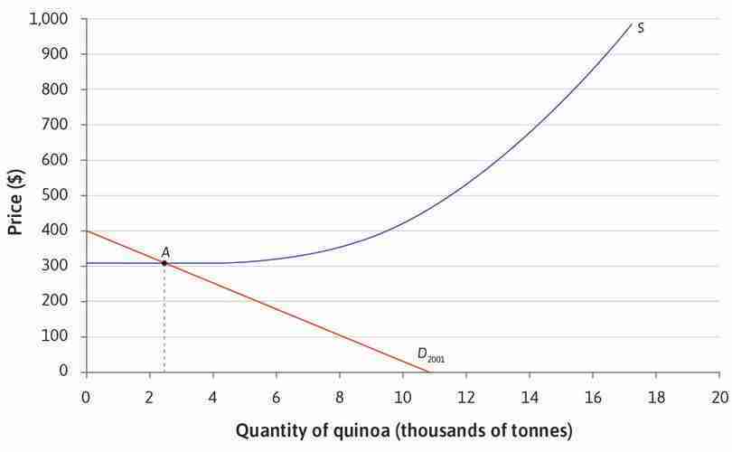
The initial equilibrium point
At the original levels of demand and supply, the equilibrium is at point A. The price is $340 per tonne, and $2.4 million tonnes of quinoa are sold.
Figure 7.23a At the original levels of demand and supply, the equilibrium is at point A. The price is $340, and $2.4 million tonnes of quinoa are sold.
An increase in demand
Demand for quinoa in Europe and North America increases between 2001 and 2008. There would be more consumers wanting to buy quinoa at each possible price. The demand curve shifts to the right.
Figure 7.23b Demand for quinoa in Europe and North America increases between 2001 and 2008. There would be more consumers wanting to buy quinoa at each possible price. The demand curve shifts to the right.
Excess demand when the price is $340
If the price remained at $340, there would be excess demand for quinoa, that is, more buyers than sellers. Some producers raise the price and their profits increase. The market is in disequilibrium.
Figure 7.23c If the price remained at $340, there would be excess demand for quinoa, that is, more buyers than sellers. Some producers raise the price and their profits increase. The market is in disequilibrium.
A new equilibrium point
The excess demand encourages more farmers to grow quinoa. The expansion of production eliminates the excess demand. There is a new equilibrium at point B with the price at $380 and a big increase in the quantity of quinoa sold.
Figure 7.23d The excess demand encourages more farmers to grow quinoa. The expansion of production eliminates the excess demand. There is a new equilibrium at point B with the price at $380 and a big increase in the quantity of quinoa sold.
A further increase in demand
Worldwide demand for quinoa continues to rise and the demand curve shifts out again to the one labelled 2009. There is excess demand. The land well suited to quinoa has all been used so the supply curve slopes upward.
Figure 7.23e Worldwide demand for quinoa continues to rise and the demand curve shifts out again to the one labelled 2009. There is excess demand. The land well suited to quinoa has all been used so the supply curve slopes upward.
A new equilibrium point with a higher price and larger quantity supplied
Some producers raise the price in response to the higher demand. Producers who have higher costs of production now find it profitable to switch to producing quinoa. At the new equilibrium at C, both price and quantity are higher.
Figure 7.23f Some producers raise the price in response to the higher demand. Producers who have higher costs of production now find it profitable to switch to producing quinoa. At the new equilibrium at C, both price and quantity are higher.
When we refer to ‘increase in demand’, it’s important to be careful about what exactly we mean. Figure 7.24 uses the example of quinoa to explain.
| Demand is higher at each possible price (the demand curve has shifted) |
| ⇩ |
| There is a change in the price |
| ⇩ |
| There is an increase in the quantity supplied |
An increase in demand for quinoa.
Figure 7.24 An increase in demand for quinoa.
This change is a movement along the supply curve. But the supply curve has not shifted! The amount supplied increased in response to the change in price. A shift in the supply curve would take place if, for example, an improved method of cultivating quinoa was invented so that for any given price, more would be supplied.
- price elasticity of supply
- The percentage change in supply that would occur in response to a 1% increase in price. Supply is elastic if this is greater than 1, and inelastic if less than 1.
After an increase in demand, the equilibrium quantity rises. The price change depends on the steepness of the supply curve, which captures how responsive supply is to prices. We know that the price elasticity of demand measures how much demand falls when prices rise. Similarly, the price elasticity of supply is defined as the percentage increase in supply when prices rise by one percent.
- shock
- An exogenous change in some of the fundamental data or variables used in a model.
You can see in Figure 7.23 that the steeper (more inelastic) the supply curve, the higher the price will rise and the less the quantity will increase. Initially, the supply curve was flat (elastic), so in the equilibrium at point B, the price was the same as at point A and the quantity sold was fully responsive to the demand shock.
- exogenous
- Coming from outside the model rather than being produced by the workings of the model itself. See also: endogenous.
When either the supply curve or the demand curve shifts, an adjustment of prices is needed to bring the market into equilibrium. Such shifts in supply and demand are often referred to as shocks in economic analysis. We start by specifying an economic model and find the equilibrium. Then we look at how the equilibrium changes when something changes—the model receives a shock. The shock is called exogenous because the model doesn’t explain why it happened—it shows the consequences of the shock, not the causes.
In the next section, we will examine another example in the world market for oil. Both the supply of and the demand for oil are more elastic in the long run, because producers can eventually build new oil wells and consumers can switch to different fuels for cars or heating. What we mean by the short run in this case is the period during which firms are limited by the capacity of existing wells, and consumers are limited by the cars and heating appliances they currently own.
Exercise 7.7 The market for quinoa
Consider again the market for quinoa studied in Figures 7.21a–c.
- Would you expect the price to fall eventually to its original level?
- Use the same model to show the effects on price and quantity of a significant improvement in the methods for producing quinoa, resulting in lower costs for farmers.
Exercise 7.8 Prices, shocks, and revolutions
Historians usually attribute the wave of revolutions in Europe in 1848 to long-term socioeconomic factors and a surge of radical ideas. But a poor wheat harvest in 1845 lead to food shortages and sharp price rises, which may have contributed to these sudden changes.12
Figure 7.25 shows the average and peak prices of wheat from 1838 to 1845, relative to silver. There are three groups of countries: those in which violent revolutions took place; those in which constitutional change took place without widespread violence; and those in which no revolution occurred.
- Explain, using supply and demand curves, how a poor wheat harvest could lead to price rises and food shortages.
- Using Excel or other data analysis programs, find a way to present the data to show that the size of the price shock, rather than the price level, is associated with the likelihood of revolution.
- Do you think this is a plausible explanation for the revolutions that occurred?
- A journalist suggests that similar factors played a part in the Arab Spring in 2010. Read the post. What do you think of this hypothesis?
Average Price 1838–45 Maximum Price 1845–48 Violent revolution 1848 Austria 52.9 104.0 Baden 77.0 136.6 Bavaria 70.0 127.3 Bohemia 61.5 101.2 France 93.8 149.2 Hamburg 67.1 108.7 Hesse-Darmstadt 76.7 119.7 Hungary 39.0 92.3 Lombardy 88.3 119.1 Mecklenburg-Schwerin 72.9 110.9 Papal States 74.0 105.1 Prussia 71.2 110.7 Saxony 73.3 125.2 Switzerland 87.9 146.7 Württemberg 75.9 128.7 Average Price 1838–45 Maximum Price 1845–48 Immediate constitutional change 1848 Belgium 93.8 140.1 Bremen 76.1 109.5 Brunswick 62.3 100.3 Denmark 66.3 81.5 Netherlands 82.6 136.0 Oldenburg 52.1 79.3 Average Price 1838–45 Average Price 1845–48 No revolution 1848 England 115.3 134.7 Finland 73.6 73.7 Norway 89.3 119.7 Russia 50.7 44.1 Spain 105.3 141.3 Sweden 75.8 81.4 Average and peak prices of wheat in Europe, 1838–1845.
Figure 7.25 Average and peak prices of wheat in Europe, 1838–1845.
Helge Berger and Mark Spoerer. 2001. ‘Economic Crises and the European Revolutions of 1848.’ The Journal of Economic History 61 (2): pp. 293–326.
Question 7.13 Choose the correct answer(s)
Look again at Figure 7.19, which shows the equilibrium of the bread market to be 5,000 loaves per day at price €2. A year later, we find that the market equilibrium price has fallen to €1.50. What can we definitely conclude?
- This is not the only possible cause of a fall in price.
- This is not the only possible cause of a fall in price.
- A downward shift in either curve would cause the price to fall. If we knew whether output had increased or decreased, we could determine which curve had shifted.
- At the market equilibrium price, there is no excess demand or supply.
Question 7.14 Choose the correct answer(s)
Which of the following statements are correct?
- If mortgage borrowing becomes cheaper, more people will want to buy houses at each house price.
- A launch of a substitute would decrease demand, shifting the demand curve down.
- The quantity of oil demanded would increase by moving along the demand curve; the curve itself would not move.
- The marginal cost of producing plastics would fall, so the supply curve would shift down.
7.13 The world oil market
Figure 7.26 plots the real price of oil in world markets (in constant 2014 US dollars) and the total quantity consumed globally from 1865 to 2014. To understand what drives the large fluctuations in the oil price, we can use our supply and demand model, distinguishing between the short run and the long run.
World oil prices in constant prices (1865–2014) and global oil consumption (1965–2014).
Figure 7.26 World oil prices in constant prices (1865–2014) and global oil consumption (1965–2014).
BP. 2015. BP Statistical Review of World Energy, June 2015.
- scarcity
- A good that is valued, and for which there is an opportunity cost of acquiring more.
Prices reflect scarcity. If a good becomes scarcer or costlier to produce, then the supply will fall and the price will tend to rise. For more than 60 years, oil industry analysts have been predicting that demand would soon outstrip supply—production would reach a peak and prices would then rise as world reserves declined. ‘Peak oil’ is not evident in Figure 7.26. One reason is that rising prices provide incentives for further exploration. Between 1981 and 2014, more than 1,000 billion barrels were extracted and consumed, yet world reserves of oil more than doubled from roughly 680 billion barrels to 1,700 billion barrels.
Prices have risen strongly in the twenty-first century and an increasing number of analysts are predicting that conventional oil, at least, has reached a peak. But unconventional resources such as shale oil are now being exploited. Perhaps it will be climate change policies, rather than resource depletion, that eventually curb oil consumption.1314
The oil price data in Figure 7.26 is difficult to interpret because of the sharp swings from high to low and back again over short periods of time. These fluctuations cannot be explained by looking at oil reserves, because they reflect short-run scarcity. Both supply and demand are inelastic in the short run.
Short-run supply and demand
On the demand side, the main use of oil products is in transport services (air, road, and sea). Demand is inelastic in the short run because of the limited substitution possibilities. For example, even if petrol prices rise substantially, in the short run most commuters will continue to use their existing cars to travel to work because of the limited alternatives immediately available to them. Therefore, the short-run demand curve is steep.
- oligopoly
- A market with a small number of sellers of the same good, giving each seller some market power.
Traditional oil extraction technology is characterized by a large up-front investment in expensive oil wells that can take many months or longer to construct, and once in place, can keep pumping until the well is depleted or oil can no longer be profitably extracted. Once the well is drilled, the cost of extracting the oil is relatively low, but the rate at which the oil is pumped faces capacity constraints—producers can get only so many barrels per day from a well. This means that, taking existing capacity as fixed in the short run, we should draw a short-run market supply curve that is initially low and flat, and then turns upwards very steeply as capacity constraints are hit. We also need to allow for the oligopolistic structure of the world market for crude oil. The Organization of Petroleum Exporting Countries (OPEC) is a cartel with a dozen member countries that currently accounts for about 40% of world oil production. OPEC sets output quotas for its members. We can represent this in our supply and demand diagram by a flat marginal cost line that stops at the total OPEC production quota. At that point, the line becomes vertical. This is not because of capacity constraints, but because OPEC producers will not sell any more oil.
Figure 7.27 assembles the market supply curve by adding the OPEC production quota to the supply from non-OPEC countries (remember that we obtain market supply curves by adding the amounts supplied by each producer at each price) and combines it with the demand curve to determine the world oil price.
The 1970s oil price shocks
In 1973 and 1974, OPEC countries imposed a partial oil embargo in response to the Middle East war. In 1979 and 1980, oil production by Iran and Iraq fell because of the supply disruptions following the Iranian Revolution and the outbreak of the Iran–Iraq war. These are represented in Figure 7.28 by a leftward shift of the world supply curve Sworld, driven by a reduction in the volume of OPEC production to Q′OPEC. Total production and consumption falls, but because demand is very price inelastic, the percentage increase in price is much larger than the percentage decrease in quantity. This is what we see in the data in Figure 7.28. The oil price (in 2014 US dollars) goes from $18 per barrel in 1973 to $56 in 1974, and then to $106 in 1980, but the declines in world oil consumption after these price shocks are small by comparison (−2% between 1973 and 1975, and −10% between 1979 and 1983).
The 2000–2008 oil price shocks
- income elasticity of demand
- The percentage change in demand that would occur in response to a 1% increase in the individual’s income.
The years 2000 to 2008 were a period of rapid economic growth in industrializing countries, especially China and India. The income elasticity of demand for oil and oil products is higher in these countries than in developed market economies, and demand for car ownership and tourist air travel is growing relatively rapidly as the countries become wealthier. This increase in income moves the demand curve to the right, as shown in Figure 7.28. In this case, it is the inelastic short-run supply curve for oil that accounts for the big increase in price and only a modest increase in world oil consumption. The sharp price decrease in 2009 has the same explanation, but in reverse—the financial crisis of 2008–2009 was a negative demand shock that moved the demand curve to the left, so world consumption fell by about 3%, and the price of crude fell from over $100 per barrel in the summer of 2008 to $40–50 in early 2009.
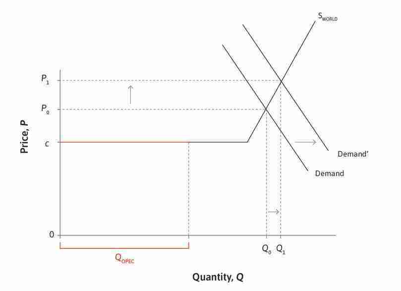
The oil price shocks of 2000–2008: Economic growth increases world demand.
Figure 7.29 The oil price shocks of 2000–2008: Economic growth increases world demand.
Exercise 7.9 The world market for oil
Using a supply and demand diagram:
- Illustrate what happens when economic growth boosts world demand
- in the short run
- in the long run as producers invest in new oil wells
- in the long run as consumers find substitutes for oil
- Similarly, describe the short- and long-run consequences of a negative supply shock similar to the 1970s shock.
- If you observed an oil price rise, how in principle could you tell whether it was driven by supply-side or demand-side developments?
- How would the diagram, and the response to shocks, be different if there were:
- a competitive market composed of many producers?
- a single monopoly oil producer?
- an OPEC cartel controlling 100% of world oil production and seeking to maximize the combined profits of its members?
- Why would individual OPEC member countries have an incentive to produce more than the quota assigned to them?
- Does this logic carry over to the situation in the real world where there are also non-OPEC producers?
Exercise 7.10 The shale oil revolution
An important development in the past 10 years has been the re-emergence of the US as a major oil producer via the ‘shale oil revolution’. Shale oil is extracted using the technology of hydraulic fracturing or ‘fracking’—injecting fluid into ground at high pressure to fracture the rock and allow extraction. In a speech called ‘The New Economics of Oil’ in October 2015, Spencer Dale, group chief economist at oil producer BP PLC, explained how shale oil production differs from traditional extraction.
- According to Dale, how has the shale oil revolution affected the world market for oil?
- How will the world oil market be different in future?
- Explain how our supply and demand diagram should be changed if his analysis is correct.
7.14 Conclusion
This unit has looked at how the firm, as an actor in the economy, decides what prices to set and how much to produce. This decision depends on both the willingness to pay (WTP) of its customers (as summarized by the demand curve and the price elasticity), and on the firm’s cost structure.
One advantage of large-scale production is lower unit costs due to increased bargaining power with suppliers, or a high initial fixed cost. But firms cannot benefit from economies of scale indefinitely.
To our economic toolkit we have added two models of firm behaviour, each relying on different assumptions regarding the nature of the product and the market structure.
| Price-setting firm (monopolistic competitor) | Price-taking firm | |
|---|---|---|
| Setting and assumptions | The firm has few competitors as it produces a differentiated product. It faces a downward-sloping product demand curve. The firm sets price to maximize profits (price-setter). There is no price discrimination, so the chosen price is the same for all customers. |
Competition from other firms producing identical products means that firms have no power to set their own prices. They each face a flat demand curve for their product. Given the market price, the firm chooses the quantity to produce to maximize profits (price-taker). |
| Economic toolkit |
Constrained optimization problem The firm chooses the highest isoprofit curve possible, given the product demand curve as a constraint. The profit-maximizing choice is where the curves are tangent. This is where MRS (slope of isoprofit) equals MRT (slope of demand). |
Supply and demand analysis The supply curve depends on suppliers’ willingness to accept (their reservation prices). Its shape depends on the marginal cost curve. The market-clearing price is determined by the intersection of market supply and market demand curves. |
| Main result | Price is greater than marginal cost, and owners receive economic rents. There exist deadweight losses, meaning there are unexploited gains from trade. The outcome is Pareto inefficient. | Price is equal to marginal cost. In this competitive equilibrium, total surplus is maximized and the outcome is Pareto efficient, assuming only buyers and sellers are affected. Owners can only receive dynamic rents when markets are in disequilibrium following an exogenous shock. |
A firm’s market power determines the markup it can set, which is inversely related to the price elasticity of demand. Competition policy aims to prevent abuses of market power that may result from the formation of cartels. The model of perfect competition provides a useful benchmark against which to evaluate economic outcomes.
Price-setting firms face a multitude of decisions every day, and their success depends on more than just ‘getting the price right’. As summarized in Figure 7.30, a firm can actively influence both consumer demand and costs in various ways, including innovation, advertising, wage-setting and influencing taxes and environmental regulation.
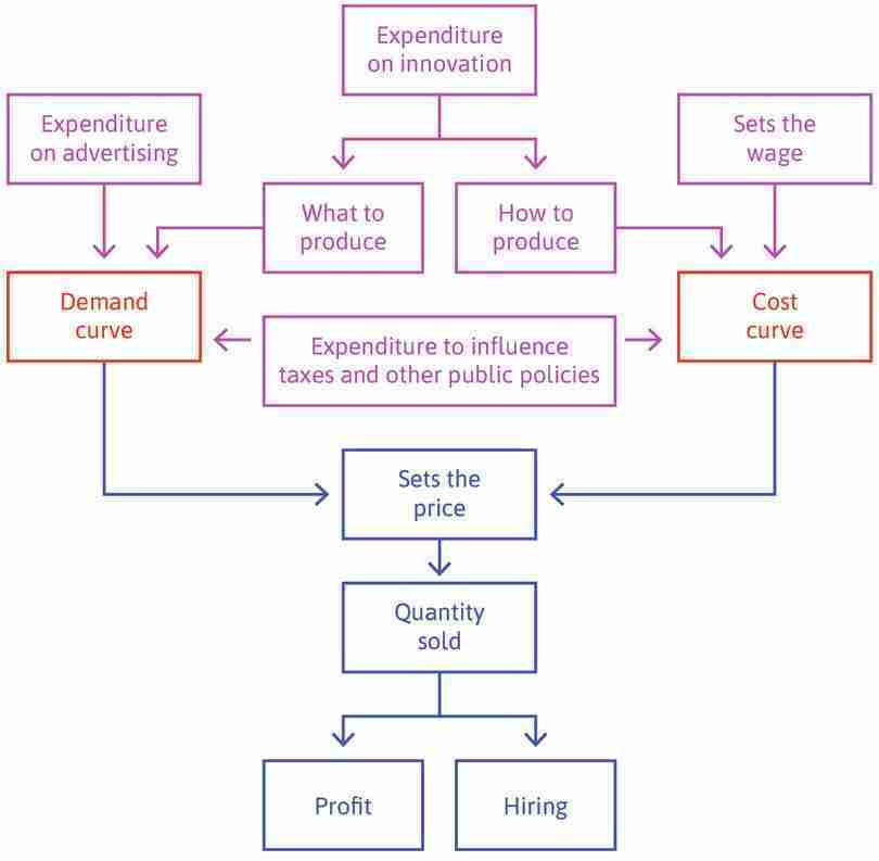
The price- and wage-setting firm’s decisions.
Figure 7.30 The price- and wage-setting firm’s decisions.
7.15 Doing Economics: Supply and demand
In this unit, we used demand and supply curves to find market equilibrium. But how do we know what the supply and demand curves look like in the real world? Unlike the models in this unit, we cannot ask consumers for their willingness to pay at different prices or ask firms to tell us their profit-maximizing decisions. Instead, usually the best data available are prices and quantities over a number of periods (both of the product we are interested in and of other products), and information about policies and other events that happened in those periods.
In Doing Economics Empirical Project 7 we will be using a ‘real-world’ example (the US market for watermelons in 1930–1951) to learn how to model demand and supply using available data and interpret the results.
Go to Doing Economics Empirical Project 7 to work on this project.
Learning objectives
In this project you will:
- convert values from natural logarithms to base 10 logarithms
- draw graphs based on equations
- give an economic interpretation of coefficients in supply and demand equations
- distinguish between exogenous and endogenous shocks
- explain how we can use exogenous supply/demand shocks to identify the demand/supply curve.
7.16 References
- Berger, Helge, and Mark Spoerer. 2001. ‘Economic Crises and the European Revolutions of 1848’. The Journal of Economic History 61 (2): pp. 293–326.
- Cournot, Augustin, and Irving Fischer. (1838) 1971. Researches into the Mathematical Principles of the Theory of Wealth. New York, NY: A. M. Kelley.
- Eisen, Michael. 2011. ‘Amazon’s $23,698,655.93 book about flies’. It is NOT junk.. Updated 22 April 2011.
- Feiwel, George R. (ed.). 1989. Joan Robinson and Modern Economic Theory. New York: New York University Press: p. 4.
- Giberson, Michael. 2010. ‘I Cringe When I See Hayek’s Knowledge Problem Wielded as a Rhetorical Club’. Knowledge Problem. Updated 5 April.
- Gilbert, Richard J., and Michael L. Katz. 2001. ‘An Economist’s Guide to US v. Microsoft’. Journal of Economic Perspectives 15 (2): pp. 25–44.
- Hayek, Friedrich A. 1994. The Road to Serfdom. Chicago, Il: University of Chicago Press.
- Kay, John. ‘The Structure of Strategy’. Reprinted from Business Strategy Review 1993.
- Krajewski, Markus. 2014. ‘The Great Lightbulb Conspiracy’. IEEE Spectrum. Updated 25 September 2014.
- Marshall, Alfred. 1920. Principles of Economics. 8th ed. London: MacMillan & Co.
- Miller, R. G., and S. R. Sorrell. 2013. ‘The Future of Oil Supply’. Philosophical Transactions of the Royal Society A: Mathematical, Physical and Engineering Sciences 372 (2006) (December).
- Owen, Nick A., Oliver R. Inderwildi, and David A. King. 2010. ‘The Status of Conventional World Oil Reserves—Hype or Cause for Concern?’ Energy Policy 38 (8): pp. 4743–49.
- Pigou, A. C. (editor). 1966. Memorials of Alfred Marshall. New York, A. M. Kelley. pp.427–28.
- Reyes, Jose Daniel, and Julia Oliver. 2013. ‘Quinoa: The Little Cereal That Could’. The Trade Post. 22 November 2013.
- Robinson, Joan. 1933. The Economics of Imperfect Competition. London: MacMillan & Co.
- Schumacher, Ernst F. 1973. Small is Beautiful: Economics as if People Mattered. New York, NY: HarperCollins.
- Seabright, Paul. 2010. The Company of Strangers: A Natural History of Economic Life (Revised Edition). Princeton, NJ: Princeton University Press.
- Shum, Matthew. 2004. ‘Does Advertising Overcome Brand Loyalty? Evidence from the Breakfast-Cereals Market’. Journal of Economics & Management Strategy 13 (2): pp. 241–72.
- The Economist. 2001. ‘Is Santa a Deadweight Loss?’ Updated 20 December 2001.
- The Economist. 2014. Keynes and Hayek: Prophets for Today. Updated 14 March 2014.
-
Ernst F. Schumacher. 1973. Small is Beautiful: Economics as if People Mattered. New York, NY: HarperCollins. ↩
-
Augustin Cournot and Irving Fischer. (1838) 1971. Researches into the Mathematical Principles of the Theory of Wealth. New York, NY: A. M. Kelley. ↩
-
Joan Robinson. 1933. The Economics of Imperfect Competition. London: MacMillan & Co. ↩
-
George R. Feiwel (ed.). 1989. Joan Robinson and Modern Economic Theory. New York: New York University Press: p. 4. ↩
-
Richard J. Gilbert and Michael L. Katz. 2001. ‘An Economist’s Guide to US v. Microsoft’. Journal of Economic Perspectives 15 (2): pp. 25–44. ↩
-
Markus Krajewski. 2014. ‘The Great Lightbulb Conspiracy’. IEEE Spectrum. Updated 25 September 2014. ↩
-
John Kay. ‘The Structure of Strategy’ (reprinted from Business Strategy Review 1993). ↩
-
Matthew Shum. 2004. ‘Does Advertising Overcome Brand Loyalty? Evidence from the Breakfast-Cereals Market’. Journal of Economics & Management Strategy 13 (2): pp. 241–72. ↩
-
Alfred Marshall. 1920. Principles of Economics. 8th ed. London: MacMillan & Co. ↩
-
Alfred Marshall. 1920. Principles of Economics. 8th ed. London: MacMillan & Co. ↩
-
A. C. Pigou (editor). 1966. Memorials of Alfred Marshall. New York, A. M. Kelley. pp. 427–28. ↩
-
Helge Berger and Mark Spoerer. 2001. ‘Economic Crises and the European Revolutions of 1848’. The Journal of Economic History 61 (2): pp. 293–326. ↩
-
R. G. Miller and S. R. Sorrell. 2013. ‘The Future of Oil Supply’. Philosophical Transactions of the Royal Society A: Mathematical, Physical and Engineering Sciences 372 (2006) (December). ↩
-
Nick A. Owen, Oliver R. Inderwildi, and David A. King. 2010. ‘The Status of Conventional World Oil Reserves—Hype or Cause for Concern?’ Energy Policy 38 (8): pp. 4743–49. ↩
