
4 Work, wellbeing, and scarcity
4.1 Introduction
- People value free time, but they also value what they can buy with their earnings from the time they spend at work.
- This is an example of the unavoidable trade-off we make when there is scarcity—satisfying one objective, such as having more free time, means satisfying other objectives less, such as having more possessions.
- An individual’s choices may be understood using economic models, which are simplifications of situations that allow us to see more by looking at less.
- The two components of our model are a description of all of the outcomes that are possible, and the person’s evaluation of each of these feasible outcomes.
- The model is based on the assumption that she will take the action that brings about the outcome—among those that are feasible—that she prefers most.
- This model helps explain differences in the hours worked by people in different countries, and the changes in hours of work as real GDP per capita rose in those countries, as we saw in Unit 1’s hockey-stick charts.
- To maintain social status and respect, and to try to attain the consumption of the very rich, people may work longer hours. This may help explain why, as a nation gets richer, its citizens may not become happier.
- We ask, ‘how good is the model?’ We can better explain differences in working hours if we also consider differences between cultures and between men and women.
You are offered a job. It will pay you eight times as much, per hour, as you earn today. This is not just a short-term offer. You can expect to continue to earn at this rate for the rest of your life. Even better, you can choose to work as few or as many hours as you like while you earn this wage.
Let us consider the choices that this life-changing offer has given you:
- You could keep your working hours unchanged, and permanently increase the amount of goods and services you consume (and so pay for), to eight times your current level.
- At the opposite extreme, you could consume exactly what you consume today, and reduce your working hours to one-eighth of the current level, maybe about an hour a day. The rest of your time is now free.
- Or, in principle, you could increase both your consumption and free time. You cut back on your hours a little, but to a level at which you still earn more after your pay rise.
- Or, of course, you could really cash in. You could use this opportunity to work more hours. Your consumption would increase by more than a factor of eight.
Given how much you earn, how would you respond?
Now ask yourself whether your response would be different if you earned the median wage of a US graduate ($1,324 per week), or had the median income across the entire globe (around $50 per week at current PPPs).
In the absence of fairy godmothers, this seems like a pure thought experiment. An opportunity on this scale hardly ever happens.
But it is far from imaginary. While such a large change in circumstance rarely occurs to one person, such changes did occur over time to a typical worker in many rich countries, as those countries moved along the hockey-stick paths we showed you in Unit 1. If the inhabitants of poor countries anticipate their income levels rising towards those in rich countries, changes of this magnitude, or even larger, will be a plausible prospect for a large fraction of the global population.
In 1930, John Maynard Keynes, a British economist, predicted a future of free time in abundance, even warning of an embarrassment of riches in leisure. He published an essay entitled ‘Economic Possibilities for our Grandchildren’, in which he suggested that, over the next 100 years, technological improvements would make us, on average, about eight times better off.1
What he called ‘the economic problem, the struggle for subsistence’ would be solved, and we would not have to work more than, say, 15 hours per week to satisfy our economic needs. The question he raised was, ‘How would we cope with all the additional leisure time?’.
Keynes’ prediction for the rate of technological progress in countries such as the UK and the US has been approximately right, and working hours have indeed fallen, although much less than he expected. It seems extremely unlikely that average working hours will be 15 hours per week by 2030, as Keynes predicted.
An article by Tim Harford in the ‘Undercover Economist’ column of the Financial Times examines why Keynes’ prediction was wrong.
The hockey-stick charts in Unit 1 illustrated the dramatic increases in goods and services consumed in countries that have experienced the capitalist revolution. This prompts the question of whether economic progress always results in more free time as well as more goods. The answer is generally yes, but in different proportions in different countries.
Generally, but not always. In the year 1600, the average British worker worked for 266 days, which means taking roughly two days off a week. This did not change much until the Industrial Revolution in the eighteenth century, when wages began to rise. But working time rose too—to 318 days in 1870. As wages rose for British workers, the number of days they took off work reduced by half!
If you want to compare working hours in 1870 to those in the modern world, Michael Huberman and Chris Minns calculate them in their paper, ‘The Times They Are Not Changin’: Days and Hours of Work in Old and New Worlds, 1870–2000’. Explorations in Economic History 44 (4): pp. 538–67.
In the US in the nineteenth century, hours of work initially increased for many workers who shifted from farming to industrial jobs. In 1865, the US abolished slavery, and former slaves used their freedom to work much less. From the late nineteenth century until the middle of the twentieth century, working time gradually fell. Figure 4.1 shows how annual working hours have fallen since 1900 in many countries.
Michael Huberman and Chris Minns. 2007. ‘The Times They Are Not Changin’: Days and Hours of Work in Old and New Worlds, 1870–2000’. Explorations in Economic History 44 (4): pp. 538–67.
Exercise 4.1 Working hours across countries and time
Use Figure 4.1 to answer these questions.
- Looking at both Panel A and B, describe what happened to working hours over the period 1900–2000.
- Compare working hours in the countries in Panel A with those in Panel B, and describe any differences you see.
- What possible explanations can you suggest for why the decline in working hours was greater in some countries than in others?
- Why do you think that the decline in working hours is faster in most countries in the first half of the century compared to the second half?
- In recent years, is there any country in which working hours have increased? Why do you think this happened?
Figure 4.2 shows trends in income and working hours since 1870 in the Netherlands, the US and France.
An article gives more historical detail on the hours that people worked in the US: Robert Whaples. 2001. ‘Hours of Work in U.S. History’. EH.net Encyclopedia.
As in Unit 1, income is measured as real GDP per capita in US dollars. This is not the same as average earnings, but gives us a useful indication of average income for the purposes of comparison across countries and through time. In the late nineteenth and early twentieth centuries, average income approximately tripled, and hours of work fell substantially.
During the rest of the twentieth century, income per head rose four-fold. Hours of work continued to fall in the Netherlands and France (albeit more slowly) but levelled off in the US, where there has been little change since 1960. At the end of this unit, we return to these cross-country differences.
Annual hours of work and real income (1870–2016).
Figure 4.2 Annual hours of work and real income (1870–2016).
Maddison Project Database, version 2018. Jutta Bolt, Robert Inklaar, Herman de Jong and Jan Luiten van Zanden (2018); ‘Rebasing ‘Maddison’: new income comparisons and the shape of long-run economic development’, Maddison Project Working paper 10; Michael Huberman and Chris Minns. 2007. ‘The Times They Are Not Changin’: Days and hours of work in Old and New Worlds, 1870–2000’. Explorations in Economic History 44 (4): pp. 538–67; OECD Statistics. GDP is measured at PPP in 1990 international Geary–Khamis dollars.
While many countries have experienced similar trends, there are still differences in outcomes. Figure 4.3 illustrates the wide disparities in free time and income between countries between the years 2013–2017. Here, we have calculated free time by subtracting average annual working hours from the number of hours in a year. You can see that the higher-income countries seem to have lower working hours and more free time, but there are also some striking differences between them. For example, the Netherlands and the US have similar levels of income, but Dutch workers have much more free time. And the US and Turkey have similar amounts of free time, but a large difference in income.
Average annual hours of free time per worker and real income (2013–2017).
Figure 4.3 Average annual hours of free time per worker and real income (2013–2017).
OECD. Level of GDP per capita and productivity. Accessed March 2019.
In many countries, there has been a huge increase in living standards since 1870. But in some places, people have carried on working just as many hours as before but consumed more, while in other countries, people now have much more free time. Why has this happened? We will provide some answers to this question by studying a basic problem of economics—scarcity—and how we make choices when we cannot have everything that we want, such as goods and free time.
Study the model of decision making that we use in this unit carefully! It will be used repeatedly throughout the course, because it gives us an insight into a wide range of economic problems. Before developing our model, we need to ask why economists use models at all.
Question 4.1 Choose the correct answer(s)
Based on Figure 4.2, which of the following statements are true?
- The negative correlation between the number of hours worked and real GDP per capita does not necessarily imply that one causes the other.
- The lower real GDP per capita in the Netherlands may be due to a number of factors, including the possibility that the Dutch may prefer less income but more leisure time for cultural or other reasons.
- From the start to the end of the line shown, the real GDP per capita of France increased from roughly $2,000 to $20,000 (ten-fold) while annual hours worked fell from over 3,000 to under 1,500.
- That would be nice. However, past performance does not necessarily mean that the trend will continue in the future.
Question 4.2 Choose the correct answer(s)
Based on Figure 4.3, which of the following statements are true?
- While there is positive correlation between real GDP per capita and free time, the dispersion suggests that, for some nationalities, the increase in living standard takes the form of more goods and services to consume (for example, the US), while for others this has taken the form of more leisure time (for example, France).
- As shown in the chart, workers from the US and Turkey both enjoy 6,900–7,000 hours of free time, but the US has a much higher real GDP per capita than Turkey.
- The Norwegians produce higher real output per capita than the Germans, despite both working a similar number of hours.
- This is the other way around; Japanese workers have more free time than do Korean workers, but produce similar real output per capita.
4.2 Economic models: How to see more by looking at less
What happens in the economy depends on what millions of people do, and how their decisions affect the behaviour of others. It would be impossible to understand the economy by describing every detail of how they act and interact. We need to be able to stand back and look at the big picture. To do this, we use models.
To create an effective model, we need to distinguish between the essential features of the economy that are relevant to the question we want to answer, which features should be included in the model, and which details are unimportant, and can be ignored.
Types of model
Models come in many forms—you have seen two of them already in Figures 2.1 and 2.15. For example, Figure 2.15 illustrated that economic interactions involve flows of goods (for example, when you buy a washing machine), services (when you purchase haircuts or bus rides), and also people (when you spend a day working for an employer). You have encountered still more models in the public goods game, the climate change game, and the ultimatum game.
Figure 2.15 is a diagrammatic model illustrating the flows that occur within the economy, and between the economy and the biosphere. The model is not ‘realistic’—the economy and the biosphere don’t look anything like it—but it nevertheless illustrates the relationships among them. The fact that the model omits many details—and in this sense is unrealistic—is a feature of the model, not a bug.
- equilibrium
- A model outcome that does not change unless an outside or external force is introduced that alters the model’s description of the situation.
When we build a model, the process follows these steps:
- We construct a simplified description of the conditions under which people take actions.
- Then we describe in simple terms what determines the actions that people take.
- We determine how each of their actions affects each other.
- We determine the outcome of these actions. This is often an equilibrium (something is constant).
- Finally, we try to get more insight by studying what happens to certain variables when conditions change.
A good model has five attributes:
- It is clear: It helps us better understand something important.
- It identifies important relationships: We need to have accurate information about these to evaluate alternative courses of action.
- It predicts accurately: Its predictions are consistent with evidence.
- It improves communication: It helps us to understand what we agree (and disagree) about.
- It is useful: We can use it to find ways to improve how the economy works.
Economic models often use mathematical equations and graphs, as well as words and pictures. Mathematics is part of the language of economics and can help us to communicate our statements about models precisely to others. Much of the knowledge of economics, however, cannot be expressed by using mathematics alone. It requires clear descriptions, using standard definitions of terms.
A model starts with some assumptions or hypotheses about how people behave, and often gives us predictions about what we will observe in the economy. Gathering data on the economy, and comparing it with what a model predicts, helps us to decide whether the assumptions we made when we built the model—what to include and what to leave out—were justified.
Governments, central banks, corporations, trade unions, and anyone else who makes policies or forecasts use some type of simplified model.
Bad models can result in disastrous policies. To have confidence in a model, we need to see whether it is consistent with evidence. We will see that the economic models used in later units pass this test—even though they leave many questions unanswered.
In this unit, we are going to build an economic model to help explain the trends in free time as incomes rose historically, and the variation across countries in these aspects of wellbeing.
The ceteris paribus assumption in models
- ceteris paribus
- Economists often simplify analysis by setting aside things that are thought to be of less importance to the question of interest. The literal meaning of the expression is ‘other things equal’. In an economic model it means an analysis ‘holds other things constant’.
As is common in scientific inquiry, economists often simplify an analysis by setting aside things that are thought to be of less importance to the question of interest, by using the phrase ‘holding other things constant’. More often they use the Latin expression ceteris paribus, meaning ‘other things equal’. For example, later in the course we simplify an analysis of what people would choose to buy by looking at the effect of changing a price—ignoring other influences on our behaviour like brand loyalty, or what others would think of our choices. We ask, ‘What would happen if the price changed, but everything else that might influence the decision was the same?’. These ceteris paribus assumptions, when used well, can clarify the picture without distorting the key facts.
In scientific experiments and in the experiments conducted by economists in the lab and in the field that we have considered in previous units, the experimental design holds many things constant in order to uncover the effect of X on Y. The ceteris paribus assumption refers to holding things constant in thought experiments.
Exercise 4.2 Designing a model
For a country (or city) of your choice, look up a map of the railway or public transport network. When designing this model, how do you think the modeller selected which features of reality to include?
4.3 Decision making, trade-offs, and opportunity costs
- opportunity cost
- The opportunity cost of some action A is the foregone benefit that you would have enjoyed if instead you had taken some other action B. This is called an opportunity cost because by choosing A you give up the opportunity of choosing B. It is called a cost because the choice of A costs you the benefit you would have experienced had you chosen B.
Alexei is a student who faces a dilemma. He wants both a higher grade and more free time. But, ceteris paribus (holding other things equal) he cannot increase his free time without getting a lower grade in the exam. Another way of expressing this is to say that free time has an opportunity cost—to get more free time, Alexei must forgo the opportunity of getting a higher grade. Whatever he decides to do, there is a cost to him. The opportunity cost of more free time is his dislike of getting a lower grade. We could also turn it around: the opportunity cost of getting a higher grade is how much he dislikes having less free time.
In everyday decision making, opportunity costs are relevant whenever we consider choosing between alternative and mutually exclusive courses of action. When we consider the cost of taking action A, we include the fact that if we do A, we cannot do B. So, forgoing the opportunity to do B becomes part of the cost of doing A. This is called an opportunity cost because doing A means forgoing the opportunity to do B.
Accountants think differently about costs. Imagine that an accountant and an economist have been asked to report the cost of going to a concert A in a theatre, which has a $25 admission cost. In a nearby park, there is concert B, which is free but happens at the same time. You cannot go to both.
- Accountant
- The cost of concert A is your ‘out-of-pocket’ cost—you paid $25 for a ticket, so the cost is $25.
- Economist
- But what do you have to give up to go to concert A? You give up the $25, plus opportunity of enjoying the free concert in the park. So the cost of concert A for you is the out-of-pocket cost plus the opportunity cost.
Suppose that the most you would have been willing to pay to attend the concert in the park (if it wasn’t free) is $15. The benefit of your next best alternative to concert A would be $15 of enjoyment in the park. This is the opportunity cost of going to concert A.
- economic cost
- The out-of-pocket cost of an action, plus the opportunity cost.
- economic rent
- A payment or other benefit received above and beyond what the individual would have received in his or her next best alternative (or reservation option). See also: reservation option.
The total economic cost of concert A is the cost of the ticket plus the opportunity cost: $25 + $15 = $40. If the pleasure you anticipate from being at concert A is greater than the economic cost, say $50, then you will forego concert B and buy a ticket to the theatre. (The benefit of an action minus the economic cost is called its economic rent.)
On the other hand, if you anticipate $35 worth of pleasure from concert A, then the economic cost of $40 means you will not choose to go to the theatre. In simple terms, given that you must pay $25 for the ticket, you will instead opt for concert B, pocketing the $25 to spend on other things and enjoying $15 worth of benefit from the free park concert.
Why don’t accountants think this way? Because it is not their job. Accountants are paid to keep track of money, not to provide decision rules on how to choose among alternatives, some of which do not have a stated price. But making sensible decisions and predicting how sensible people will make decisions involve more than keeping track of money. An accountant might argue that the park concert is irrelevant.
- Accountant
- Whether or not there is a free park concert does not affect the cost of going to the concert A. The cost to you is always $25.
- Economist
- But whether or not there is a free park concert can affect whether you go to concert A or not, because it changes your available options. If your enjoyment from concert A is $35 and your next best alternative is staying at home, with enjoyment of $0, you will choose concert A. However, if concert B is available, you will choose it rather than concert A.
The table in Figure 4.4 summarizes the example of your choice of which concert to attend. If something is a cost, the number is negative. If it is a benefit, the number is positive.
| A high value on concert A ($) | A low value on concert A ($) | |
|---|---|---|
| Out-of-pocket cost (price of ticket for A) | −25 | −25 |
| Opportunity cost (foregone pleasure concert B) | −15 | −15 |
| Economic cost (sum of out-of-pocket and opportunity cost) | −40 | −40 |
| Enjoyment of concert A | +50 | +35 |
| Enjoyment minus economic cost | +10 | −5 |
| Decision | Go to concert A. | Go to concert B. |
Opportunity costs and decision making: Which concert will you choose?
Figure 4.4 Opportunity costs and decision making: Which concert will you choose?
Exercise 4.3 Opportunity costs
The British government introduced legislation in 2012 that gave universities the option to raise their tuition fees. Most chose to increase annual tuition fees from £3,000 to £9,000.
From the viewpoint of an accountant, does this mean that the cost of going to university has tripled? What would an economist’s viewpoint be?
Question 4.3 Choose the correct answer(s)
You are a taxi driver in Melbourne who earns A$50 for a day’s work. You have been offered a one-day ticket to the Australian Open for A$40. Being a big tennis fan, you value the experience at A$100. Based on this information, which of the following statements is true?
- By going to the Open, you are foregoing the opportunity of earning A$50 from taxi driving. This is your opportunity cost.
- The economic cost is the sum of the actual price you pay plus the opportunity cost, which in this case is A$40 + A$50 = A$90.
- The benefit minus economic cost (out-of-pocket plus opportunity costs) of an action is the economic rent of an action. In this case, the economic rent is A$100 – A$40 – A$50 = A$10.
- The maximum price you would have paid for the ticket is the price at which your economic rent would be zero, which in this case is A$50.
4.4 Making decisions when there are trade-offs
As a student, you choose how many hours to spend studying every day. There may be many factors influencing your choice—how much you enjoy studying, how difficult you find it, how much studying your friends do, and so on. Perhaps part of the motivation to devote time to studying comes from your belief that, the more time you spend studying, the higher the grade you will obtain at the end of the course. In this unit, we will construct a simple model of a student’s choice of how many hours to work, based on the assumption that the more time spent working, the better the final grade will be.
We assume a positive relationship between hours worked and final grade, but is there any evidence to back this up? A group of educational psychologists looked at the study behaviour of 84 students at Florida State University to identify the factors that affected their performance.2
At first sight, there seems to be only a weak relationship between the average number of hours per week the students spent studying and their grade point average (GPA) at the end of the semester. This is in Figure 4.5.
The 84 students have been split into two groups of 42 students each, according to their hours of study. The average GPA for those with high study time is 3.43—only slightly more than the GPA of those with low study time.
| High study time (42 students) | Low study time (42 students) | |
|---|---|---|
| Average GPA | 3.43 | 3.36 |
Study time and grades.
Figure 4.5 Study time and grades.
Elizabeth Ashby Plant, Karl Anders Ericsson, Len Hill, and Kia Asberg. 2005. 2005. ‘Why study time does not predict grade point average across college students’. Contemporary Educational Psychology 30 (1): pp. 96–116. Additional calculations were conducted by Ashby Plant, Florida State University, in June 2015.
Using the ceteris paribus assumption
Looking more closely, we discover this study is an interesting illustration of why we should be careful when we make ceteris paribus assumptions. Within each group of 42 students, there are many potentially important differences. The conditions in which they study would be an obvious difference to consider—an hour working in a busy, noisy room may not be as useful as an hour spent in the library.
In Figure 4.6, we see that students studying in poor environments are more likely to study longer hours. Of these 42 students, 31 of them have high study time, compared with only 11 of the students with good environments. Perhaps they are distracted by other people around them, so it takes them longer to complete their assignments than those students who work in the library.
| High study time | Low study time | |
|---|---|---|
| Good environment | 3.63 (11 students) | 3.43 (31 students) |
| Poor environment | 3.36 (31 students) | 3.17 (11 students) |
Average GPA in good and poor study environments.
Figure 4.6 Average GPA in good and poor study environments.
Elizabeth Ashby Plant, Karl Anders Ericsson, Len Hill, and Kia Asberg. 2005. ‘Why study time does not predict grade point average across college students’. Contemporary Educational Psychology 30 (1): pp. 96–116. Additional calculations were conducted by Ashby Plant, Florida State University, in June 2015.
Now look at the average GPAs in the top row—if the environment is good, students who study longer do better. You can see in the bottom row that high study time pays off for those who work in poor environments too. This relationship was not as clear when we didn’t consider the effect of the study environment.
After considering environment and other relevant factors (including the students’ past GPAs and the hours they spent in paid work or partying), the psychologists estimated that an additional hour of study time per week raised a student’s GPA at the end of the semester by 0.24 points on average. If we take two students who are the same in all respects except for study time, we predict that the one who studies for longer will have a GPA that is 0.24 points higher for each extra hour—in other words, study time raises GPA by 0.24 per hour, ceteris paribus.
Exercise 4.4 Ceteris paribus assumptions
You have been asked to conduct a research study at your university, similar to the one done at Florida State University.
- What factors do you think should be held constant in a model of the relationship between study hours and final grade?
- What other information about the students, in addition to study environment, would you want to collect?
Question 4.4 Choose the correct answer(s)
Based on Figure 4.6, which of the following statements are true?
- Among the 42 students with ‘high study time’, 31 studied in a poor environment while only 11 studied in a good environment. It may be that students need more time to complete assignments in a bad environment.
- This is true regardless of the students’ study environment.
- This is not true; those who spend longer studying in a bad environment attain lower grades on average than those who spend less time studying in a good environment.
- Students attain higher grades in a good environment compared to a bad environment, for both high study time and low study time.
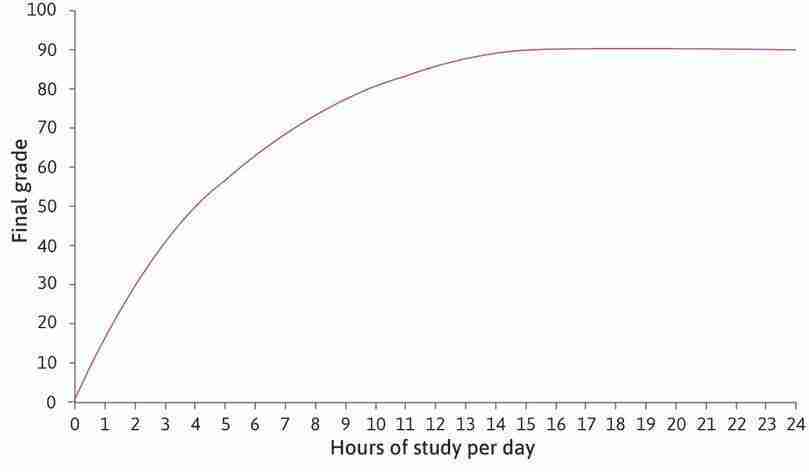
Introducing the production function
Now imagine Alexei is a student who can vary the number of hours he spends studying. We will assume that, as in the Florida State University study, the hours he spends studying over the semester will increase the percentage grade that he will receive at the end, ceteris paribus. This relationship between study time and final grade is represented in the table in Figure 4.7. In this model, study time refers to all the time that Alexei spends learning, whether in class or individually, measured per day (not per week, as for the Florida students). The table shows how his grade will vary if he changes his study hours, if all other factors—his social life, for example—are held constant.
- production function
- A graphical or mathematical expression describing the amount of output that can be produced by any given amount or combination of input(s). The function describes differing technologies capable of producing the same thing.
This is Alexei’s production function. In general, a production function tells us how much of a good or service is produced, given the inputs into the production process. In Alexei’s case, it translates the number of hours per day spent studying (his input of labour) into a percentage grade (his output). In reality, the final grade might also be affected by unpredictable events (in everyday life, we normally lump the effect of these things together and call it ‘luck’). You can think of the production function as telling us what Alexei will get under normal conditions, if he is neither lucky nor unlucky.
If we plot this relationship on a graph, we get the curve in Figure 4.7. Alexei can achieve a higher grade by studying more, so the curve slopes upward. At 15 hours of work per day he gets the highest grade he is capable of, which is 90%. Any further time spent studying does not affect his exam result (he will be so tired that studying more each day will not achieve anything), and the curve becomes flat.
- marginal product
- The additional amount of output that is produced if a particular input was increased by one unit, while holding all other inputs constant.
Alexei’s marginal product is the increase in his grade from increasing study time by one hour. Follow the steps in Figure 4.7 to see how to calculate the marginal product.
| Study hours | 0 | 1 | 2 | 3 | 4 | 5 | 6 | 7 | 8 | 9 | 10 | 11 | 12 | 13 | 14 | 15 or more |
|---|---|---|---|---|---|---|---|---|---|---|---|---|---|---|---|---|
| Grade | 0 | 20 | 33 | 42 | 50 | 57 | 63 | 69 | 74 | 78 | 81 | 84 | 86 | 88 | 89 | 90 |
How does the amount of time spent studying affect Alexei’s grade?
Figure 4.7 How does the amount of time spent studying affect Alexei’s grade?
| Study hours | 0 | 1 | 2 | 3 | 4 | 5 | 6 | 7 | 8 | 9 | 10 | 11 | 12 | 13 | 14 | 15 or more |
|---|---|---|---|---|---|---|---|---|---|---|---|---|---|---|---|---|
| Grade | 0 | 20 | 33 | 42 | 50 | 57 | 63 | 69 | 74 | 78 | 81 | 84 | 86 | 88 | 89 | 90 |
Alexei’s production function
The curve is Alexei’s production function. It shows how an input of study hours produces an output, the exam grade.
Figure 4.7a The curve is Alexei’s production function. It shows how an input of study hours produces an output, the exam grade.
| Study hours | 0 | 1 | 2 | 3 | 4 | 5 | 6 | 7 | 8 | 9 | 10 | 11 | 12 | 13 | 14 | 15 or more |
|---|---|---|---|---|---|---|---|---|---|---|---|---|---|---|---|---|
| Grade | 0 | 20 | 33 | 42 | 50 | 57 | 63 | 69 | 74 | 78 | 81 | 84 | 86 | 88 | 89 | 90 |
Alexei’s maximum grade
At 15 hours of study per day, Alexei achieves his maximum possible grade, 90. After that, further hours will make no difference to his result—the curve is flat.
Figure 4.7d At 15 hours of study per day, Alexei achieves his maximum possible grade, 90. After that, further hours will make no difference to his result—the curve is flat.
| Study hours | 0 | 1 | 2 | 3 | 4 | 5 | 6 | 7 | 8 | 9 | 10 | 11 | 12 | 13 | 14 | 15 or more |
|---|---|---|---|---|---|---|---|---|---|---|---|---|---|---|---|---|
| Grade | 0 | 20 | 33 | 42 | 50 | 57 | 63 | 69 | 74 | 78 | 81 | 84 | 86 | 88 | 89 | 90 |
Increasing study time from 4 to 5 hours
Increasing study time from 4 to 5 hours raises Alexei’s grade from 50 to 57. Therefore, at 4 hours of study, the marginal product of an additional hour is approximately 7.
Figure 4.7e Increasing study time from 4 to 5 hours raises Alexei’s grade from 50 to 57. Therefore, at 4 hours of study, the marginal product of an additional hour is approximately 7.
| Study hours | 0 | 1 | 2 | 3 | 4 | 5 | 6 | 7 | 8 | 9 | 10 | 11 | 12 | 13 | 14 | 15 or more |
|---|---|---|---|---|---|---|---|---|---|---|---|---|---|---|---|---|
| Grade | 0 | 20 | 33 | 42 | 50 | 57 | 63 | 69 | 74 | 78 | 81 | 84 | 86 | 88 | 89 | 90 |
Increasing study time from 10 to 11 hours
Increasing study time from 10 to 11 hours raises Alexei’s grade from 81 to 84. At 10 hours of study, the marginal product of an additional hour is approximately 3. As we move along the curve, the slope of the curve falls, so the marginal product of an extra hour falls. The marginal product is diminishing.
Figure 4.7f Increasing study time from 10 to 11 hours raises Alexei’s grade from 81 to 84. At 10 hours of study, the marginal product of an additional hour is approximately 3. As we move along the curve, the slope of the curve falls, so the marginal product of an extra hour falls. The marginal product is diminishing.
| Study hours | 0 | 1 | 2 | 3 | 4 | 5 | 6 | 7 | 8 | 9 | 10 | 11 | 12 | 13 | 14 | 15 or more |
|---|---|---|---|---|---|---|---|---|---|---|---|---|---|---|---|---|
| Grade | 0 | 20 | 33 | 42 | 50 | 57 | 63 | 69 | 74 | 78 | 81 | 84 | 86 | 88 | 89 | 90 |
The marginal product
The marginal product is the slope of the line that just touches but does not cross the production function. The marginal product at 4 hours of study is approximately 7, which is the increase in the grade from one more hour of study. More precisely, the marginal product is the slope of the line at that point, which is slightly higher than 7. The marginal product at 11 hours of study is approximately 2.
Figure 4.7g The marginal product is the slope of the line that just touches but does not cross the production function. The marginal product at 4 hours of study is approximately 7, which is the increase in the grade from one more hour of study. More precisely, the marginal product is the slope of the line at that point, which is slightly higher than 7. The marginal product at 11 hours of study is approximately 2.
At each point on the production function, the marginal product is the increase in the grade from studying one more hour. The marginal product corresponds to the slope of the production function.
The concept of diminishing returns
- diminishing marginal product
- A property of some production functions according to which each additional unit of input results in a smaller increment in total output than did the previous unit.
Alexei’s production function in Figure 4.7 gets flatter the more hours he studies, so the marginal product of an additional hour falls as we move along the curve. The marginal product is diminishing. The model captures the idea that an extra hour of study helps a lot if you are not studying much, but if you are already studying a lot, then studying even more does not help very much.
Notice that, if Alexei was already studying for 15 hours a day, the marginal product of an additional hour would be zero. Studying more would not improve his grade. As you might know from experience, a lack of either sleep or time to relax could even lower Alexei’s grade if he worked more than 15 hours a day. If this were the case, then his production function would start to slope downward, and Alexei’s marginal product would become negative.
Marginal change is an important and common concept in economics. You will often see it marked as a slope on a diagram. With a production function like the one in Figure 4.7, the slope changes continuously as we move along the curve. We have said that when Alexei studies for 4 hours a day the marginal product is 7, the increase in the grade from one more hour of study. Because the slope of the curve changes between 4 and 5 hours on the horizontal axis, this is only an approximation of the actual marginal product. More precisely, the marginal product is the rate at which the grade increases, per hour of additional study. In Figure 4.7, the true marginal product is the slope of the line that just touches the curve at 4 hours. In this unit, we will use approximations so that we can work in whole numbers, but you may notice that sometimes these numbers are not quite the same as the slopes.
Question 4.5 Choose the correct answer(s)
Based on Figure 4.7, which of the following statements are true?
- Increasing study hours from 4 to 5 changes the final grade from 50 to 57, so the marginal product at 4 hours of study is approximately 7.
- The curve is flat after 15 hours of study, meaning that an extra hour of study has no effect on the final grade. The marginal product is therefore constant (zero).
- The curve is flat after 15 hours of study, meaning that studying more than 15 hours has no effect on the final grade.
- The marginal product at 7 hours is approximately 4 (73 – 69), while the marginal product at 10 hours is approximately 3 (84 – 81).
4.5 Preferences
- preference
- Pro-and-con evaluations of the possible outcomes of the actions we may take that form the basis by which we decide on a course of action.
If Alexei has the production function shown in Figure 4.7, how many hours per day will he choose to study? The decision depends on his preferences. The term preferences describes pro-and-con evaluations of the possible outcomes of the actions we may take that are the basis of our deciding on a course of action. In this case, his preferences describe the benefits (a higher grade) and the cost (less free time) associated with studying any particular number of hours. If he cared only about grades, he should study for 15 hours a day. But, like other people, Alexei also values his free time—he likes to sleep, go out or watch TV. So he faces a trade-off—how many percentage points is he willing to give up in order to spend time on things other than study?
Indifference curves: Different combinations of goods that are equally ranked
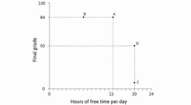
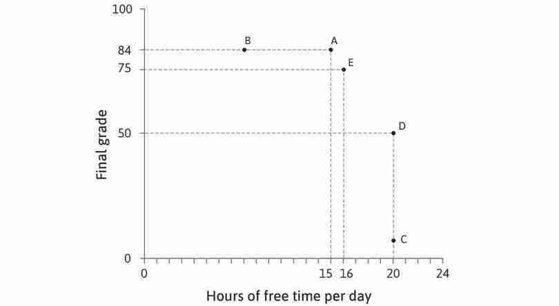
We illustrate his preferences using Figure 4.8, with free time on the horizontal axis and final grade on the vertical axis. Free time is defined as all the time that he does not spend studying. Every point in the diagram represents a different combination of free time and final grade. Given his production function, not every combination that Alexei would want will be possible, but for the moment we will only consider the combinations that he would prefer.
We can assume:
- For a given grade, he prefers a combination with more free time to one with less free time. Therefore, even though both A and B in Figure 4.8 correspond to a grade of 84, Alexei prefers A because it gives him more free time.
- Similarly, if two combinations both have 20 hours of free time, he prefers the one with a higher grade.
- But compare points A and D in the table in Figure 4.8. Would Alexei prefer D (low grade, plenty of time) or A (higher grade, less time)? One way to find out would be to ask him.
- utility
- A numerical indicator of the value that one places on an outcome, such that higher-valued outcomes will be chosen over lower-valued ones when both are feasible.
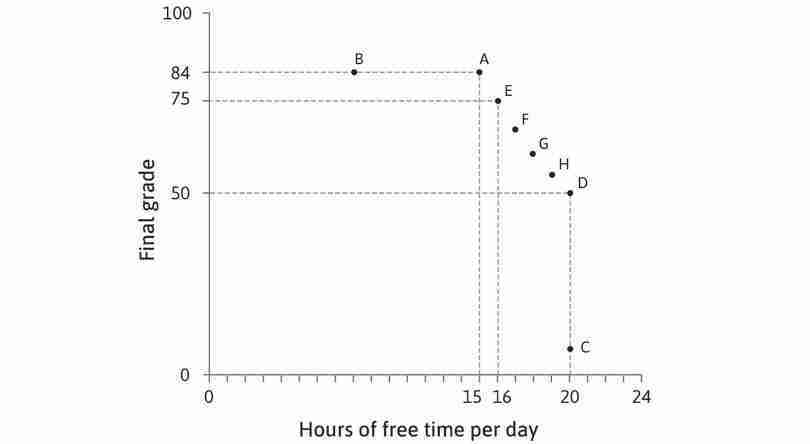
Suppose he says he is indifferent between A and D, meaning he would feel equally satisfied with either outcome. We say that these two outcomes would give Alexei the same utility. And we know that he prefers A to B, so B provides lower utility than A or D.
A systematic way to graph Alexei’s preferences would be to start by looking for all the combinations that give him the same utility as A and D. We could ask Alexei another question, ‘Imagine that you could have the combination at A (15 hours of free time, 84 points). How many points would you be willing to sacrifice for an extra hour of free time?’. Suppose that, after due consideration, he answers ‘9’. Then we know that he is indifferent between A and E (16 hours, 75 points). Then we could ask the same question about combination E, and so on until point D. Eventually, we could draw up a table like the one in Figure 4.8. Alexei is indifferent between A and E, between E and F, and so on, which means he is indifferent between all the combinations from A to D.
- indifference curve
- A curve of the points which indicate the combinations of goods that provide a given level of utility to the individual.
The combinations in the table are plotted in Figure 4.8 and joined together to form a downward-sloping curve, called an indifference curve, which joins together all the combinations that provide equal utility or ‘satisfaction’.
| A | E | F | G | H | D | |
|---|---|---|---|---|---|---|
| Hours of free time | 15 | 16 | 17 | 18 | 19 | 20 |
| Final grade | 84 | 75 | 67 | 60 | 54 | 50 |
Mapping Alexei’s preferences.
Figure 4.8 Mapping Alexei’s preferences.
| A | E | F | G | H | D | |
|---|---|---|---|---|---|---|
| Hours of free time | 15 | 16 | 17 | 18 | 19 | 20 |
| Final grade | 84 | 75 | 67 | 60 | 54 | 50 |
Alexei prefers more free time to less free time
Combinations A and B both deliver a grade of 84, but Alexei will prefer A because it has more free time.
Figure 4.8a Combinations A and B both deliver a grade of 84, but Alexei will prefer A because it has more free time.
| A | E | F | G | H | D | |
|---|---|---|---|---|---|---|
| Hours of free time | 15 | 16 | 17 | 18 | 19 | 20 |
| Final grade | 84 | 75 | 67 | 60 | 54 | 50 |
Alexei prefers a high grade to a low grade
At combinations C and D, Alexei has 20 hours of free time per day, but he prefers D because it gives him a higher grade.
Figure 4.8b At combinations C and D, Alexei has 20 hours of free time per day, but he prefers D because it gives him a higher grade.
| A | E | F | G | H | D | |
|---|---|---|---|---|---|---|
| Hours of free time | 15 | 16 | 17 | 18 | 19 | 20 |
| Final grade | 84 | 75 | 67 | 60 | 54 | 50 |
Indifference
We don’t know whether Alexei prefers A or E, so we ask him—he says he is indifferent.
Figure 4.8c We don’t know whether Alexei prefers A or E, so we ask him—he says he is indifferent.

| A | E | F | G | H | D | |
|---|---|---|---|---|---|---|
| Hours of free time | 15 | 16 | 17 | 18 | 19 | 20 |
| Final grade | 84 | 75 | 67 | 60 | 54 | 50 |
More combinations giving the same utility
Alexei says that F is another combination that would give him the same utility as A and E.
Figure 4.8d Alexei says that F is another combination that would give him the same utility as A and E.
| A | E | F | G | H | D | |
|---|---|---|---|---|---|---|
| Hours of free time | 15 | 16 | 17 | 18 | 19 | 20 |
| Final grade | 84 | 75 | 67 | 60 | 54 | 50 |
Constructing the indifference curve
By asking more questions, we discover that Alexei is indifferent between all these combinations between A and D.
Figure 4.8e By asking more questions, we discover that Alexei is indifferent between all these combinations between A and D.
| A | E | F | G | H | D | |
|---|---|---|---|---|---|---|
| Hours of free time | 15 | 16 | 17 | 18 | 19 | 20 |
| Final grade | 84 | 75 | 67 | 60 | 54 | 50 |
Other indifference curves
Indifference curves can be drawn through any point in the diagram, to show other points giving the same utility. We can construct other curves, starting from B or C in the same way as before, by finding out which combinations give the same amount of utility.
Figure 4.8g Indifference curves can be drawn through any point in the diagram, to show other points giving the same utility. We can construct other curves, starting from B or C in the same way as before, by finding out which combinations give the same amount of utility.
If you look at the three curves drawn in Figure 4.8, you can see that the one through A gives higher utility than the one through B. The curve through C gives the lowest utility of the three. To describe preferences, we don’t need to know the exact utility of each option; we only need to know which combinations provide more or less utility than others.
Summary of indifference curves
- consumption good
- A good or service that satisfies the needs of consumers over a short period.
The curves we have drawn capture our typical assumptions about people’s preferences between two goods. In other models, these will often be consumption goods, such as food or clothing, and we refer to the person as a consumer. In our model of a student’s preferences, the goods are ‘final grade’ and ‘free time’. Notice that:
- Indifference curves slope downward due to trade-offs: Since resources (such as time or money) are limited, to get more of one good usually means giving up some of the other good(s). Therefore, if you are indifferent between two combinations, the combination that has more of one good must have less of the other good.
- Higher indifference curves correspond to higher utility levels: As we move up and to the right in the diagram, further away from the origin, we move to combinations with more of both goods.
- Indifference curves are usually smooth: Small changes in the amounts of goods don’t cause big jumps in utility.
- Indifference curves do not cross: Work through Exercise 4.5 to understand why.
- As you move to the right along an indifference curve, it becomes flatter.
Question 4.6 Choose the correct answer(s)
Based on Figure 4.8, which of the following statements is correct?
- The student is indifferent between A and all the other points on the same indifference curve, namely E, F, G, H and D.
- This is true, as points A and D are on the same indifference curve.
- Higher indifference curves imply higher levels of utility, but the specific level of utility depends on the student’s relative preferences for both goods. It is not necessarily true that 50% additional free time would make the student 50% happier.
- A grade of 54 with 19 hours of free time is point H. The student is indifferent between this point and point F, where he gets a grade of 67 with 17 hours of free time. He would, therefore, strictly prefer a grade of 67 with 18 hours of free time to H.
The marginal rate of substitution (MRS): Trade-offs between objectives
- marginal rate of substitution (MRS)
- The trade-off that a person is willing to make between two goods. At any point, this is the slope of the indifference curve. See also: marginal rate of transformation.
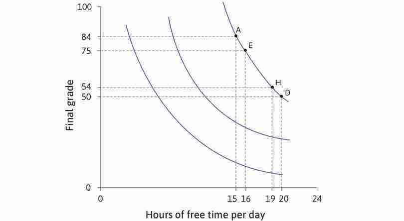
Look at Alexei’s indifference curves, which are plotted again in Figure 4.9. If he is at A, with 15 hours of free time and a grade of 84, he would be willing to sacrifice 9 percentage points for an extra hour of free time, taking him to E (remember that he is indifferent between A and E). We say that his marginal rate of substitution (MRS) between grade points and free time at A is nine; it is the reduction in his grade that would keep Alexei’s utility constant following a one-hour increase of free time.
We have drawn the indifference curves as becoming gradually flatter because it seems reasonable to assume that, the more free time and the lower the grade he has, the less willing he will be to sacrifice further percentage points in return for free time, so his MRS will be lower. In Figure 4.9, we have calculated the MRS for some combinations along the indifference curve. You can see that, when Alexei has more free time and a lower grade, the MRS—the number of percentage points he would give up to gain an extra hour of free time—gradually falls.
Alexei’s indifference curves
The diagram shows three indifference curves for Alexei. The curve furthest to the left offers the lowest satisfaction.
Figure 4.9a The diagram shows three indifference curves for Alexei. The curve furthest to the left offers the lowest satisfaction.
Alexei is indifferent between A and E
He would be willing to move from A to E, giving up 9 percentage points for an extra hour of free time. His marginal rate of substitution is 9. The indifference curve is steep at A.
Figure 4.9c He would be willing to move from A to E, giving up 9 percentage points for an extra hour of free time. His marginal rate of substitution is 9. The indifference curve is steep at A.
Alexei is indifferent between H and D
At H he is only willing to give up 4 points for an extra hour of free time. His MRS is 4. As we move down the indifference curve, the MRS diminishes, because points become scarce relative to free time. The indifference curve becomes flatter.
Figure 4.9d At H he is only willing to give up 4 points for an extra hour of free time. His MRS is 4. As we move down the indifference curve, the MRS diminishes, because points become scarce relative to free time. The indifference curve becomes flatter.
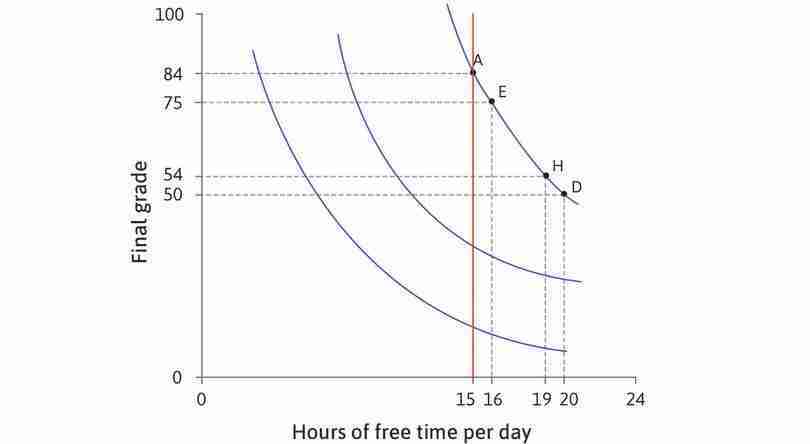
All combinations with 15 hours of free time
Look at the combinations with 15 hours of free time. On the lowest curve, the grade is low and the MRS is small. Alexei would be willing to give up only a few points for an hour of free time. As we move up the vertical line, the indifference curves are steeper—the MRS increases.
Figure 4.9e Look at the combinations with 15 hours of free time. On the lowest curve, the grade is low and the MRS is small. Alexei would be willing to give up only a few points for an hour of free time. As we move up the vertical line, the indifference curves are steeper—the MRS increases.
All combinations with a grade of 54
Now look at all the combinations with a grade of 54. On the curve furthest to the left, free time is scarce and the MRS is high. As we move to the right along the red line, he is less willing to give up points for free time. The MRS decreases, the indifference curves get flatter.
Figure 4.9f Now look at all the combinations with a grade of 54. On the curve furthest to the left, free time is scarce and the MRS is high. As we move to the right along the red line, he is less willing to give up points for free time. The MRS decreases, the indifference curves get flatter.
The MRS is the slope of the indifference curve; it falls as we move to the right along the curve. If you move from one point to another in Figure 4.9, you can see that the indifference curves get flatter if you increase the amount of free time, and steeper if you increase the grade. When free time is scarce relative to grade points, Alexei is less willing to sacrifice an hour for a higher grade—his MRS is high and his indifference curve is steep.
As the analysis in Figure 4.9 shows, if you move up the vertical line through 15 hours, the indifference curves get steeper—the MRS increases. For a given amount of free time, Alexei is willing to give up more grade points for an additional hour when he has a lot of points compared to when he has few (for example, if he was in danger of failing the course). By the time you reach A, where his grade is 84, the MRS is high; grade points are so plentiful here that he is willing to give up 9 percentage points for an extra hour of free time.
You can see the same effect if you fix the grade and vary the amount of free time. If you move to the right along the horizontal line for a grade of 54, the MRS becomes lower at each indifference curve. As free time becomes more plentiful, Alexei becomes less and less willing to give up grade points for more time.
Exercise 4.5 Why indifference curves never cross
In Figure 4.10, IC1 is an indifference curve joining all the combinations that give the same level of utility as A. Combination B is not on IC1.
- Does combination B give higher or lower utility than combination A? How do you know?
- Draw a sketch of the diagram, and add another indifference curve, IC2, that goes through B and crosses IC1. Label the point at which they cross as C.
- Combinations B and C are both on IC2. What does that imply about their levels of utility?
- Combinations C and A are both on IC1. What does that imply about their levels of utility?
- According to your answers to (3) and (4), how do the levels of utility at combinations A and B compare?
- Now compare your answers to (1) and (5) and explain how you know that indifference curves can never cross.
Exercise 4.6 Your marginal rate of substitution
Imagine that you are offered at job at the end of your university course that requires you to work for 40 hours per week. This would leave you with 128 hours of free time per week. Estimate the weekly pay that you expect to receive (be realistic!).
- Draw a diagram with free time on the horizontal axis and weekly pay on the vertical axis, and plot the combination corresponding to your job offer, calling it A. Assume you need about 10 hours a day for sleeping and eating, so you may want to draw the horizontal axis with 70 hours at the origin.
Now imagine you were offered another job requiring 45 hours of work per week.
- What level of weekly pay would make you indifferent between this and the original offer?
- By asking yourself more questions about the trade-offs you would make, plot an indifference curve through A to represent your preferences.
- Use your diagram to estimate your marginal rate of substitution between pay and free time at A.
Question 4.7 Choose the correct answer(s)
Based on Figure 4.8, which of the following statements are true?
- The indifference curve through C is lower than that through B. Hence, Alexei prefers B to C.
- A (where Alexei has the grade of 84 and 15 hours of free time) and D (where Alexei has the grade of 50 with 20 hours of free time) are on the same indifference curve.
- At D, Alexei has the same amount of free time but a higher grade.
- The opposite trade-off is true. Going from G to D, Alexei is willing to give up 10 grade points for 2 extra hours of free time. Going from G to E, he is willing to give up 2 hours of free time for 15 extra grade points.
Question 4.8 Choose the correct answer(s)
The marginal rate of substitution (MRS) is:
- The marginal rate of substitution represents the ratio of the trade-off at the margin; in other words, how much of one good the consumer is willing to sacrifice for one extra unit of the other.
- This is the definition of the marginal rate of substitution.
- The MRS is the amount of one good that can be substituted for one unit of the other while keeping utility constant.
- The slope of the indifference curve represents the marginal rate of substitution—the trade-off between two goods that keeps utility constant.
4.6 The feasible set
Now we return to Alexei’s problem of how to choose between high grades and free time. Free time has an opportunity cost in the form of lost percentage points in his grade (equivalently, we might say that percentage points have an opportunity cost in the form of the free time Alexei gives up to obtain them). But before we can describe how Alexei resolves his dilemma, we need to work out precisely which alternatives are available to him.
From the production function to the feasible set
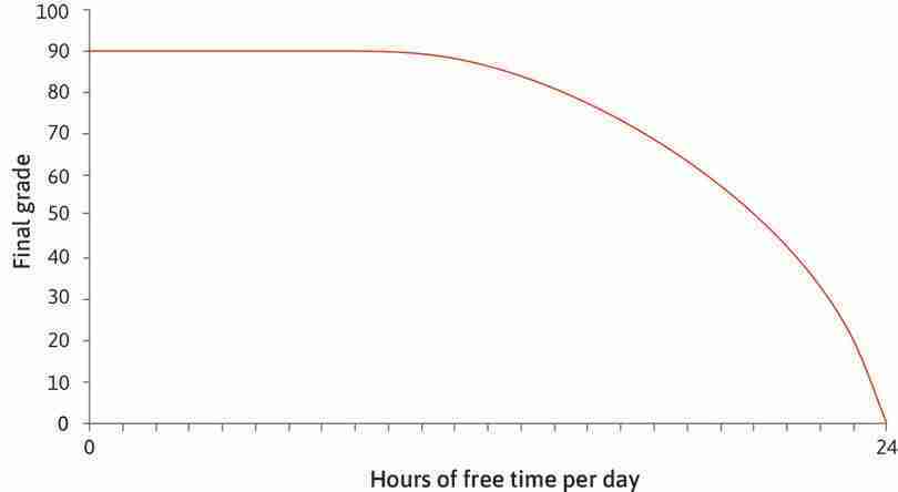
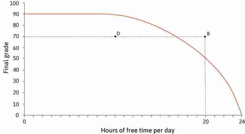
To answer this question, we look again at the production function. This time, we will show how the final grade depends on the amount of free time, rather than study time. There are 24 hours in a day. Alexei must divide this time between studying (all the hours devoted to learning) and free time (all the rest of his time). Figure 4.11 shows the relationship between his final grade and hours of free time per day—the mirror image of Figure 4.7. If Alexei studies solidly for 24 hours, that means zero hours of free time and a final grade of 90. If he chooses 24 hours of free time per day, we assume he will get a grade of zero.
- feasible frontier
- The curve made of points that defines the maximum feasible quantity of one good for a given quantity of the other. See also: feasible set.
- feasible set
- All of the combinations of the things under consideration that a decision-maker could choose given the economic, physical or other constraints that he faces. See also: feasible frontier.
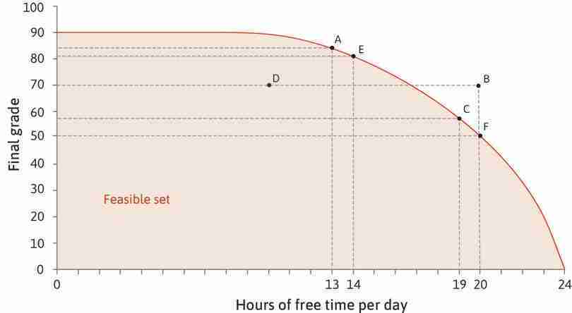
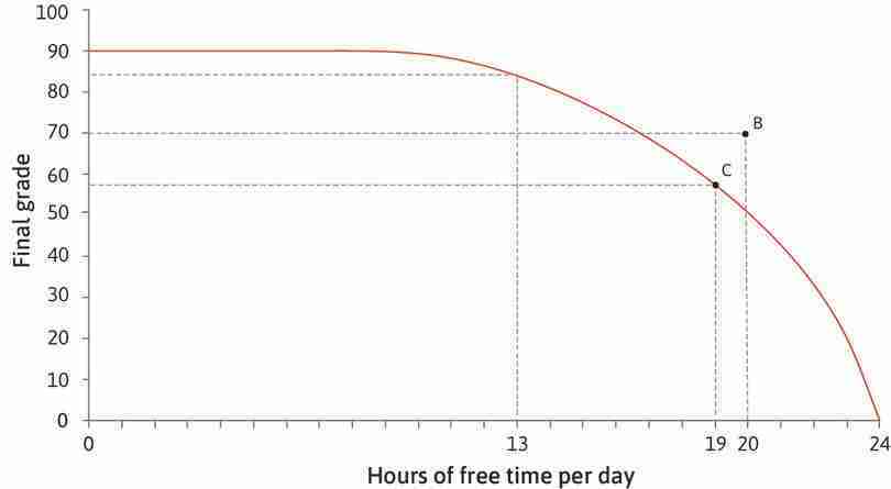
In Figure 4.11, the axes are ‘final grade’ and ‘free time’, the two goods that give Alexei utility. If we think of him choosing to consume a combination of these two goods, the curved line in Figure 4.11 shows the boundary of what is feasible. The line is his feasible frontier—the highest grade he can achieve given the amount of free time he takes, and the area inside the frontier is the feasible set.
Follow the analysis of Figure 4.11 to see which combinations of grade and free time are feasible, and which are not, and how the slope of the frontier represents the opportunity cost of free time.
| A | E | C | F | |
|---|---|---|---|---|
| Free time | 13 | 14 | 19 | 20 |
| Grade | 84 | 81 | 57 | 50 |
| Opportunity cost | 3 | 7 |
How does Alexei’s choice of free time affect his grade?
Figure 4.11 How does Alexei’s choice of free time affect his grade?
| A | E | C | F | |
|---|---|---|---|---|
| Free time | 13 | 14 | 19 | 20 |
| Grade | 84 | 81 | 57 | 50 |
| Opportunity cost | 3 | 7 |
The feasible frontier
This curve is called the feasible frontier. It shows the highest final exam grade Alexei can achieve, given the amount of free time he takes. With 24 hours of free time, his grade would be zero. By having less free time, Alexei can achieve a higher grade.
Figure 4.11a This curve is called the feasible frontier. It shows the highest final exam grade Alexei can achieve, given the amount of free time he takes. With 24 hours of free time, his grade would be zero. By having less free time, Alexei can achieve a higher grade.
| A | E | C | F | |
|---|---|---|---|---|
| Free time | 13 | 14 | 19 | 20 |
| Grade | 84 | 81 | 57 | 50 |
| Opportunity cost | 3 | 7 |
Infeasible combinations
Given Alexei’s abilities and conditions of study, under normal conditions he cannot take 20 hours of free time and expect to get a grade of 70 (remember, we are assuming that luck plays no part). Therefore, B is an infeasible combination of hours of free time and exam grade.
Figure 4.11c Given Alexei’s abilities and conditions of study, under normal conditions he cannot take 20 hours of free time and expect to get a grade of 70 (remember, we are assuming that luck plays no part). Therefore, B is an infeasible combination of hours of free time and exam grade.
| A | E | C | F | |
|---|---|---|---|---|
| Free time | 13 | 14 | 19 | 20 |
| Grade | 84 | 81 | 57 | 50 |
| Opportunity cost | 3 | 7 |
A feasible combination
The maximum grade Alexei can achieve with 19 hours of free time per day is 57.
Figure 4.11d The maximum grade Alexei can achieve with 19 hours of free time per day is 57.
| A | E | C | F | |
|---|---|---|---|---|
| Free time | 13 | 14 | 19 | 20 |
| Grade | 84 | 81 | 57 | 50 |
| Opportunity cost | 3 | 7 |
Inside the frontier
Combination D is feasible, but Alexei is wasting time and/or points in the exam. He could get a higher grade with the same hours of study per day, or have more free time and still get a grade of 70.
Figure 4.11e Combination D is feasible, but Alexei is wasting time and/or points in the exam. He could get a higher grade with the same hours of study per day, or have more free time and still get a grade of 70.
| A | E | C | F | |
|---|---|---|---|---|
| Free time | 13 | 14 | 19 | 20 |
| Grade | 84 | 81 | 57 | 50 |
| Opportunity cost | 3 | 7 |
The feasible set
The area inside the frontier, together with the frontier itself, is called the feasible set. (A set is a collection of things–in this case, all the feasible combinations of free time and grade.)
Figure 4.11f The area inside the frontier, together with the frontier itself, is called the feasible set. (A set is a collection of things–in this case, all the feasible combinations of free time and grade.)
| A | E | C | F | |
|---|---|---|---|---|
| Free time | 13 | 14 | 19 | 20 |
| Grade | 84 | 81 | 57 | 50 |
| Opportunity cost | 3 | 7 |
The opportunity cost of free time
At combination A, Alexei could get an extra hour of free time by giving up 3 points in the exam. The opportunity cost of an hour of free time at A is 3 points.
Figure 4.11g At combination A, Alexei could get an extra hour of free time by giving up 3 points in the exam. The opportunity cost of an hour of free time at A is 3 points.
| A | E | C | F | |
|---|---|---|---|---|
| Free time | 13 | 14 | 19 | 20 |
| Grade | 84 | 81 | 57 | 50 |
| Opportunity cost | 3 | 7 |
The opportunity cost varies
The more free time he takes, the higher the marginal product of studying, so the opportunity cost of free time increases. At C, the opportunity cost of an hour of free time is higher than at A—Alexei would have to give up 7 points instead of 3.
Figure 4.11h The more free time he takes, the higher the marginal product of studying, so the opportunity cost of free time increases. At C, the opportunity cost of an hour of free time is higher than at A—Alexei would have to give up 7 points instead of 3.
| A | E | C | F | |
|---|---|---|---|---|
| Free time | 13 | 14 | 19 | 20 |
| Grade | 84 | 81 | 57 | 50 |
| Opportunity cost | 3 | 7 |
The slope of the feasible frontier
The opportunity cost of free time at C is 7 points, corresponding to the slope of the feasible frontier. At C, Alexei would have to give up 7 percentage points (the vertical change is −7) to increase his free time by an hour (the horizontal change is 1). The slope is −7.
Figure 4.11i The opportunity cost of free time at C is 7 points, corresponding to the slope of the feasible frontier. At C, Alexei would have to give up 7 percentage points (the vertical change is −7) to increase his free time by an hour (the horizontal change is 1). The slope is −7.
Any combination of free time and final grade that is on or inside the frontier is feasible. Combinations outside the feasible frontier are said to be infeasible given Alexei’s abilities and conditions of study. On the other hand, even though a combination lying inside the frontier is feasible, choosing it would imply Alexei has effectively thrown away something that he values. If he studied for 14 hours a day, then according to our model, he could guarantee himself a grade of 89. But he could obtain a lower grade (70, say), if he just stopped writing before the end of the exam. It would be foolish to throw away points like this for no reason, but it would be possible. Another way to obtain a combination inside the frontier might be to sit in the library doing nothing—Alexei would be taking less free time than is available to him, which again makes no sense.
By choosing a combination inside the frontier, Alexei would be giving up something that is freely available—something that has no opportunity cost. He could obtain a higher grade without sacrificing any free time, or have more time without reducing his grade.
The feasible frontier is a constraint on Alexei’s choices. It represents the trade-off he must make between grade and free time. At any point on the frontier, taking more free time has an opportunity cost in terms of grade points foregone, corresponding to the slope of the frontier.
The marginal rate of transformation (MRT): Trade-offs in what is feasible
- marginal rate of transformation (MRT)
- A measure of the trade-offs a person faces in what is feasible. Given the constraints (feasible frontier) a person faces, the MRT is the quantity of some good that must be sacrificed to acquire one additional unit of another good. At any point, it is the slope of the feasible frontier. See also: feasible frontier, marginal rate of substitution.
Another way to express the same idea is to say that the feasible frontier shows the marginal rate of transformation (MRT)—the rate at which Alexei can transform free time into grade points. Look at the slope of the frontier between points A and E in Figure 4.11.
- The slope of AE: This is the vertical distance from A to E divided by horizontal distance from A to E. It is −3.
- At point A: Alexei could get 1 more unit of free time by giving up 3 grade points. The opportunity cost of a unit of free time is 3.
- At point E: Alexei could transform 1 unit of time into 3 grade points. The marginal rate at which he can transform free time into grade points is 3.
Note that the slope of AE is only an approximation to the slope of the frontier. More precisely, the slope at any point is the slope of the line that just touches the frontier, and this represents both the MRT and the opportunity cost at that point.
The two trade-offs
Note that we have now identified two trade-offs:
- The marginal rate of substitution (MRS) is about a person’s objectives: In the previous section, we saw that the MRS measures the trade-off that Alexei is willing to make between exam grade and free time. The MRS is the slope of an indifference curve, which is almost always blue in the figures.
- The marginal rate of transformation (MRT) is about the constraints a person faces: In contrast to the MRS, the MRT measures the trade-off that Alexei is constrained to make by the feasible frontier. The MRT is the slope of the feasible frontier which is almost always red in the figures.
As we shall see in the next section, the choice Alexei makes between his grade and his free time will strike a balance between these two trade-offs.
Question 4.9 Choose the correct answer(s)
Figure 4.11 shows Alexei’s production function, which describes how his final grade (the output) depends on the number of hours spent studying (the input). Free time per day is given by 24 hours minus the number of hours of study. Based on this information and the figure, which of the following statements is true?
- The hours of free time per day are already given as 24 hours minus the hours of study per day. Therefore, the number of hours spent sleeping is included in the hours of free time.
- The production function is the same as the feasible frontier, except that it takes negative free time (hours of study) as its input. The production function is therefore the feasible frontier mirrored across the vertical axis and shifted horizontally.
- The production function is horizontal after 15 hours of study per day. Therefore, the feasible frontier is horizontal only up to 9 hours of free time per day.
- Ten hours of study is equivalent to 14 hours of free time in a 24-hour day, and the marginal product of labour (additional output per labour hour) is the same as the marginal rate of transformation (trade-off between extra output and labour), so these two values are equal.
Question 4.10 Choose the correct answer(s)
Consider a student whose final grade increases with the number of hours spent studying. Her choice is between more free time and higher grades, both of which are ‘goods’. Which of the following are the same as her marginal rate of transformation between the two goods?
- The marginal rate of transformation is equal to all of these.
4.7 Decision making and scarcity
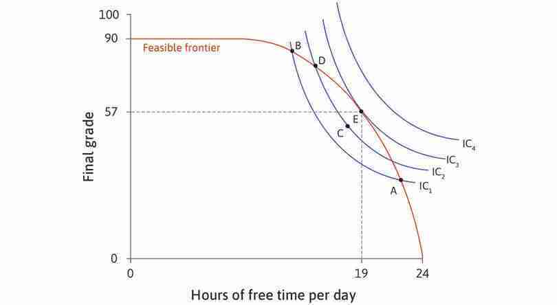
The final step in this decision-making process is to determine the combination of final grade and free time that Alexei will choose. Figure 4.12a brings together his feasible frontier (Figure 4.11) and indifference curves (Figure 4.9). Recall that the indifference curves indicate what Alexei prefers, and their slopes show the trade-offs that he is willing to make; the feasible frontier is the constraint on his choice, and its slope shows the trade-off he is constrained to make.
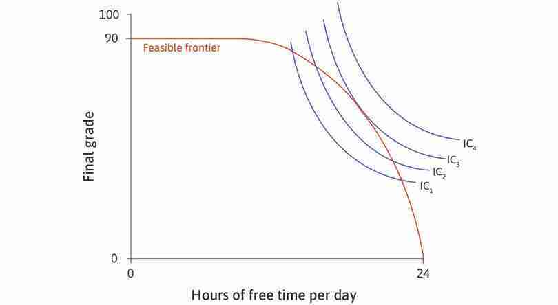
Figure 4.12a shows four indifference curves, labelled IC1 to IC4. IC4 represents the highest level of utility because it is the furthest away from the origin. No combination of grade and free time on IC4 is feasible, however, because the whole indifference curve lies outside the feasible set. Suppose that Alexei considers choosing a combination somewhere in the feasible set, on IC1. By looking at the analysis of Figure 4.12a, you will see that he can increase his utility by moving to points on higher indifference curves until he reaches a feasible choice that maximizes his utility.
How many hours does Alexei decide to study?
Figure 4.12a How many hours does Alexei decide to study?
Indifference curves and the feasible frontier
The diagram brings together Alexei’s indifference curves and his feasible frontier.
Figure 4.12a(a) The diagram brings together Alexei’s indifference curves and his feasible frontier.
Feasible combinations
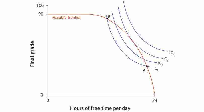
On the indifference curve IC1, all combinations between A and B are feasible because they lie in the feasible set. Suppose Alexei chooses one of these points.
Figure 4.12a(b) On the indifference curve IC1, all combinations between A and B are feasible because they lie in the feasible set. Suppose Alexei chooses one of these points.
Could do better
All combinations in the lens-shaped area between IC1 and the feasible frontier are feasible, and give higher utility than combinations on IC1. For example, a movement to C would increase Alexei’s utility.
Figure 4.12a(c) All combinations in the lens-shaped area between IC1 and the feasible frontier are feasible, and give higher utility than combinations on IC1. For example, a movement to C would increase Alexei’s utility.
The best feasible trade-off
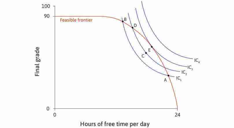
Alexei can raise his utility by moving into the lens-shaped area above IC2. He can continue to find feasible combinations on higher indifference curves, until he reaches E.
Figure 4.12a(e) Alexei can raise his utility by moving into the lens-shaped area above IC2. He can continue to find feasible combinations on higher indifference curves, until he reaches E.
The best feasible trade-off
At E, he has 19 hours of free time per day and a grade of 57. Alexei maximizes his utility—he is on the highest indifference curve obtainable, given the feasible frontier.
Figure 4.12a(f) At E, he has 19 hours of free time per day and a grade of 57. Alexei maximizes his utility—he is on the highest indifference curve obtainable, given the feasible frontier.
MRS = MRT
At E, the two curves touch but do not cross. The marginal rate of substitution (the slope of the indifference curve) is equal to the marginal rate of transformation (the slope of the frontier).
Figure 4.12a(g) At E, the two curves touch but do not cross. The marginal rate of substitution (the slope of the indifference curve) is equal to the marginal rate of transformation (the slope of the frontier).
Alexei maximizes his utility at point E, at which the slope of his indifference curve is equal to the slope of the feasible frontier. The model predicts that Alexei will:
- choose to spend 5 hours each day studying, and 19 hours on other activities
- obtain a grade of 57 as a result.
We can see from Figure 4.12a that at E, the feasible frontier and the highest attainable indifference curve IC3 touch but do not cross. At E, the slope of the indifference curve is the same as the slope of the feasible frontier. Remember that the slopes represent the two trade-offs facing Alexei:
- The slope of the indifference curve is the MRS: It is the trade-off he is willing to make between free time and percentage points.
- The slope of the frontier is the MRT: It is the trade-off he is constrained to make between free time and percentage points because it is not possible to go beyond the feasible frontier.
Alexei achieves the highest possible utility where the two trade-offs just balance (E). His best combination of grade and free time is at the point where the marginal rate of transformation is equal to the marginal rate of substitution.
Figure 4.12b lists the MRS (slope of indifference curve) and MRT (slope of feasible frontier) at the points shown in Figure 4.12a. At B and D, the number of points Alexei is willing to trade for an hour of free time (MRS) is greater than the opportunity cost of that hour (MRT), so he prefers to increase his free time. At A, the MRT is greater than the MRS so he prefers to decrease his free time. And, as expected, at E the MRS and MRT are equal.
- constrained choice problem
- This problem is about how we can do the best for ourselves, given our preferences and constraints, and when the things we value are scarce. See also: constrained optimization problem.
| B | D | E | A | |
|---|---|---|---|---|
| Free time | 13 | 15 | 19 | 22 |
| Grade | 84 | 78 | 57 | 33 |
| MRT | 2 | 4 | 7 | 9 |
| MRS | 20 | 15 | 7 | 3 |
How many hours does Alexei decide to study?
Figure 4.12b How many hours does Alexei decide to study?
We have modelled the student’s decision of study hours as what we call a constrained choice problem—a decision-maker (Alexei) pursues an objective (utility maximization in this case) subject to a constraint (his feasible frontier).
In our example, both free time and points in the exam are scarce for Alexei because:
- Free time and grades are goods: Alexei values both of them.
- Each has an opportunity cost: More of one good means less of the other.
In constrained choice problems, the solution is the individual’s best choice. If we assume that utility maximization is Alexei’s goal, the best combination of grade and free time is a point on the feasible frontier at which:
The table in Figure 4.13 summarizes Alexei’s trade-offs.
| The trade-off | Represented as | Equal to | |
|---|---|---|---|
| MRS | Marginal rate of substitution: The number of percentage points Alexei is willing to trade for an hour of free time | The slope of the indifference curve | |
| MRT, or opportunity cost of free time | Marginal rate of transformation: The number of percentage points Alexei would gain (or lose) by giving up (or taking) another hour of free time | The slope of the feasible frontier | The marginal product of labour |
Alexei’s trade-offs.
Figure 4.13 Alexei’s trade-offs.
Exercise 4.7 Exploring scarcity
In our model of decision making, grade points and free time are scarce. Describe a situation in which Alexei’s grade points and free time would not be scarce. Remember, scarcity depends on both his preferences and the production function.
Question 4.11 Choose the correct answer(s)
Figure 4.12a shows Alexei’s feasible frontier and his indifference curves for final exam grade and hours of free time per day. Suppose that all students have the same feasible frontier, but their indifference curves may differ in shape and slope depending on their preferences.
Use the diagram to decide which of the following statements are true.
- If Alexei were at a point on the feasible frontier where MRS ≠ MRT, then he would be willing to give up more of one good than would actually be necessary to get some of the other. Therefore, he will choose to do so until he reaches a point where MRS = MRT.
- Along the feasible frontier, Alexei would be on a higher indifference curve at E than at D. Therefore, point D is not the best choice.
- Students with flatter indifference curves (those who are more willing to sacrifice more hours of free time for the same number of extra marks) have a lower marginal rate of substitution. Therefore, they will choose bundles to the left of E (such as D) where their indifference curves touch but do not cross the feasible frontier.
- The points along the feasible frontier to the left of E have higher ratios of final exam mark per hour of free time, but are not the best for Alexei. The best point is where the marginal rate of substitution equals the marginal rate of transformation.
4.8 Hours of work and economic growth
- average product
- Total output divided by a particular input, for example per worker (divided by the number of workers) or per worker per hour (total output divided by the total number of hours of labour put in).
New technologies raise the output produced per hour of labour. This is called the average product or labour productivity. We now have the tools to analyse the effects of increased productivity on living standards, specifically on incomes and free time.
A farmer’s production function
So far, we have considered Alexei’s choice between studying and free time. We now apply our model of constrained choice to Angela, a self-sufficient farmer who chooses how many hours to work. We assume that Angela produces grain to eat and does not sell it to anyone else. If she produces too little grain, she will starve.
What is stopping her producing more than enough grain? Like the student, Angela also values free time—she gets utility from both free time and consuming grain.
As a result, her choice is constrained. Producing grain takes labour time, and each hour of labour means Angela foregoes an hour of free time. The hour of free time sacrificed is the opportunity cost of the grain produced. Like Alexei, Angela faces a problem of scarcity. She has to make a choice between her consumption of grain and her consumption of free time.
Technological progress
- technological progress
- A change in technology that reduces the amount of resources (labour, machines, land, energy, time) required to produce a given amount of the output.
To understand her choice and how it is affected by technological progress (as in Unit 1), we need to model her production function and her preferences.
Figure 4.14 shows the initial production function before the change occurs, which is the relationship between the number of hours worked and the amount of grain produced. Notice that the graph has a similar concave shape to Alexei’s production function. The marginal product of an additional hour’s work, shown by the slope, diminishes as the number of hours increases.
A technological improvement—such as seeds with a higher yield, or better equipment that makes harvesting quicker—will increase the amount of grain produced in a given number of hours. The analysis in Figure 4.14 demonstrates the effect on the production function.
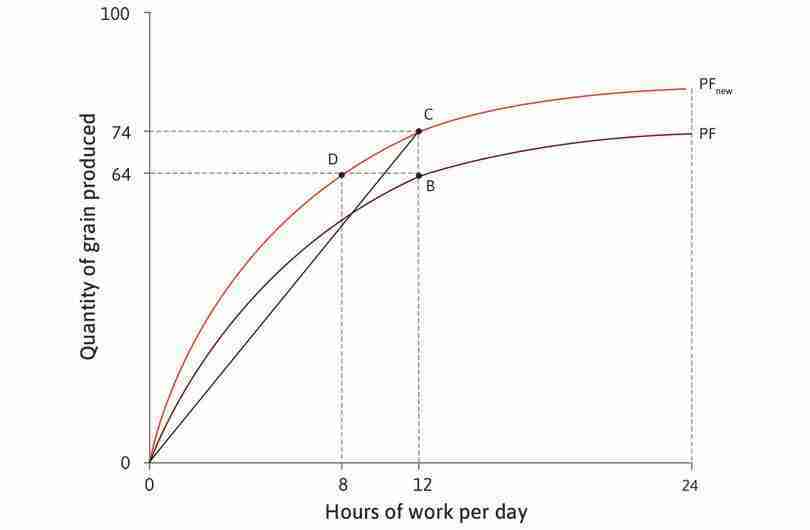
| Working hours | 0 | 1 | 2 | 3 | 4 | 5 | 6 | 7 | 8 | 9 | 10 | 11 | 12 | 13 | 18 | 24 |
|---|---|---|---|---|---|---|---|---|---|---|---|---|---|---|---|---|
| Grain | 0 | 9 | 18 | 26 | 33 | 40 | 46 | 51 | 55 | 58 | 60 | 62 | 64 | 66 | 69 | 72 |
How technological change affects the production function.
Figure 4.14 How technological change affects the production function.
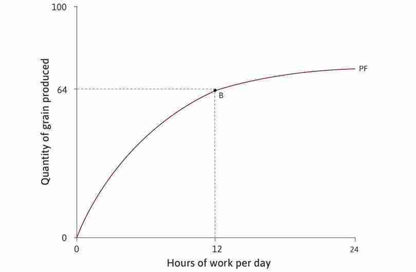
| Working hours | 0 | 1 | 2 | 3 | 4 | 5 | 6 | 7 | 8 | 9 | 10 | 11 | 12 | 13 | 18 | 24 |
|---|---|---|---|---|---|---|---|---|---|---|---|---|---|---|---|---|
| Grain | 0 | 9 | 18 | 26 | 33 | 40 | 46 | 51 | 55 | 58 | 60 | 62 | 64 | 66 | 69 | 72 |
The initial technology
The table shows how the amount of grain produced depends on the number of hours worked per day. For example, if Angela works for 12 hours a day, she will produce 64 units of grain. This is point B on the graph.
Figure 4.14a The table shows how the amount of grain produced depends on the number of hours worked per day. For example, if Angela works for 12 hours a day, she will produce 64 units of grain. This is point B on the graph.
| Working hours | 0 | 1 | 2 | 3 | 4 | 5 | 6 | 7 | 8 | 9 | 10 | 11 | 12 | 13 | 18 | 24 |
|---|---|---|---|---|---|---|---|---|---|---|---|---|---|---|---|---|
| Grain | 0 | 9 | 18 | 26 | 33 | 40 | 46 | 51 | 55 | 58 | 60 | 62 | 64 | 66 | 69 | 72 |
A technological improvement
An improvement in technology means that more grain is produced for a given number of working hours. The production function shifts upward, from PF to PFnew.
Figure 4.14b An improvement in technology means that more grain is produced for a given number of working hours. The production function shifts upward, from PF to PFnew.
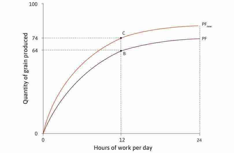
| Working hours | 0 | 1 | 2 | 3 | 4 | 5 | 6 | 7 | 8 | 9 | 10 | 11 | 12 | 13 | 18 | 24 |
|---|---|---|---|---|---|---|---|---|---|---|---|---|---|---|---|---|
| Grain | 0 | 9 | 18 | 26 | 33 | 40 | 46 | 51 | 55 | 58 | 60 | 62 | 64 | 66 | 69 | 72 |
More grain for the same amount of work
If Angela works for 12 hours per day, she can produce 74 units of grain (point C).
Figure 4.14c If Angela works for 12 hours per day, she can produce 74 units of grain (point C).
| Working hours | 0 | 1 | 2 | 3 | 4 | 5 | 6 | 7 | 8 | 9 | 10 | 11 | 12 | 13 | 18 | 24 |
|---|---|---|---|---|---|---|---|---|---|---|---|---|---|---|---|---|
| Grain | 0 | 9 | 18 | 26 | 33 | 40 | 46 | 51 | 55 | 58 | 60 | 62 | 64 | 66 | 69 | 72 |
Same amount of grain, less work
Alternatively, by working 8 hours a day, she can produce 64 units of grain (point D), which previously took 12 hours.
Figure 4.14d Alternatively, by working 8 hours a day, she can produce 64 units of grain (point D), which previously took 12 hours.
| Working hours | 0 | 1 | 2 | 3 | 4 | 5 | 6 | 7 | 8 | 9 | 10 | 11 | 12 | 13 | 18 | 24 |
|---|---|---|---|---|---|---|---|---|---|---|---|---|---|---|---|---|
| Grain | 0 | 9 | 18 | 26 | 33 | 40 | 46 | 51 | 55 | 58 | 60 | 62 | 64 | 66 | 69 | 72 |
The average product of labour
The average product at a particular point is the slope of the ray from that point to the origin. For example, at point B, Angela’s average product is 64/12 = 5.33 units per hour.
Figure 4.14e The average product at a particular point is the slope of the ray from that point to the origin. For example, at point B, Angela’s average product is 64/12 = 5.33 units per hour.
| Working hours | 0 | 1 | 2 | 3 | 4 | 5 | 6 | 7 | 8 | 9 | 10 | 11 | 12 | 13 | 18 | 24 |
|---|---|---|---|---|---|---|---|---|---|---|---|---|---|---|---|---|
| Grain | 0 | 9 | 18 | 26 | 33 | 40 | 46 | 51 | 55 | 58 | 60 | 62 | 64 | 66 | 69 | 72 |
Technological improvement raises the average product
After technological improvement, Angela’s average product from working the same number of hours is now 74/12 = 6.17 units per hour.
Figure 4.14f After technological improvement, Angela’s average product from working the same number of hours is now 74/12 = 6.17 units per hour.
Notice that the new production function is steeper than the original one for every given number of hours. The new technology has increased Angela’s marginal product of labour. At every point, an additional hour of work produces more grain than under the old technology.
Question 4.12 Choose the correct answer(s)
Based on Figure 4.14, which of the following statements about marginal and average product are true?
- Because there are no previous hours to consider, the average product for the initial hour is just the output produced in that hour, which in turn approximates to the marginal product from 0 to 1 hours (the precise marginal product changes over this interval, reflected in the decreasing slope of the production function).
- For 2 hours of work, the average product is 9, which is greater than the marginal product (approximately 8).
- For 11 hours of work, the average product is 62/11 = 5.64, which is greater than the average product at 12 hours of work (64/12 = 5.33).
- The slope of the line that touches but does not cross the production function becomes less steep as hours of work increase. Likewise, the slope of the ray from the origin to a point on the production function become less steep at higher hours of work.
From the production function to the feasible frontier
Figure 4.15 shows Angela’s feasible frontier, which is just the mirror image of the production function, for the original technology (FF), and the new one (FFnew).
As before, what we call free time is all the time that is not spent working to produce grain—it includes time for eating, sleeping, and everything else that we don’t count as farm work, as well as her leisure time. The feasible frontier shows how much grain can be consumed for each possible amount of free time. Points B, C, and D represent the same combinations of free time and grain as in Figure 4.14. The slope of the frontier represents the MRT (the marginal rate at which free time can be transformed into grain) or, equivalently, the opportunity cost of free time. You can see that technological progress expands the feasible set, giving her a wider choice of combinations of grain and free time.
The two trade-offs again
- tangency
- When a line touches a curve, but does not cross it.
Now we add Angela’s indifference curves to the diagram, representing her preferences for free time and grain consumption, in order to find which combination in the feasible set is best for her. Figure 4.16 shows that her best choice under the original technology is to work for 8 hours a day, giving her 16 hours of free time and 55 units of grain. This is the point of tangency, where her two trade-offs balance out—her marginal rate of substitution (MRS) between grain and free time (the slope of the indifference curve) is equal to the MRT (the slope of the feasible frontier). We can think of the combination of free time and grain at point A as a measure of her standard of living.
Follow the analysis of Figure 4.16 to see how her choice changes as a result of technological progress.
Angela’s choice between free time and grain.
Figure 4.16 Angela’s choice between free time and grain.
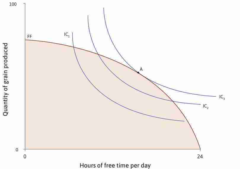
Maximizing utility with the original technology
The diagram shows the feasible set with the original production function and Angela’s indifference curves for combinations of grain and free time. The highest indifference curve she can attain is IC3 at point A.
Figure 4.16a The diagram shows the feasible set with the original production function and Angela’s indifference curves for combinations of grain and free time. The highest indifference curve she can attain is IC3 at point A.
Angela’s new best choice
When the technology of farming has improved, Angela’s best choice is point E, where FFnew just touches indifference curve IC4. She has more free time and more grain than before.
Figure 4.16d When the technology of farming has improved, Angela’s best choice is point E, where FFnew just touches indifference curve IC4. She has more free time and more grain than before.
Technological change raises Angela’s standard of living—it enables her to achieve higher utility. Note that in Figure 4.16, she increases both her consumption of grain and her free time.
It is important to realize that this is just one possible result. Had we drawn the indifference curves differently, Angela’s trade-offs would have been different. We can say that the improvement in technology definitely makes it feasible to both consume more grain and have more free time, but whether Angela will choose to have more of both depends on her preferences between these two goods, and her willingness to substitute one for the other.
To understand why, remember that technological change makes the production function steeper—it increases Angela’s marginal product of labour. This means that the opportunity cost of free time is higher, giving her a greater incentive to work. But also, now that she can have more grain for each hour of free time, she may be more willing to give up some grain for more free time—that is, to reduce her hours of work.
These two effects of technological progress work in opposite directions. In Figure 4.16, the second effect dominates and she chooses point E, with more free time as well as more grain.
Exercise 4.8 Your production function
Think back to the constrained choice problem of final grade and study hours.
- What could bring about a technological improvement in your and your fellow students’ production functions?
- Draw a diagram to illustrate how this improvement would affect your feasible set of grades and study hours.
- Analyse what might happen to your choice of study hours, and the choices that you might make.
Question 4.13 Choose the correct answer(s)
The following diagram shows a farmer’s choice between free time and grain before and after an improvement in technology.
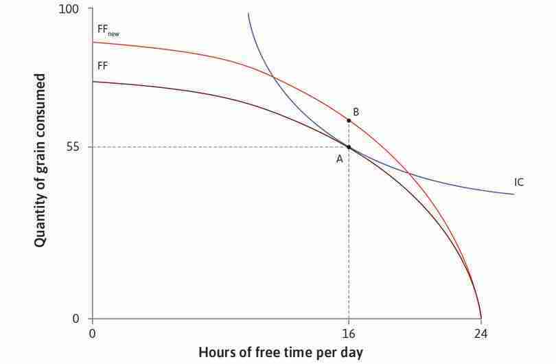
A farmer’s choice between free time and grain.
Figure 4.17 A farmer’s choice between free time and grain.
Based on this information, which of the following statements are correct?
- A larger MRS means that the farmer is willing to sacrifice more grain for an extra hour of free time, which gives him an incentive to take more free time than before.
- A larger MRT implies that each additional hour of free time incurs a greater opportunity cost in forgone consumption of grain than before. This gives the farmer an incentive to take less free time than before.
- The chosen point can be to the left of B, if the incentive to take more free time (induced by a larger MRS) is more than offset by the incentive to work more (induced by a larger MRT).
- This is true; it depends on the relative size of the incentive to take more free time induced by a higher MRS and the incentive to work more induced by a higher MRT at B.
4.9 Applying the model: Explaining changes in working hours
- normal good
- A good for which demand increases when a person’s income rises, holding prices unchanged.
- inferior good
- A good whose consumption decreases when income increases (holding prices constant).
- income effect
- The effect, for example, on the choice of consumption of a good that a change in income would have if there were no change in the price or opportunity cost.
- substitution effect
- The effect for example, on the choice of consumption of a good that is only due to changes in the price or opportunity cost, given the new level of utility.
We can apply the model to help us understand how the technological change and rising incomes described in Unit 1 affected the trade-off faced by workers. Higher wages meant it was possible to have both higher consumption and more free time. And, like Angela, workers wanted more of both. In economics, the term normal good is used when more of something is demanded as income rises. Using this definition, both consumption and free time are normal goods. (A good whose consumption falls when income rises, like an inexpensive but not very tasty source of carbohydrates, is called an inferior good.)
We use the idea of the two effects of technological progress on Angela’s choice of free time to explore what has happened to working hours over the past 250 years.
When technological progress flows through to higher hourly wages, there are two effects:
- Income effect (of higher hourly wages): The higher income from every hour of work has made workers better off. This is called the income effect—since free time is a normal good, the income effect means that workers want to have more hours of free time (as well as more consumption).
- Substitution effect (of higher hourly wages): The higher reward from working an extra hour has increased the incentive to work. This is called the substitution effect—it has the effect of reducing hours of free time as workers substitute away from free time towards what is now higher-paying work.
Before 1870
Let’s consider first the period before 1870 in Britain, when wages increased due to technological progress, and working hours rose.
- Income effect: At this time, there was a relatively low level of consumption. The income effect resulting in the choice of more free time was small.
- Substitution effect: Workers were paid more, so each hour of work brought more rewards than before in the form of goods, increasing the incentive to work longer hours. The substitution effect resulting in the choice of less free time was large.
- The substitution effect dominated: Work hours rose, which can be interpreted as saying that the substitution effect (free time falls) was bigger than the income effect (free time rises).
During the twentieth century
During the twentieth century, we saw rising wages but falling working hours. Using the same concepts, we can account for this change as follows:
To see how to use a diagram to represent the income and substitution effects, see Section 3.7 of The Economy.
- Income effect: By the late nineteenth century, workers had a higher level of consumption and valued free time relatively more, so the income effect of a wage increase was larger.
- Substitution effect: This increased the incentive to work longer hours.
- The income effect dominated: When the income effect began to outweigh the substitution effect, working time fell.
The future
What about the future?
The high-income economies will continue to experience a major transformation—the declining role of work in the course of our lifetimes. We start working at a later age, stop working at an earlier age, and spend fewer hours at work during our working years. Robert Fogel, an economic historian, estimated the total working time in the past, including travel to and from work and unpaid work at home, which economists call ‘home production’. He made projections for the year 2040, defining what he called ‘discretionary time’ in a day as 24 hours minus the amount we all need for biological maintenance (sleeping, eating, and personal hygiene). Fogel calculated leisure time as discretionary time minus working time.3
Fogel estimated that, in 1880, lifetime leisure time was just a quarter of lifetime work hours. In 1995, lifetime leisure time exceeded lifetime working time. He predicted that lifetime leisure would be three times lifetime working hours by the year 2040. His estimates are shown in Figure 4.18.
Estimated lifetime hours of work and leisure (1880, 1995, 2040).
Figure 4.18 Estimated lifetime hours of work and leisure (1880, 1995, 2040).
Robert William Fogel. 2000. The Fourth Great Awakening and the Future of Egalitarianism. The Political Realignment of the 1990s and the Fate of Egalitarianism. Chicago: University of Chicago Press.
It is possible that Fogel overstated the future decline in working time, as Keynes once did. But he raises the challenging possibility that one of the great changes brought about by the technological revolution could be a vastly reduced role of work in the life of an average person.
Question 4.14 Choose the correct answer(s)
In the period before 1870 in Britain, both wages and hours worked rose, while in the twentieth century, working hours fell even though wages continued to rise. Based on this information, which of the following statements are correct?
- The wage rate is the MRT, which has risen over time.
- The number of hours of free time rose because the positive income effect (more free time) more than offset the negative substitution effect (less free time).
- A higher wage rate means a higher opportunity cost of free time. Therefore, the substitution effect is always negative.
- In the twentieth century, the positive income effect (more free time) dominated the negative substitution effect (less free time), so that hours of free time rose.
4.10 Applying the model: Explaining differences between countries
Brian Burgoon and Phineas Baxandall explore the differences between the average hours that people spend at work in different developed countries and argue that cultural and economic differences have created three different ‘worlds’ in this paper: Brian Burgoon and Phineas Baxandall. 2004. ‘Three Worlds of Working Time: The Partisan and Welfare Politics of Work Hours in Industrialized Countries.’ Politics & Society 32 (4): 439–73.
Figure 4.3 showed that, in countries with higher income (real GDP per capita), workers tend to have more free time; it also showed that there are big differences in annual hours of free time between countries with similar income levels. The table in Figure 4.19 shows our calculations of the disposable income of an average employee per hour worked, his or her free time per day, and the maximum amount that could be consumed per day. The figures are shown for five countries.
| Country | Wage (disposable income per hour worked) | Free time per day | The most that could be consumed per day |
|---|---|---|---|
| US | 34.02 | 19.12 | 165.91 |
| South Korea | 17.39 | 18.45 | 96.41 |
| Netherlands | 36.90 | 20.07 | 144.87 |
| Turkey | 9.23 | 18.92 | 46.90 |
| Mexico | 6.79 | 17.82 | 41.96 |
Free time and consumption per day across countries (2013).
Figure 4.19 Free time and consumption per day across countries (2013).
OECD. Average annual hours actually worked per worker. Accessed June 2016. Net income after taxes calculated in US dollars using PPP exchange rates.
From the data in Figure 4.19, we see that average free time in Mexico and South Korea was virtually the same, although the wage was much higher in South Korea than in Mexico. People from the Netherlands and the US have about as much to spend per day, but the Dutch have around one hour less of free time.
Could it be that South Koreans have the same preferences as Americans, so that, if the wage increased in South Korea, they would make the same choice? This seems unlikely—the substitution effect would lead them to consume more goods and take less free time; it is implausible to suppose that the income effect of a wage increase would lead them to consume fewer goods. More plausible is the hypothesis that South Koreans and Americans (on average) have different preferences.
In particular, the idea that South Koreans work exceptionally hard is consistent with the hypothesis that the average American is willing to give up more units of daily goods for an hour of free time than the average South Korean.
4.11 Is this a good model? Does it matter that people (mostly) do not really optimize?
We have looked at three different contexts in which people decide how long to spend working—a student (Alexei), a farmer (Angela), and wage earners in different countries and periods. We have used a model of preferences and feasible sets in which their best (utility-maximizing) choice is the level of working hours at which the slope of the feasible frontier is equal to the slope of the indifference curve.
You may have been thinking that this is not what people do in real life!
Billions of people organize their working lives without knowing anything about MRS and MRT (if they did make decisions that way, perhaps we would have to subtract the hours they would spend making calculations). And even if they did make their choice using mathematics, most of us can’t just leave work whenever we want to. So how can this model be useful?
Remember that models help us ‘see more by looking at less’. Lack of realism is an intentional feature of any model.
Is it possible that a model that ignores how we think is a good model of how we choose?
Milton Friedman, an economist, explained that, when economists use models in this way, they do not claim that we actually think through these calculations (such as equating MRS to MRT) each time we make a decision. Instead, we each try various choices (sometimes not even intentionally) and we tend to adopt habits, or rules of thumb, that make us feel satisfied and not regret our decisions.
In his book, Essays in Positive Economics, Friedman described this as similar to playing billiards (pool):
Consider the problem of predicting the shots made by an expert billiard player. It seems not at all unreasonable that excellent predictions would be yielded by the hypothesis that the billiard player made his shots as if he knew the complicated mathematical formulas that would give the optimum directions of travel, could estimate accurately by eye the angles, etc., describing the location of the balls, could make lightning calculations from the formulas, and could then make the balls travel in the direction indicated by the formulas.
Our confidence in this hypothesis is not based on the belief that billiard players, even expert ones, can or do go through the process described. It derives rather from the belief that, unless in some way or other they were capable of reaching essentially the same result, they would not in fact be expert billiard players.4
Similarly, if we see a person regularly choosing to go to the library after lectures instead of going out, or not putting in much work on their farm, or asking for longer shifts after a pay rise, we do not need to suppose that this person has done the calculations we set out. If that person later regretted the choice, next time they might go out a bit more, work harder on the farm, or cut their hours back. Eventually, we could speculate they might end up with a decision on work time that is close to the result of our calculations.
This is why economic theory can help to explain—and sometimes even predict—what people do, even though those people are not performing the mathematical calculations that economists make in their models.
4.12 Extending the model: The influence of culture and politics
A second unrealistic aspect of the model is that usually employers (and not individual workers) choose working hours, and employers often impose a longer working day than workers prefer. As a result, the hours that many people work are regulated by law, so that neither the employee nor the employer can choose to work beyond the maximum amount. In this case, the government has limited the feasible set of hours and goods.
- Cultures differ. Some northern European peoples highly value their vacation times, while South Korea is famous for the long hours that employees put in.
- Legal limits on working time differ. In Belgium and France, the normal work week is limited to 35–39 hours, while in Mexico the limit is 48 hours, and in Kenya even longer.
This explanation stresses culture (meaning changes in preferences or differences in preferences among countries) and politics (meaning differences in laws, or trade union strength and objectives). Culture and politics certainly help to explain differences in working hours between countries.
Employers have an incentive to take account of these differences. For example, employers who advertise jobs with the working hours that most people prefer may find they have more applicants than other employers offering too many (or too few) hours.
Remember, we also judge the quality of a model by whether it provides insight into something that we want to understand. You can make a judgement as to whether our model of the choice of hours of work helps us understand why working hours differ so much between countries and why they have changed over time.
Exercise 4.9 Another definition of economics
Lionel Robbins, an economist, wrote in 1932 that ‘Economics is the science that studies human behaviour as a relationship between given ends and scarce means which have alternative uses’.5
- Give an example from this unit to illustrate the way that economics studies human behaviour as a relationship between ‘given ends and scarce means with alternative uses’.
- Are the ‘ends’ of economic activity—that is, the things we desire—fixed? Use examples from this unit (study time and grades, or working time and consumption) to illustrate your answer.
- The subject matter that Robbins refers to—doing the best you can in a given situation—is an essential part of economics. But is economics limited to the study of ‘scarce means which have alternative uses’? In answering this question, include a contrast between Robbins’ definition of economics and the one given in Section 2.14. Note that Robbins wrote this passage at a time when 15% of the British workforce was unemployed.
4.13 Extending the model: Women, men, and the gender division of labour
A good model is like a structure made of LEGO: we can build on it, or take bits out and replace them by others without starting again. One way to build on the model of the choice of working hours is to consider differences between men and women. The trade-offs on which the model is based will look different, especially if we consider men and women who live in a household with children.
Most important we need to ask what we really mean by ‘free time’. When we introduced the term, we explained it was about how Alexei ‘values his free time—he likes to sleep, go out or watch TV’.
But suppose we want to understand the work choices of Alexa, not Alexei. Alexa is a mother of two children under the age of five, and is co-habiting with the children’s father. For Alexa, the time that she is not working outside the home is hardly ‘free,’ because she lives in a society which is bound by a social norm that the mother is responsible for most of the childcare and home production.
- gender division of labour
- The ways men and women differ in how they spend their work time.
The ways men and women differ in how they spend their work time is known as the gender division of labour. The greater importance of home production in a woman’s day is an almost universal aspect of the gender division of labour in modern societies, though this differs markedly across nations and age groups.
So, let’s divide Alexa’s 24-hour day into three parts: working outside the home, home production, and free time. Alexei, too, may spend some time on home production.
As in the model of how much time to study, or to cultivate grain, Alexa and Alexei each face a trade-off. Each now has three objectives: more goods that can be purchased with the wages gained by working for pay, a cleaner house and better care for children, and more free time. In each case, achieving more of one objective implies getting less of the other objective. In other words, the opportunity cost of more time with the kids is either less free time, lower earnings to purchase goods, or both.
How could the choice of working hours model be extended to take account of the gender division of labour? Three important aspects of the problem missing from the model so far are:
- Social norms: These will have an important bearing on the choice of hours spent in unpaid work. If home production and childcare are considered to be ‘women’s work’ this will affect the preferences of both men and women about doing that work.
- Strategic interaction and joint decision making: Both may be important. Whether cooperatively or in conflict, men and women raising children together will be aware that their wellbeing depends not only on their own choices, but also the choices of their partner. Understanding their decisions might require that we represent their interaction as a game (as in Unit 2) rather than as a single individual deciding how many hours to study or to produce grain.
- Gender inequality in pay: In most countries this will mean Alexa’s opportunity cost of spending more time doing unpaid work in the home, and working less outside the home, is less than Alexei’s—because her pay would be less than his.
Total time spent doing unpaid care work by men and women in Belgium, Finland and the US (latest year of available data).
Figure 4.20 Total time spent doing unpaid care work by men and women in Belgium, Finland and the US (latest year of available data).
Calculated from International Labour Office. 2018. Care work and care jobs for the future of decent work. Geneva: ILO: pp. 67. Note: Latest year of available data is 2013 for Belgium, 2009 for Finland, and 2016 for the US.
Figure 4.20 shows the amount of unpaid care work done by men and women in households with no children and with children under five. In all three countries, women spend more time in unpaid care work than men in households without children, and women’s unpaid work rises by more in households with young children.
There are interesting differences across countries though. In Finland, with the lowest gap in pay between men and women, unpaid care work is shared more equally than in the other two countries. With young children, unpaid care work goes up in all three countries. The difference made by children is greatest in Finland—comparing the three countries, Finnish men and women spend the fewest minutes in unpaid care in households without children and the most when there are young children. Belgium is at the other extreme. Children are associated with only a modest increase in unpaid care time by women, and almost no extra time on the part of men.
Generous maternity and paternity leave in Finland help account for the increase in time spent in unpaid care work in households with young children. By contrast, in Belgium, the early age at which almost all children are in childcare outside the home (30 months) helps account for the lower amount of time spent in unpaid care work by both men and women than in Finland.
Among high income countries, the US is one of the least generous in terms of parental leave and provision of subsidized or free childcare places. Women frequently continue to work full time, adding a second shift of childcare in the home.
4.14 Work and wellbeing as a social dilemma
We can also use the model to study questions of public policy concerning work, and the time we spend at work. One of the reasons a person may choose to work longer hours is to be able to show off their material success to others. Some goods—such as expensive cars, watches, and clothes—may be desired as status symbols. Their owners value these or other luxuries partly because ownership raises their status above that of other people.
Conspicuous consumption
- conspicuous consumption
- The purchase of goods or services to publicly display one’s social and economic status.
Perhaps one of your motives when you buy a car, or a coat, is to demonstrate your wealth and superior style. Or perhaps you settle for a cheaper second-hand coat but feel envious, embarrassed, or disadvantaged at a job interview. Thorstein Veblen (1857–1929), an American economist and sociologist, described buying luxury items as a public display of social and economic status as conspicuous consumption. The process is more commonly described as ‘keeping up with the Joneses’.
Veblen made an important point—when we work, buy, save, and engage in other economic activities, we are not only attempting to get things; we are also trying to be someone consistent with our own aspirations and the respect of others.
Expensive goods are a good way to communicate high income for the simple reason that poor people will not be able to compete on this terrain. The rich are the ‘Joneses’, whom people want to emulate.
- positional good
- A good—such as high status, conspicuous consumption, or power—which, if enjoyed by one member of a community is experienced negatively by others. The more one person benefits from this good, the more others are harmed.
Goods that are valued more because they are a symbol of status or income are an example of a larger class called positional goods. They are positional because they are based on status or power, which can be ranked as high or low. Our positions in this ranking, like the rungs of a ladder, may be higher or lower. But there is only a fixed amount of a positional good to go around. If Jo is on a higher rung of the ladder because of her new coat, somebody must now be on a lower rung.
Positional goods are sometimes called ‘public bads’. Like public goods, they are ‘available’ to everyone—nobody in the neighbourhood can escape the fact that one of the neighbours is driving a BMW. But instead of a positive external effect on others, the effect is negative—envy.
To see how this leads to a social dilemma, consider the case of Sue Smith and her sister Jo Jones, each moving with their families to a new town. Each family has a choice between buying a luxury house or a more modest one. Their payoffs are represented in Figure 4.21. Since both families have limited funds, they would be better off if both bought modest houses than if both bought luxury ones, squeezing the rest of their budgets. But Sue is status-conscious and the two families are competitive when it comes to lifestyle. If the Smiths buy a modest house, the Joneses can benefit from feeling superior if they choose a luxury house. The Smiths, in turn, will feel miserable.
In short, Sue is trying to keep up with the Joneses, and Jo is trying to keep up with the Smiths.
- prisoners’ dilemma
- A game in which the payoffs in the dominant strategy equilibrium are lower for each player, and also lower in total, than if neither player played the dominant strategy.
You can see that this problem has the structure of a prisoners’ dilemma. Whatever the Joneses do, the Smiths are better off with a luxury house. For both couples, choosing Luxury is a dominant strategy. They will achieve a payoff of 1 each, and the outcome is Pareto inefficient, because both would be better off if they each bought modest houses.
- external effect
- When a person’s action confers a benefit or cost on some other individual, and this effect is not taken account of by the person in deciding to take the action. It is external because it is not included in the decision-making process of the person taking the action. Positive effects refer to benefits, and negative effects to costs, that are experienced by others. A person breathing second-hand smoke from someone else’s cigarette is a negative external effect. Enjoying your neighbour’s beautiful garden is a positive external effect. Also known as: externality. See also: incomplete contract, market failure, external benefit, external cost.
- Veblen effect
- A negative external effect that arises from the consumption of a positional good. Examples include the negative external effects imposed on others by the consumption of luxury housing, clothing, or vehicles.
The root of this problem is the external effect that one family imposes on the other by choosing a luxury house. The price of the luxury house that Sue’s family will buy does not include the positional externalities inflicted on her sister’s family. If it did, Sue would not buy the luxury house, given the payoffs in the table.
What can they do to avoid the Pareto-inefficient outcome? We know from Unit 2 that altruism would help, but Sue and Jo are more moved by sibling rivalry—these families are not altruistic about houses.
The ‘keeping up with the Joneses’ problem that Sue and Jo face arises because people care not only about what they have, but also about what they have relative to what other people have. This is sometimes called a Veblen effect.
Taxing a positional good to address a social dilemma
The Nash equilibrium that is the outcome of this social dilemma will be that both families purchase a luxury house, when both would have been better off with more modest accommodation. If the only people trapped in the ‘keeping up with the Joneses’ dilemma were really sisters, we might expect them to contain their sibling rivalry sufficiently to agree that both would buy a modest house. But our story about the sisters is really a parable about entire communities, even on a global level; a face-to-face conversation, eye contact, and a handshake might have worked among sisters, but will not solve the problem.
A government policymaker might devise a policy that would address the social dilemma, however. Recall from the previous unit that policies change outcomes by altering the Nash equilibrium of the relevant interaction. So, in this case, the policymaker would have to think of a way to make both families buying a modest home into a Nash equilibrium.
The policymaker could do this simply by passing a law prohibiting luxury housing. A more acceptable policy might be to impose a tax on luxury housing. You can see from the payoff matrix in Figure 4.21 that in order to make (Modest, Modest) a Nash equilibrium, a tax of just a little more than 0.5 on luxury housing would accomplish the objective. (This is similar to imposing a tax on placing additional cows on the pasture in the tragedy of the commons game in Section 3.8.) Be sure that you understand what the new payoff matrix (with the tax) would look like, and why it would solve the social dilemma.
Exercise 4.10 Tax on a positional good
Consider the situation in Figure 4.21.
- Suppose the government imposed a tax of 0.6 on luxury housing. Draw the new (after-tax) payoff matrix and use game theory concepts to explain why this tax solves the social dilemma.
- How large would the tax have to be in order to completely account for the Veblen effect? Draw the new payoff matrix (with this tax) and explain, with reference to external effects, why a tax of this size also solves the social dilemma.
Positional goods, inequality and the overwork rat race
Veblen effects can be especially important in economies in which ‘the Joneses’ are very rich, so that keeping up with them requires people to work long hours or to shift their expenditure away from necessities—like food consumed privately—and into conspicuous consumption.
Veblen effects help to explain two facts about modern economies:
- People work longer hours in countries in which the very rich receive a larger fraction of the income: Figure 4.22 shows some of the data for a large number of rich countries over the entire twentieth century. For example, the US has both higher hours of work and a higher income share of the very rich than Germany, France, Sweden, and the Netherlands. A century ago, American workers worked fewer hours than workers in all these countries. But over the past 100 years, the share of income going to the very rich declined in all these countries. Sweden, for example, went from one of the most unequal countries (by this measure) to one of the more equal. (For more on this topic, watch Juliet Schor’s ‘Economist in action’ video.)
- As a nation gets richer, its citizens often do not become happier: When an individual gets a wage increase or loses a job, there is a large effect on how happy that individual claims to be. But economists have also found that a change in our income has a much smaller effect if most of our acquaintances also got the same rise, or also lost their job. When an entire nation gets richer, the effect on individual happiness is small, if there is one at all.
Another reason that, as a nation gets richer, its citizens may not become happier is that people may become habituated to their recent standard of living, and so their happiness reverts back to previous levels if they do not keep becoming ever richer.
The situation in which nations become richer but their citizens become no happier—due either to the effects of income relativities or of habituation, or adaptation, as it is often known—is known as the ‘Easterlin Paradox’, in honour of the economist who made the argument in 1974.6
Betsey Stevenson and Justin Wolfers, among other economists, produce alternative evidence that the link between happiness and higher incomes is not broken, even for the most developed countries.7
When Veblen effects are present, the conspicuous consumption of the well off is a positional good, which has a negative external effect. If conspicuous consumption is experienced by everyone, reducing their satisfaction with their own situation, it is a public bad.
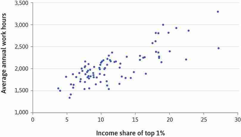
The relationship between average annual work hours and income share of the very rich (twentieth century).
Figure 4.22 The relationship between average annual work hours and income share of the very rich (twentieth century).
Michael Huberman. 2004. ‘Working hours of the world unite? New international evidence of worktime’. Journal of Economic History 64, 964–1001 and Andrew Leigh. 2007. ‘How closely do top incomes shares track other measures of inequality?’ Economic Journal 117, 619–33.
Exercise 4.11 Using Excel: Correlation or causation?
Figure 4.22 is a scatterplot of average annual work hours and income share of the top 1%, using data from 10 OECD countries. Download and save the spreadsheet containing the data for Figure 4.22.
- Make a scatterplot similar to Figure 4.22, showing data for each country in a different colour. Follow the walk-through in Figure 4.23 below on how to compile a scatterplot diagram in Excel. Are there any patterns you see for particular countries that are different from the overall pattern shown in Figure 4.22?
Making a colour-coded scatterplot.
Figure 4.23 Making a colour-coded scatterplot.
The data
This is what the data looks like. Column A has country names, Column B has years, Column C has the percentage of total income earned by the top 1% in the population, and Column D has average annual working hours.
Figure 4.23a This is what the data looks like. Column A has country names, Column B has years, Column C has the percentage of total income earned by the top 1% in the population, and Column D has average annual working hours.
Add the other countries to the scatterplot
The scatterplot currently has data for Australia only. Now we will add the other countries to the scatterplot one by one, so they will each be shown in a different colour.
Figure 4.23c The scatterplot currently has data for Australia only. Now we will add the other countries to the scatterplot one by one, so they will each be shown in a different colour.
Add the other countries to the scatterplot
The section on the left lists all the data series currently plotted on the chart. We need to add the other countries as separate data series, so they will appear in different colours.
Figure 4.23d The section on the left lists all the data series currently plotted on the chart. We need to add the other countries as separate data series, so they will appear in different colours.
Add the other countries to the scatterplot
After completing step 9, your scatterplot will look like the one shown above, with each country represented by a different colour.
Figure 4.23f After completing step 9, your scatterplot will look like the one shown above, with each country represented by a different colour.
Add a chart legend
We will add a legend so it is easy to see which colour represents each country. You can see that the relationship between average annual working hours (vertical axis) and income share owned by the top 1% is positive for all countries, but clearer for some countries compared to others.
Figure 4.23h We will add a legend so it is easy to see which colour represents each country. You can see that the relationship between average annual working hours (vertical axis) and income share owned by the top 1% is positive for all countries, but clearer for some countries compared to others.
- Calculate the correlation coefficient between average annual work hours and income share of the top 1%, using data from all countries. (Visit Doing Economics for a walk-through on how to calculate the correlation coefficient in Excel.) What does this coefficient tell us about the strength of the association between these two variables?
- Now calculate the correlation coefficient for each country separately. Which country has the highest correlation coefficient, and which country has the lowest? Suggest some explanations for why the relationship between income share and work hours differs in strength between countries.
- In this unit, we presented one explanation for what we observe in Figure 4.22, namely that the conspicuous consumption of the top 1% may motivate people to work more (‘keep up with the Joneses’). Can you think of an explanation for why higher average annual working hours would lead to a higher income share of the top 1%? What other factors could be responsible for the observed relationship? Based on your answers, discuss whether we can conclude from Figure 4.22 that a higher income share of the top 1% causes higher average annual work hours.
Changing preferences
When interpreting changes in working hours, we should also consider the possibility that preferences change over time. If you look carefully at Figure 4.1, you can see that, in the last part of the twentieth century, hours of work rose in the US, even though wages hardly increased. Hours of work also rose in Sweden during this period.
Why? Perhaps Swedes and Americans came to value consumption more over these years. In other words, their preferences changed (in diagrammatic terms, this would be a flattening of the indifference curves.) This may have occurred because, in both the US and Sweden, the share of income gained by the very rich increased considerably and the lavish consumption habits of the rich set a higher standard for everyone else. According to this explanation, Swedes and Americans were ‘keeping up with the Joneses’ and the Joneses got richer, leading everyone else to change their preferences.
The combined political, cultural and economic influences on our choices may produce some surprising trends. In our ‘Economist in action’ video, Juliet Schor, a sociologist and economist who has written about the paradox that many of the world’s wealthiest people are working more despite gains in technology, asks what this means for our quality of life, and for environment sustainability.

Exercise 4.12 Veblen effects and policy
- The example of Veblen effects above concerns houses. Can you think of any other examples where Veblen effects are present?
- Why do Veblen effects cause inefficiency?
- Describe in what way Veblen effects are similar to (or different from) pollution?
- Discuss whether the government should adopt policies to address this market failure and, if so, what might they be?
Question 4.15 Choose the correct answer(s)
Watch the ‘Economist in action’ video of Juliet Schor. Which of the following statements were not mentioned in the video?
- This was mentioned in the video.
- This was mentioned in the video.
- Trends in working hours since the 1970s depend on the data used.
- This was mentioned in the video.
4.15 Conclusion
Technological improvements have enabled people to increase their consumption of goods and services and also to enjoy more free time. The extent to which higher wages have led to decreased working hours varies across time and between countries, reflecting the fact that preferences may change over time and that they are shaped by different cultural factors.
Using the key concept in economic modelling of ceteris paribus, we have built a constrained choice model to study an individual’s choice between different combinations of consumption and free time.
| Constraint: The feasible set | Preferences: Indifference curves |
|---|---|
| The production function translates inputs (like hours of work) into outputs (like grades or grain.) Diminishing marginal product means that, for each additional unit of input, the resulting increase in output becomes smaller. For some given level of input, the marginal product is the slope of the production function, while the average product is the slope of the ray from the origin to a given point on the production function. |
Indifference curves join together all combinations of goods (like free time and consumption) that provide the same level of utility. Indifference curves are based on our preferences, that is on the benefit or cost that we associate with each possible outcome. To reflect the trade-off between two things that we value positively (‘goods’), indifference curves slope downwards. |
| The feasible frontier gives the maximum amount of one good (grain) that can be obtained for a given amount of another (free time). The trade-off in what is feasible is represented by its slope, the marginal rate of transformation (MRT). This shows the opportunity cost of, for example, increasing free time by one hour in terms of the grain the individual must forgo. | The trade-off between objectives is represented by the slope of an indifference curve and is called the marginal rate of substitution (MRS), and it represents the trade-off between the two goods, namely, how much more of one good would be required to offset the subtraction of one unit of the other good. |
| Optimal choice: MRT = MRS | |
Technological progress can be modelled as an upward shift of the production function.
This expands the feasible set (in this case just the mirror image of the production function).
We have distinguished between two effects of a wage increase:
- The substitution effect: The amount by which leisure hours fall due to their higher opportunity cost in terms of foregone income.
- The income effect: The amount by which free time increases as a result of higher income, assuming that, like income, free time is a normal good.
Finally, we have considered how the conspicuous consumption of positional goods as a status symbol may lead to a Pareto-inefficient outcome in which one person’s luxury consumption inflicts negative external effects, called Veblen effects, on others.
4.16 Doing Economics: Measuring wellbeing
In Unit 1 and in this unit, we have used real GDP per capita to compare living standards across countries or measure progress in living standards over time. The rationale is that higher income/expenditure means a greater ability to spend on goods and services, which in turn increases material wellbeing. Since material wellbeing can contribute to non-material wellbeing, we might also expect countries with higher real GDP per capita to have higher non-material wellbeing. But how do we measure non-material wellbeing? And does a higher real GDP per capita necessarily mean a higher non-material wellbeing?
In the Doing Economics Empirical Project 4 we answer these questions. The project shows how different variables can be summarized into an index by looking at real GDP and its components. We will then learn how indices of non-material wellbeing are constructed, and compare an index of material wellbeing (real GDP per capita) with an index of non-material wellbeing (the Human Development Index).
Go to Doing Economics Empirical Project 4 to work on this problem.
Learning objectives
In this project you will:
- check datasets for missing data
- generate new variables using cell formulae
- sort data and assign ranks based on values
- distinguish between time series and cross sectional data, and plot appropriate charts for each type of data
- calculate the geometric mean and explain how it differs from the arithmetic mean
- construct indices using the geometric mean, and use index values to rank observations
- explain the difference between two measures of wellbeing (real GDP per capita and the Human Development Index)
4.17 References
- Easterlin, Richard. 1974. ‘Does economic growth improve the human lot?’ In M Abramovitz, P David & M Reder (Eds.), Nations and Households in Economic Growth: Essays in Honor of Moses Abramovitz. New York: Academic Press.
- Fogel, Robert William. 2000. The Fourth Great Awakening and the Future of Egalitarianism: The Political Realignment of the 1990s and the Fate of Egalitarianism. Chicago: University of Chicago Press.
- Friedman, Milton. 1953. Essays in Positive Economics. (7th ed.) Chicago: University of Chicago Press.
- Harford, Tim. 2015. ‘The rewards for working hard are too big for Keynes’s vision’. The Undercover Economist.
- Huberman, Michael, and Chris Minns. 2004. ‘The Times They Are Not Changin’: Days and Hours of Work in Old and New Worlds, 1870–2000’. Explorations in Economic History 44 (4): pp. 538–67.
- Keynes, John Maynard. 1963. ‘Economic Possibilities for our Grandchildren’. In Essays in Persuasion. New York, NY: W. W. Norton & Co.
- Leigh, Andrew. 2007. ‘How closely do top incomes shares track other measures of inequality?’ Economic Journal 117: pp. 619-33.
- Plant, E. Ashby, Karl Anders Ericsson, Len Hill, and Kia Asberg. 2005. ‘Why study time does not predict grade point average across college students: Implications of deliberate practice for academic performance’. Contemporary Educational Psychology 30 (1): pp. 96–116.
- Robbins, Lionel. (1932) 1984. An Essay on the Nature and Significance of Economic Science. (3rd ed.) New York: New York University Press.
- Stevenson, Betsey, and Justin Wolfers. 2008. ‘Economic growth and subjective well-being: Reassessing the Easterlin paradox’. Brookings Papers on Economic Activity: pp. 1–87.
- Whaples, Robert. 2001. ‘Hours of work in U.S. History’. EH.net Encyclopedia.
-
John Maynard Keynes. 1963. ‘Economic Possibilities for our Grandchildren’. In Essays in Persuasion. New York, NY: W. W. Norton & Co. ↩
-
Elizabeth Ashby Plant, Karl Anders Ericsson, Len Hill, and Kia Asberg. 2005. ‘Why study time does not predict grade point average across college students: Implications of deliberate practice for academic performance’. Contemporary Educational Psychology 30 (1): pp. 96–116. ↩
-
Robert William Fogel. 2000. The Fourth Great Awakening and the Future of Egalitarianism: The Political Realignment of the 1990s and the Fate of Egalitarianism. Chicago: University of Chicago Press. ↩
-
Milton Friedman. 1953. Essays in Positive Economics. (7th ed.) Chicago: University of Chicago Press. ↩
-
Lionel Robbins. (1932) 1984. An Essay on the Nature and Significance of Economic Science. (3rd ed.) New York: New York University Press. ↩
-
Richard A. Easterlin. 1974. ‘Does economic growth improve the human lot?’ In M Abramovitz, P David, and M Reder (Eds.). Nations and Households in Economic Growth: Essays in Honor of Moses Abramovitz. New York: Academic Press. ↩
-
Betsey Stevenson and Justin Wolfers. 2008. ‘Economic growth and subjective well-being: Reassessing the Easterlin paradox’. Brookings Papers on Economic Activity: pp. 1–87. ↩
